Hehe. Of course. My approach is always to get a physical prototype made before I’m ever willing to produce, or certainly sell, anything. It’s way more expensive to do it this way, but you never know how something is going to work out in real life until you actually make it.  Renders can be helpful in the early ideation and R&D stage, but ultimately they don’t cut it for me.
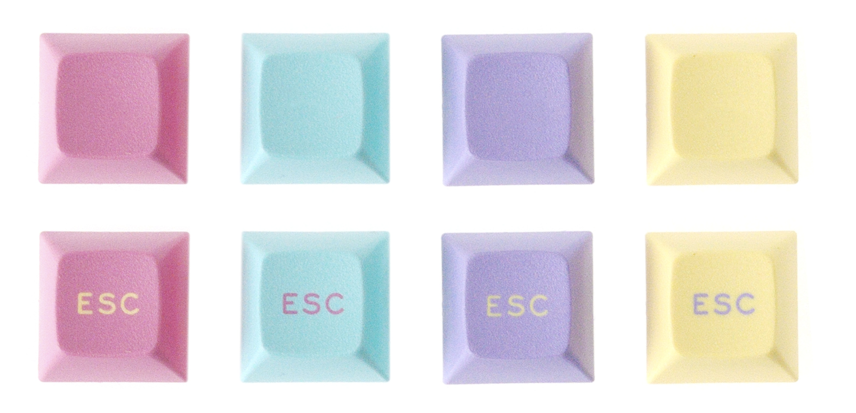
I’m actually personally really into pastels and I also just think that these color chips look really amazing together in person. This is always more important to me than the conceptual “theme” of the set, but I still think it fits pretty well within the framework of the aesthetic/images pasted above, even if it’s a bit singular and not for everybody.
I did experiment wth some more saturated options, particularly for the teal color, such as below, but I was never really happy with anything I came up with. The more saturated colors of the “Hot Calc” are pretty cool and I do like them, but a) SP doesn’t have good matches for those colors, which would require semi-expensive Pantone matching and b) I just inherently sort of like the pastel colors more, I think. Still, I might look into Pantone matching. The pink and purple in particular I think could stand to be a bit more magenta/saturated, depending on the look I’d ultimately want to go for. SP has a particularly anemic selection of stock purples in ABS.
2 Likes
That picture of Rocko’s Modern Life just invoked some serious nostalgia in me. Excited to see where this goes!
1 Like
Saw this today on the Vaporwave subreddit:
That’s what I’m talking about.  Pastel AF.
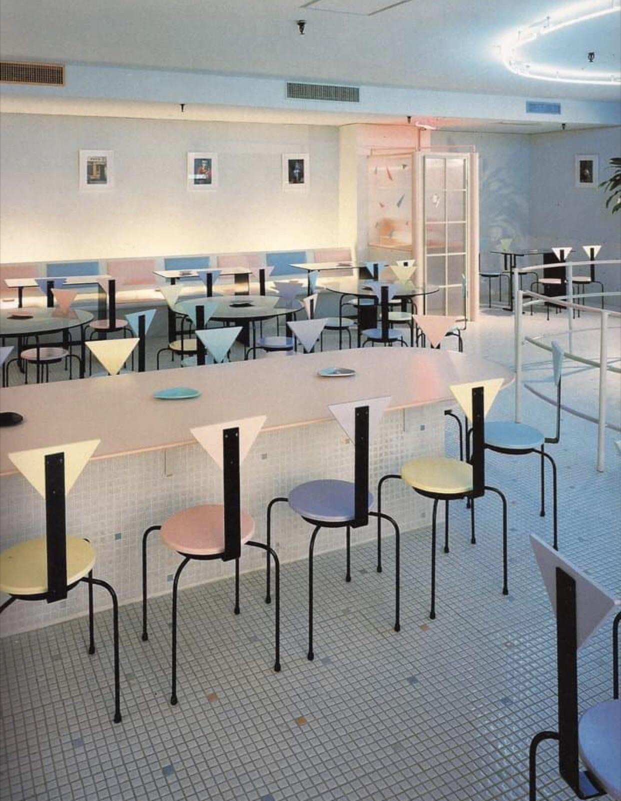
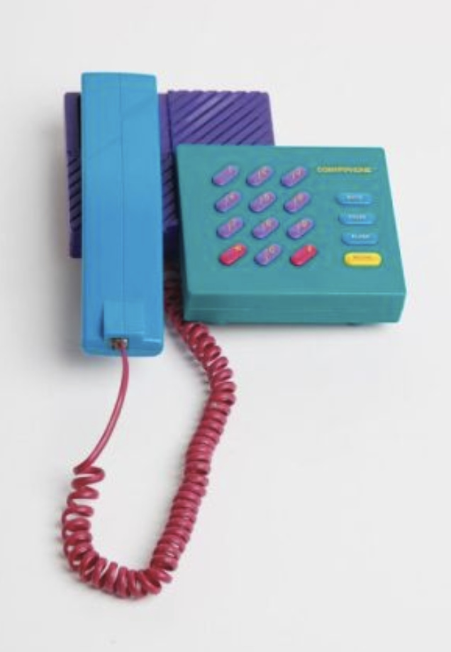
For more saturated examples of a similar aesthetic:
While the latter my be slightly more canonically evocative, I think I may inherently just like the more pastel form. I’m still ruminating on that.
I think I really just need to get some keycap prototypes first and to see what the resins looks like together in person.
3 Likes
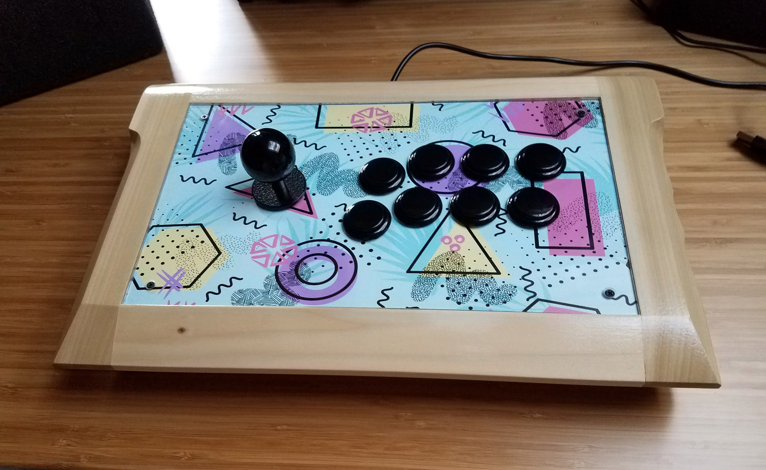
Love the colorway. Reminds me of the retro gaming stick I made last year.
4 Likes
Whoa! That’s amazing, and totally spot on with the aesthetic I have in mind.
2 Likes
I’ve started a little list/survey for people to register their interest. Please let me know if you’d be down for a set like this.
1 Like
Like you, I personally favour the less saturated colours of the era. It also gives it a bit of a faded look that is more like the nostalgic glow in my memory…
1 Like
I have such a strange desire to own that masterful piece of shelving
1 Like
I’m working with SP right now to get some test shots of these colors to verify that the legend contrasts will work. 
I think what this might need are some darker accent colors to make it pop, like black enter and escape keys with neon yellow or hot pink legends. I was just noticing how many of your references have black outlines or drop shadows that emphasize and delineate the hues. Just my 2 cents; it’s a cool idea!
Norbauer continues to knock it out of the park with every single design he’s ever done.
1 Like
Thats why i got in this hobbie
Being a 80s & 90s kid I do absolutely love the ideal of this set! The colorway you have come up with is pretty evocative of the early 90’s vibe, but personally I would like to see the colors a bit darker or more saturated. They have a very pastel look & that almost makes the colorway feel more Easter themed than early 90s themed to me. Would that creamy pastel hue carry over to IRL samples from SP?
1 Like
I was somewhat constrained by the available in-house SP palette, which is especially limited in the realm of magenta and purple. (Pantone matching turns out to be a problem unless you hit pretty high quantities.)
However, I personally love desaturated colors, so I’m comfortable with the selections at the moment, but I’ll withhold full judgement until I actually see them on caps in reality, as I definitely don’t want it to look too washed out. In the meantime, feel free to consider it the Easter-and-cotton-candy set if that feels more appropriate.  It feels pretty 90s and Vaporwave to me, but everybody has his or her own associations. For me, the question is ultimately just: does this set look cool in reality on its own aesthetic merits, regardless of explicit “theme.” And on that question, I just want to see it in person first and then figure out where to go from there.
3 Likes
I’m interested!
Btw, I think this is a lot more “Vaporwave” in design than the “GMK Vaporwave” set that’s currently in IC phase now. You nailed it with actual colors representative of the era rather than the stylized ones we tend to look at it with now.
2 Likes
I also agree that that set isn’t super evocative of the aesthetic, though it’s kind of nice still on its own terms. Signature Plastics is currently working on the physical samples of the color pairings for me, so I’ll have more to show soon (hopefully).
2 Likes
Color sample pics coming next week as soon as I’m back up at my NorCal office. I’m extremely happy with the samples.
6 Likes
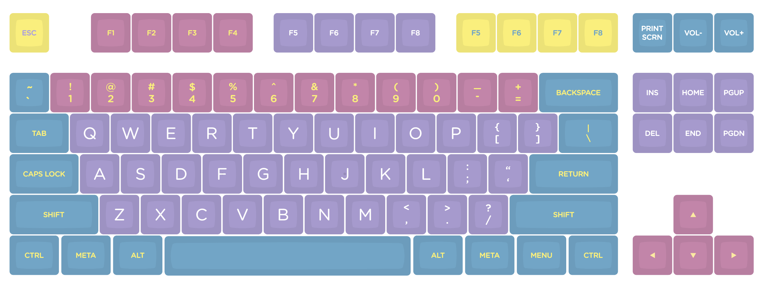
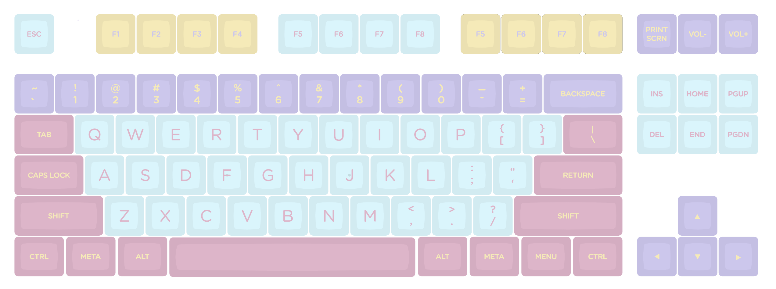
Here is where I am at the moment. Thoughts, feedback, and/or vitriolic derision welcome.
Still messing around with what colors go where. Three-color sets are weird. It is also really hard to convey these colors in RGB for some reason, so the mock-up looks a bit washed out to what the actual keys looks like IRL.
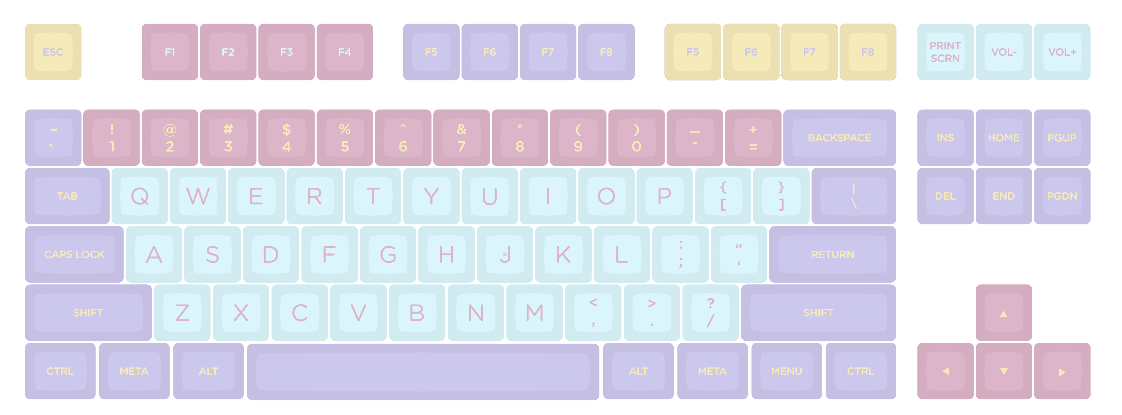
Here is another variant, which I think I may prefer.
This will also come boxed in a Trapper-Keeper shaped gift box, with some cool artwork (TBD).
4 Likes