A little background first. For anyone that might not be aware, RAMA was a premium designer brand associated primarily with keyboards as well as some other desk and photography accoutrements, mostly known for their custom keyboards and artisan keycaps.
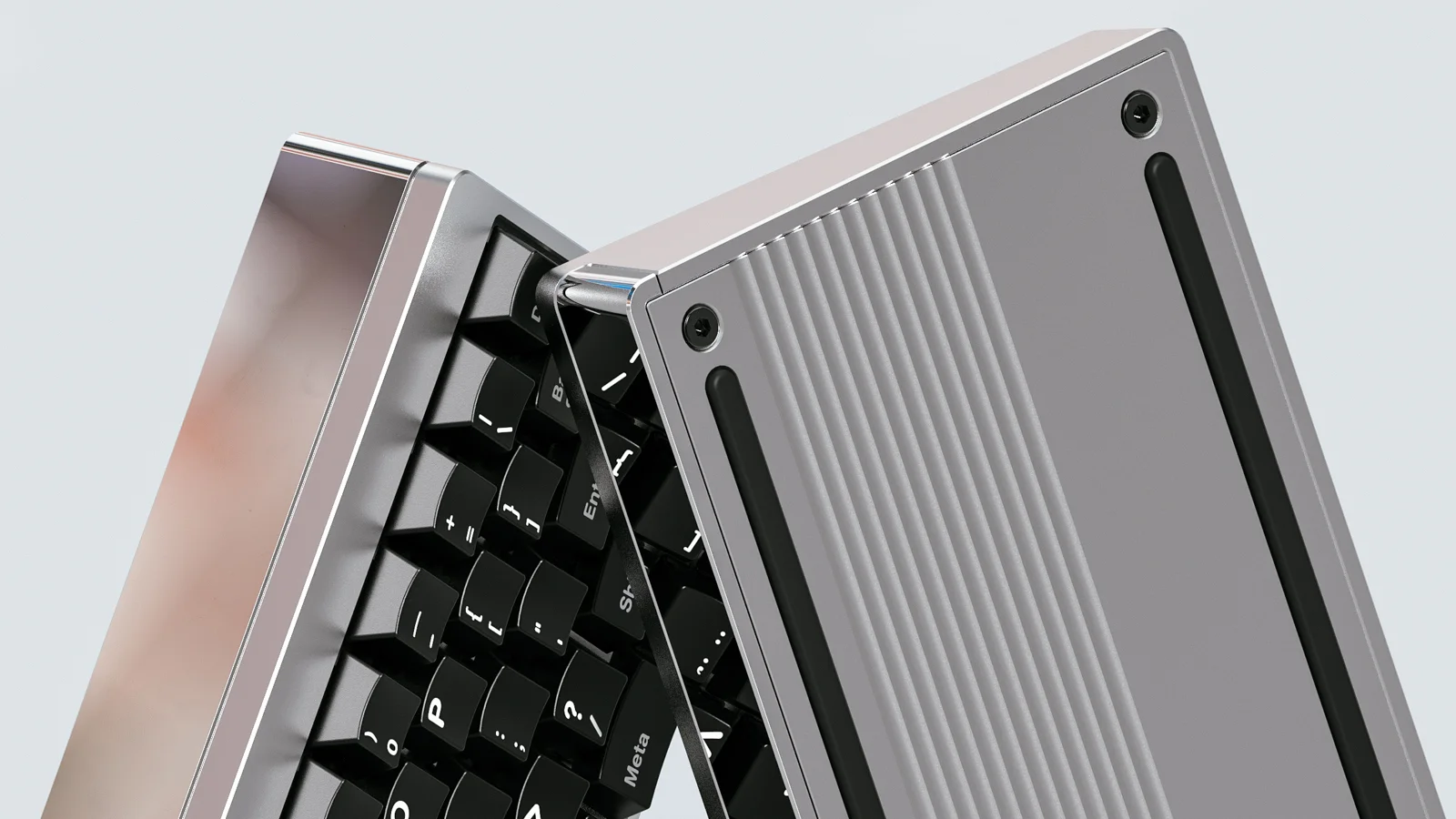
RAMA M60-A promotional render
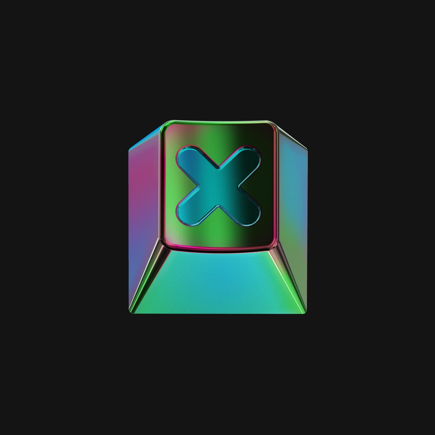
RAMA Colorchrome X artisan cap render
Just over five years ago, RAMA’s new keycap profile went up for pre-order.
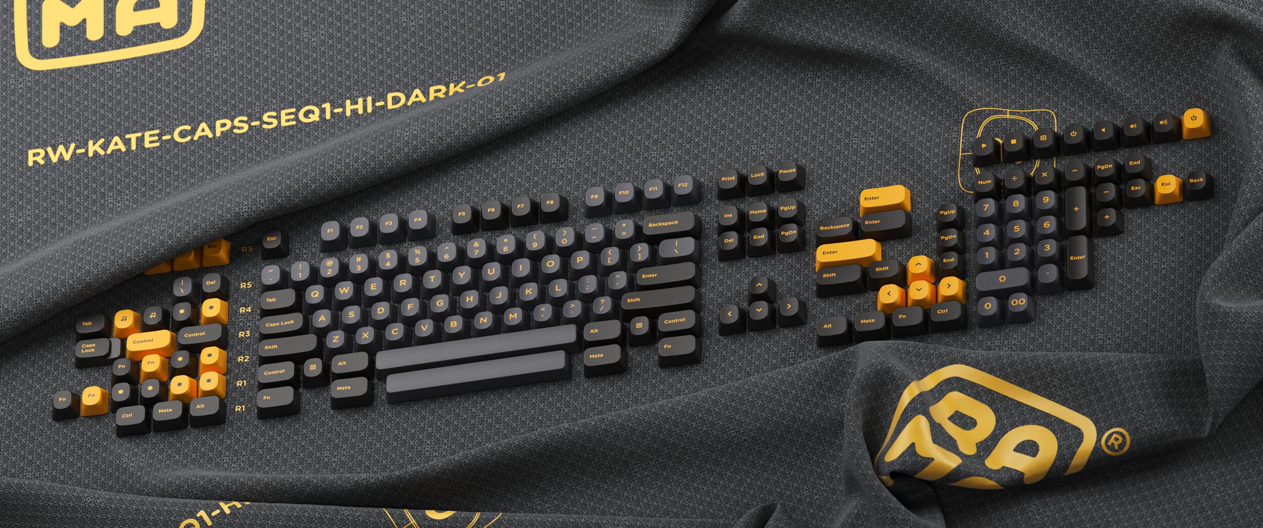
At the time it was called KATE, subsequently changed to CAPS. That’s all I’m going to say about that here. The caps were to ship with their own premium storage containers, called CASE.
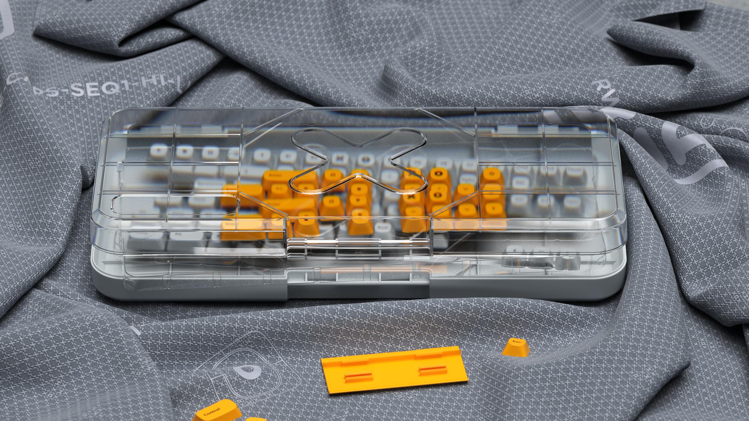
Production ostensibly began in 2021, but faced delay after delay, reportedly going through quality revisions with the original chosen manufacturer (who I believe to be Mastars, previously responsible for producing many if not all of his artisan caps).
A second run (in new colors and sans over-engineered plastic packaging) at a reduced price was announced, in spite of the first run still not having been produced. Unanswered questions and support tickets abound.
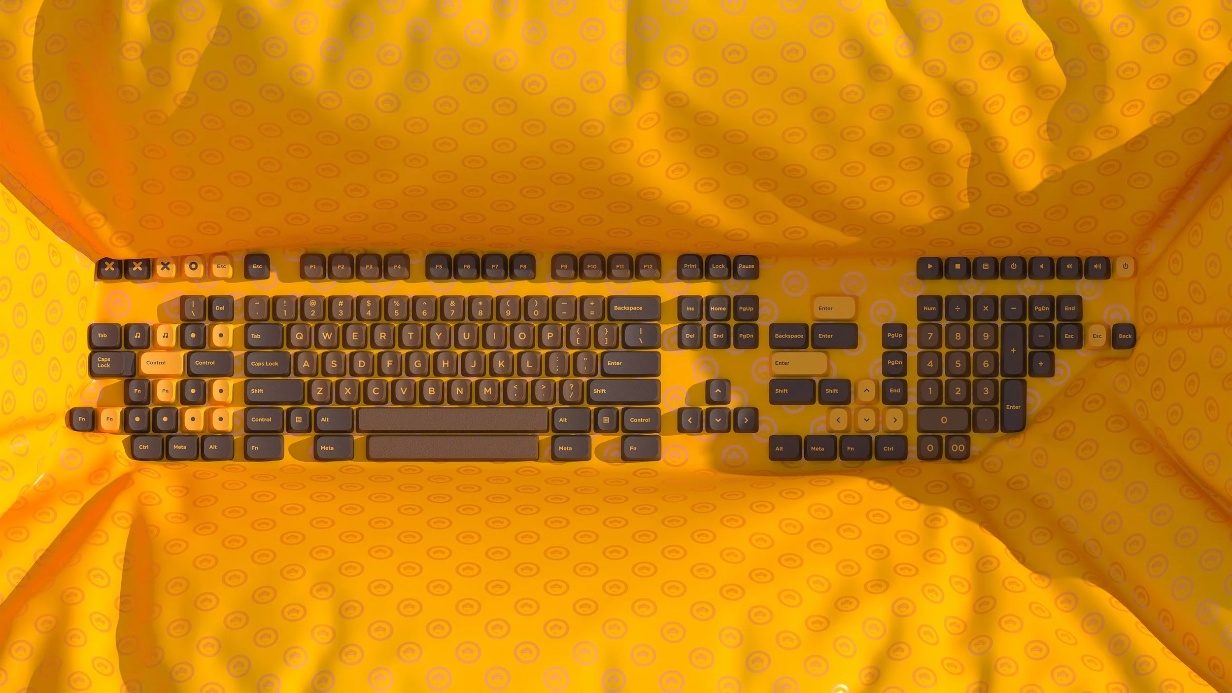
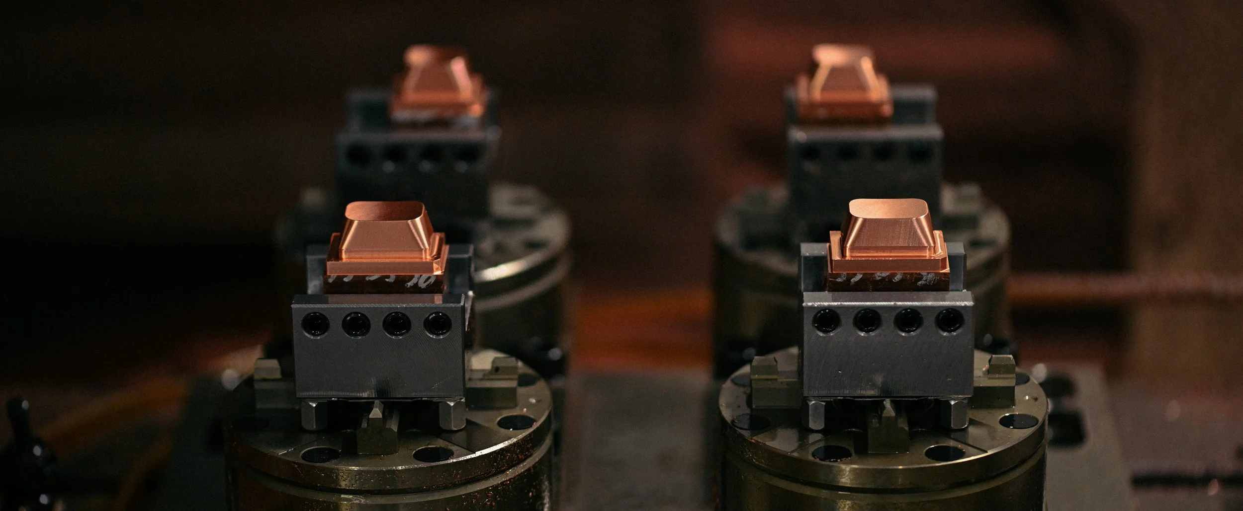
Eventually, after numerous sparse updates, production was moved to another manufacturer for the stated interest of maintaining quality, with photos of new tooling being posted - at this point around three years after the original announcement.
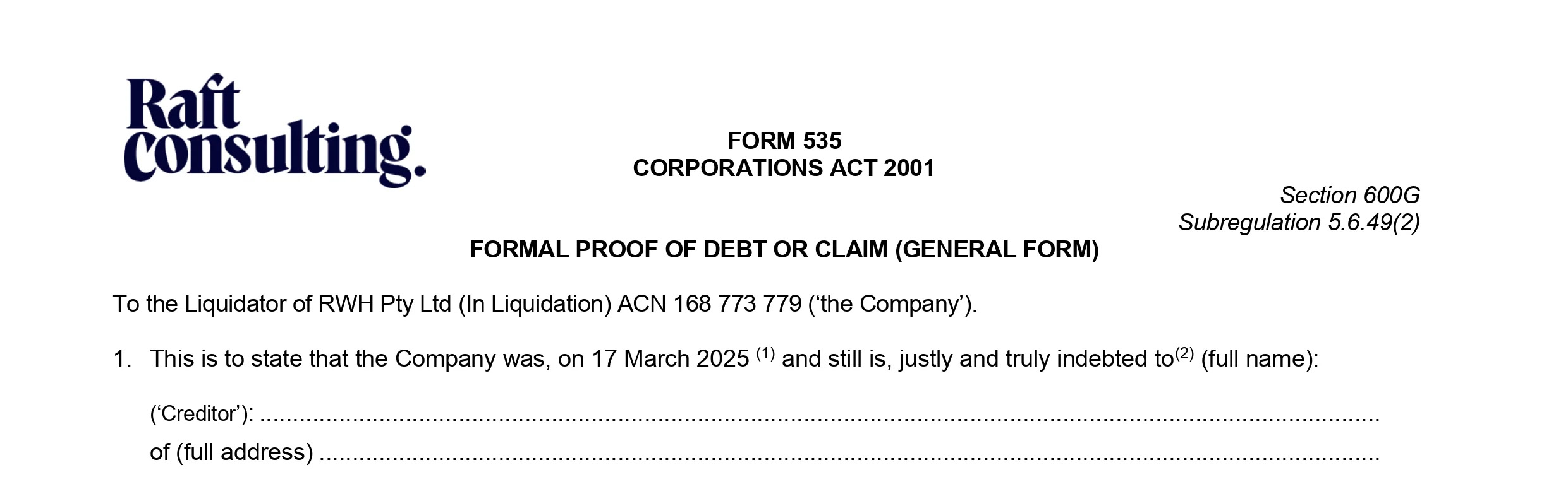
Then, silence upon silence, for about another year. The next bit of news was that RAMA was in forced liquidation by the Australian government for not honoring its debts. As an operating entity, RAMA Works was gone, its assets being divided amongst its debtors with many orders unfulfilled, keycaps or otherwise. Most reasonably assumed this was the end of the CAPS story.
However, zFrontier got involved, took over the tooling, and oversaw production of the keycaps, recently bringing them to actual fruition and offering a roughly at-cost discount to folks who got stiffed on the first go-round. They exist (!) - and in spite of their exceptionally troubled development and subsequent passive rug-pull, are actually quite good.
The CAPS
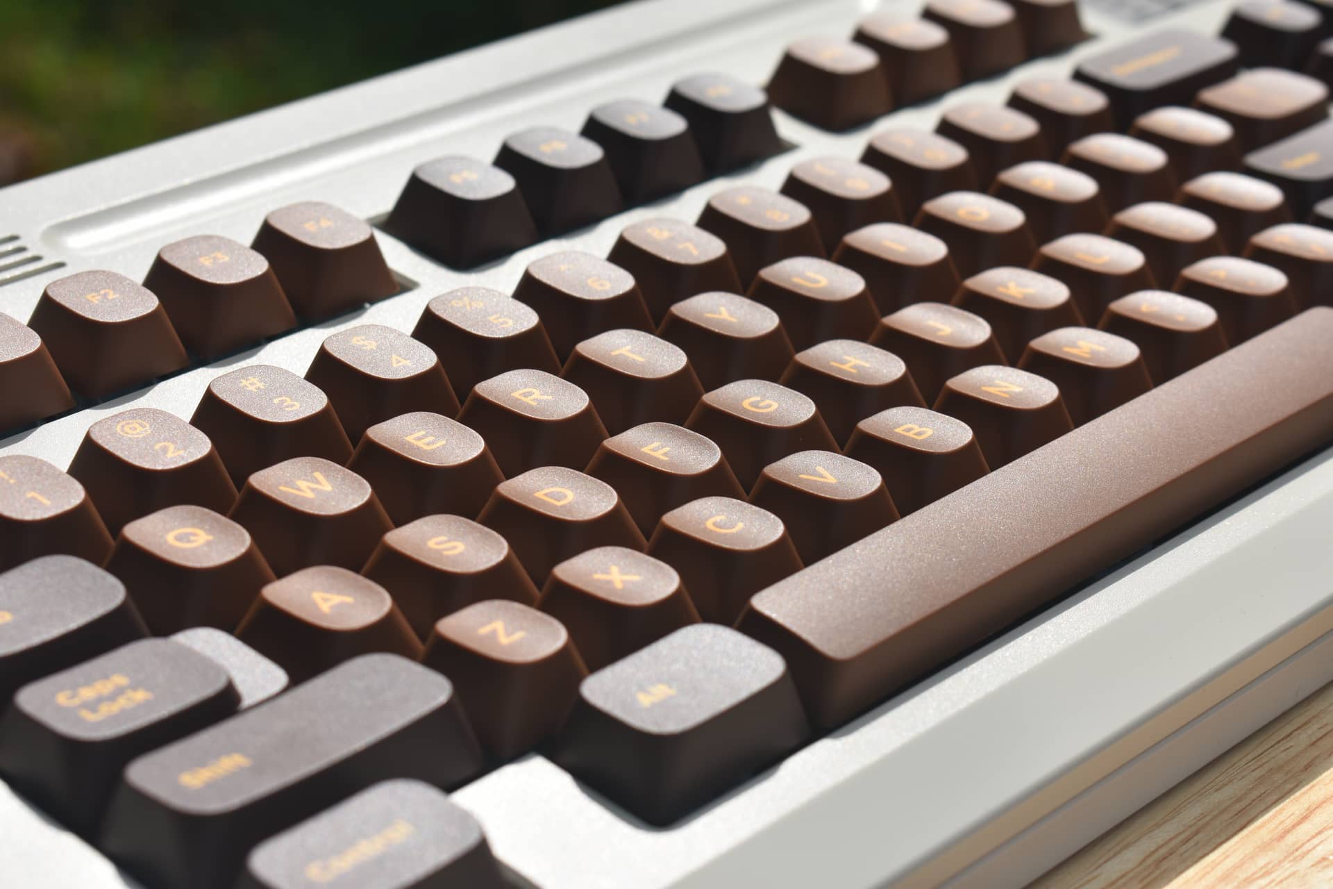
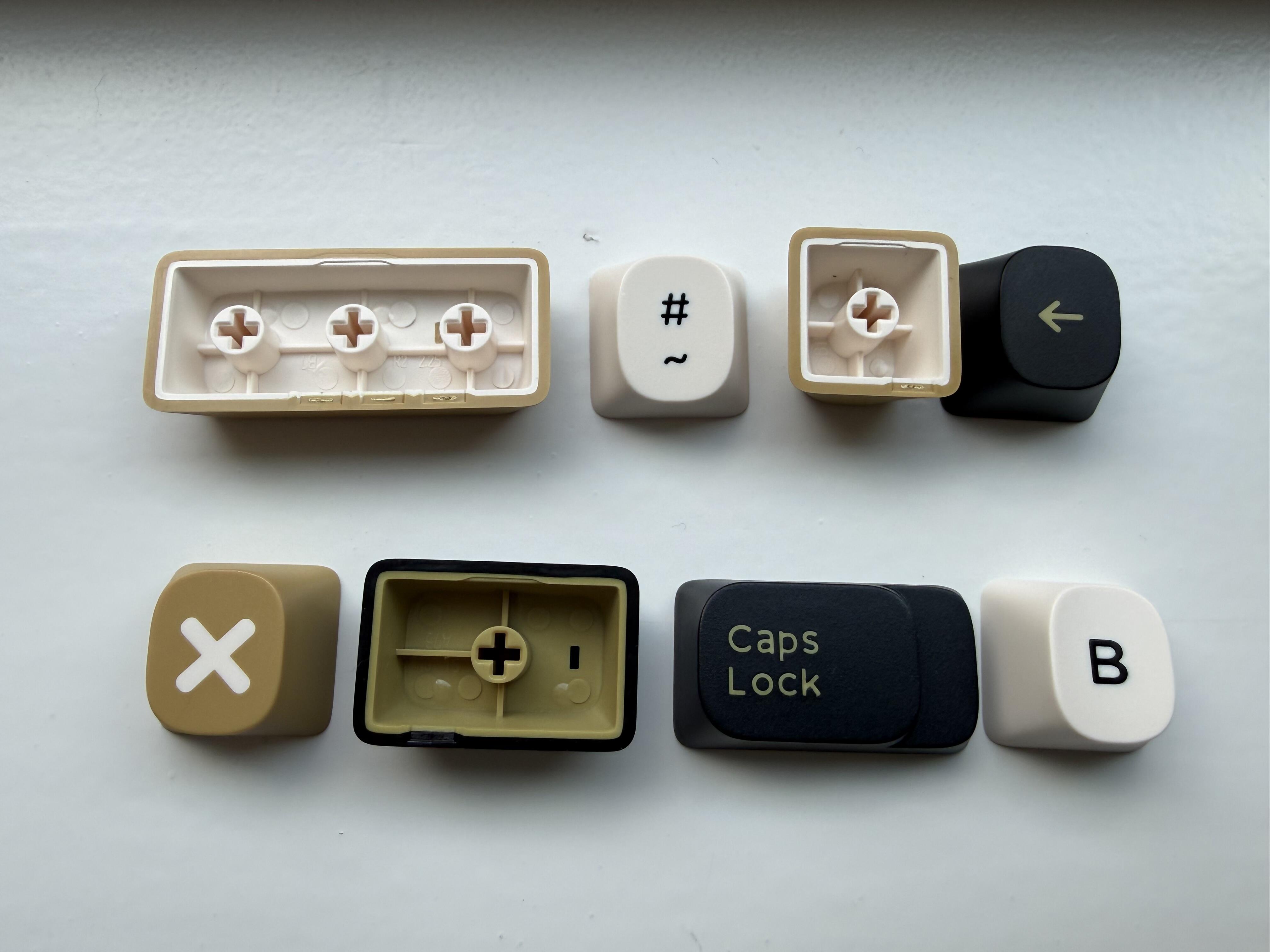
And here they are, in the resin, five years later.
I’ve been using my “Tea Egg” colorway set for about a week now, and I’m honestly impressed. I’m no fan of the man behind these, but this is an art-not-the-artist situation for me - and I have almost exclusively good things to say about CAPS.
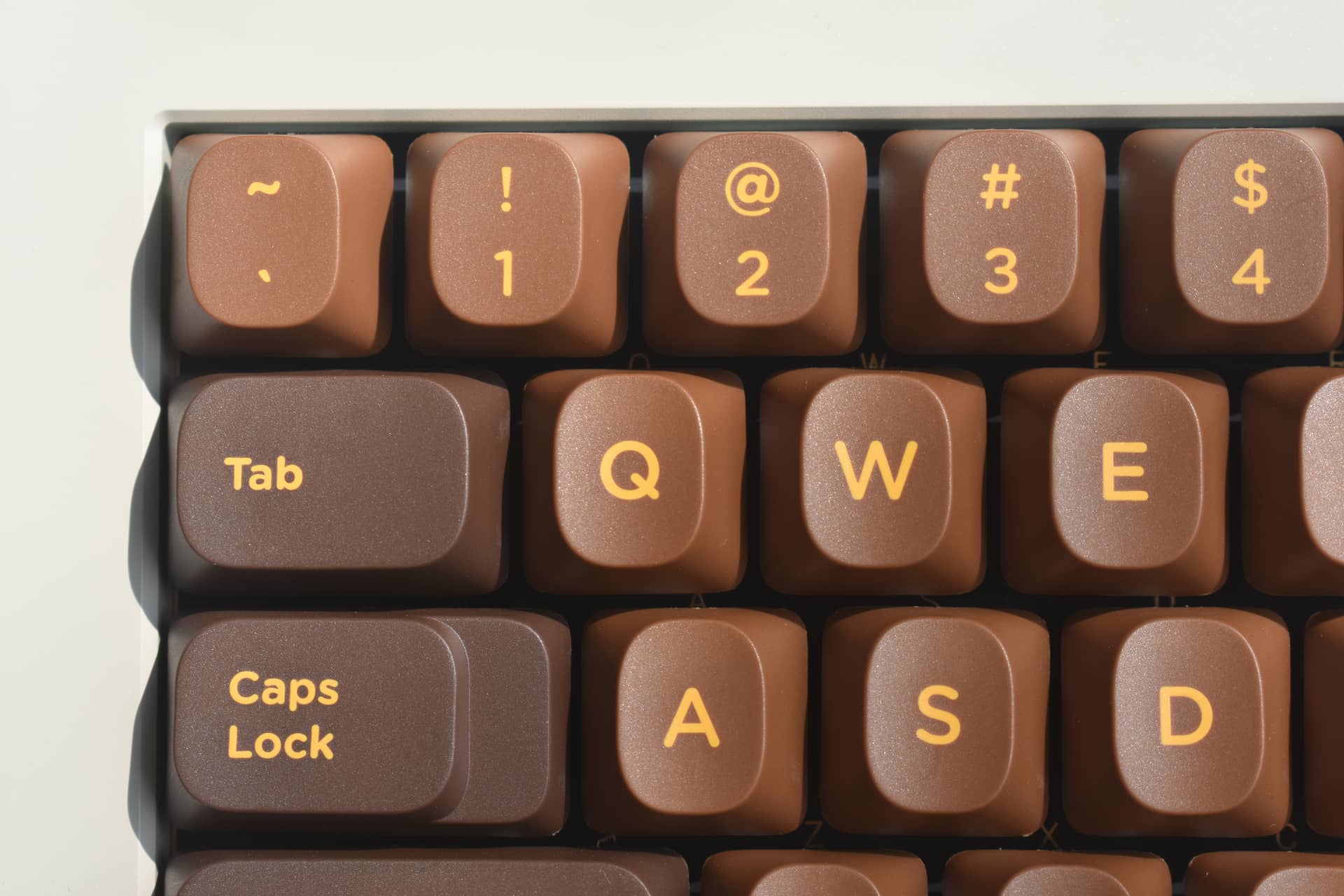
First, let’s talk about the shape. The most noticeable thing about them are the faces, narrow and very rounded, shaped a bit like fingertips.
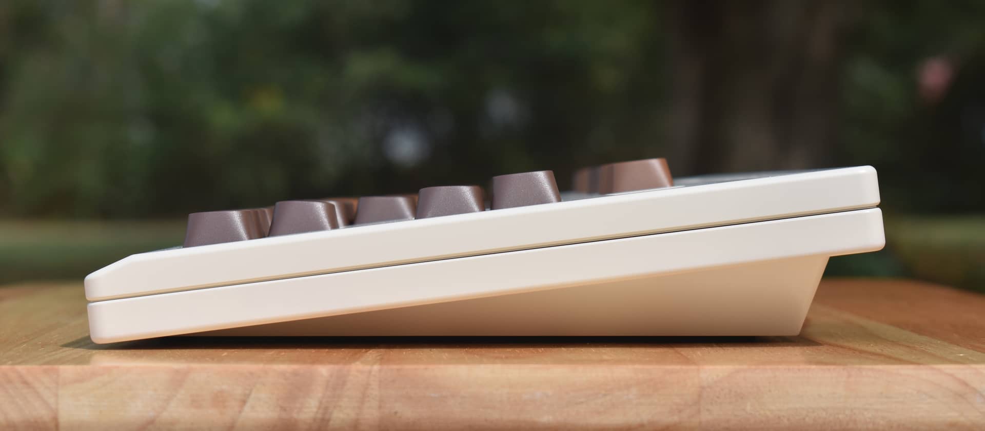
In terms of familiarity, the side profile is a bit less dramatic:
Here they are compared to some other popular profiles, lined-up next to GMK CYL (Cherry Profile), GMK MTNU, MT3, and SP SA:
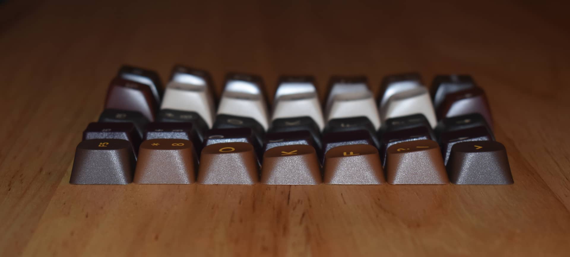
Rows are top-to bottom, also including the scooped homing keys. Here it’s easy to see that the heights and row angles are mostly similar to CYL aside from the bottom row, which is very nearly level.
There’s just enough angle that I still like to flip the space bar, though - here’s a full view of the set on my Class80 TKL, complete with that flipped space bar:
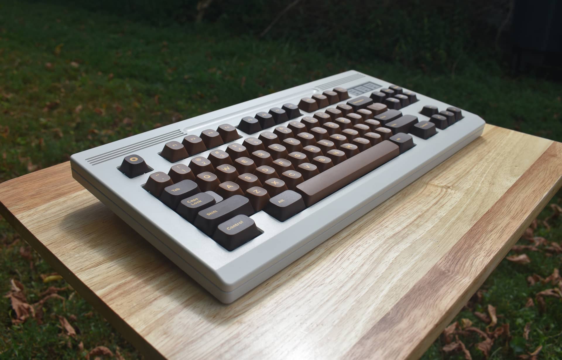
A less interesting, if more informative angle:
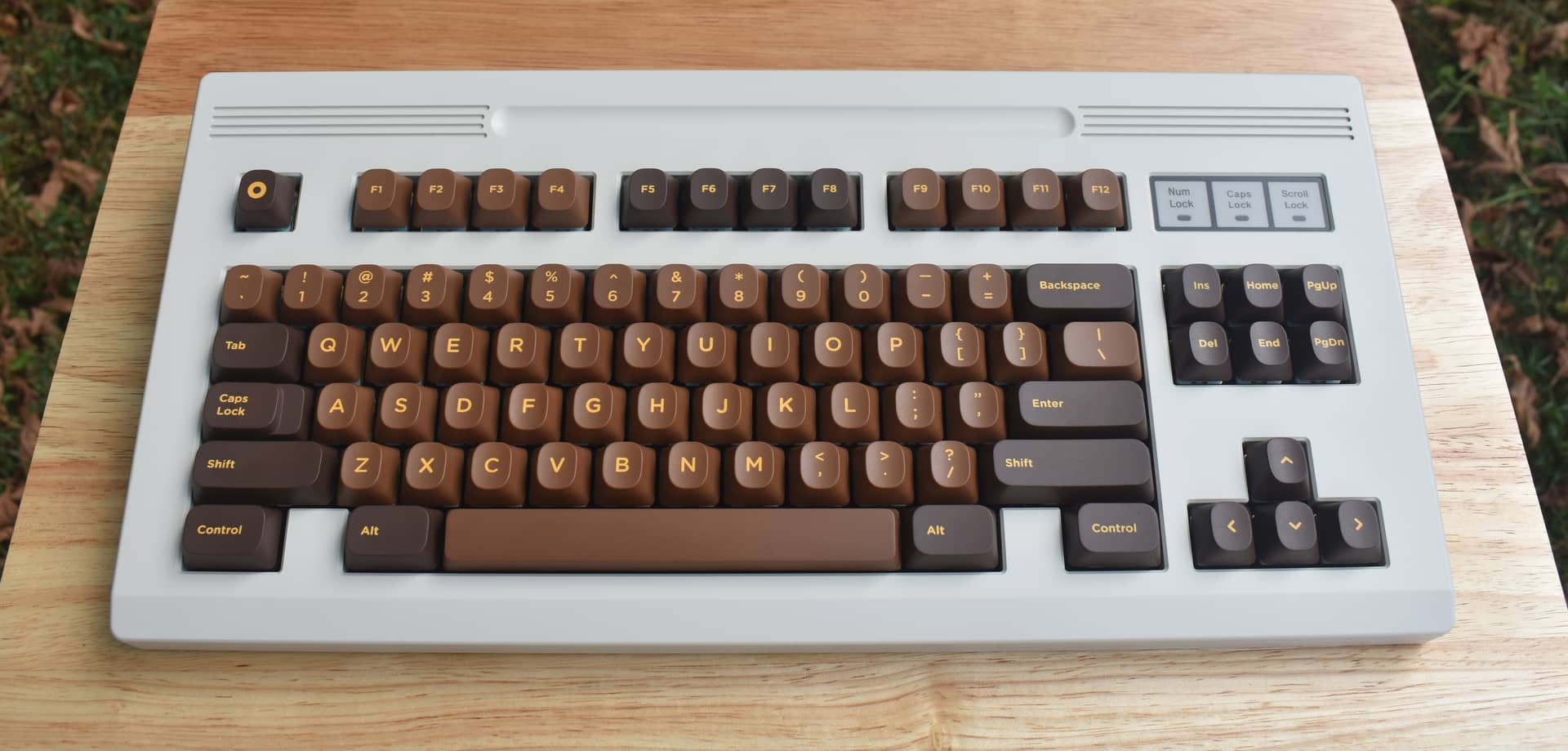
Note: I’ve used Photoshop to remove dust from this white keyboard in some of these photos - but not from the keycaps. Any dust or minor blemishes is left in-place for those.
Speaking of which, the only blemish on my set that I could notice with the naked eye is a small, minor scuff on the bottom-right corner of the right Shift key, and only when the light hits it just so. Here’s a couple angles of said small blemish, where the cap’s texture has been flattened:


Here’s another look at the homing scoop; it’s a fairly subtle difference, but plenty enough to see and feel:
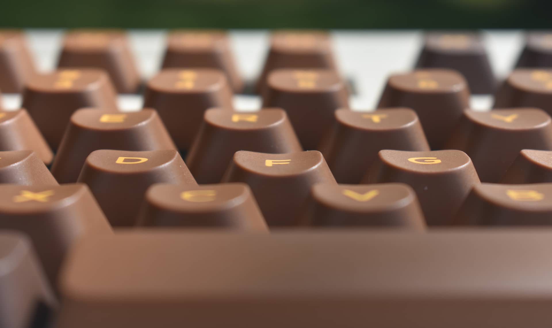
Usability / Familiarity:
Now, with front faces that unusual*, I would have thought these would take some real adjustment to get used to, but the ergonomics feel quite natural to me and I’ve been able to type intuitively with them. My good-day average is about 120wpm, and I hit that mark with these first try.
*On closer inspection, they aren’t actually as unusual as they appear. While the corners are essentially rounded out of existence, the width of the faces at the middle of the cap is nearly identical to CYL. Here’s another angle of that side-by-side comparison:
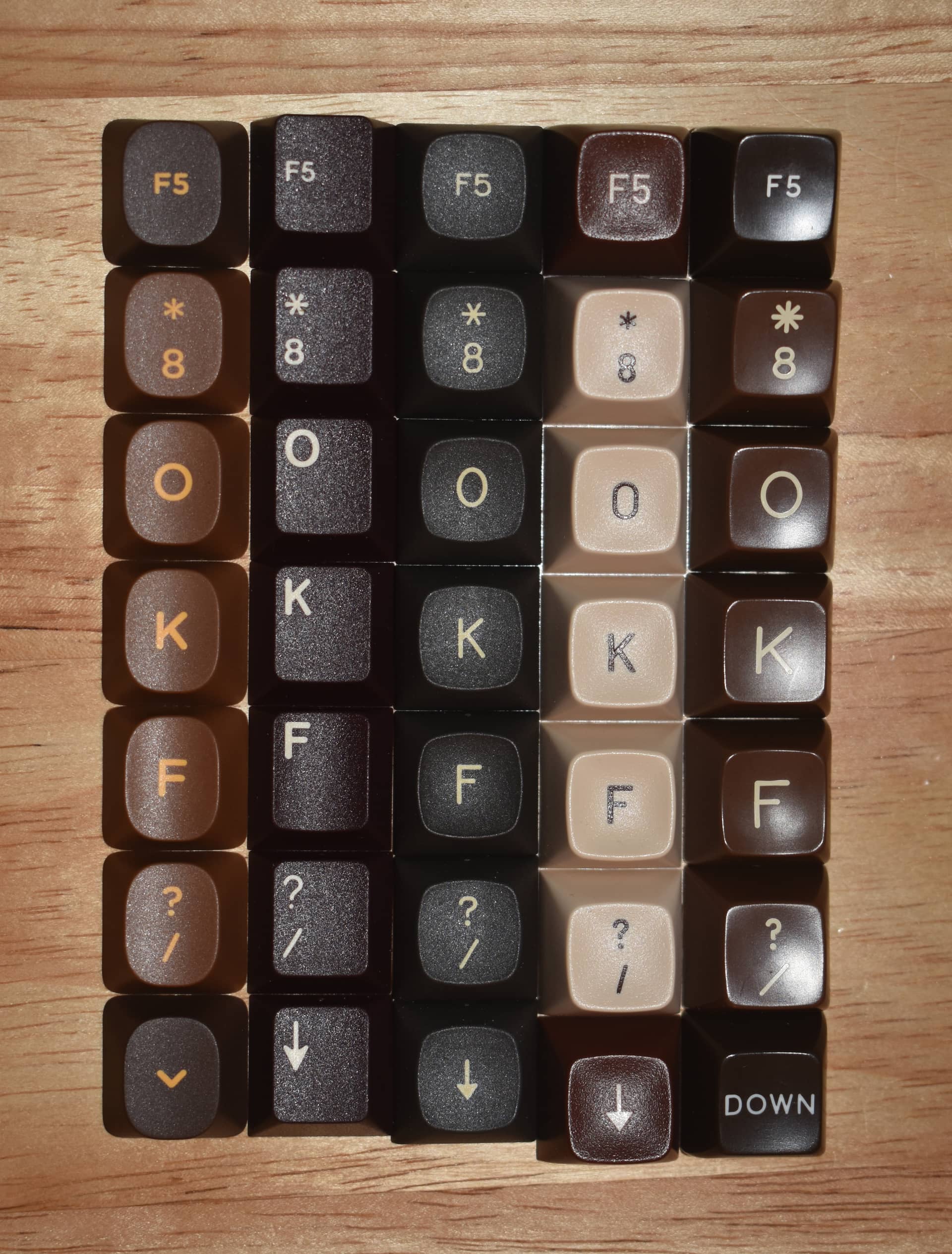
These are aligned at the top edge; you can see that corners aside, their overall footprint matches CYL / Cherry while being smaller than MT3 or SA at the bottom. Compared to CYL, the front faces are more centered to the bottoms, but at their widest and tallest points, the faces nearly match. So - even though they appear very different than Cherry profile, they feel very familiar to it, and I think this is why they’ve been so effortless to adjust to.
The above photo isn’t perfectly in-focus on the caps in question, but it’s also a good place to compare the texture and legend appearance. In terms of quality, I think they are notably more consistent and clean than MT3, which was produced by Tera Plastics alongside DCX. Those two profiles suffer from some degree of legend thickness inconsistency and occasional visible separation between the shot layers - I’ve observed nothing of the sort with CAPS.
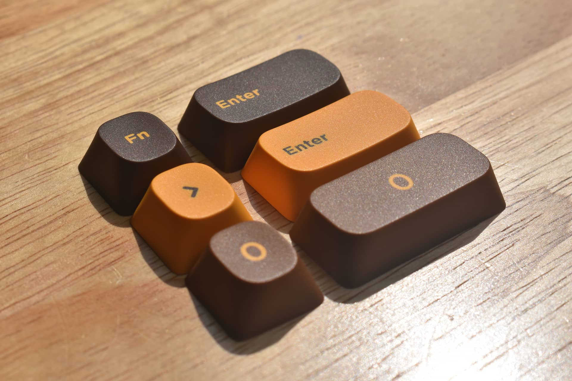
In some images the legends can seem a bit blurry - I think this might just come down to light diffusion through plastic that isn’t perfectly opaque, as the “blurry” effect seems more apparent on some colors than others. Here’s a closeup of a couple legends so you can see their crisp, clean edges (at least when it comes to the material itself):
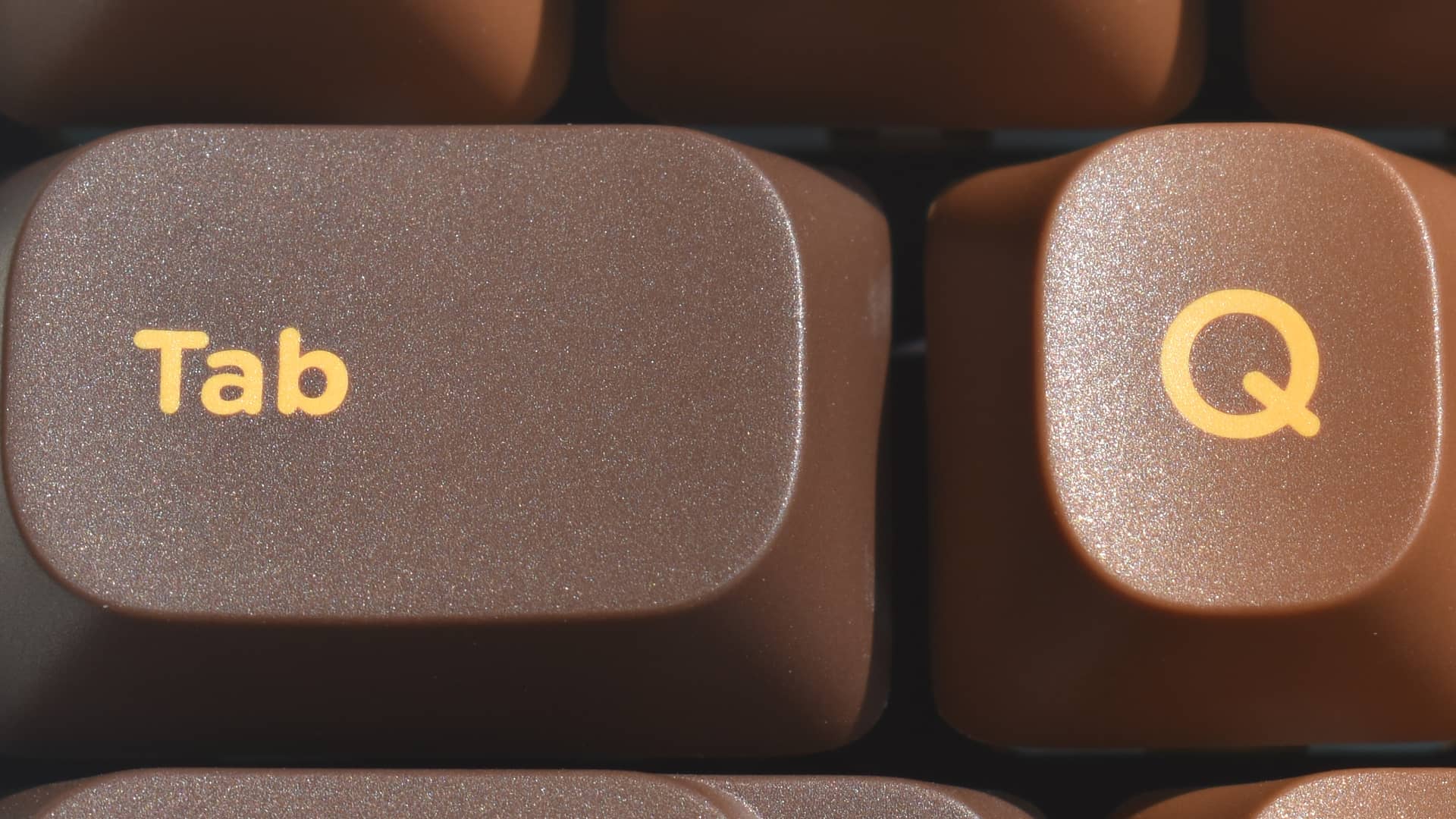
Here are some photos focusing on the injection molding:
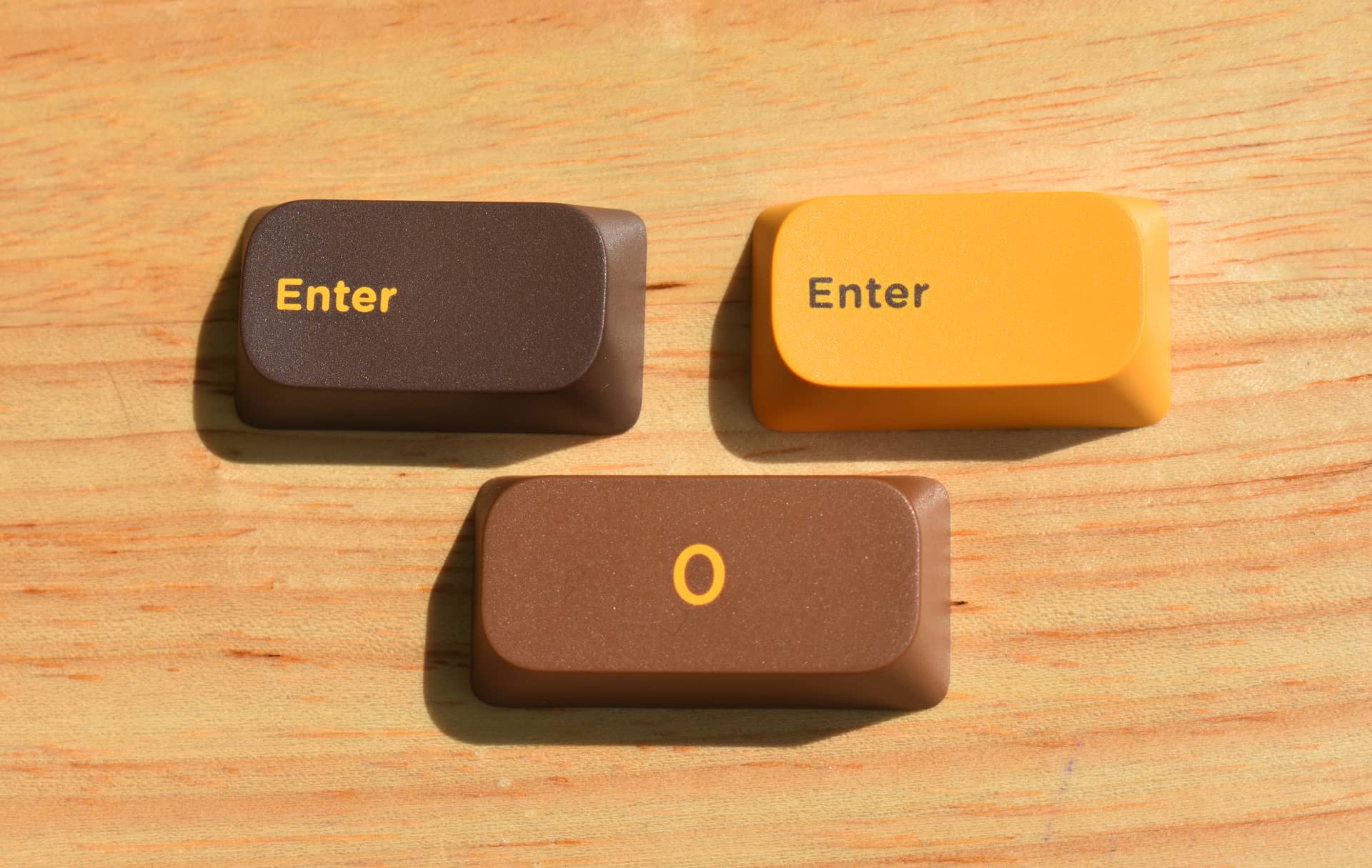
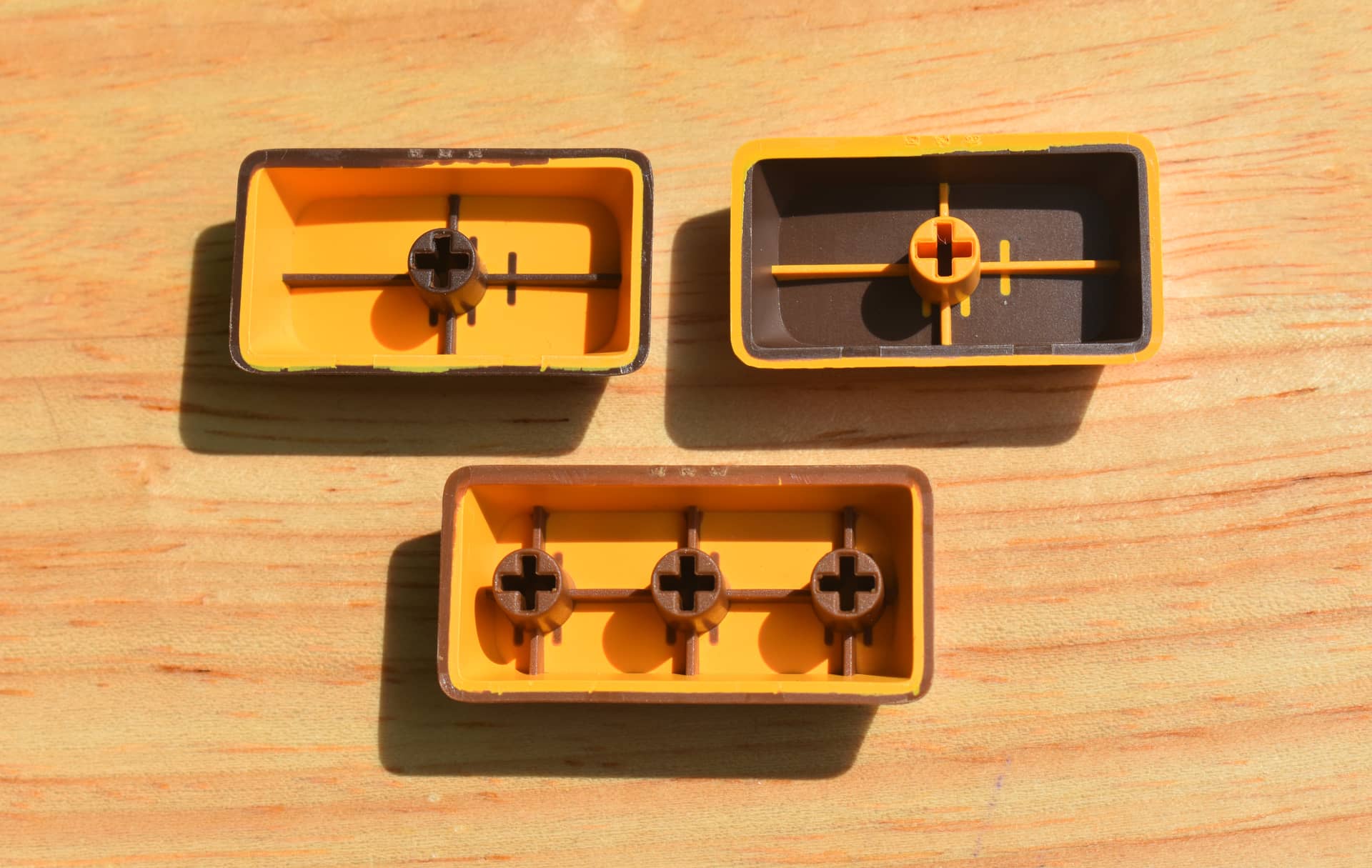
Here you can see that the sprue marks are nicely hidden on the underside (something I really wish GMK did for both of their profiles).
I didn’t measure the thickness of these for this review (if only because my caliper batteries are dead and I can’t be troubled to go get more), but it’s easy to see that both layers are of decent thickness.
You might also be able to see an example of that light diffusion / transparency-based color bleeding I mentioned earlier on the underside of that bottom-middle cap, around the edges, particularly near the top-left corner - I think this is what makes some of the legends look blurry, rather than actual blending of the plastics at their edges.
Here’s a similar look at some 1u caps:

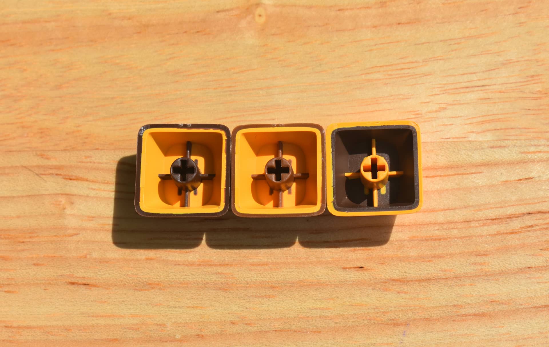
While we’re looking at the stems, this is a good time to mention that these seem to have a nice, normal, consistent fit on the switches I’ve mounted them on so far (in this case, Keygeek MZ Z1 switches with LY plastic stems). The scooped homing keys appear to have a slightly less tight fit, but are by no means loose - they just went on a bit more easily.
Also on the topic of stems - I don’t see any stem twist. They all seem to sit nice and straight on the switches. To be expected of any caps presented as premium.
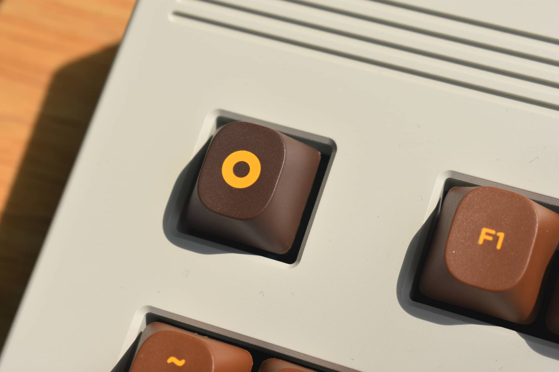
In this photo you can see some flash on the edges of the central cap - that’s the little thin bits sticking out slightly at the bottom edges in some places. This might be the only aspect in which quality control is noticeably inferior to other top-shelf profiles, and it’s both minor and easy to address with a fingernail - I’ve left it in-place for this review in the interest of clarity and documentation, but I’ll probably burnish it away later.
If you zoom in, you may also see the dust all over this keyboard case which I’ve run out of steam to remove at this point.
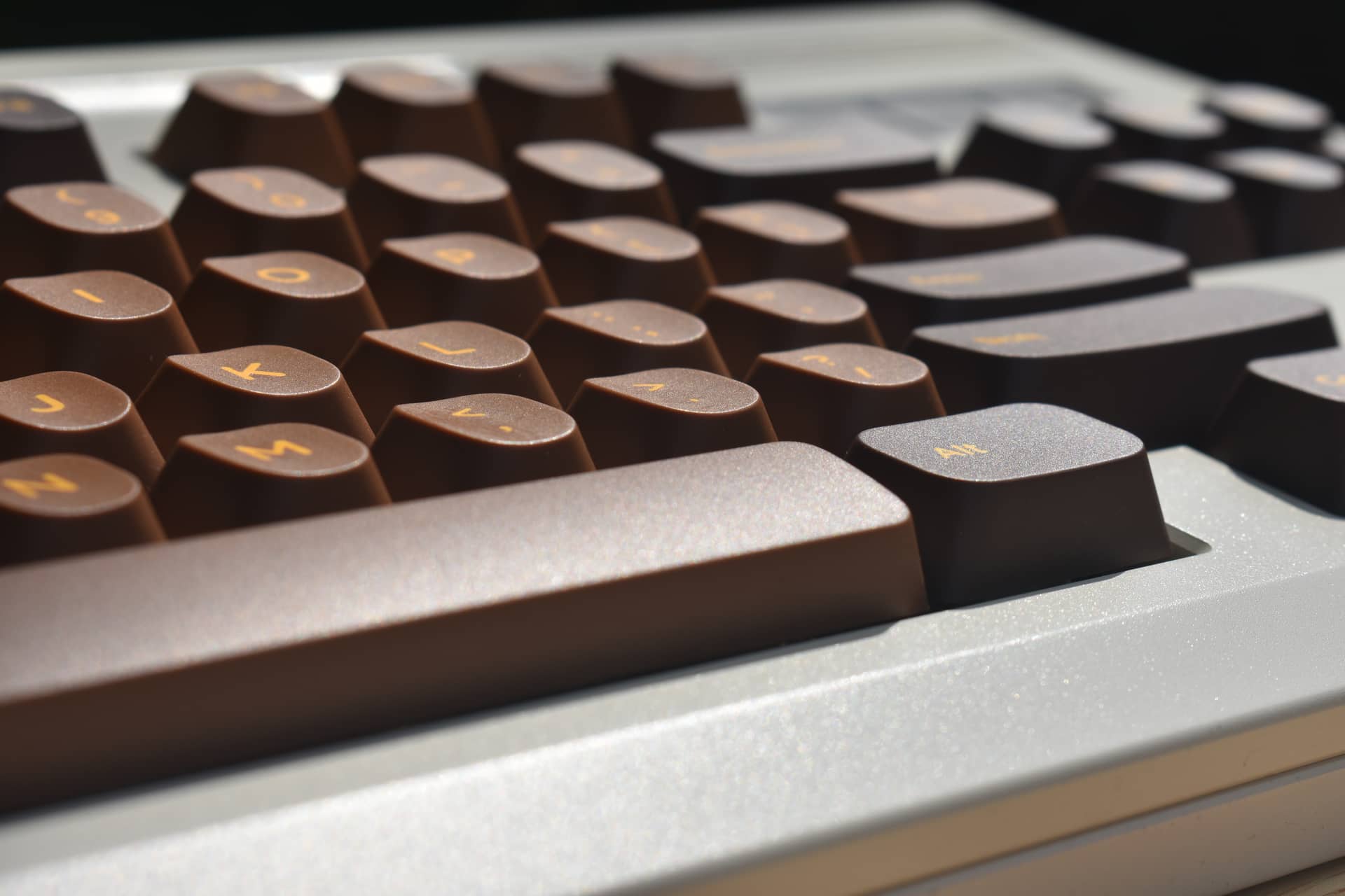
They look a bit like Pringles from this angle, don’t they?
One more look from the side, to get another angle on the angles, and the flipped space bar:
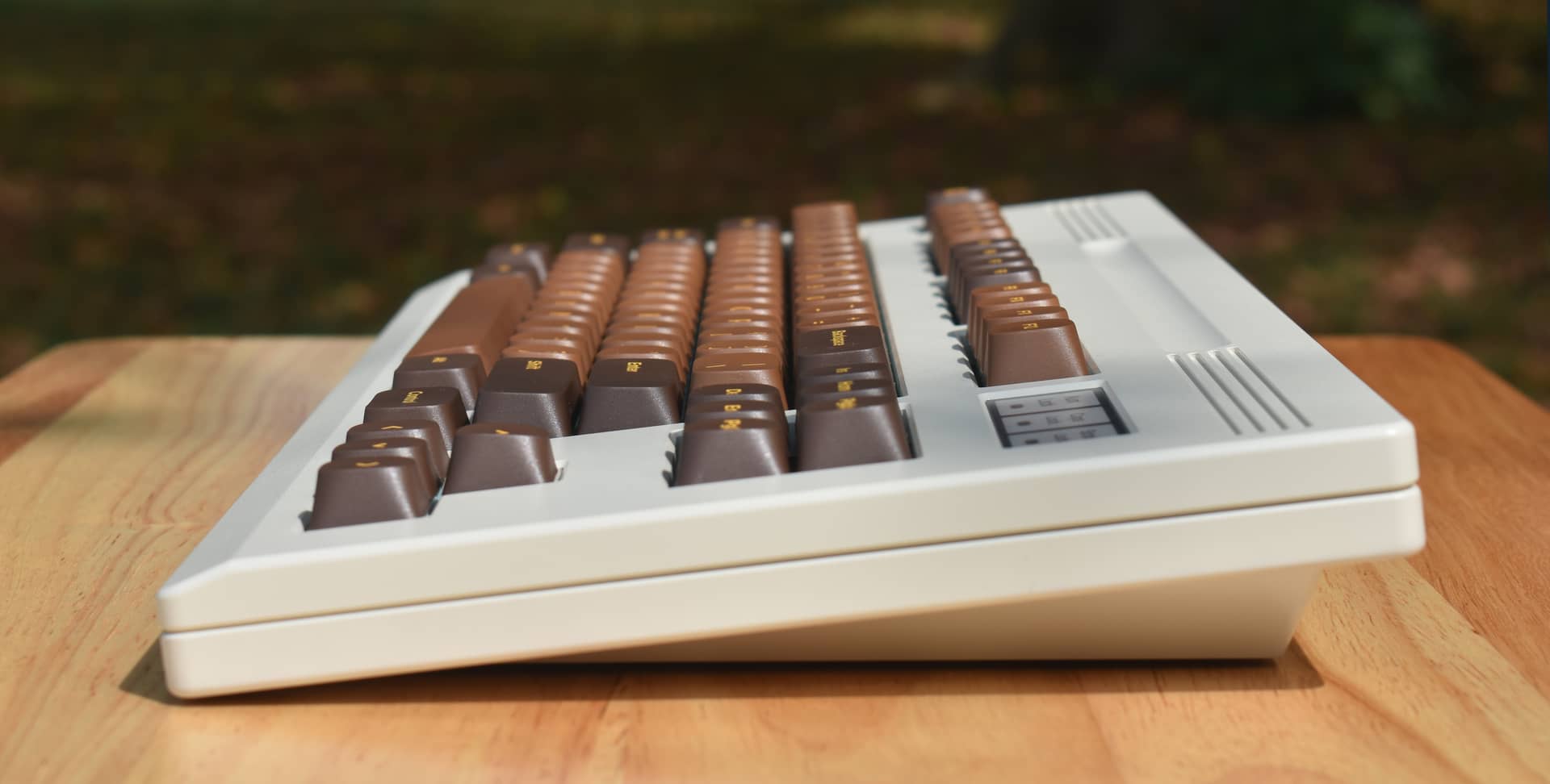
Don’t zoom in too much - it’s so dusty. You can see the space bar angle is subtle, but there.
I think they sound nice, too - I don’t have a good recording right now, but I’d say they are reasonably similar to other premium double-shot caps of their size.
Conclusion:
While I’m not exactly sure I’d say these were worth a five year wait, or essentially buying them a second time (albeit at a steep discount) just to get my hands on them, I will say that I’m pleasantly surprised at what excellent caps they turned out to be. They look great, they feel great, and I’d call their quality control comfortably above-average if not excellent.
The man and his brand may have left a sour taste in my mouth, but the caps have left my fingers happy - and my appreciation goes out to zFrontier for rescuing this profile from the abyss (and for giving us first-rounders a price break). I’m not sure if they have plans to run any additional (or custom) colorways with it, but that’s something I’d like to see now that the tooling exists.
If you like the distinct look of these CAPS, I can heartily recommend them for enjoyable use - especially now that they’re in-stock rather than a distant promise.
Cheers!