I was a good boy this month and didn’t buy a modern modelfkeyboard like I wanted to.
I did get a YAS62, and I have no regrets about that.
I was a good boy this month and didn’t buy a modern modelfkeyboard like I wanted to.
I did get a YAS62, and I have no regrets about that.
This is my 3rd Heavy-6…
![]()
<thomas-ran-voice>Noice.<thomas-ran-voice>
You might need some endgame stickers to go on that puppy! I’ve just ordered some for my endgame (YAS62 I’m typing on right now). InfinityKey also have “OVERKILL” if that fits the board better, haha.
My precious package arrived today, containing my Winghead keyboard cases 
No time to open it yet but will soon give news in the related Keebtalk thread 
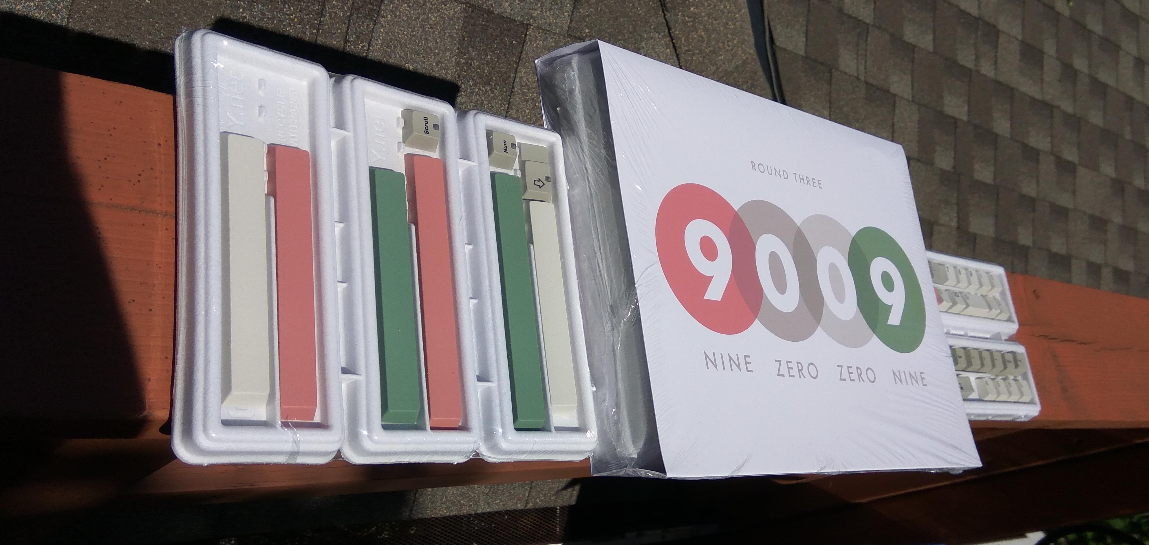
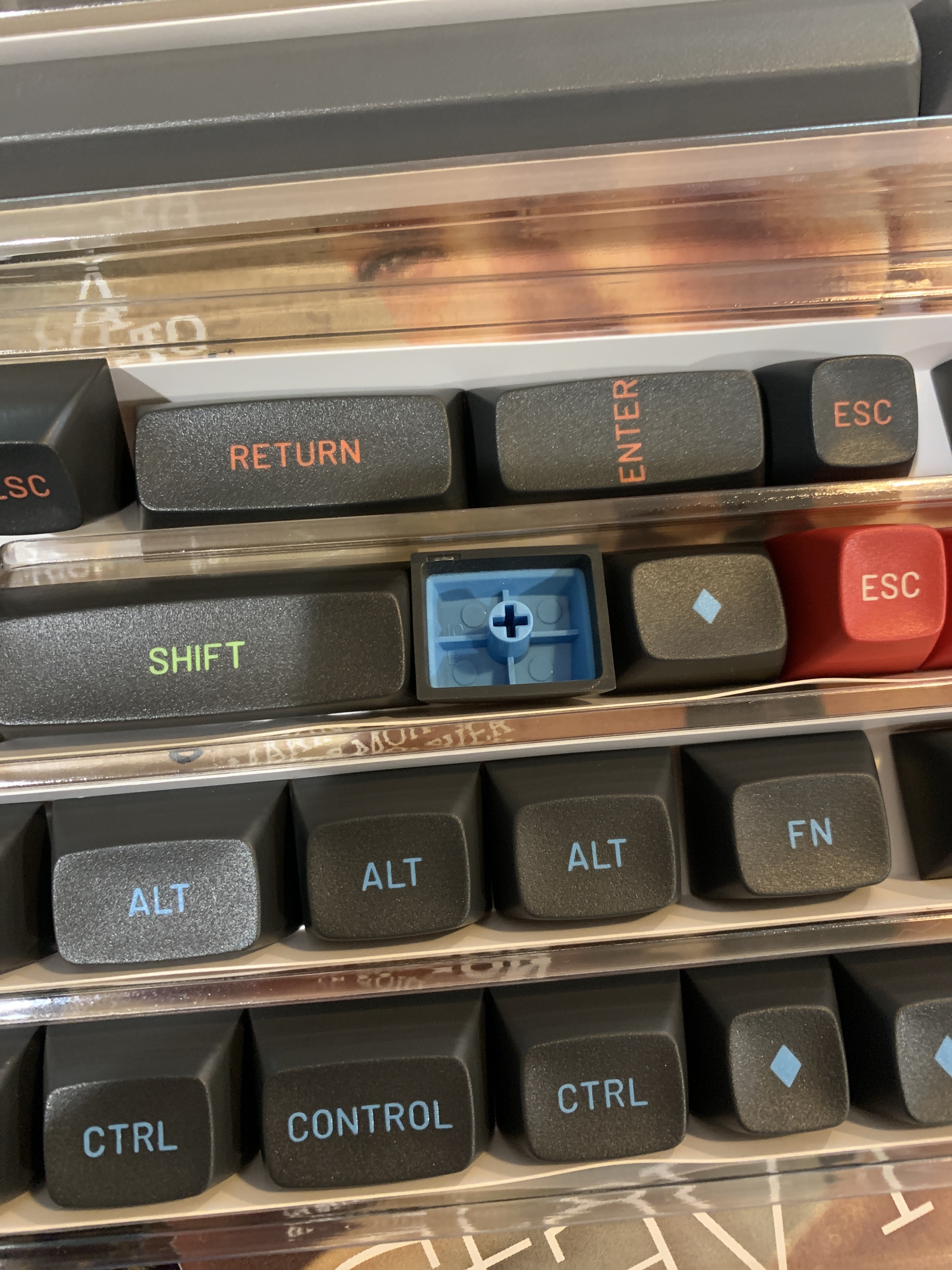
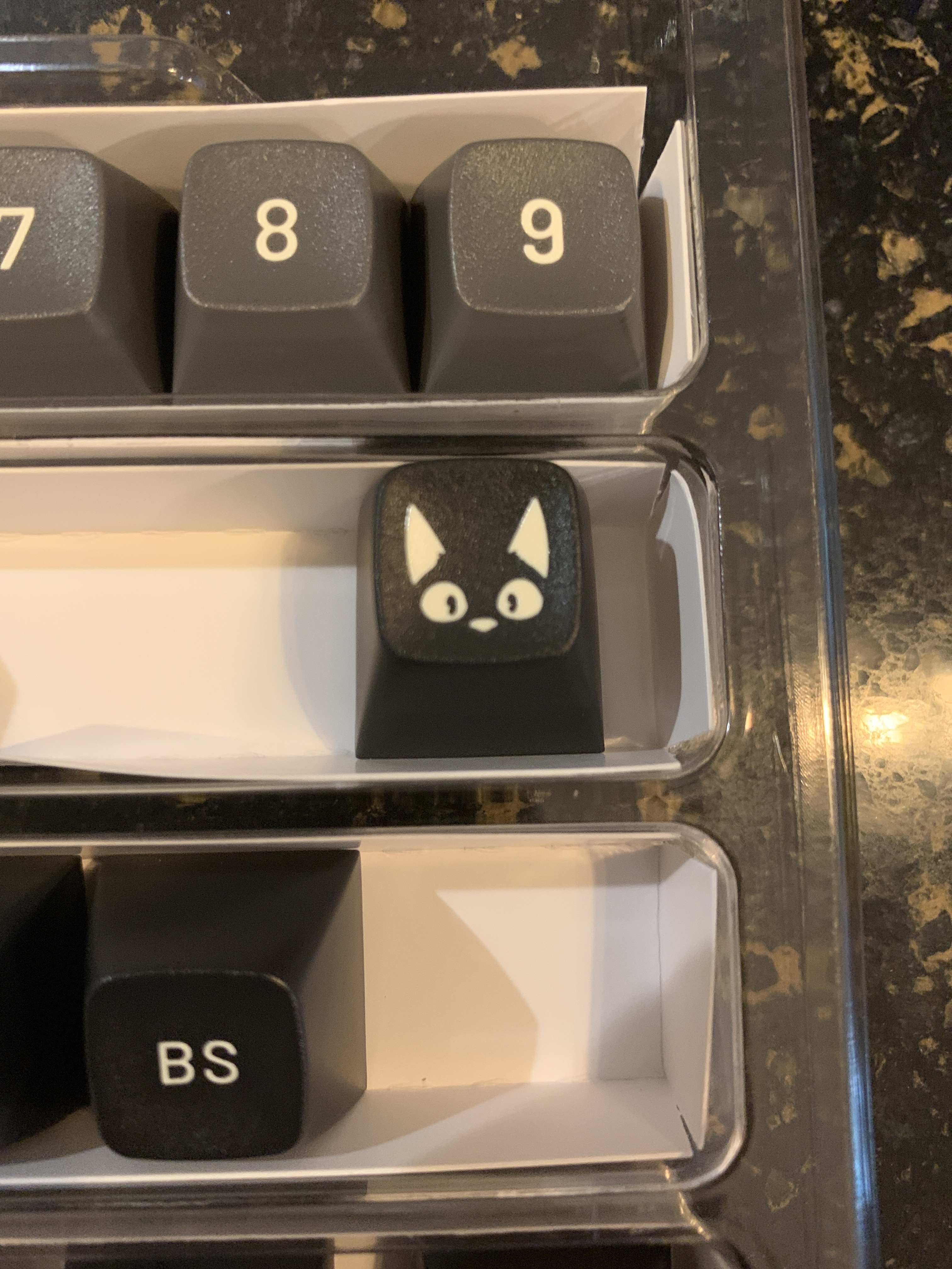
Yo. I got my susuwatari set!
They look REALLY nice! The color accents on the mods are good too!
Some weird things going on underneath on some of them. Probably won’t be an issue though
Biggest thing I noticed was they are quite a bit lighter in the hand.
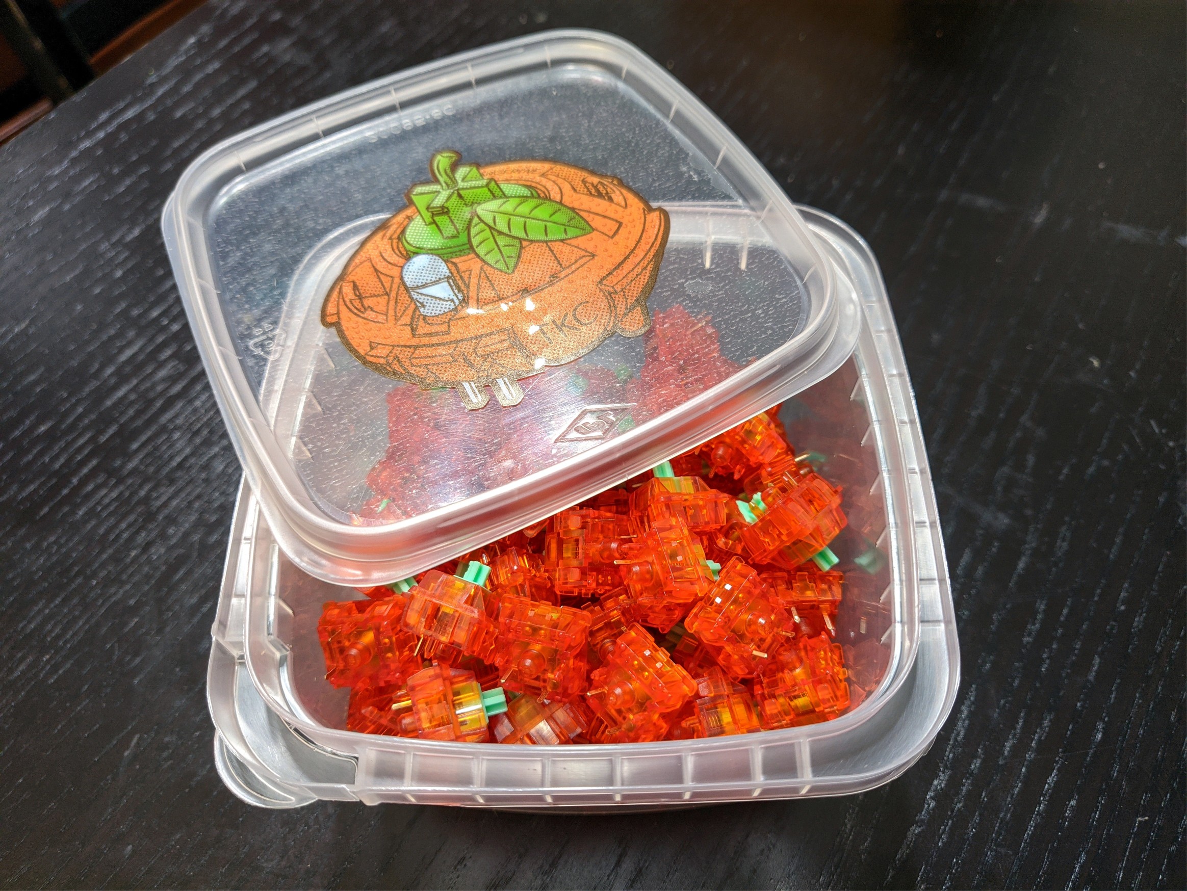
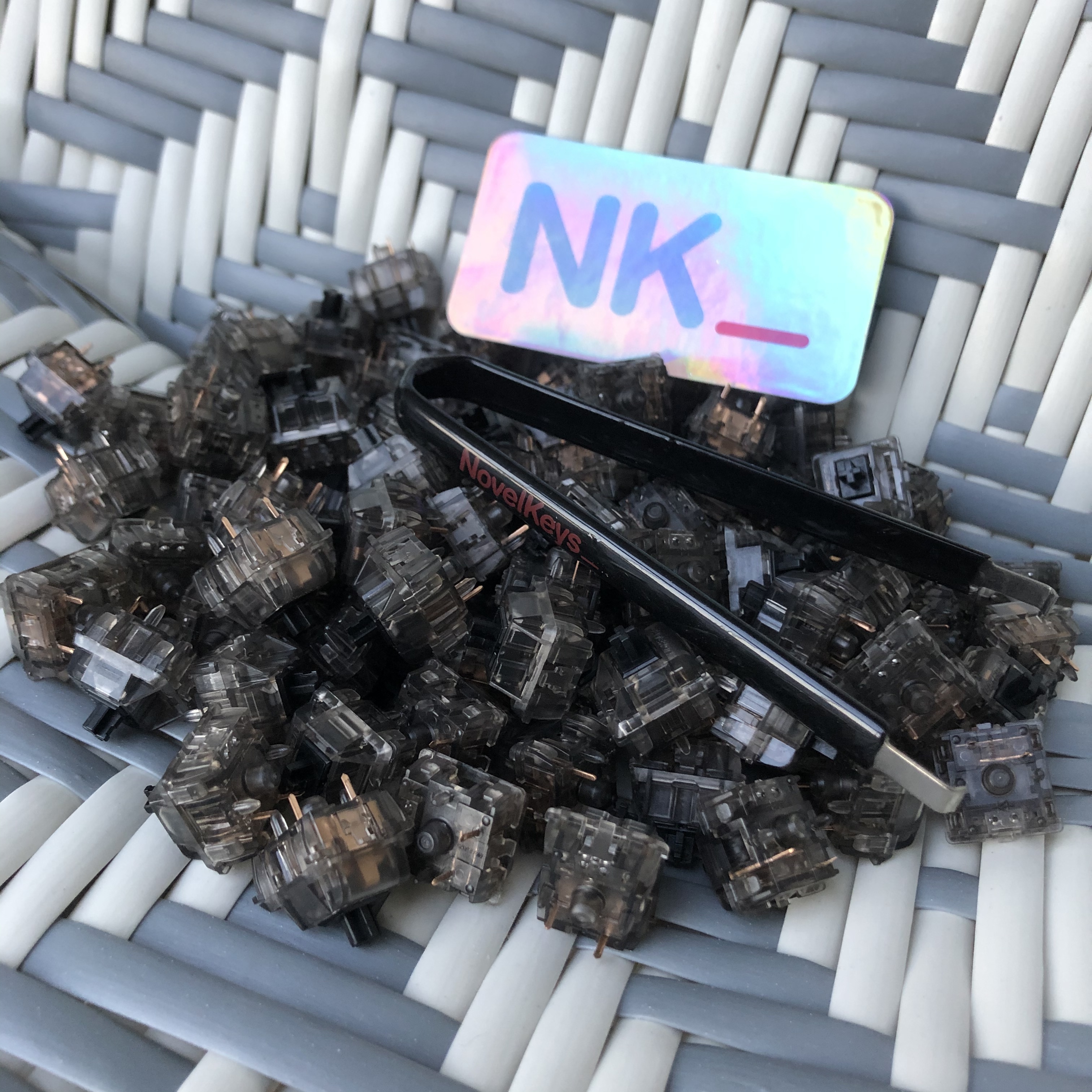
I got 99 switches but ordered 100. Not gonna worry about that though.
So have you noticed anything odd with the legends that you’d think make Matt3o bemoan them? or was it him being too critical as a designer?
ooooooooOOOOOOOOooooooo
Hype! These look really good. Rarely have I seen a production set match their renders and these are no exception, but these are some fantastic looking caps. I can’t wait for mine to arrive! @givemeyourshoes Same hype for the Tangies - any day now! Also I was so sure you were about to make a Jay Z reference I had the song going in my head and everything.
I got 99 switches but they left out one
I’m not all that picky when it comes to legends. The only set so own that I have issues with is the cubic set with dissimilar font sizes on the modifiers.
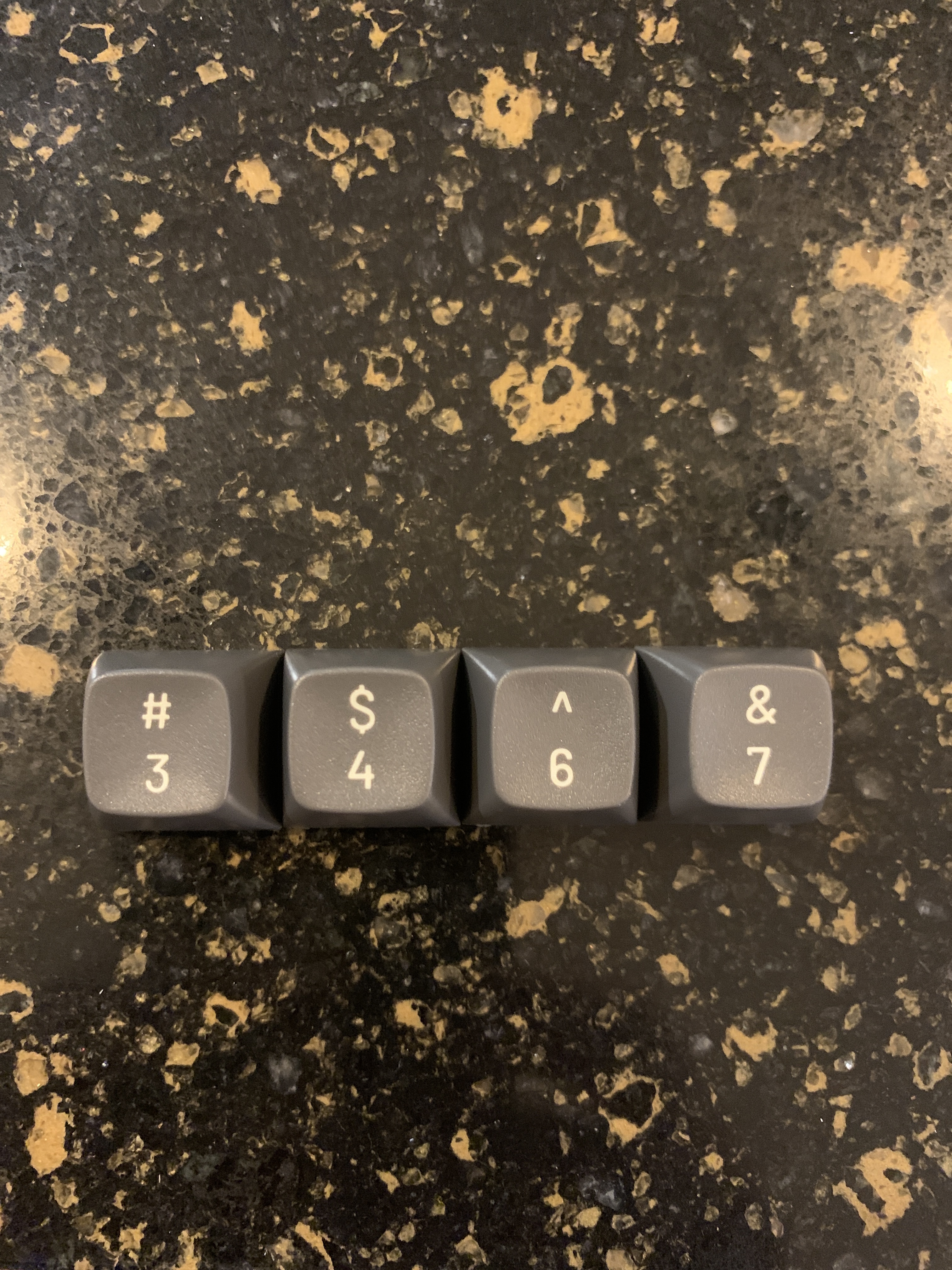
But these look very good to me. If I were to guess, the gripe will be with the secondary characters on the numbers. Dollar sign and ampersand look a bit large compared to the others. Carat looks a tad small.
I don’t see anything else that seems wrong.
Spoiler below. The bonus cap! It comes in a separate little baggie. Don’t throw it out accidentally!!
Well I don’t have the Tangies or Susuwatari yet, but I did get my hands on some Silent Inks:
…complete with a much better switch puller than the hand-murdering device that comes with a lot of boards.
Novelkeys almost always throws in a free sticker. So far, I don’t think I’ve gotten the same one twice - and this one might be my favorite so far. It goes perfectly with my modest levels of hype for Cyberpunk 2077…
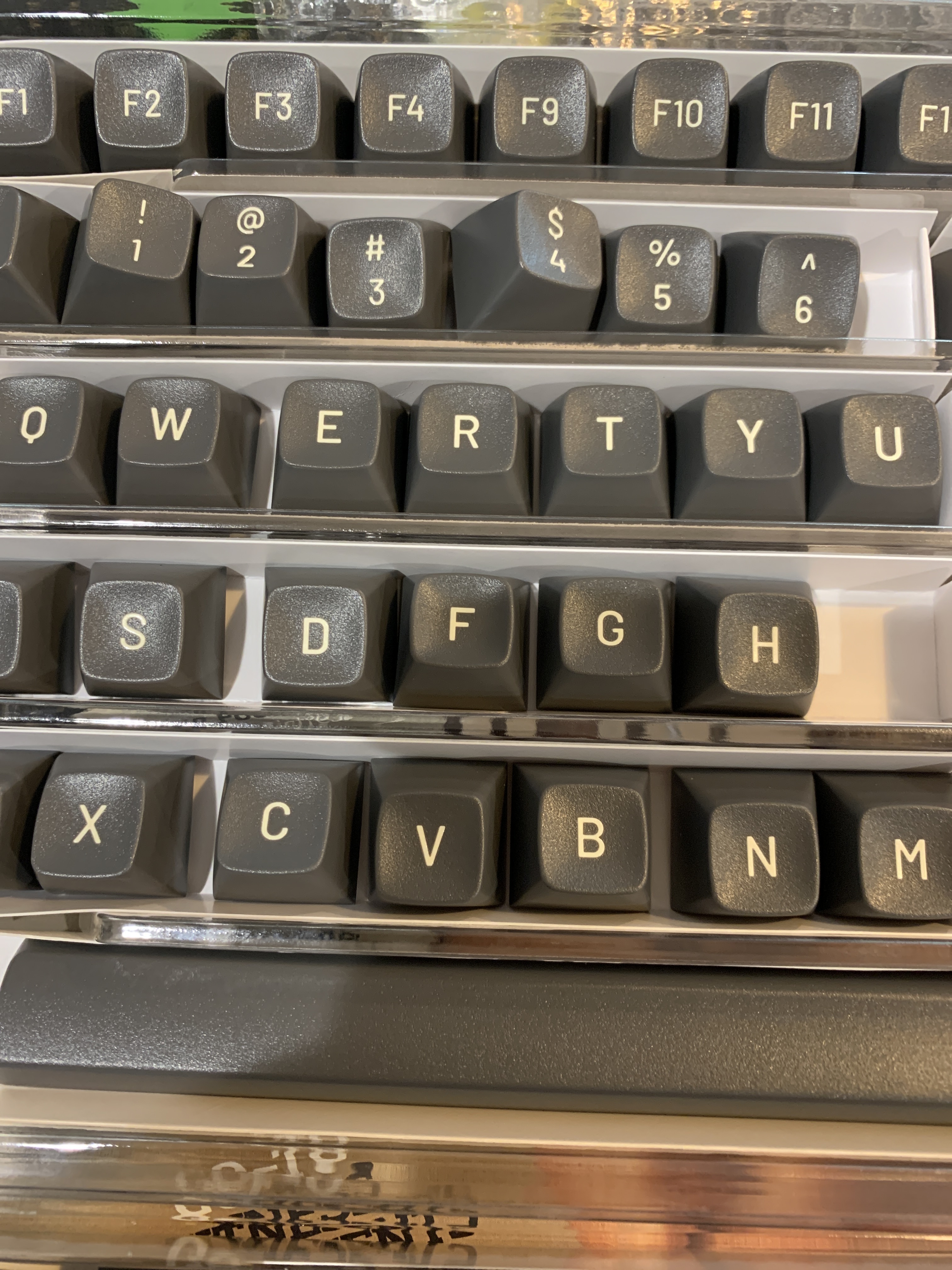
Milkshake came in. Thankfully not as bad as some people have gotten; there are a few issues with the corners on some of the caps but nothing substantial. There is a little bit of the swirling going on with the white but you have to be looking at things at the right angle to spot it.
The only somewhat large issue is one or two of the 1u keys seem to slide on quite easily, still usable but not great. I might still ask for replacements for that whenever Keyreative gets around to fixing the issues with this set.
That said I really like KAT… 
edit Gagh - found some chips / gouges in some of the caps after reading a bit more about QC and inspecting a few of the caps in more detail. NK has been informed. Still though, all in all I’ve very pleased with KAT overall.
3 different packages came in today!
One second hand aluminium case for my dz60.
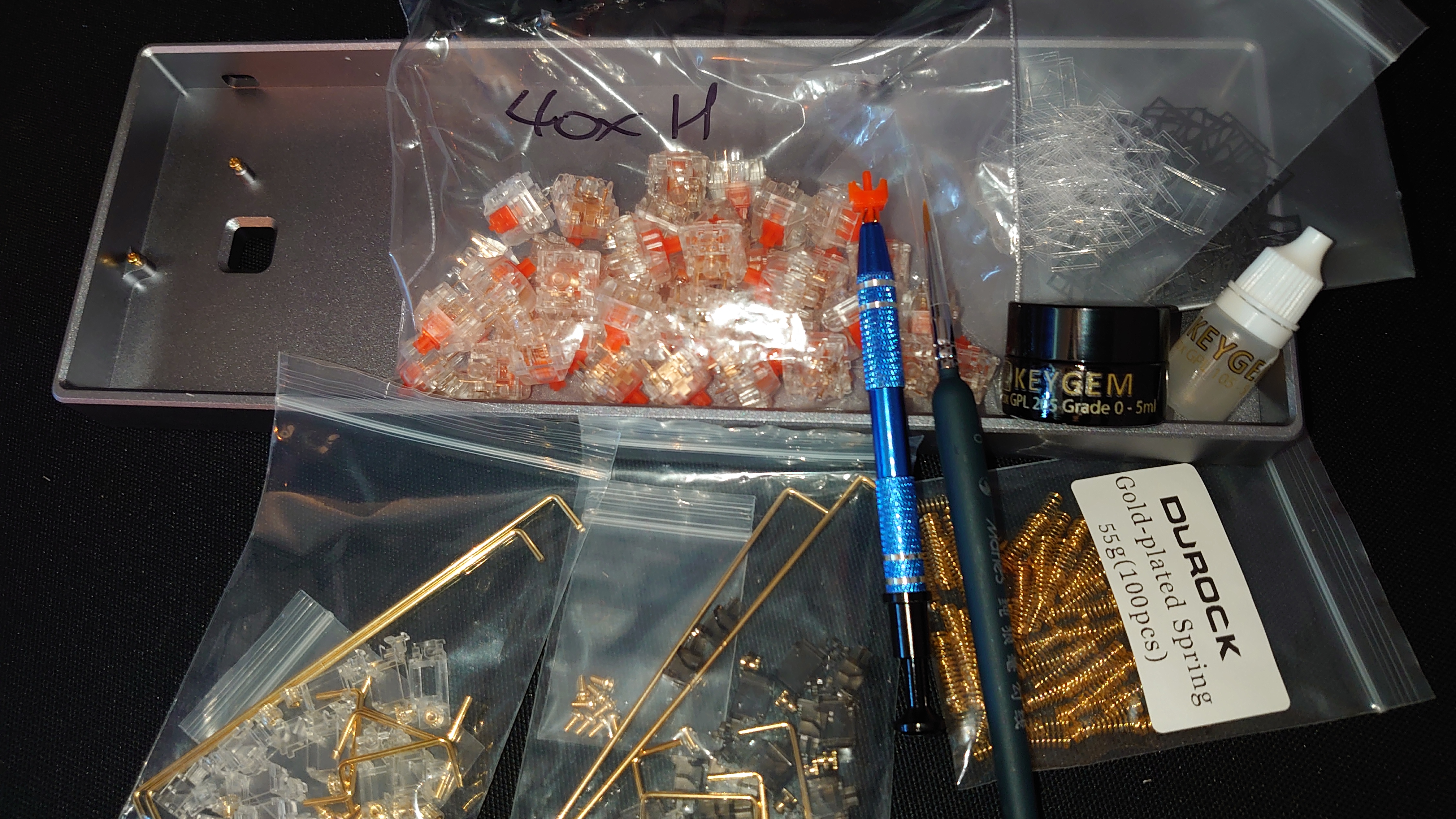
40 Helios v2(don’t ask me why I only ordered 50 the first time)
Lube, films, springs, stabs and tools from keygem.store

 )
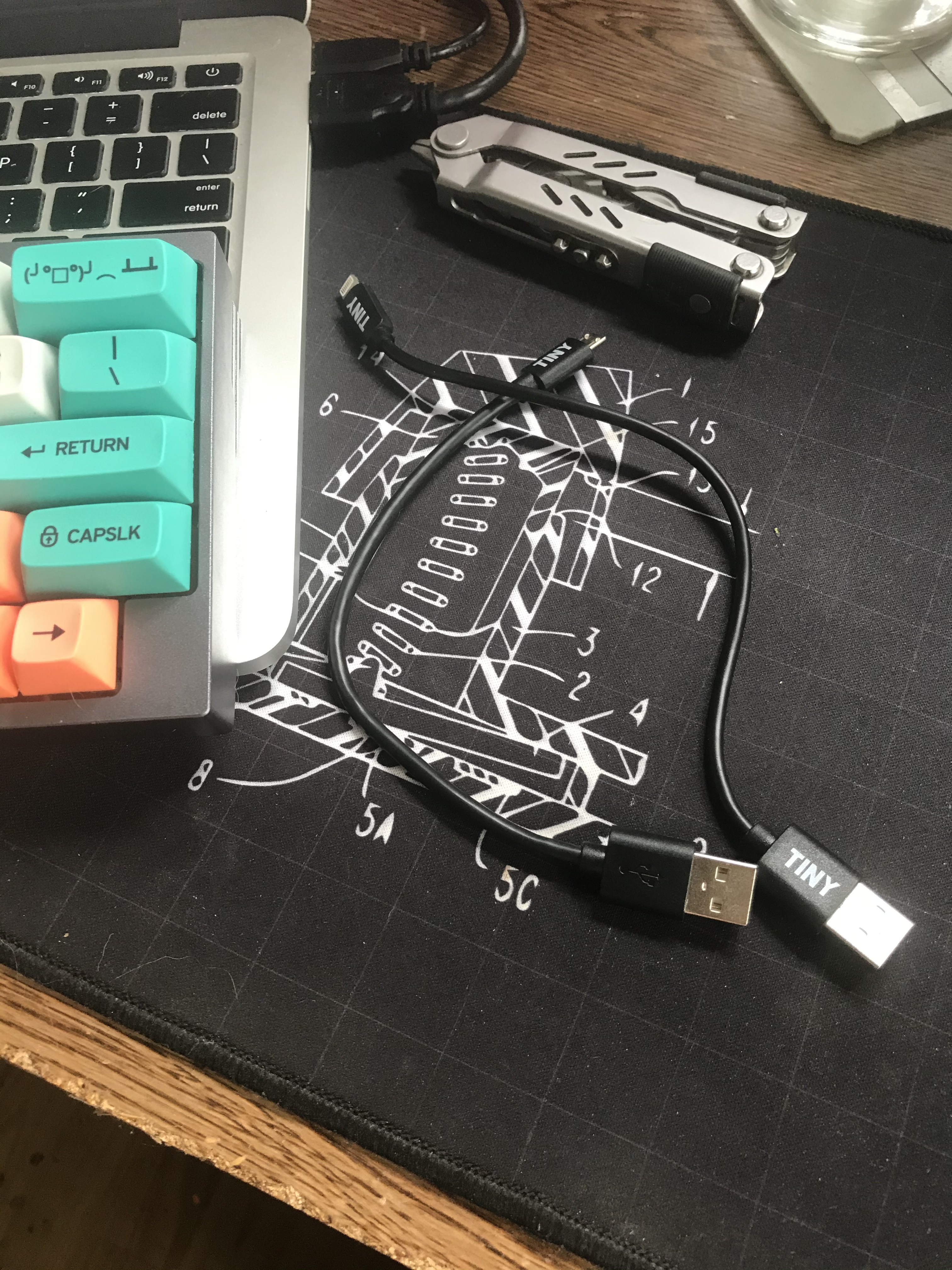
)Not from today but I forgot to post yesterday… I got some Tiny Cables, USB A to micro and USB A to lightning. I really wish they made USB mini cables, and I’ve leaned on them a little bit to do so, so here’s hoping. They’re a tiny company with full transparency (they blogged about their startup), they make good companies, and for full transparency I did their logo.
I have no idea why there is not sticker! I will slap the one who packed it 
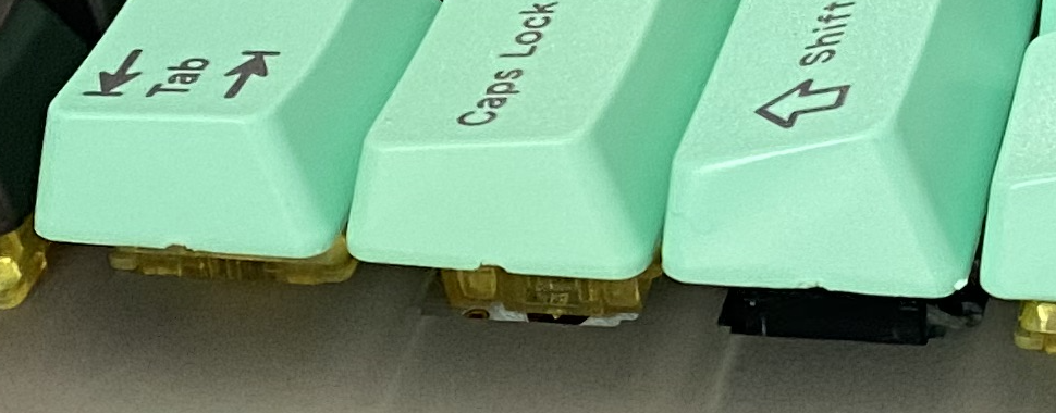
Hey the weirdness on the Susuwatari caps is actually a feature, it looks likes the pull tabs on each key were cleverly designed to be hidden inside.
Compare these to pull tabs marks on some Signature Plastics keysets.
You can clearly see where each key was pulled off of the production tabs.
The unequal symbols are just how they would print on the computer.
The font is called Barlow (open font) and they used the actual proportions instead of scaling them all to 0.15 inch (if I’m not mistaken) like SP does. That makes it easier to get a consistent line thickness, I suppose.
Now, why did they not choose a rounded typeface is another question…
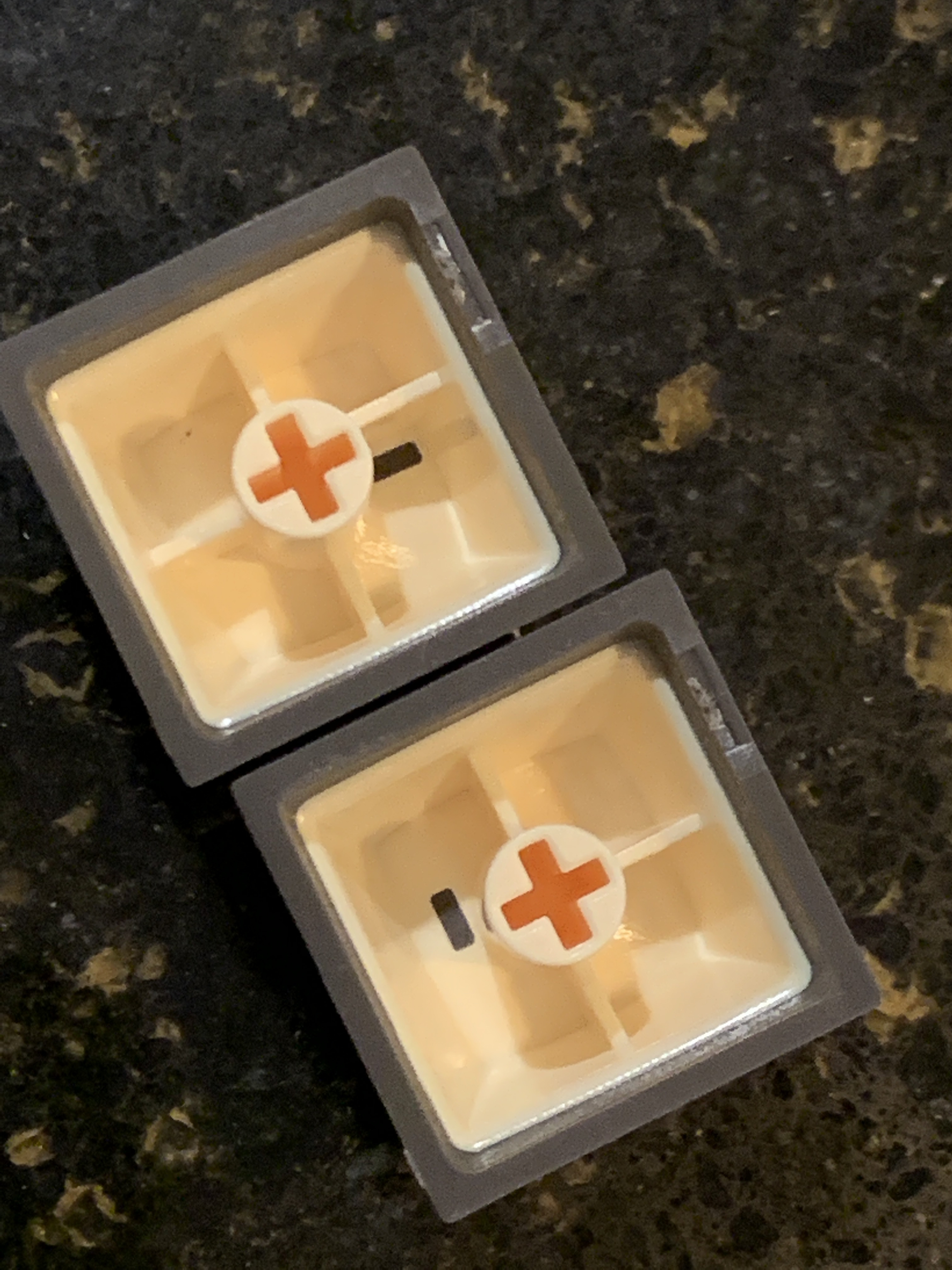
Actually I was referring to the cross supports from the wall of the cap to the stem, not the sprue marks. The cross support on some caps is offset in one position. And on some caps a cross support is actually missing.