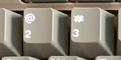
Old:
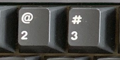
New:
Photos by pixelpusher.
The old ones looked better. Has anything else changed?
Old:
New:
Photos by pixelpusher.
The old ones looked better. Has anything else changed?
My assumption is that they were older molds and may have been aging poorly, so they redid the molds.
Because the old # looks… awful. Yuck.
I love the old #, especially.
Although, at this point, it’s more about being true to the original Cherry legends.
The old ones look crooked, unaligned with the numbers.
It was probably changed to make things look more uniform across keys.
+1 to the old hashtag looking terrible. It’s not uniform and all and the proportions look all wrong to me. The new ones are def better imo.
Being adherent with “OG” will put you, more often than not, in the deep minority camp. It is what it is. I love OG stuff, but I know I’m in that minority and my opinion may very well cast to the side due to “popular demand”.
It is tough to decide sometimes over a flashy new GMK set or OG Cherry goodness that’s for sure!