Dsa 2077

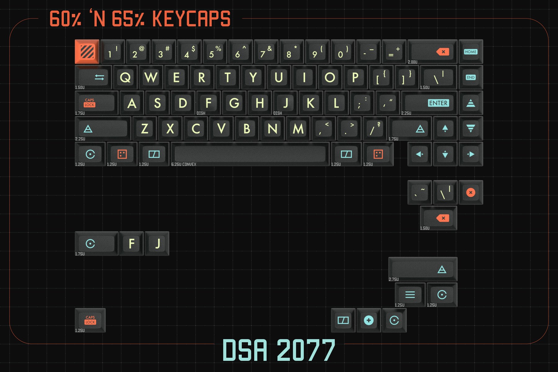
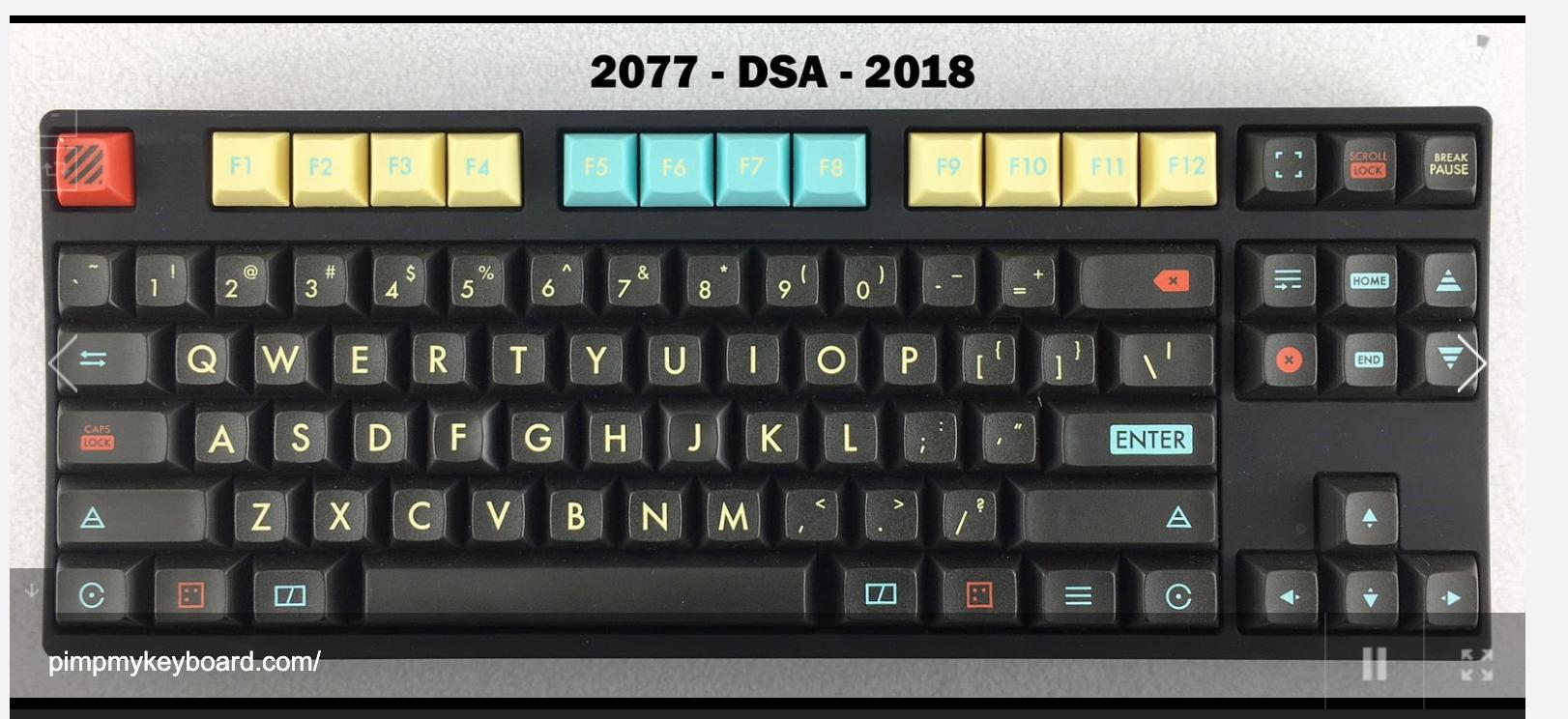
Another take on the cyberpunk theme. Mixed feelings on this one. I couldn’t get into DSA when I tried, and I can’t say I’m a fan of washed-out canary yellow - but there is something about this design I really like. Maybe it’s the mod icons, maybe it’s the grid and red lines making me nostalgic for late 80’s packaging, I dunno - but I kinda dig it.

Not enough to buy it… but enough to have some cognitive dissonance choosing not to.

I thought I recognized this. It ran a few years back as well:

There’s a shot on the PMK Gallery as well:

2 Likes

Something about this screams vector graphics on cathode ray tubes - I really do like those icons.

I’ve recently warmed up to DSA—no clue why. I even recently purchased a set of Quartz.

Anyway I’m not a huge fan of the color way. It seems a little all over the place to me but maybe that was the designer’s goal considering the theme

I don’t understand this set. The photos or renders show both pastel F-row and black F-row, the Lay-out photos only show pastel, which is it?

I also can’t decide if I like it or not…

I love this set and have been hunting it for years! I bought it as soon as I saw it this morning.

There is coupon code GLIMY10 takes another $10 off.

It’s like cyber punk meets Great Gatsby.

1 Like