Hi all
I’m looking for some feedback with a set I’ve been working on. This is still early days and I don’t feel like it’s really at interest check phase as it probably still needs lots of work. I tried getting feedback on my facebook and instagram but wasn’t successful.
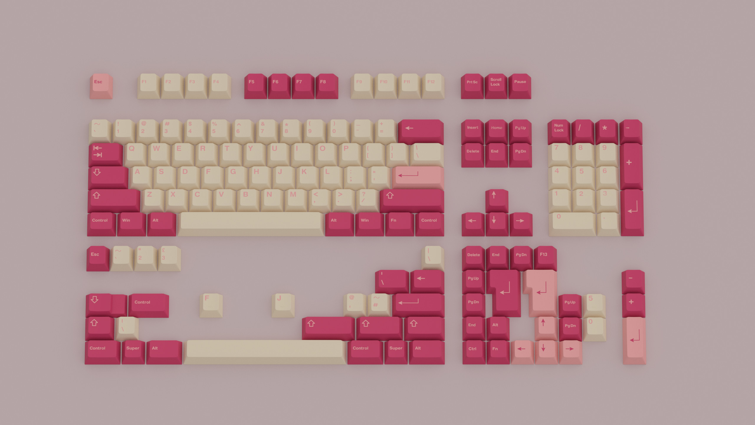
The proposed set name is: Kiku the Japanese name for chysanthemum
The design is based on Japanese woodblock printings of chrysanthemums by Keika Hasegawa.
The colours chosen are based on the washi paper and chrysanthemum petals.
Any feedback would be helpful.
Thanks
1 Like
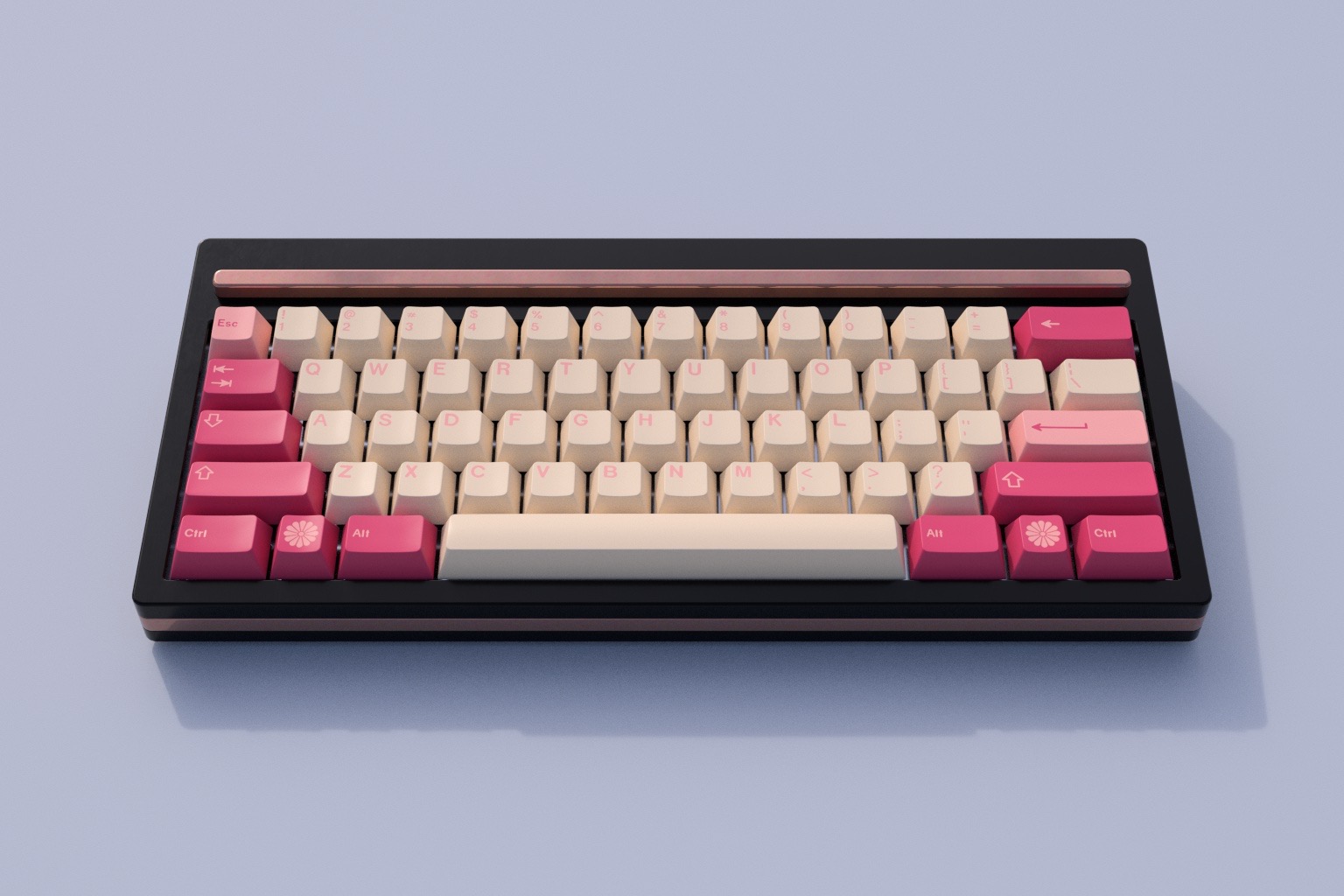
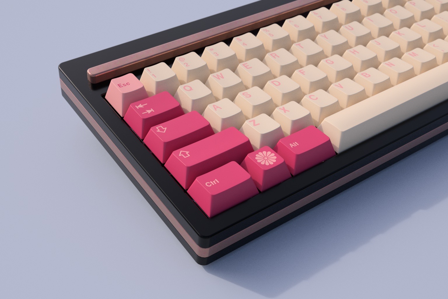
Keyboard by Prototypist
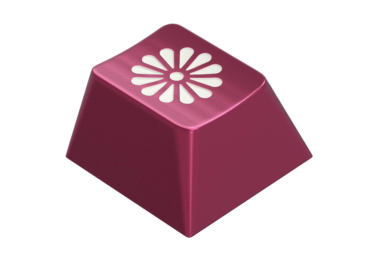
I also made a random novelty based on Rama Works’ novelties.
1 Like
Nice set! Design-wise, it holds together well overall. I would personally increase the contrast on the alphas, and/or look for another accent color that could have higher contrast. Unclear if this is meant for GMK production, but maybe use CP as base color on alphas to increase contrast?
1 Like
I know it’s got a whole other theme going on but looks very similar to gmk (and probably jtk) valentine
Love the colors. I agree with having a little more contrast for the alphas.
I think this would pair really well with the new Bobagum switches; their stems have a very similar color to the mods.
1 Like
I agree that this looks similar to Valentines colors in general. Since it’s themed after a flower, maybe throw a little green in there to carry that theme through a bit more. Either green legends for a little more contrast (which as others said would be helpful) or as the space bar to resemble a flower stem.