As I have just started my Christmas break and came back to my family home from Collage, I got bored and wanted to try something I have been already thinking about for a while. I had no previous contact with Fusion 360, only with AutoCad and MechanicalCad as I’m studing automatics and robotics. So for now this isn’t anything serious just getting to learn the software and basics of keyboard design. Here I’ll be posting updates on my journey (provided that there’ll be anything worth sharing). Please take it easy on me and any advices are welcome!
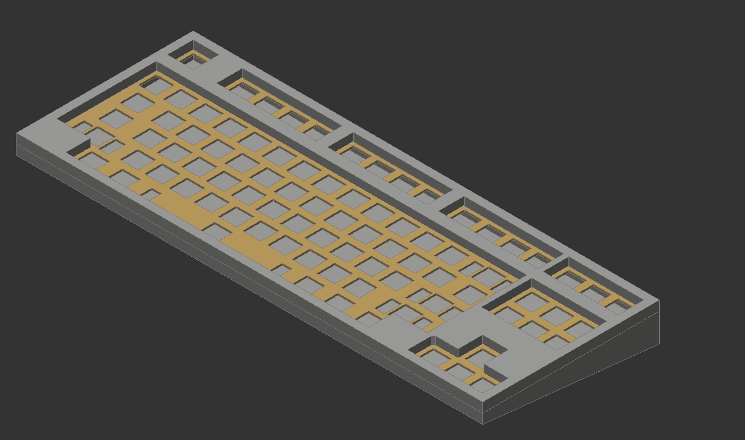
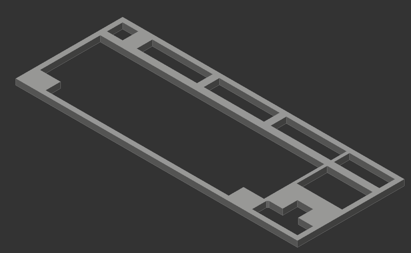
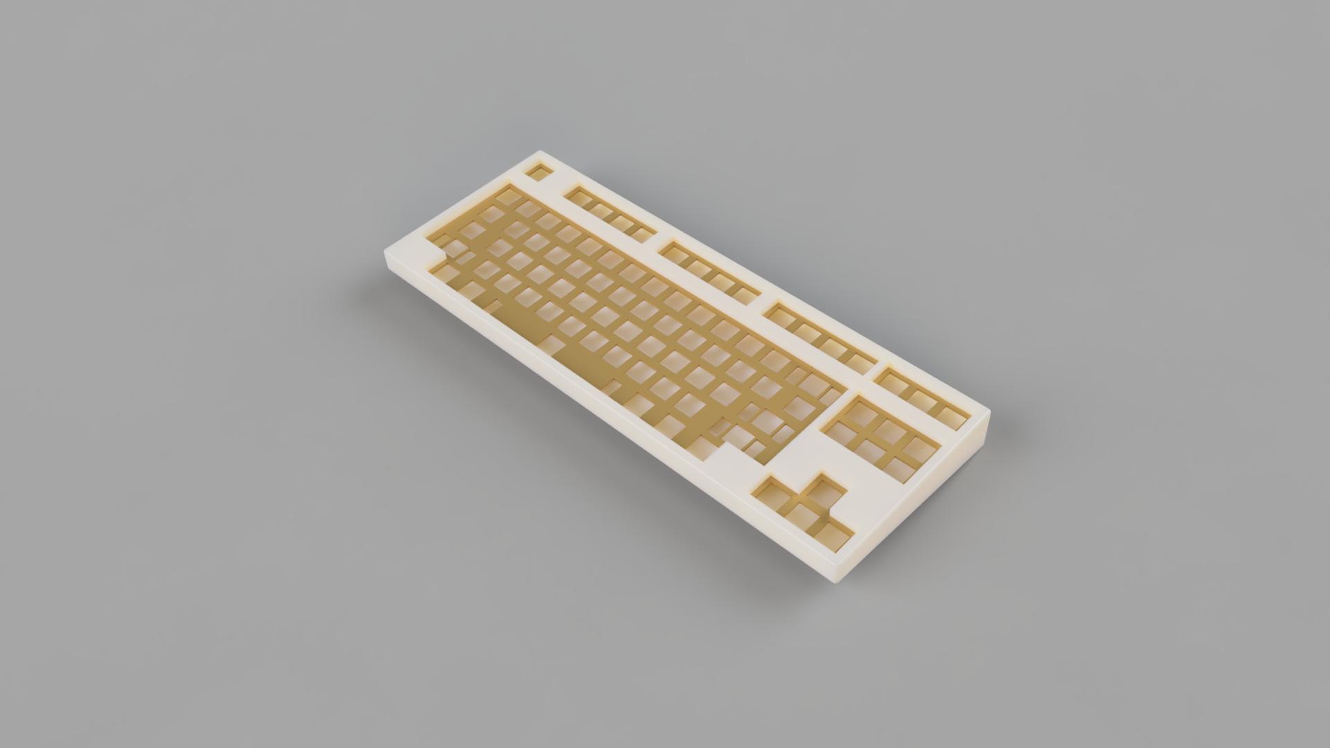
Here’s an outcome of a first evening spent designing. Just the basic structure:
What I want to do next is to figure out the mounting style. No idea where to begin with tbh so for now I might just play with the design and go to the more technicall stuff later on.
Well I haven’t decided yet as It’s for me to speak about preferences because I haven’t experienced that many custom keeb builds. My background is: lightly modified anne pro 2, tofu60 actrylic + alu plate with gat yellow (current keeb). The typing experience is very nice, poppy I’d say. There’s plenty of flex so I’d say it’s really soft (idk if that’s propper). I’ve listened to many sound tests and seen many keebs online and that poppy sound (also thocky) is what i like best.
When It comes to the case itself, I like it best when it’s minimal with thicc forehead. Kinda industrial looking. Doro67 is definitely one of my favourites. I also really like the aesthetic of HHKB, never had the opportunity to try one. though.
Also I wouldn’t focus on creating a keeb that will sell well right now. I think it’s best to learn te software and all the technicall stuff considering keyboards
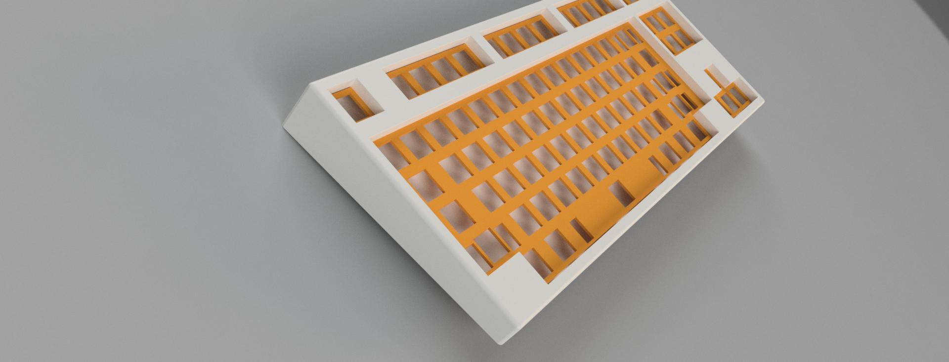
22.12.2021 Update
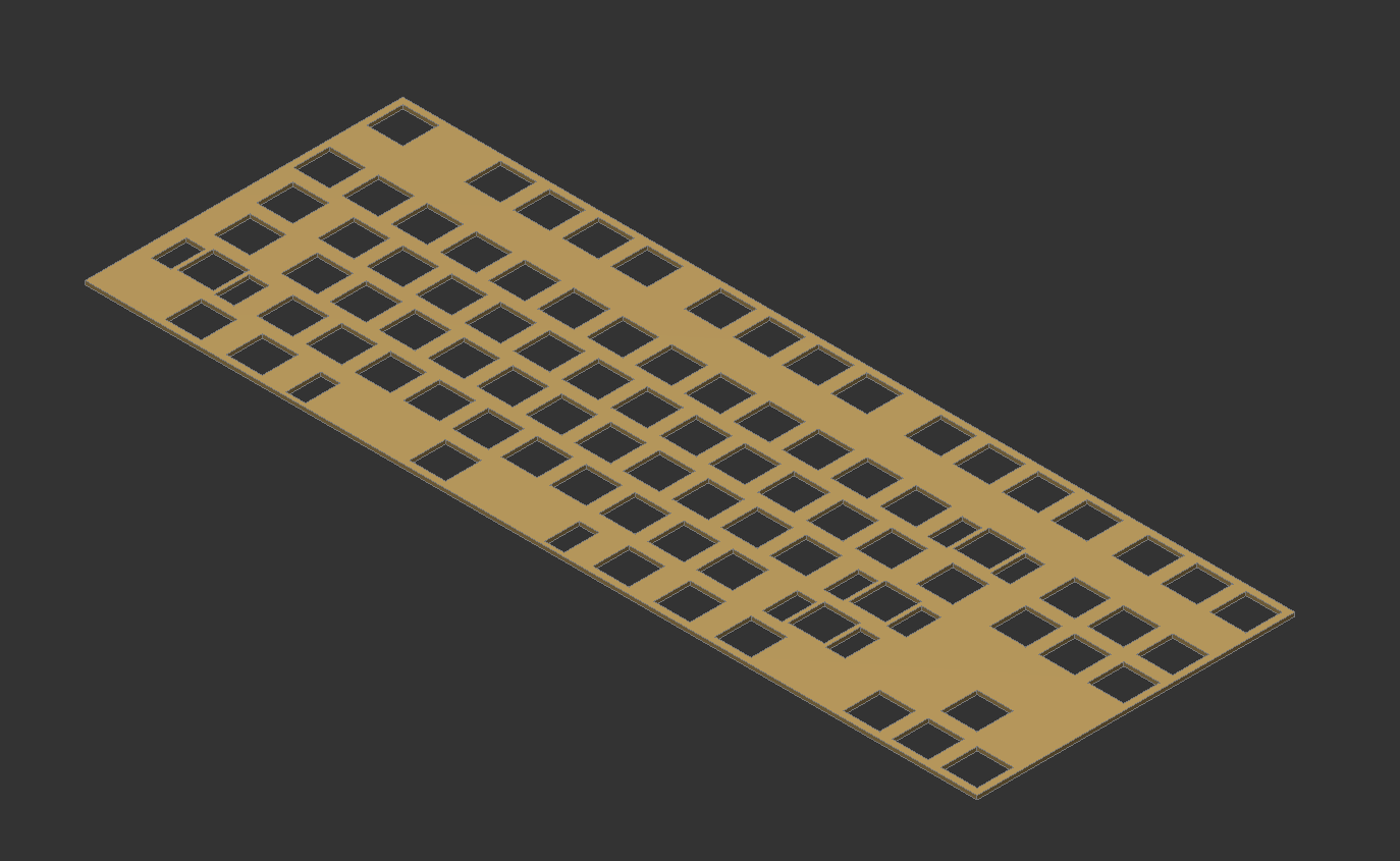
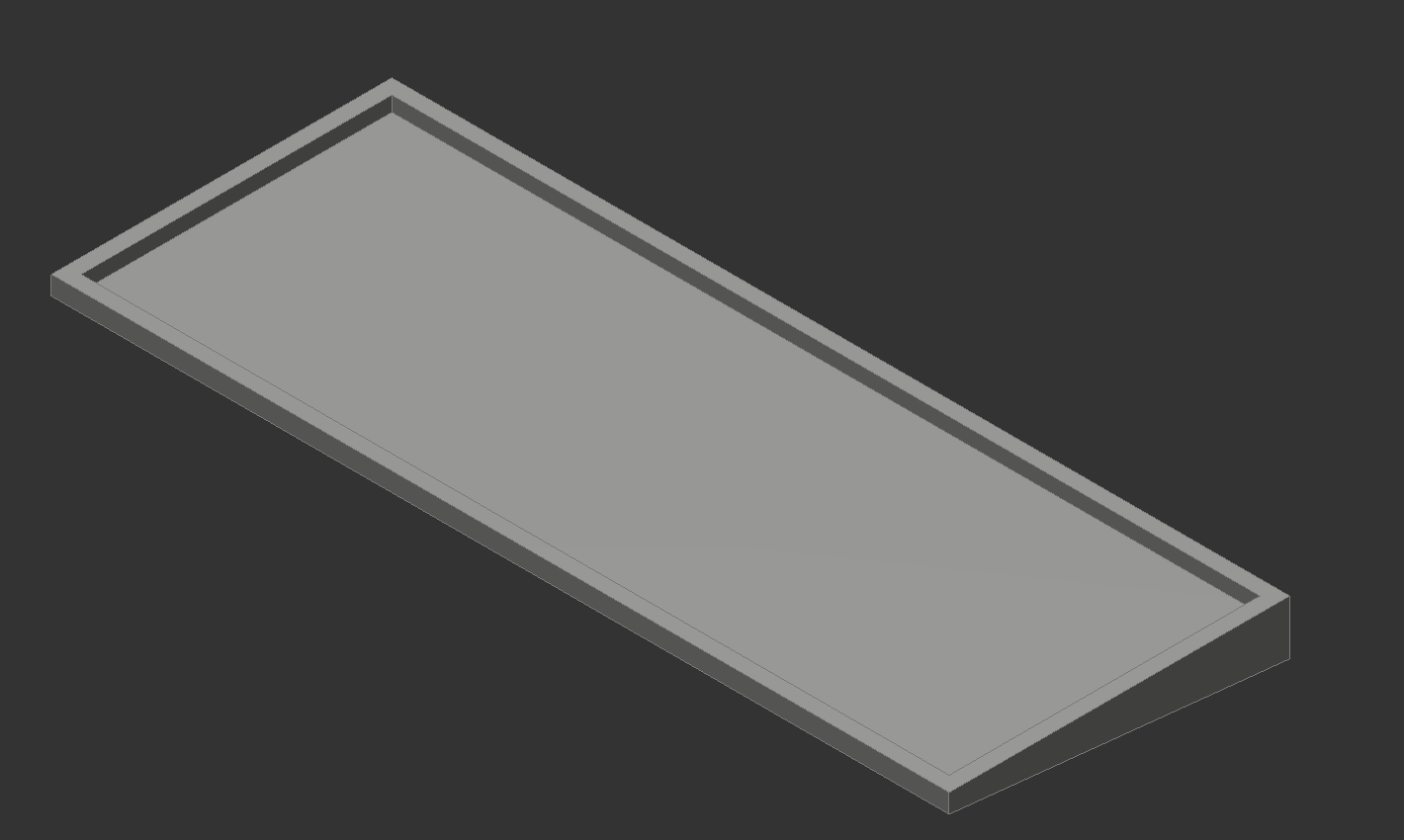
Worked on the edges, filleted them. Outside edges 2mm, 0.3mm around alphas, 0.1mm in corners, around f1 row, arrows and function keys 0.25mm
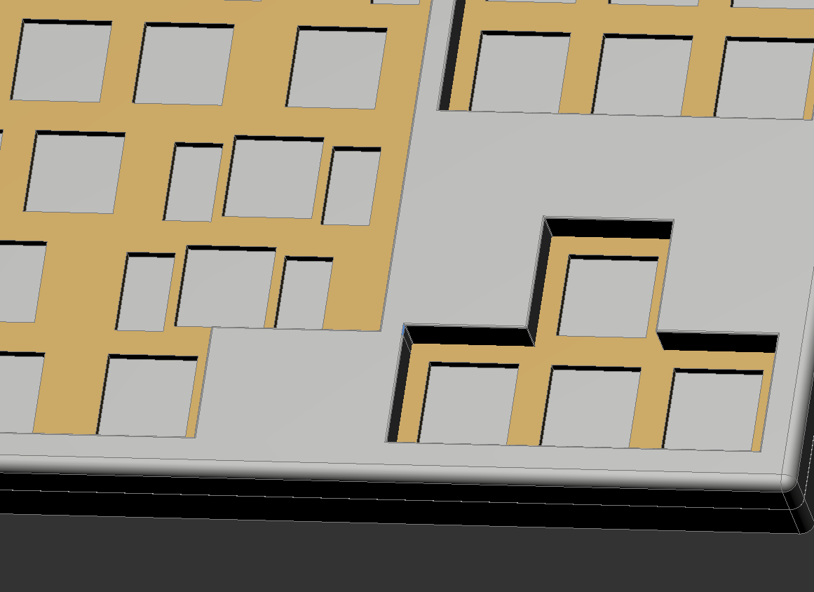
I think it’s looking really cool. The visual interaction between the HHKB style alpha cluster and the arrow cluster is giving me Tetris vibes.
I’m personally a fat fillet fan. I think I’d be OK with a keeb whose top surface is all bevel - but just a bit more on the fillets would be good, I think.
One thing I’ve noticed with cases / keebs is that while sharp corners can make for a striking aesthetic, they’ll also highlight any tolerance or manufacturing issues with switches and/or keycaps. One degree of stem twist doesn’t jump out at me - until it’s in one of those corners - then I can hardly ignore it. When I see sharp corners on the interior edges of a keeb, I think, “ok, top-shelf components only for this one”.
Thanks a lot for the input! I wasn’t going for sharp edges really but that’s how it turned out. There’s a slight difference between the design and render (visually) and I was afraid the fillets are going to be too big but it came out otherwise haha.
Right now I’m kind of busy with helping organise the christmas dinner and also taking time to spend with family but I already have some ideas that I just need time to transfer them into paper or a program.