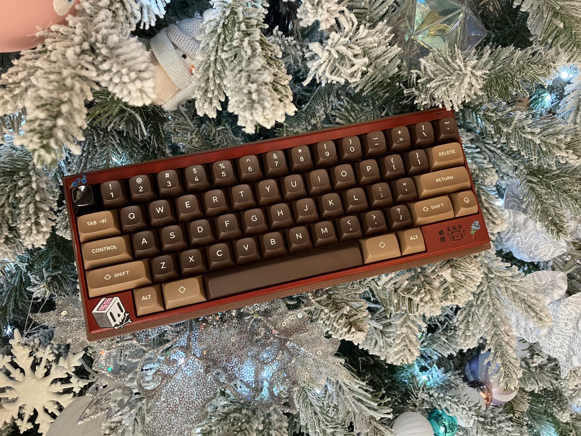
This is sooo beautiful, really nice scene. ![]()
3 Likes
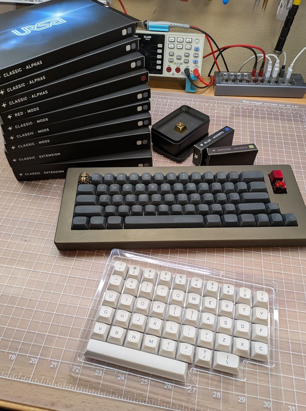
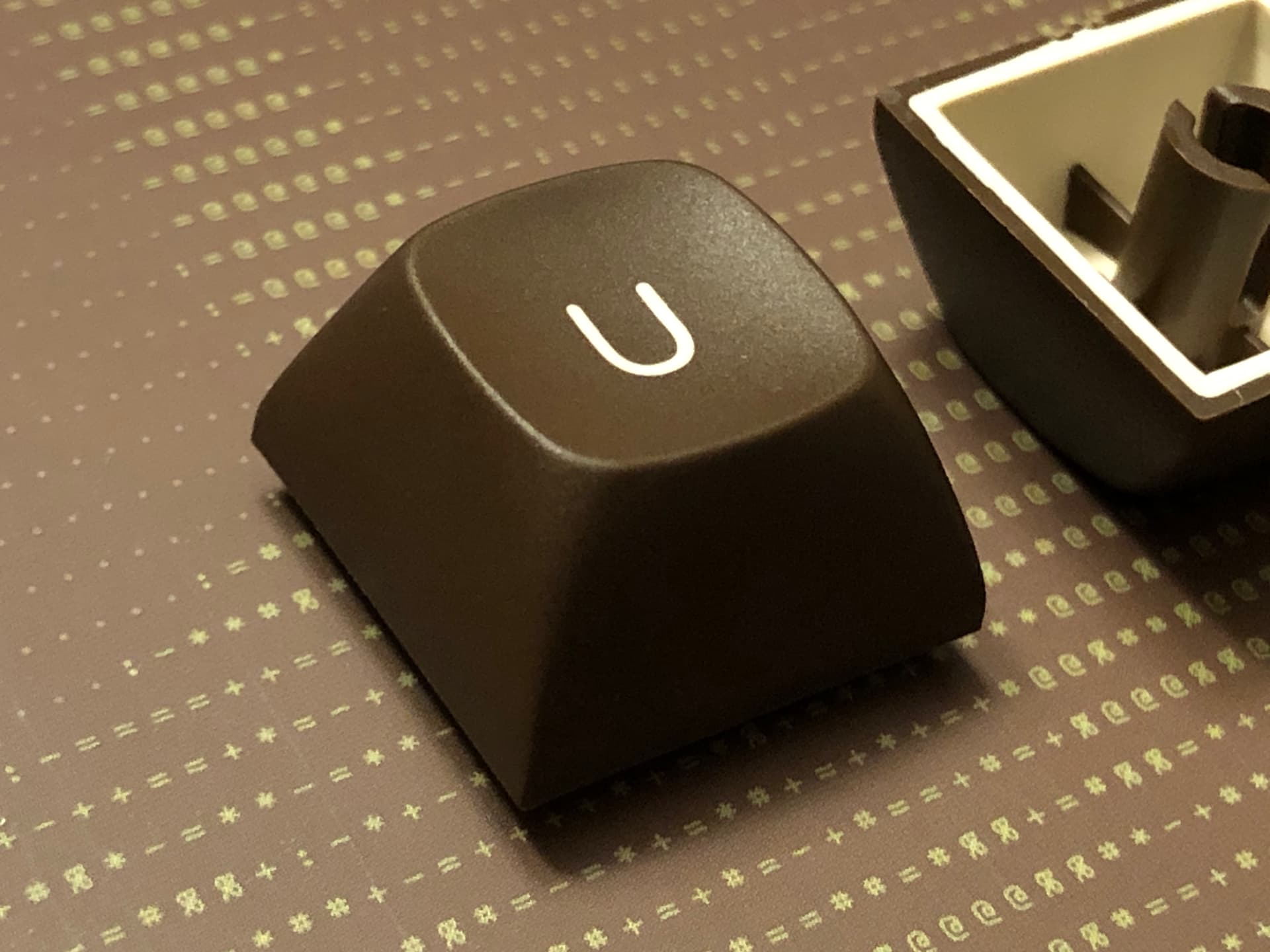
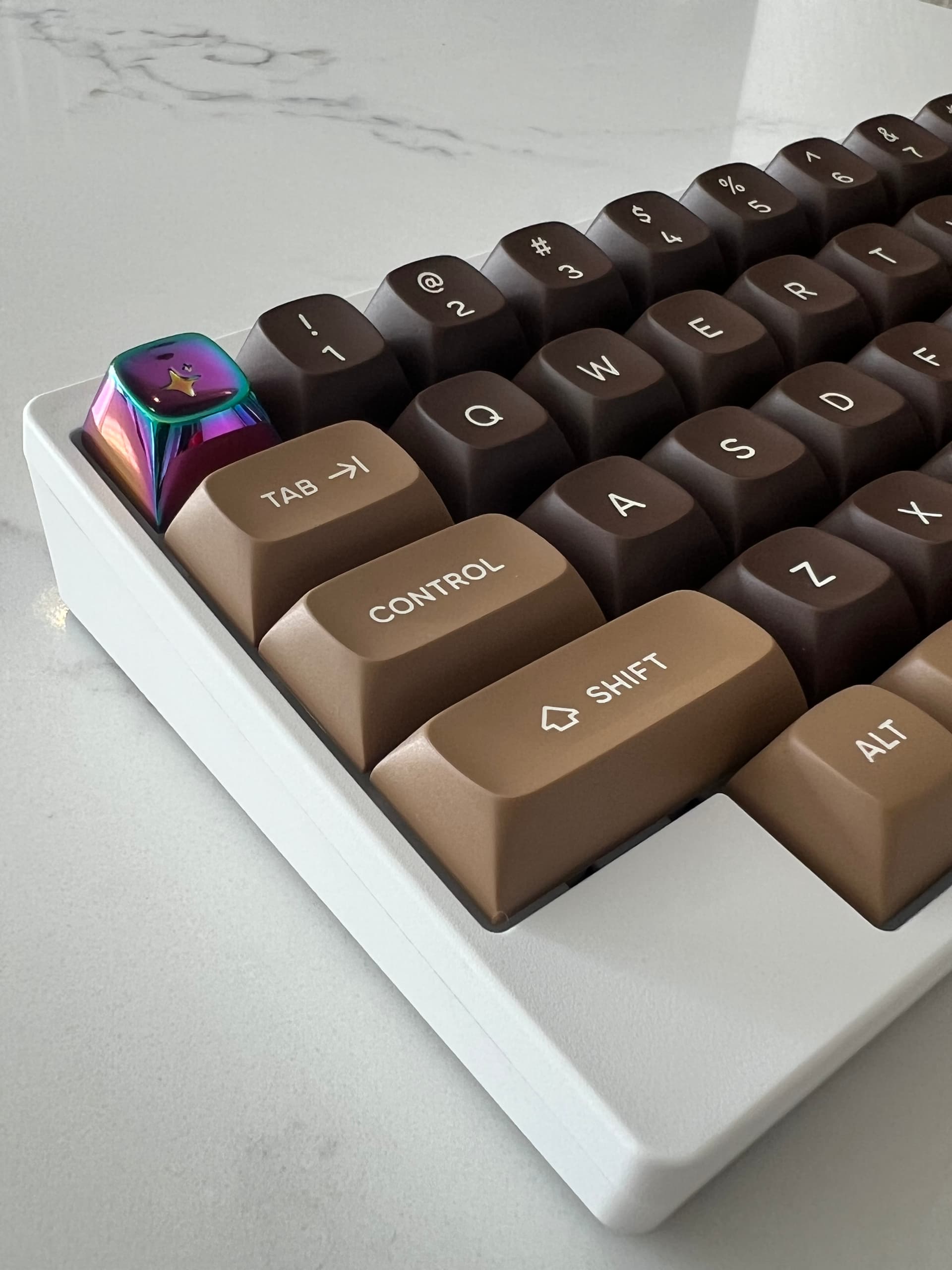
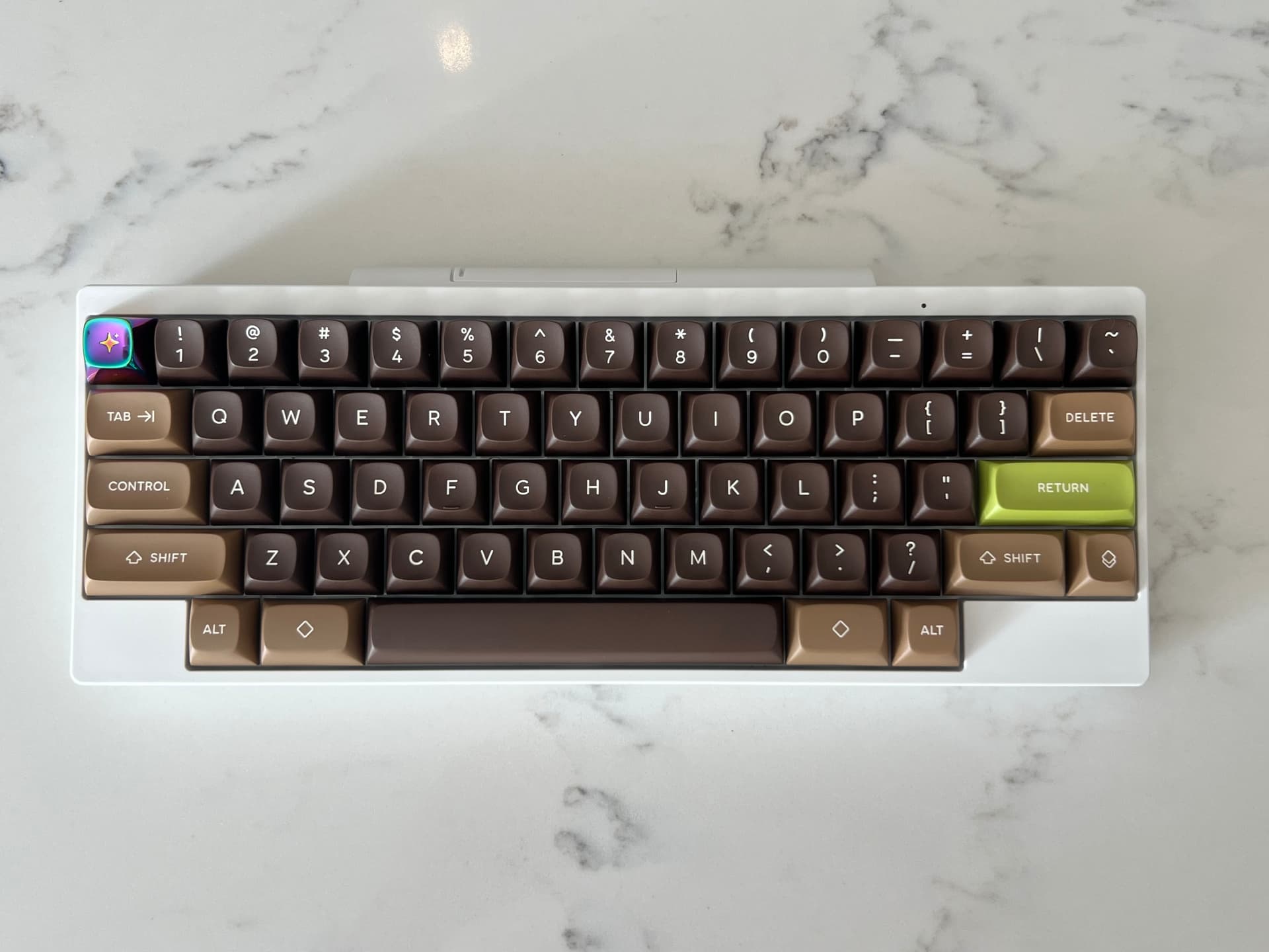
Here we have the Prototype URSA keycaps meeting the production units for the first time (at my house anyway).
10 Likes
Nice to see more photos drop in. ![]()
Hey there @pixelpusher did your order come in yet?
2 Likes
Nope. It’s in the US but not here yet. Will post some pics of my minicom set when I get it.
6 Likes
Got the caps. Absolutely bat shit crazy around here so I’ll update in a day or two
4 Likes
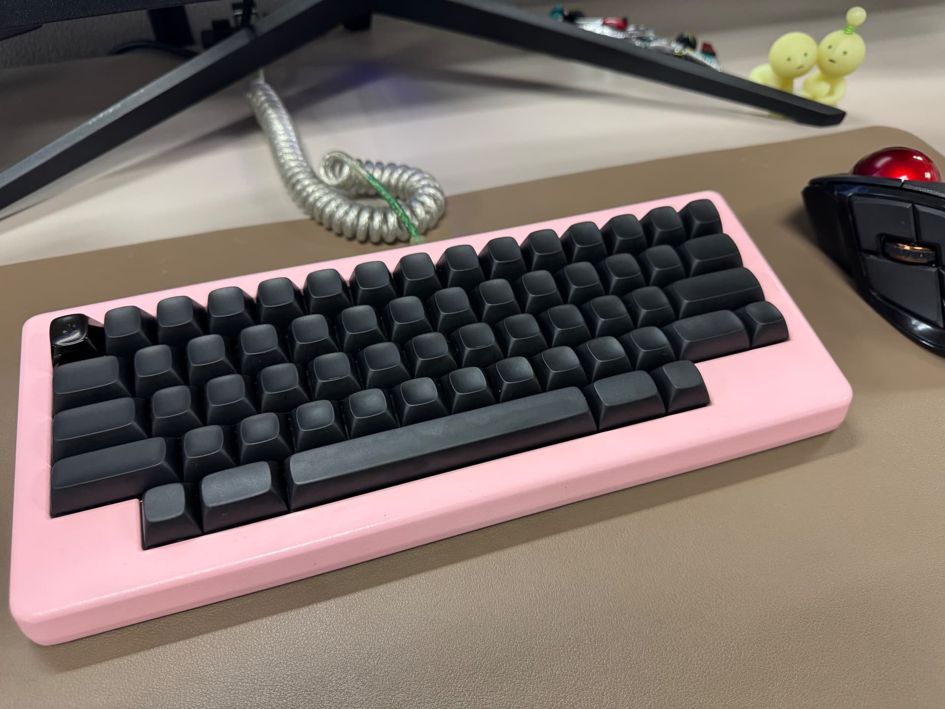
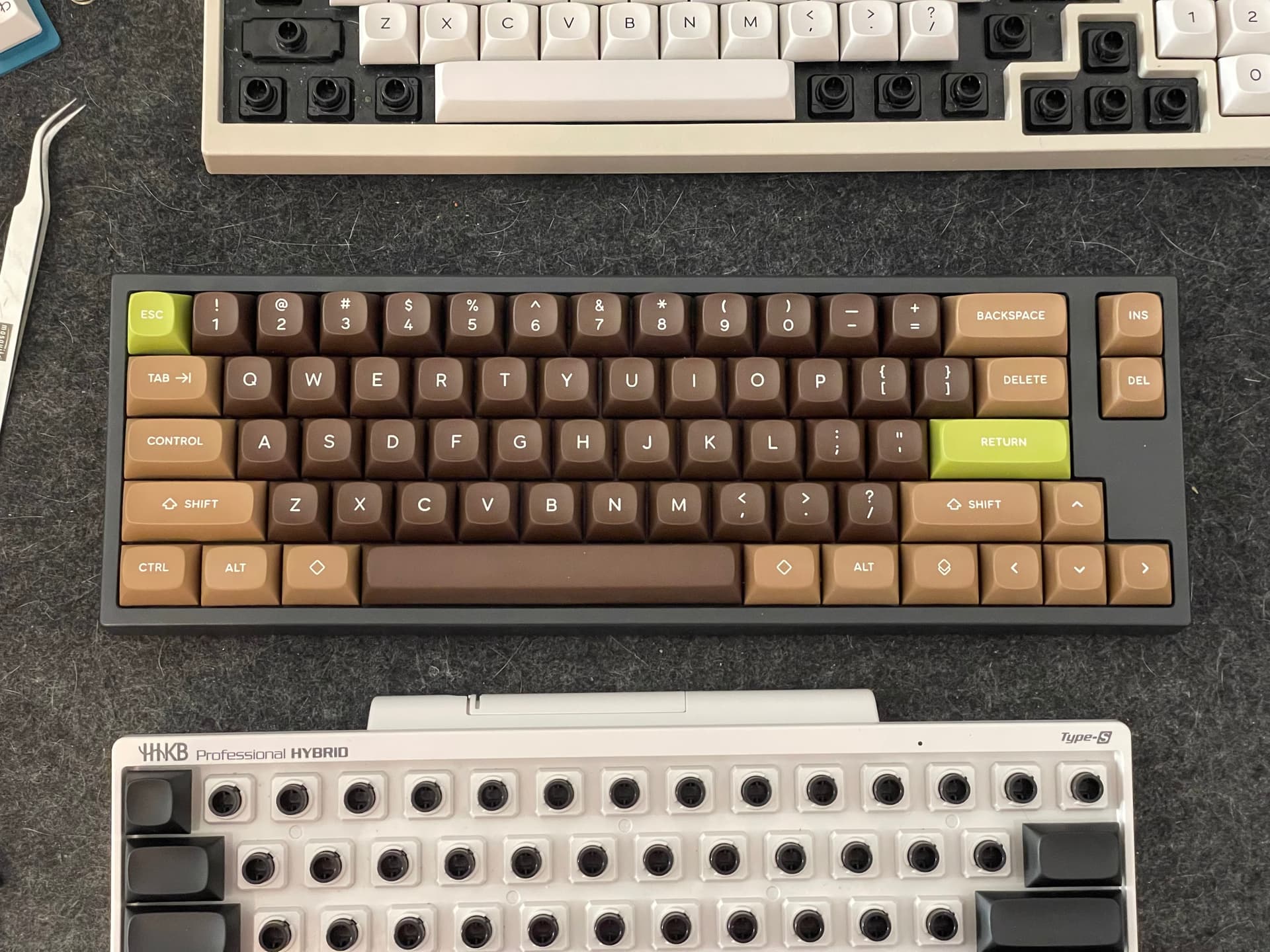
I don’t have an EC board yet (anyone got a beige Leo they want to sell?), so here’s a naked cap or two on my old phone:
I think these came out amazing.
8 Likes
I’m beyond impressed.
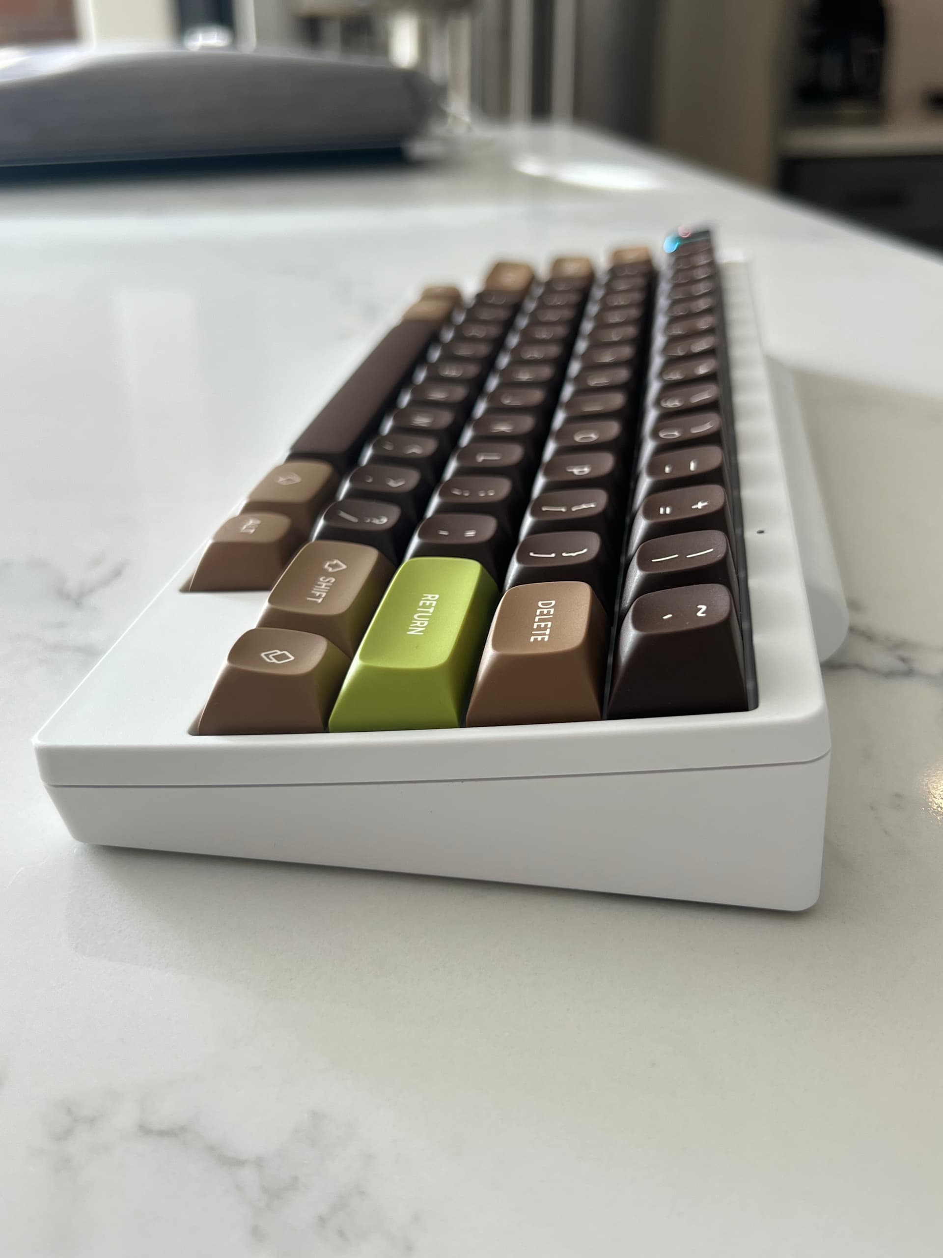
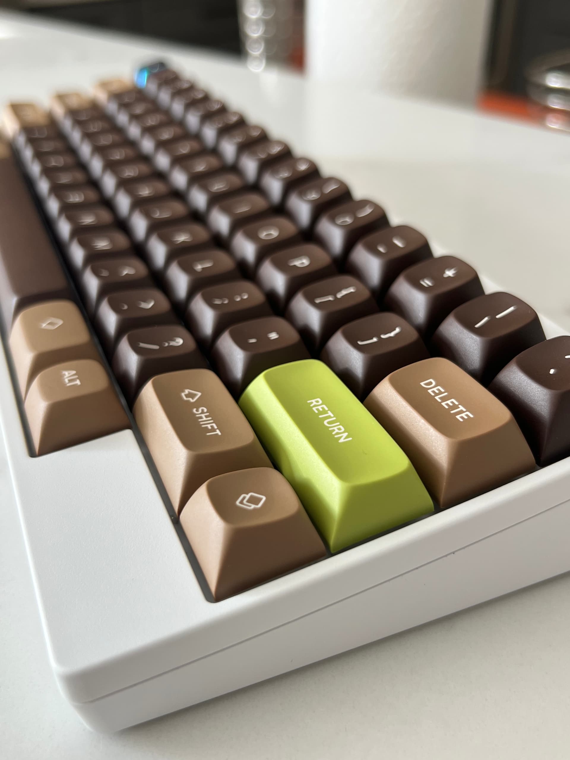
Here’s the problem. I deeply regret swapping some of my topre boards to MX stem now ![]()
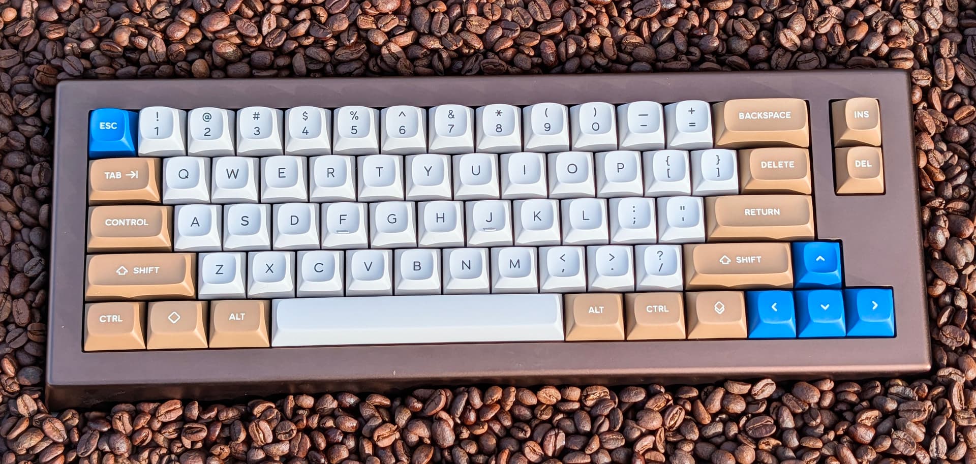
I’ll definitely be picking up a white on black for some other boards that don’t go well with brown. Oh, and I definitely need the classic colorway for my TX-66c in titan gray and Retro Refrigerator Heavy9.
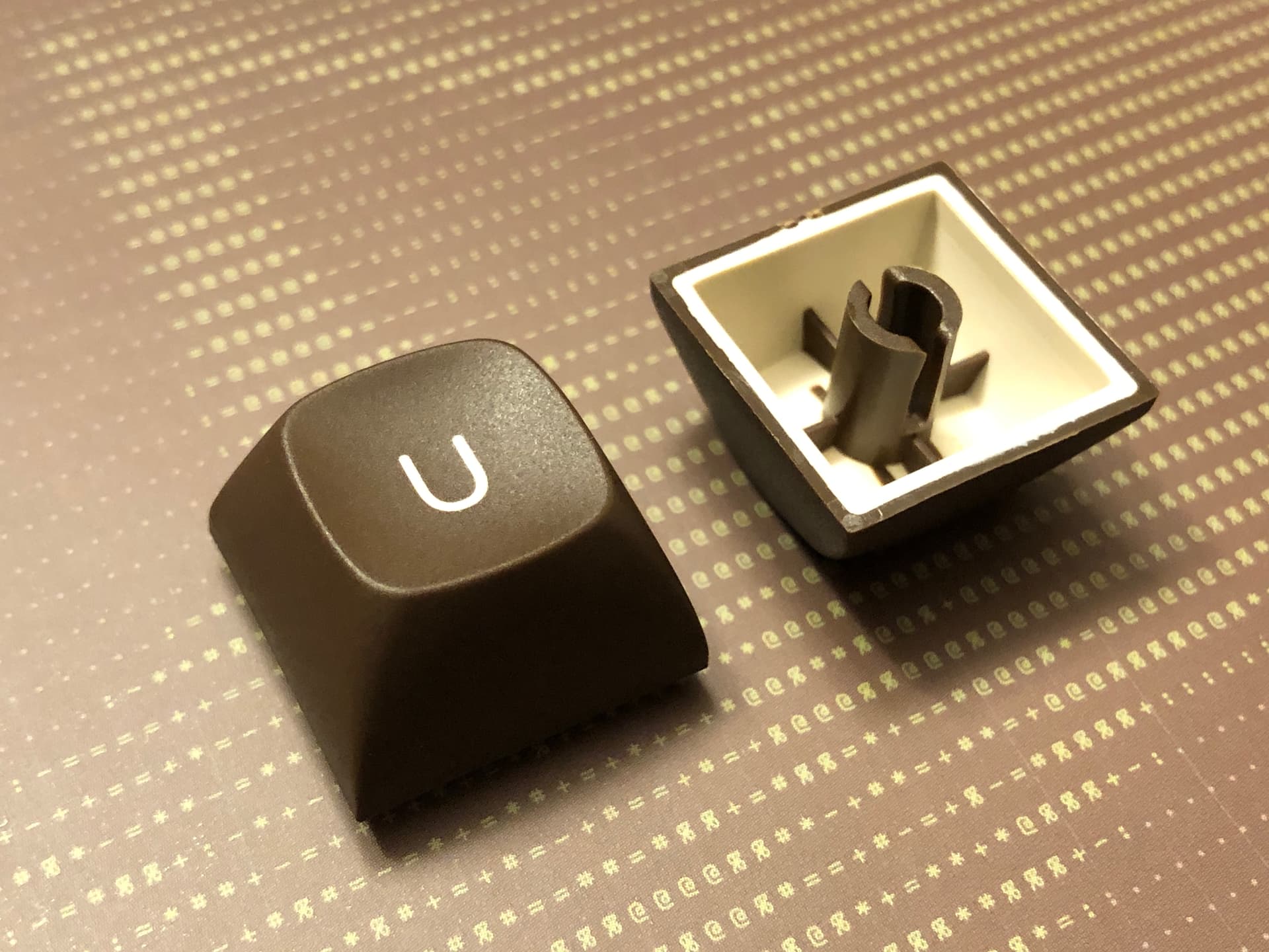
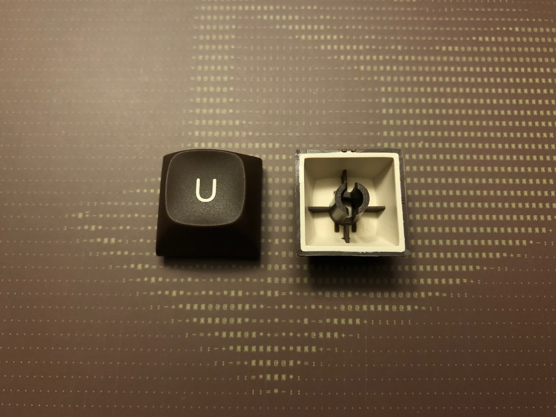
Texture: perfect
Sculpt: perfect
Fit on stems: perfect (very satisfying snap into place like OEM caps! With the exception of the metal artisan which is a bit tight yet beautiful)
Font choice, size, alignment: perfect
Color ![]()
I honestly wish this sculpt came in MX stems as well. Any plans on such?? Pretty please ![]()
Also, I need to sell of my KBDFans 2048 EC caps because they are absolute garbage compared to these.
12 Likes
The sculpt looks somewhere between MT3 and MTNU. How would you say it compares?
1 Like
I don’t have mtnu but do have several mt3 sets.
And the dish is much less deep than mt3, I’d say between mt3 and sa.
So it still hug your fingers but it is much more acceptable (to me).
The fact that is much lower profile than mt3 makes, to me, URSA very enjoyable to use overall.
I personally highly recommend to test it ![]()
4 Likes
I would say that’s a decent comparison. I prefer the sculpt of Ursa to MT3 and MTNU both.
The dish on MT3 feels too scoopy sometimes.
The angles of the sculpted rows on MTNU feel too aggressive for me for. I have to hold my hands differently for it to feel natural
I have zero issues with Ursa. It feels very natural. Maybe it’s closer to the way SA feels but improved because it’s a deeper dish so that your fingers feel slightly more locked in.
I do own a hi pro set too. Hi Pro looks great but it’s quite awkward feeling overall.
6 Likes
I am soooo happy to read your post, and appreciate you finding time to try them out @pixelpusher Thank you ![]()
4 Likes
Thank you @Deadeye Really nice photos, I just wish you had a board to try them.
1 Like
Regarding the dish, I think the dish depth in comparison to MT3 is about the same. What makes it feel less deep is the larger area of the top surface. Giving your palms room for expansion, and not feel constrained by the side walls. As for MTNU, it is less deep, and only its homing dish is as deep as URSA.
I very happy to read you notice the row profile to be pleasant. Tweaking it took me the most iterations, as it was most important to me. I guess everything came out just right put together.
Thank you again for all your support.
Andreas
2 Likes
Yes, I like MT3, but I think it’s the narrow tops and the very specific angle it encourages that keeps me from loving it. A more disciplined typist might find MT3 is perfect, but your caps seem to occupy a similar aesthetic space while not being quite so specifically tuned to a certain technique. I don’t currently own a Topre board, but I like what I’m hearing about URSA. Thank you for being so engaged and committed to seeing your project come out well. Sounds like you have made a lot of people happy!
3 Likes
wow, super interesting mix of colorways! Love it ![]()
I need more URSA!
3 Likes
I was thinking the exact same thing. I love SAs but these appear more approachable. I also love that this page goes into design details. Transparency is very appreciated for people who design stuff. Just an awesome release all around.
I highly encourage you and FK to make this profile for MX.
5 Likes