Gekucap MOA black and purple keycap set review and pics

Yet another keycap review in case anyone is interested.

This my quick and amateur review of the Gekucap black and purple pbt moa keycap set.
I got it from amazon at:
https://www.amazon.com/dp/B0DN1DF9YZ

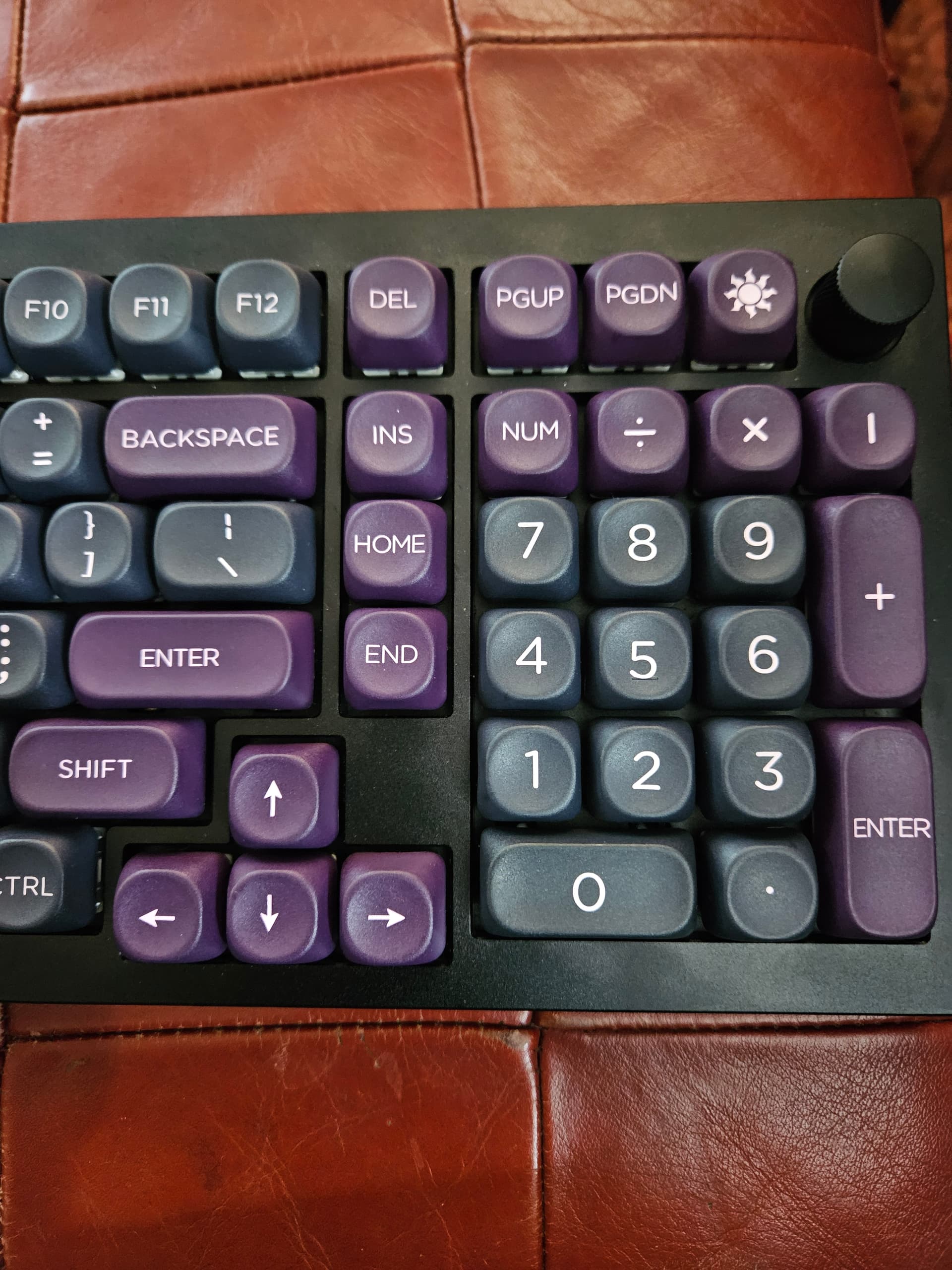
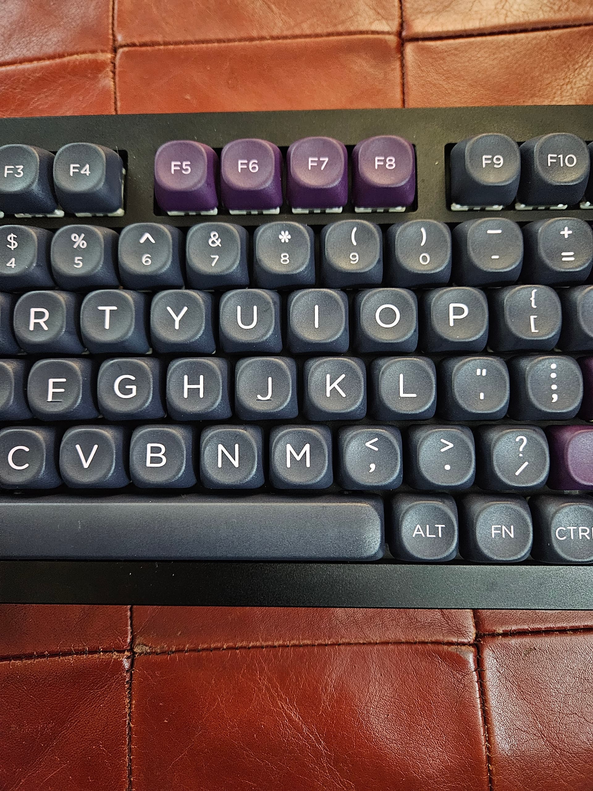
It’s MOA profile, so flat, not curved, and the keys have a more rounded top than usual square keys.

They’re actually pleasantly solid and have a deeper sound than the abs ones they’re immediately replacing.
The colors are solid and even,keys have a fair amount of texture, the letering is all well done and large.

Some pictures. Keep in mind that my camera is going to majorly up the contrast and hue as I’m just doing auto mode, not tuning anything. The colors are a gray and muted purple. Quite understated/calm.


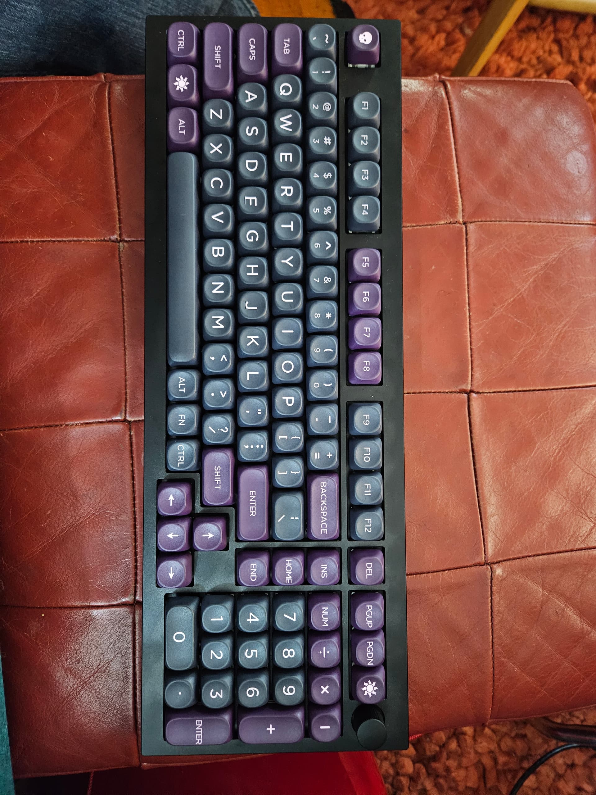
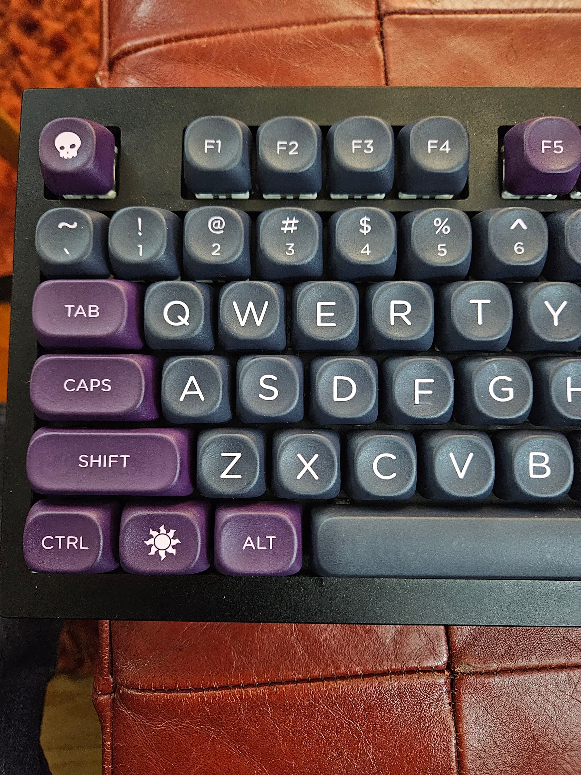
Personally, I really really like the colors and appearance of this keycap set. The bubbley shape isn’t Professional looking, really, but the cap set doesn’t look like it should be on a 13yr old’s desk, like many keycaps. I’m still undecided on the round tops, seems my typing isn’t quite as solid on the key as with a square-r capset, and I seem to be hitting neighboring keys a slight bit more. I had to correct my letters a couple of times just in this paragraph. Of course, I may well have done the same with a square-r keycap set, not sure, but I don’t Feel as solid on the rounder keys. It’s not a large difference though and may just require some acclimation, which I intend to give it. Lastly, the MOA profile curve (or complete lack thereof). I really don’t know about that yet, in short. I definitely feel the difference, but as I tend to type in short bursts unless I’m writing something like this or some of my work, my writing tends to be more thought/research, then a paragraph or two, then back to thought or research. Not sure how much I Need the curve. There’s definitely a different feel, I’m just not sure if it’s better or worse or just plain different.

What else to say? Oh, the capset did include the sun and the skull, as well as maybe a half dozen other…non-character keycaps. Whether I keep this capset on or not, These keys alone are worth the price to me, as being equal-height caps, I can use them in any row, this makes these handy for remapped keys for del/insert/home/end/pgup/pgdn.

Oh, and yes I’ve noticed I put the numpad - on wrong. Oops, fixed. Lol aaand the " was swapped with : fixed too…

4 Likes

My wife’s Keychron has MOA caps. I haven’t found a set where the look and kitting worked with what I needed in the moment, but if I do I won’t hesitate to get some. With more sedate legends like this set, they’re not a world apart from other uniform spherical profiles, and the thick PBT is not messin’ around.

They sound nice and feel nice, and apart from the benefit of flexible placement, I also think uniform profiles work great on low angle boards, which describes most of mine, with a couple of them being zero degree.

I reckon I’ll eventually get an MA set, and I don’t think any of my XDA are the slightly newer v2 (aka “ZDA”), which I understand are tweaked just ever so slightly to help keep your fingertips on the right key. I generally think XDA has become underrated, as the designs are usually cloned from GMK or SP sets, which means many people reject them out of hand, but also that no one wants to pay Drop full price for the last few sets. I’m hoping PBS and KAM will spark a renaissance in unsculpted sets, at least enough that some of them go on clearance, LOL.

1 Like

I really like the solidity of these, as well as the colorway. SO many capsets have a few weird colored keys. My nuphy halo96v2 is black and gray but then a bright yellow spacebar, red enter and teal esc/numpad enter/ WHY?

Seems most capsets are even worse, a mishmash of colors. I don’t want to be thinking about my keyboard when I’m typing, this mismash of colors is ugly to me, and distracting.

1 Like

For easy searching, “WOB” and “BOW” are often used for the white legends on black keycaps, and black legends on white keycaps. Even MOA, which started with almost exclusively very “kawaii” sets can now be had with even more staid designs than yours, though the only BOW set I found still makes you use a novelty Enter key, or else one that’s color-inverted and has the wrong font. The spacebar is also black.

We do love our pretty colors, though. :slight_smile: I’m currently typing this on my GE Medical Model M, which is mostly gray, but with all the unusual legends and sublegends for the medical device it was originally used for. F12 is red (and called “Emerg Save”), and the numpad is 75% yellow with not a single “accurate” legend at all. And that’s one of my vintage boards, LOL, although it is the most exotic looking of those.