[IC] GMK Bushidō

コンニチハ!

Introducing GMK Bushidō .

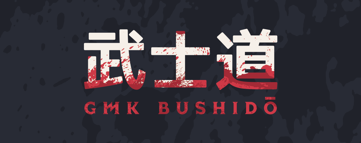
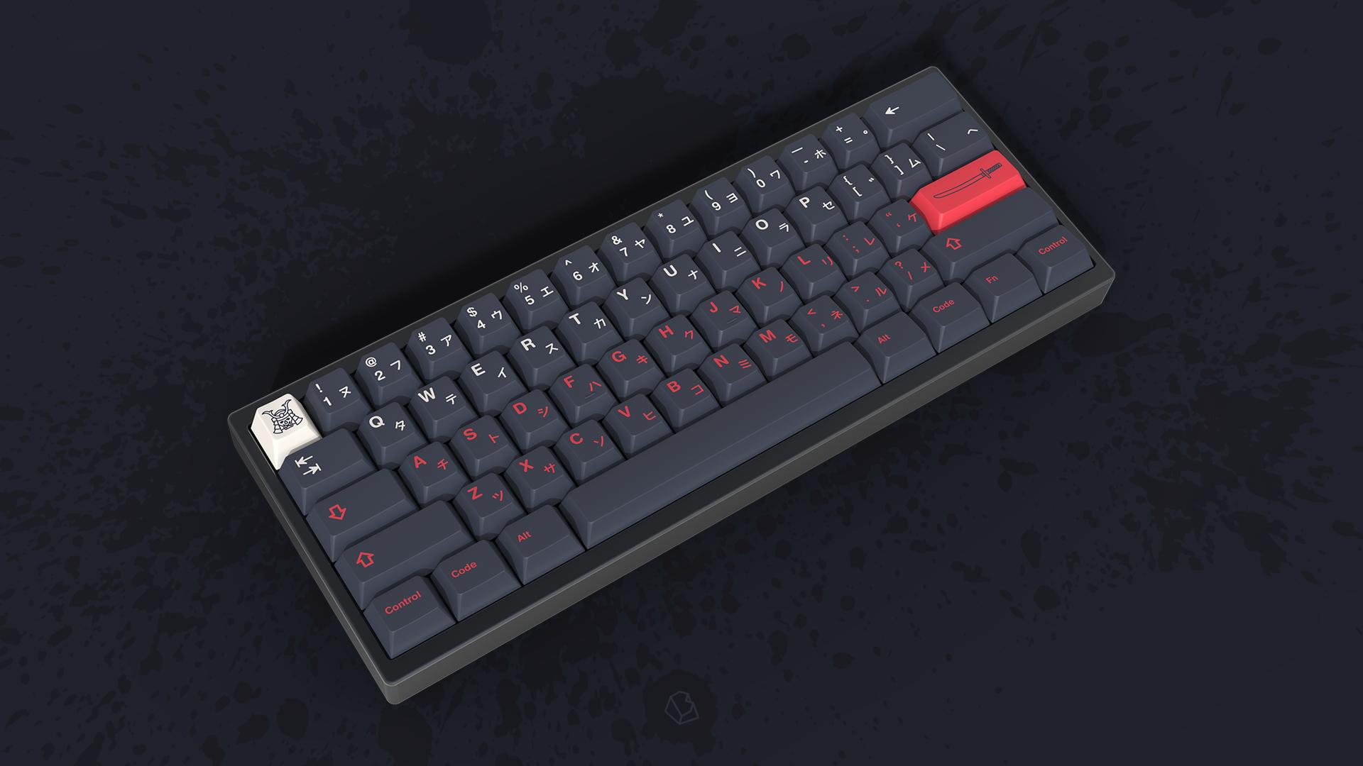
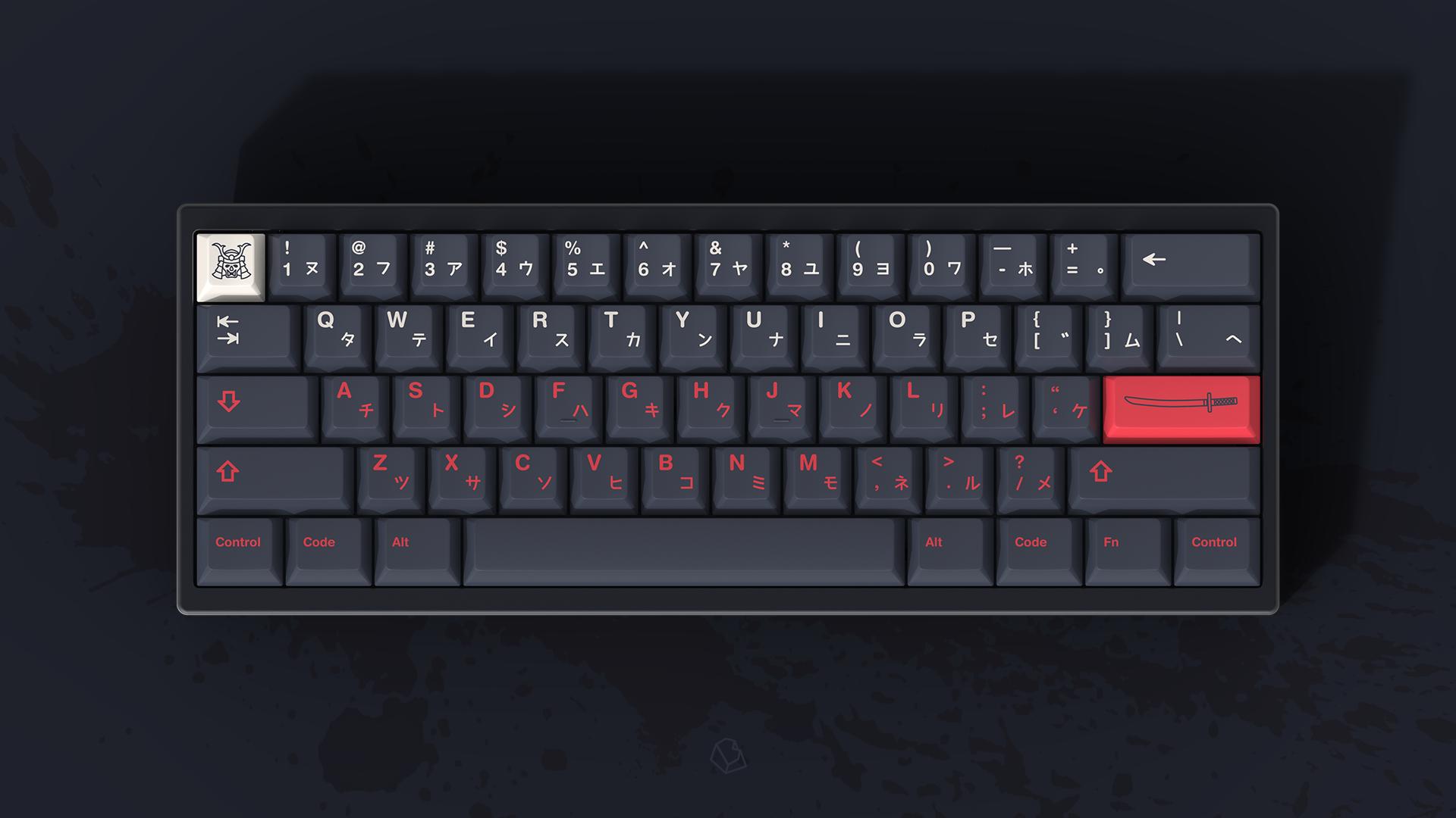
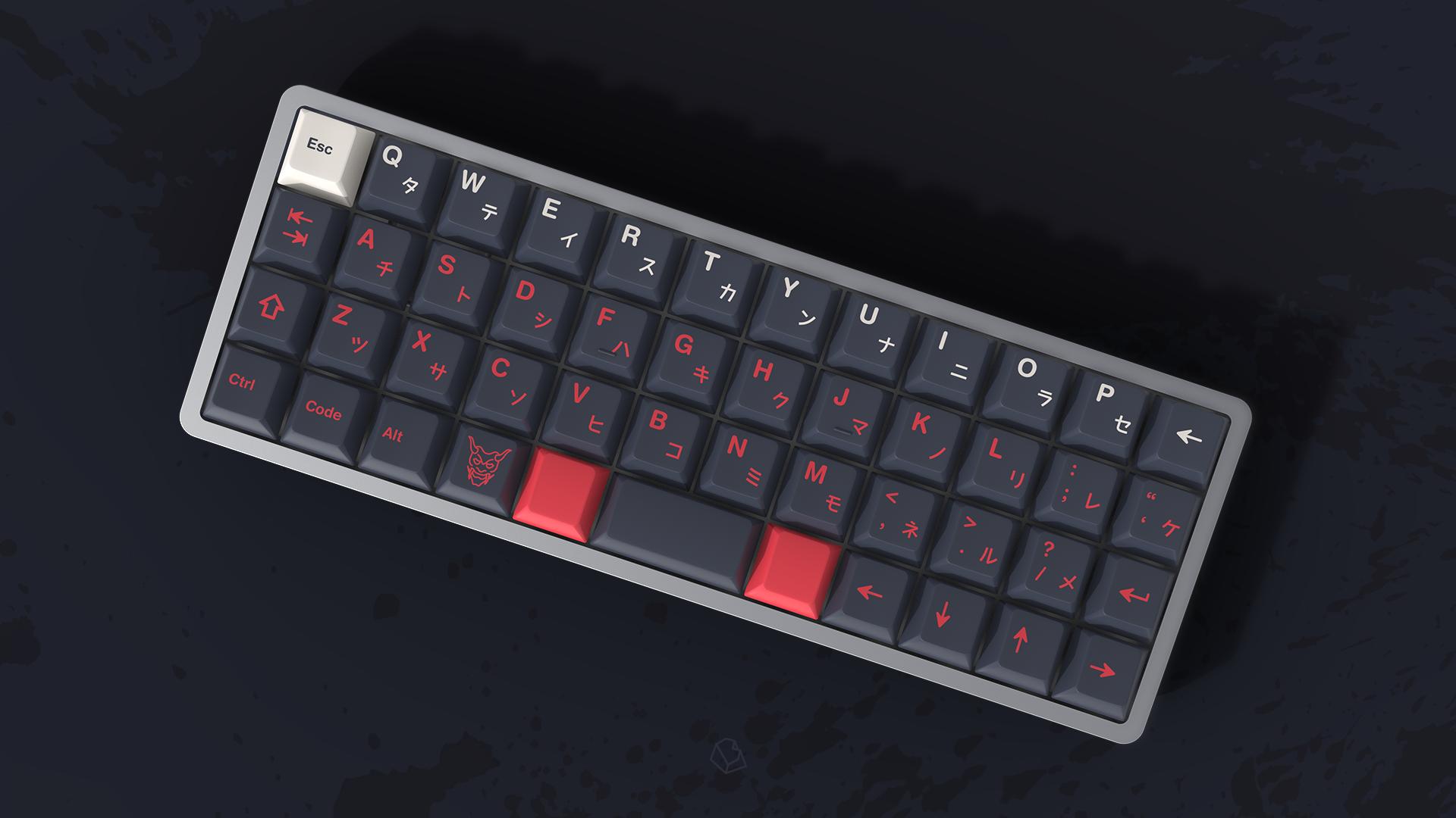
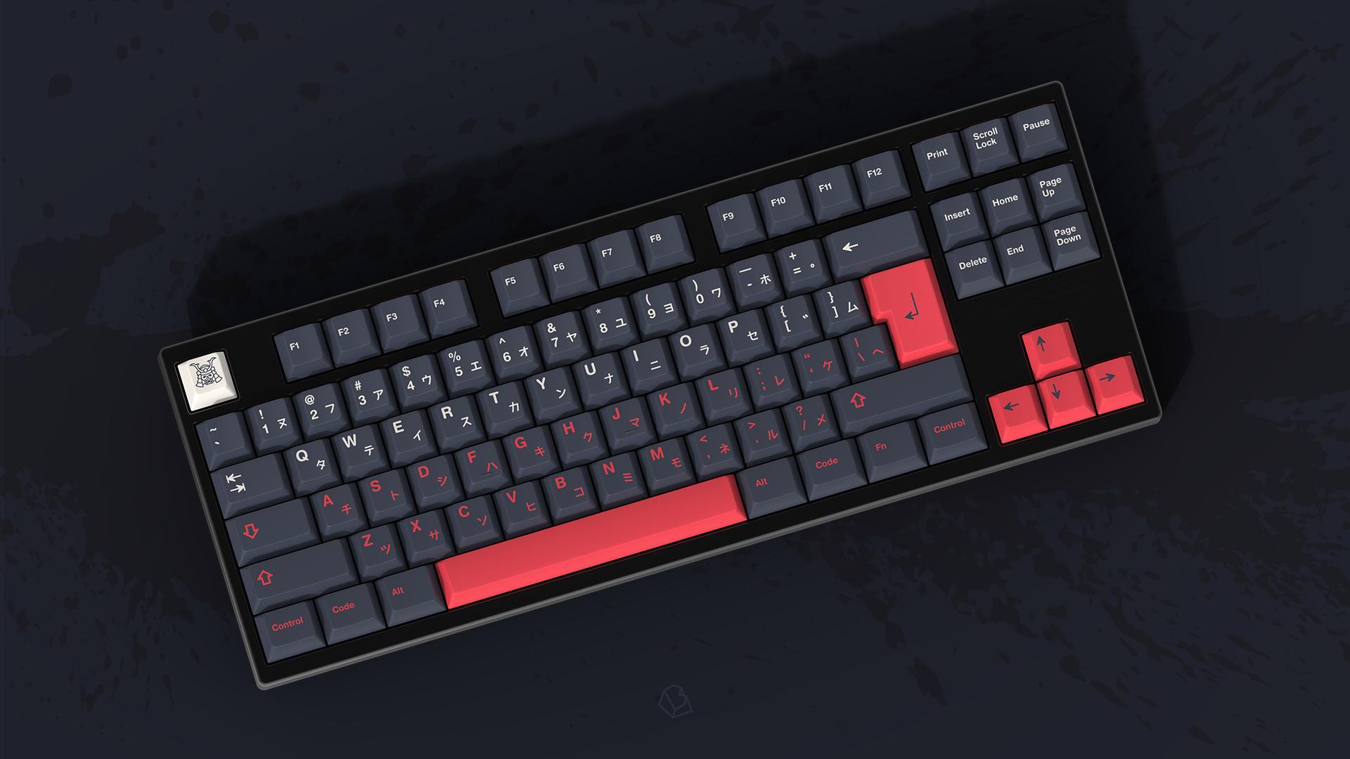
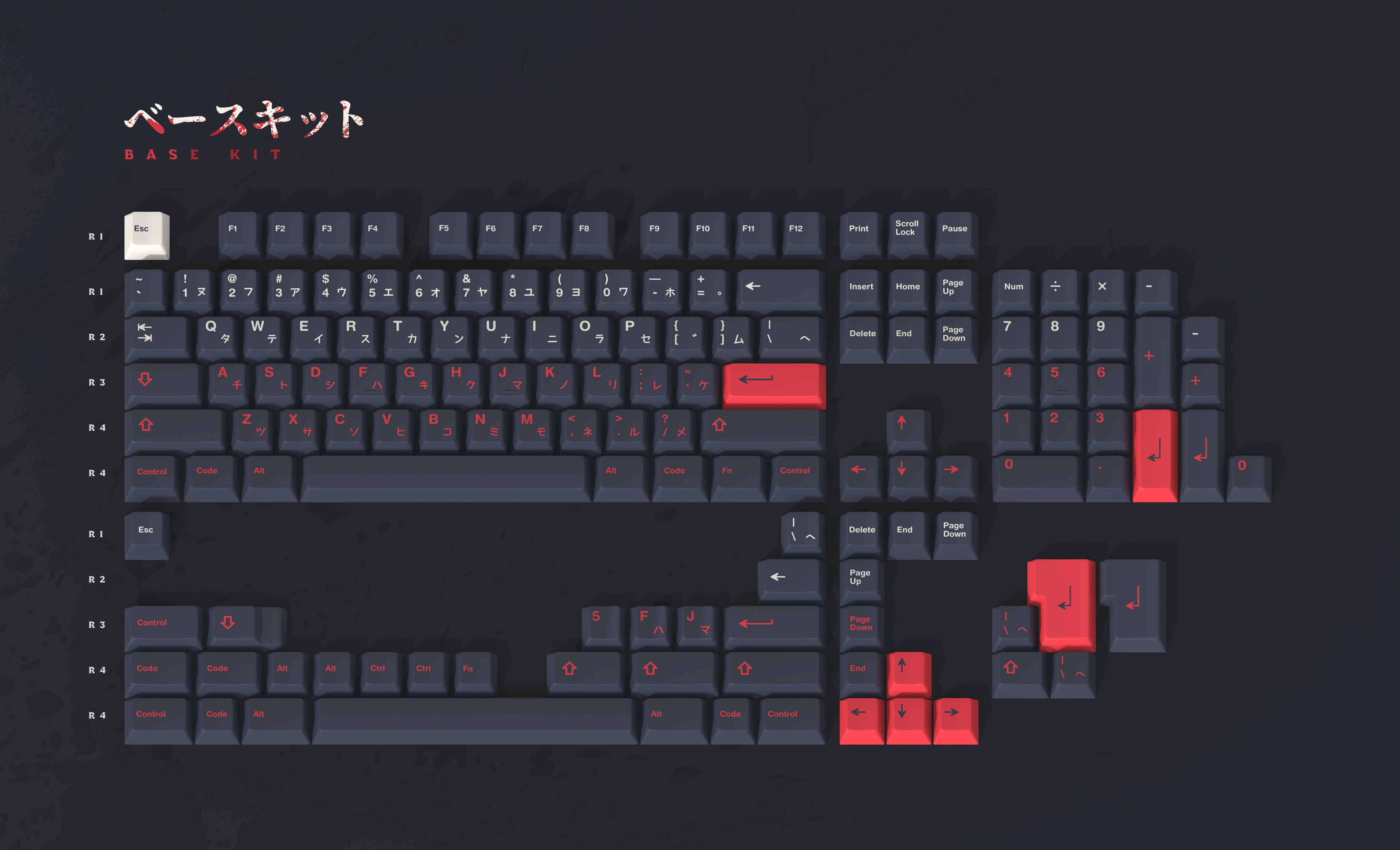
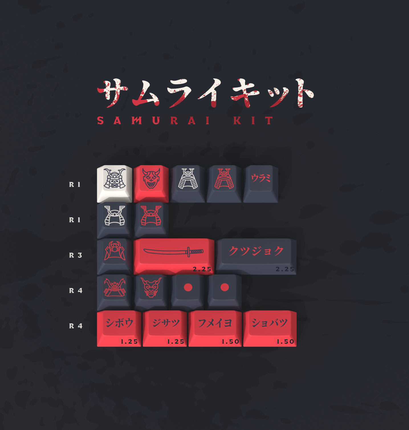
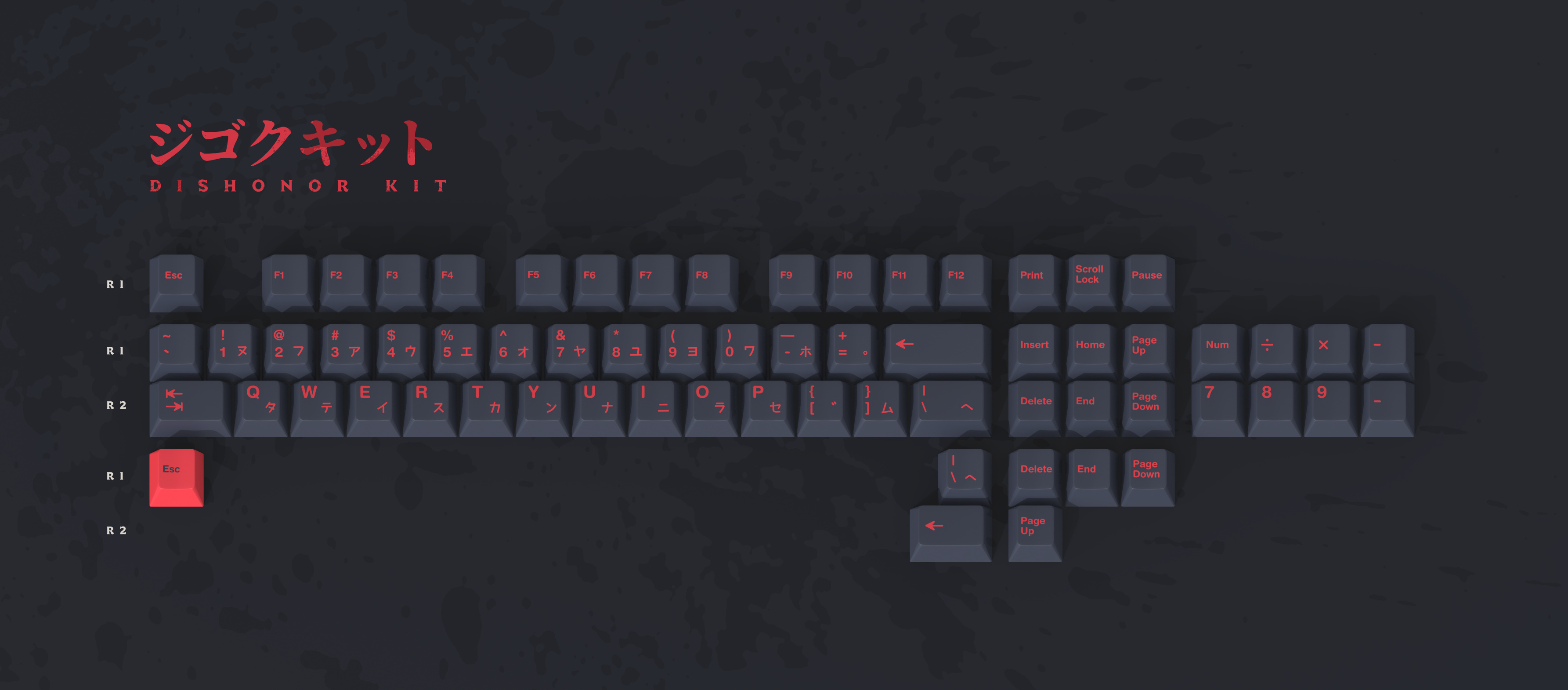
I wanted to realize a dark themed keyset for a while, around Samurai and Japanese history.
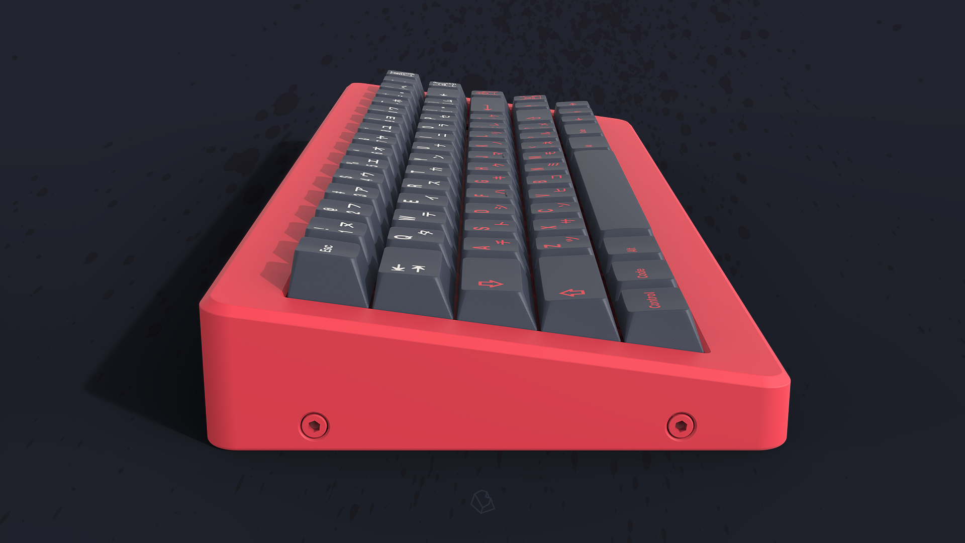
I went for a cold and a light gray in order to get a strong but subtle color contrast.
The vivid red is definitely the most important color here.
All the colors come from the RAL book.

Group Buy infos

When?
Q1 2020

Where?
Novelkeys, Candykeys, Zfrontier, Dailyclack.

Legends

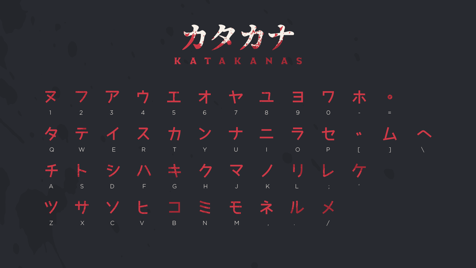
You might have noticed, these alphas currently does not exist… I decided to offer new Japanese sub-legends (instead of Hiraganas): Katakanas.
Those are definitely more sharpened and “aggressive” than Hiraganas, slicing the alphas like the Wakizashi!

Renders

Made by the one and only Oblotzky.


Keycult No.1/65


Keycult No.1/65


Rama M60-A


Rama M60-A


Rama M60-A


TGR Alice


TGR Alice


TGR x Singa Unikorn


TGR x Singa Unikorn


Rama M65-A


Rama M65-A


Bullet


Bullet


TGR Jane-2


TGR Jane-2

Kits

ベースキット Base kit

サムライキット Samurai kit
aka novelties kit

ジゴクキット Dishonor kit
An add-on kit to go full bushido!

ノマドキット Nomad kit
Extension kit for small keyboards

スペースキーキット Spacebars kit


Feel free to let me know what do you think in the comments.

サヨウナラ!

3 Likes

Are these gonna be reverse dye-sub, or is GMK gonna be making new molds for these? Either way: lookin good!

1 Like

Double shot!

Thanks :slight_smile:

ah, biip i have been waiting for this.

1 Like

To be honest, I don’t think the font being used for Katakana matches the Latin font very well.

I have to disagree. Katakanas are more geometrical than Hiraganas, so IMO they fit better :thinking:

1 Like

I said it on GH, but I’ll say it here too. I’m totally in for this one! :sunglasses:

1 Like

No I’m not talking about Hiragana vs Katakana. I’m talking about the specific Katakana font being used here. It’s like whether Helvetica matches Calibri, not whether Latin letters match Greek latters.

How… edgy.

2 Likes

Exactly, the corners have to be rounded to match the Latin font.

In addition: centered icons = bad. I like the looks and kit breakdown, however.

I plan to make the corners of the katakanas a bit rounded tho :slight_smile: Actually they’re on the renders!

Now I can recognize that the corners are indeed a little rounded in the kit renders. But, in my opinion, this is not enough. The stroke has to end in a semicircle just like it does for the Latin characters. I get that you want it to look aggressive, but for me the different font styles just look out of place.
Also, when the new molds are created, please make sure that the original Cherry legends are used for the Latin/symbols part. Don’t make the same errors that happened with the Hiragana molds for GMK Laser, where they just used Helvetica Rounded.

Set renamed.

1 Like

That’s a nice set, love the color ! Why not an ISO Be set, just for me ? :smile:

I think the new name is a great choice and the set is beautiful!

1 Like

Maybe an unpopular opinion, but… yet another Japanese keyset?

4 Likes