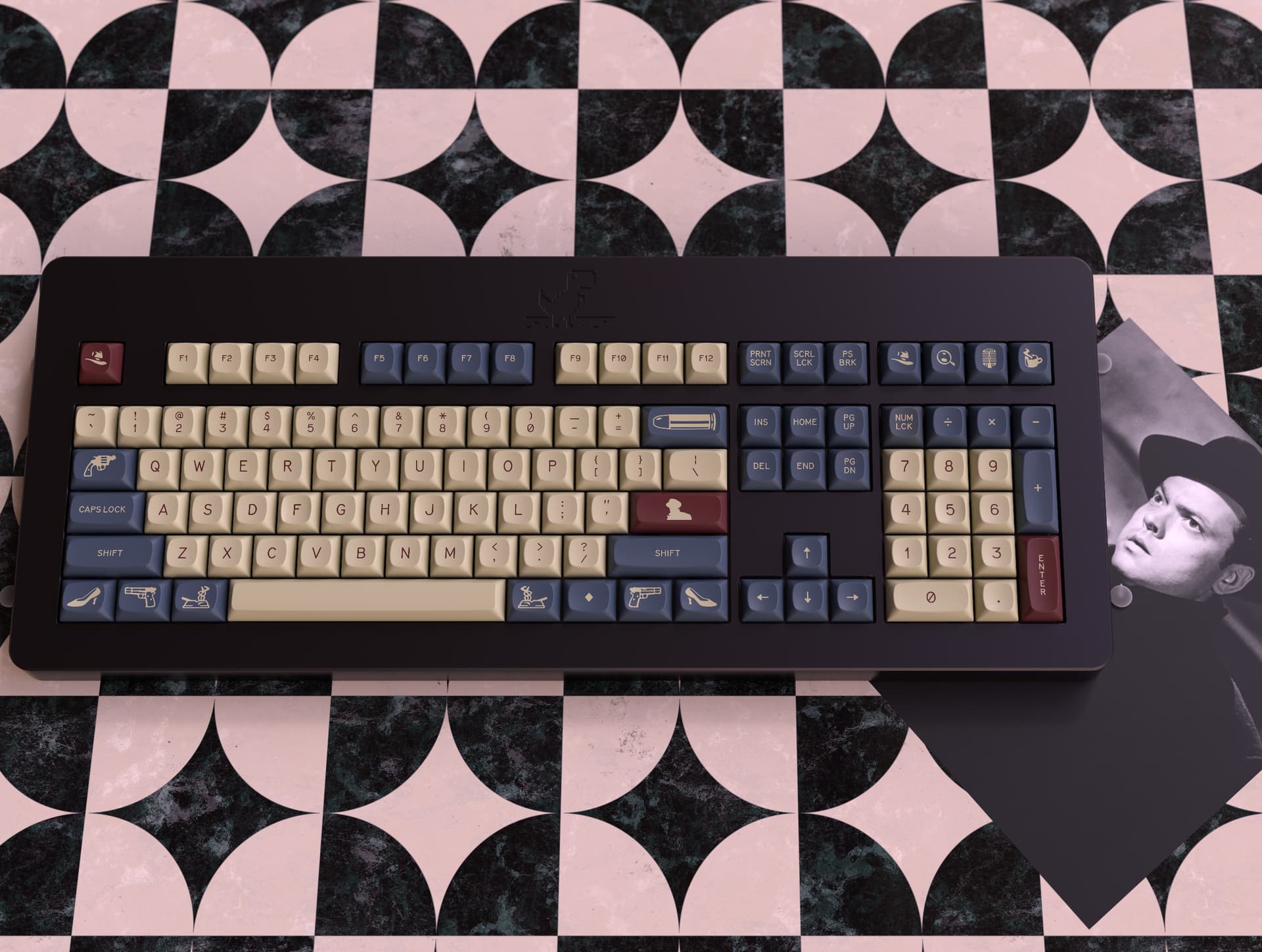
GMK MTNU Welles
This set is designed to evoke the mid-century aesthetic of film noir.
Interest Check Form
Designer Discord
Designer Instagram
Details
- Designed by Madmax13
- Novelty Design by Switchbox.studio
- Manufactured by GMK using PBT
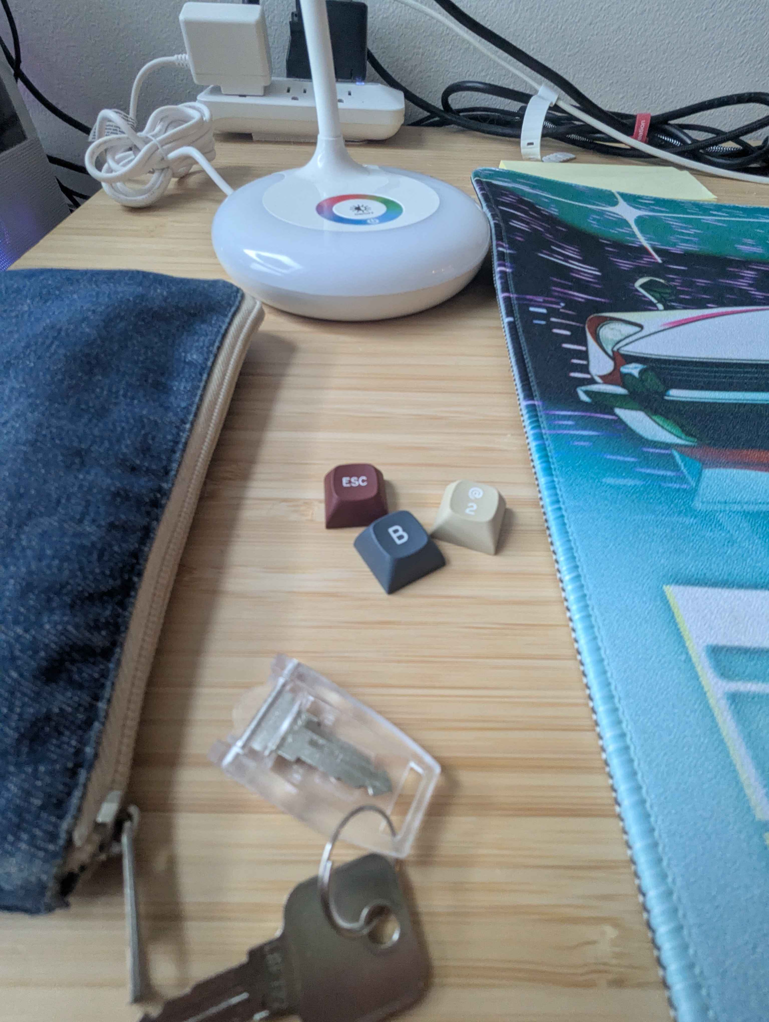
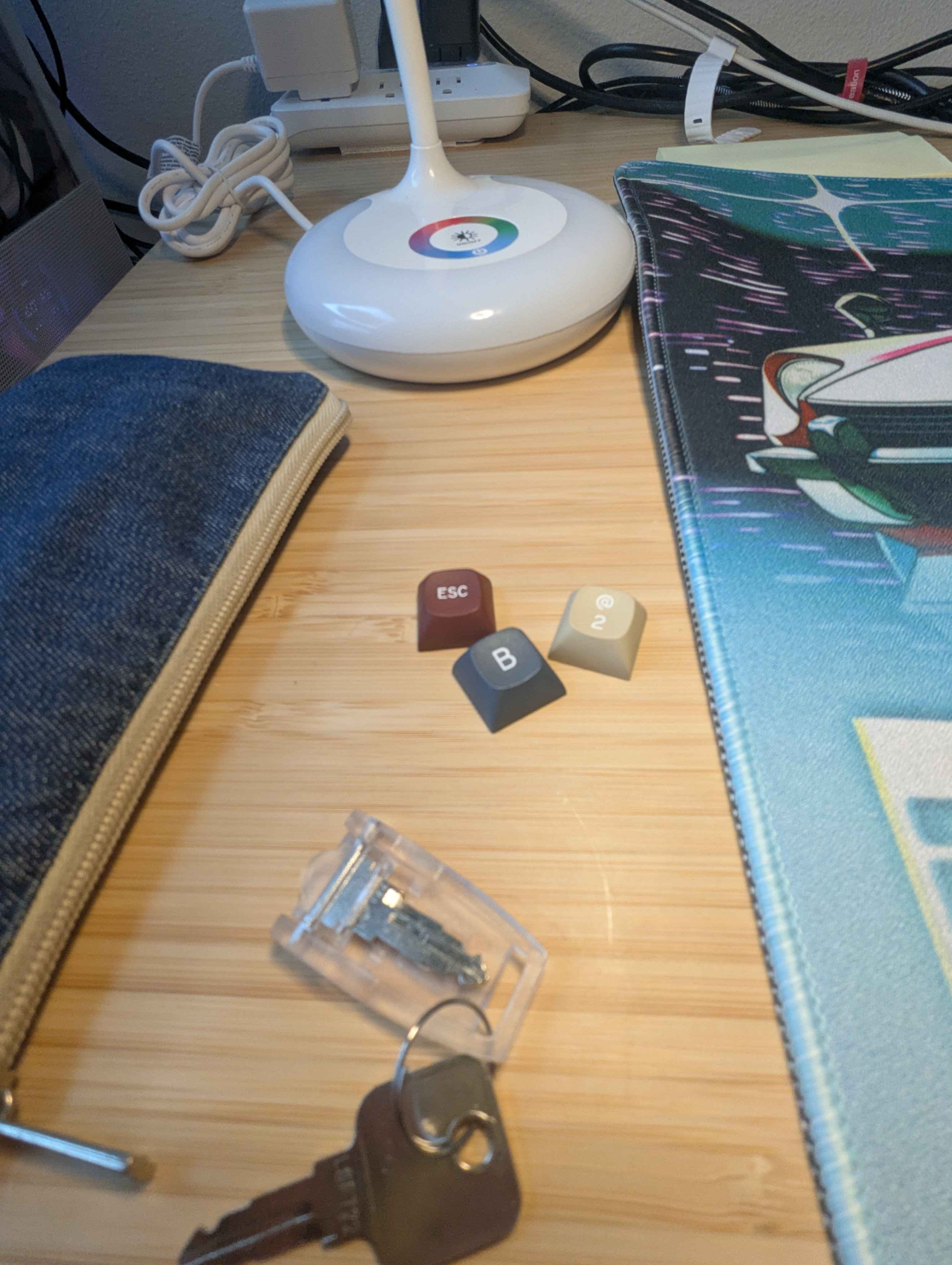
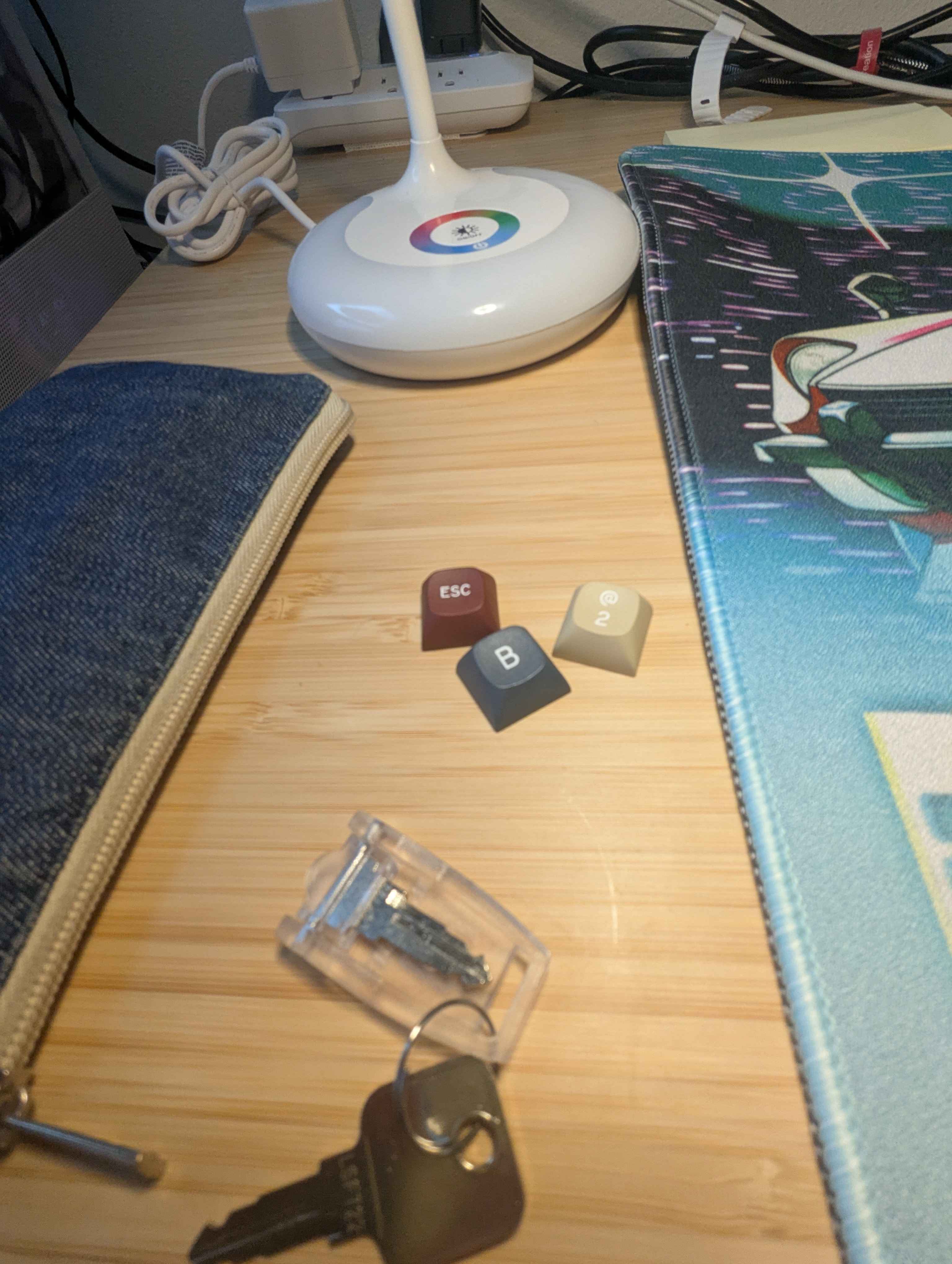
- Using SP stock color chips, sent to GMK for color matching
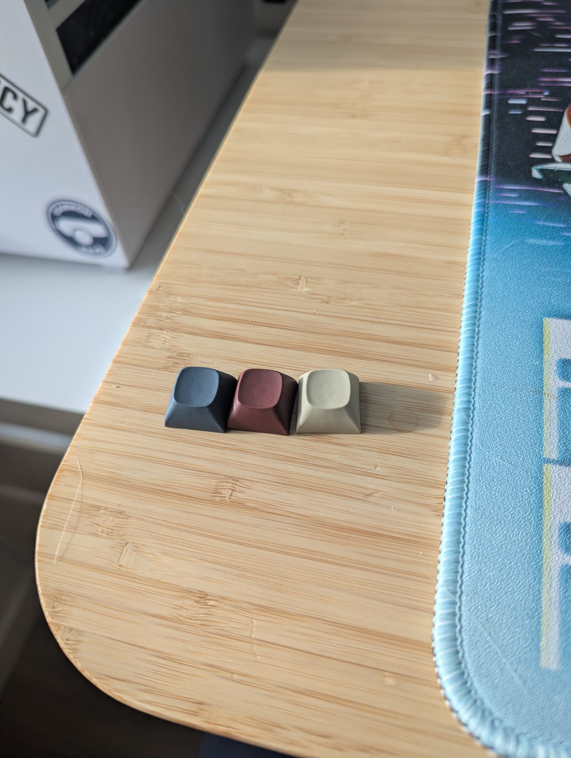
UPDATE: Received updated color samples. I have also updated the kitting diagrams and renders to reflect the color change. The Tan and Grey were spot on, but the red was darker and desaturated compared to the previous renders- the new kitting diagrams and renders reflect this. The sample photos are listed below.
Vendors
Canada- Unikeys
Inspiration
The scene opens in shadow. A cigarette smolders in an ashtray. A typewriter clacks once, then goes silent. This… this all begins with a man. Mr. Orson Welles. You’ve seen him—up there on the screen—casting long shadows as the villain in Touch of Evil . But he wasn’t just a figure in the frame. He helped shape the very language of the genre, both behind the camera and in front of it. A craftsman of mood. A dealer in chiaroscuro.
Now, this set—once dressed in the lofty curves of SA—finds itself reborn in GMK MTNU. The lower profile… the comfort… it’s a sleeker silhouette for a darker tale. But the soul remains: the legend placement, that bold SA signature—it stays. It had to stay. It speaks more honestly to the theme. To the story we’re telling.
Why these colors?
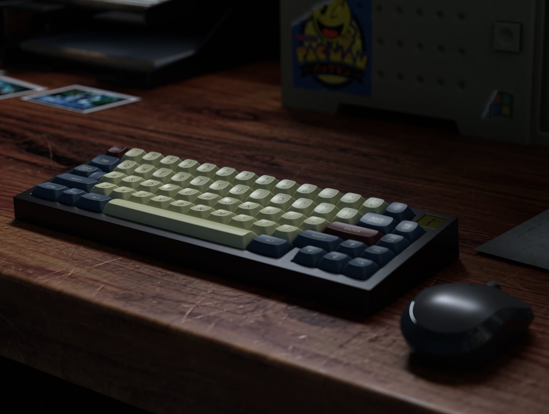
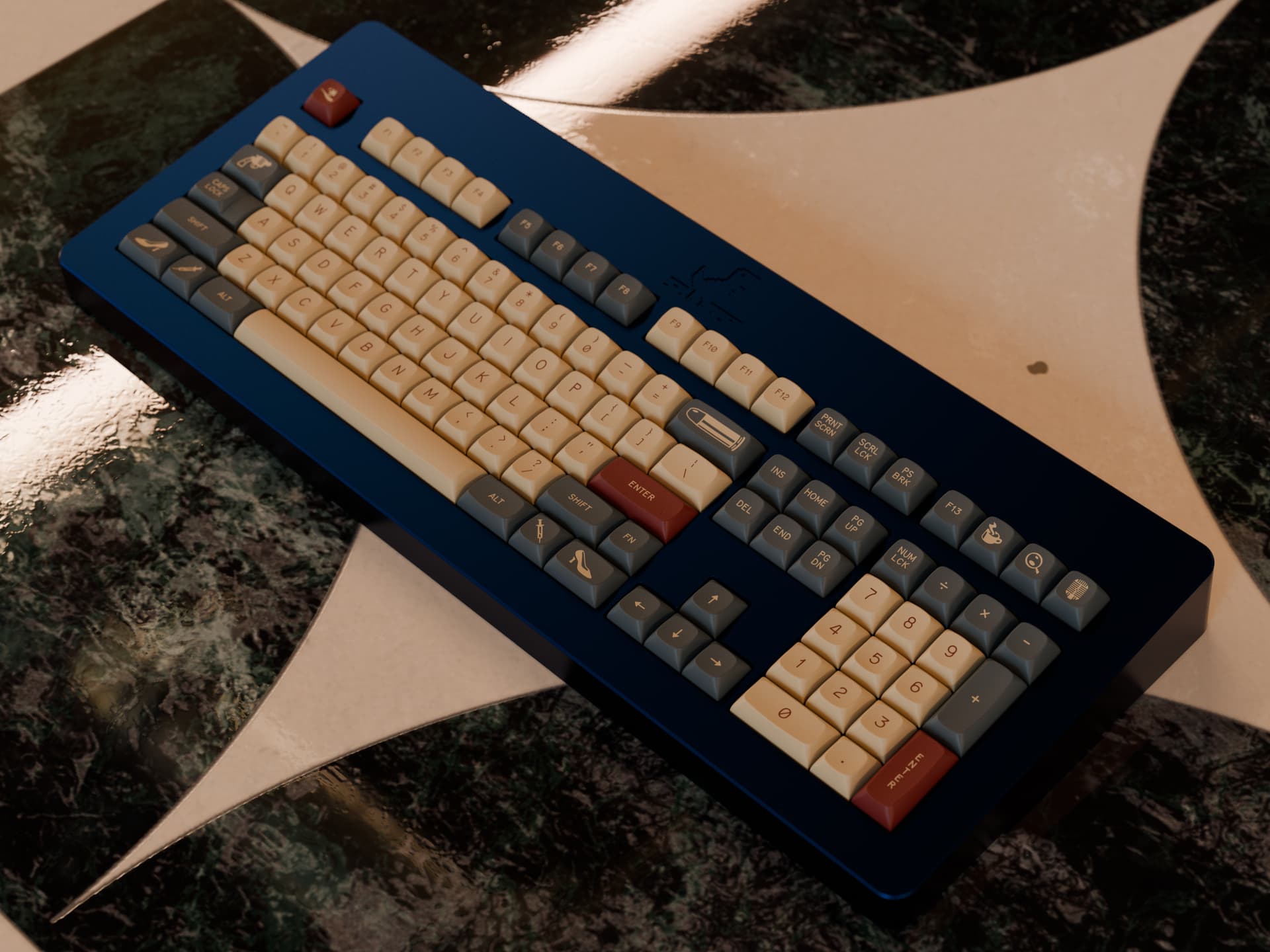
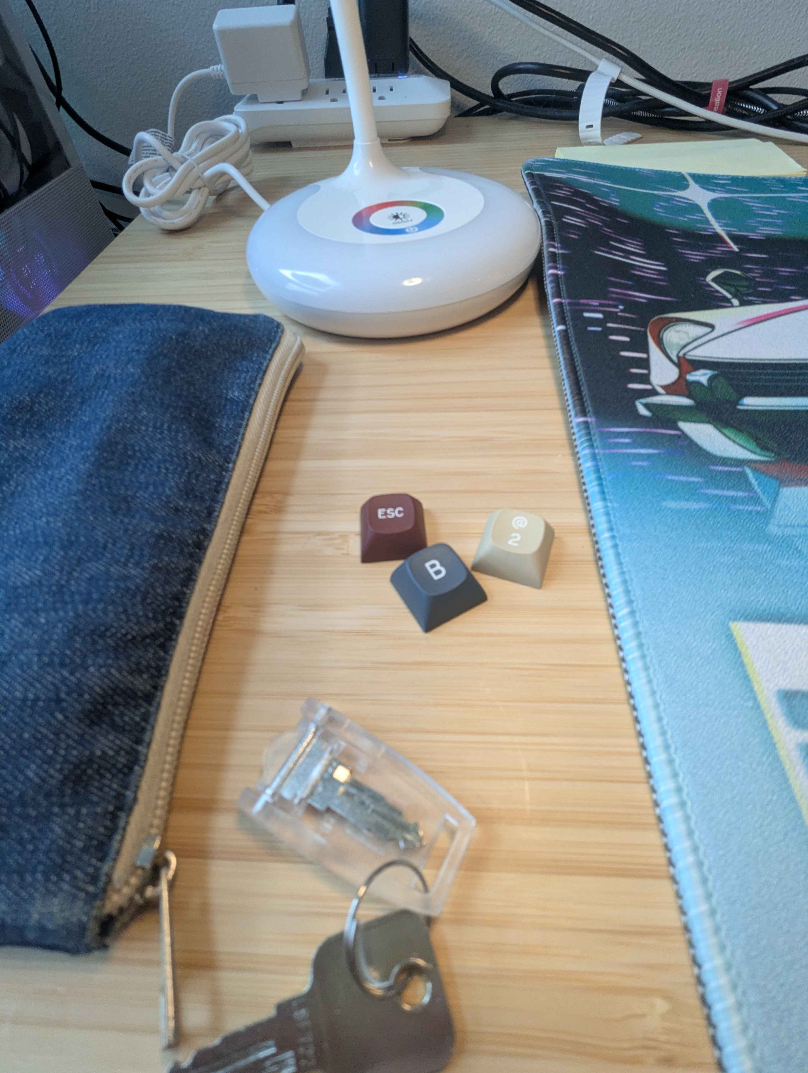
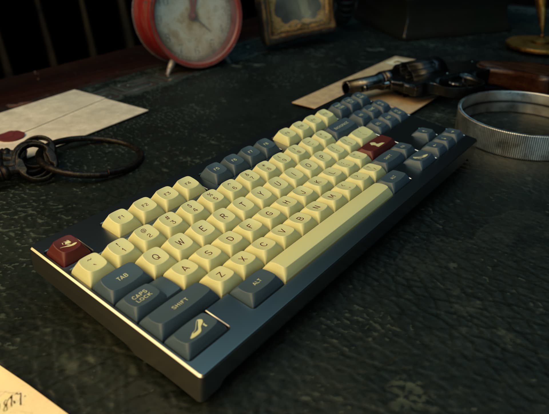
Let me show you. The alphas—tan. Not glamorous, no. But neither is the world of noir. These are the hues of old plastics, relics of another time. Phones that only ever rang with bad news. Radios whispering secrets through the static. A palette pulled from memory, from age, from truth.
The mods—grey, but cold. Blue-leaning. Like smoke curling under a streetlamp. Like the tint that haunts old black and white reels when the night stretches a little too long.
And the accents—ah, the accents. A red so deep it’s nearly blood. Not crimson. No, this is the red of pulp. Of danger. Of lipstick on a glass left behind. It’s the splash of passion and violence that marks every cover of a dime-store novel… every poster that promised sin in shadows.
So when you press these keys, know you’re not just typing.
You’re telling a story.
Kitting
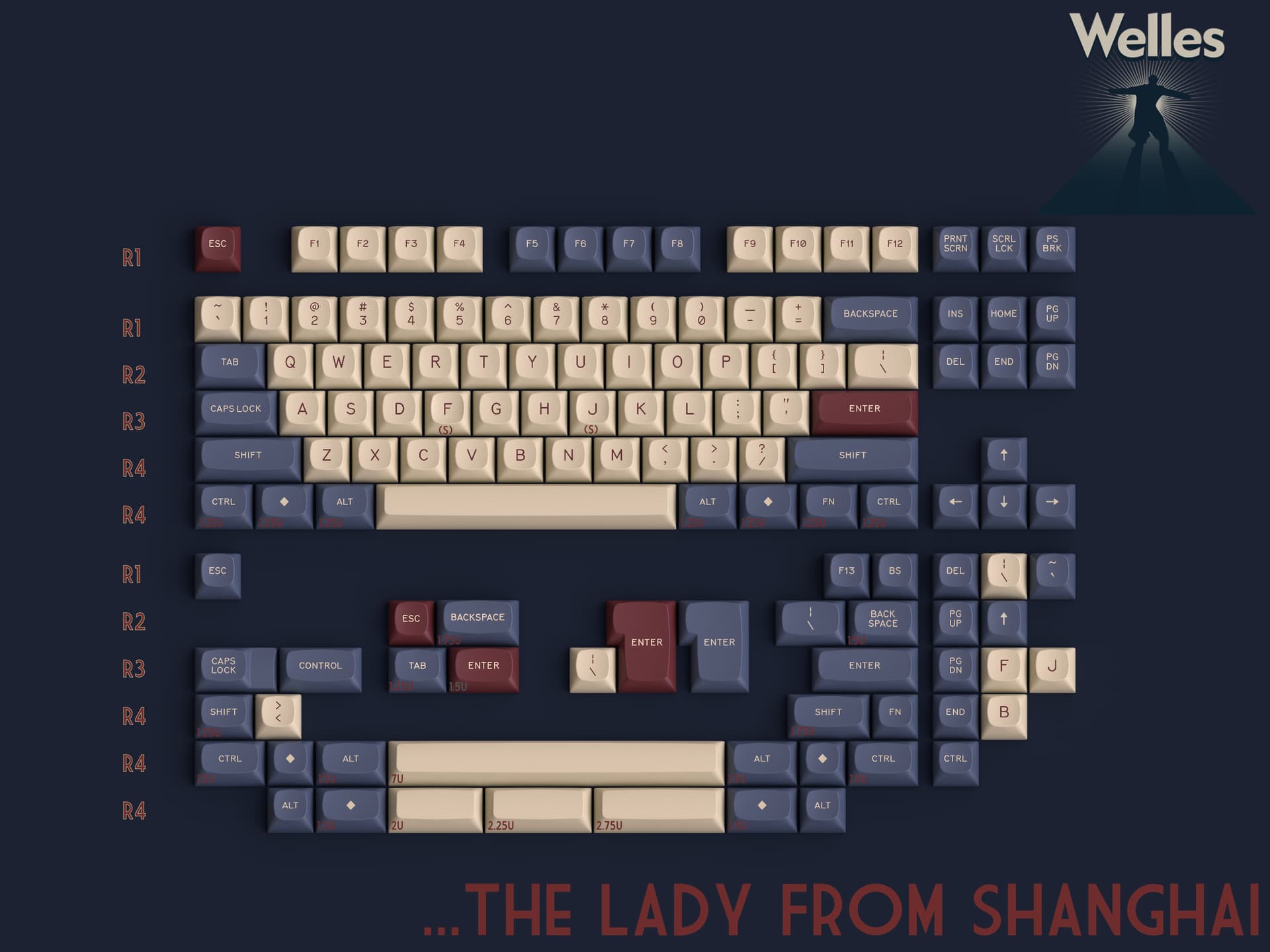
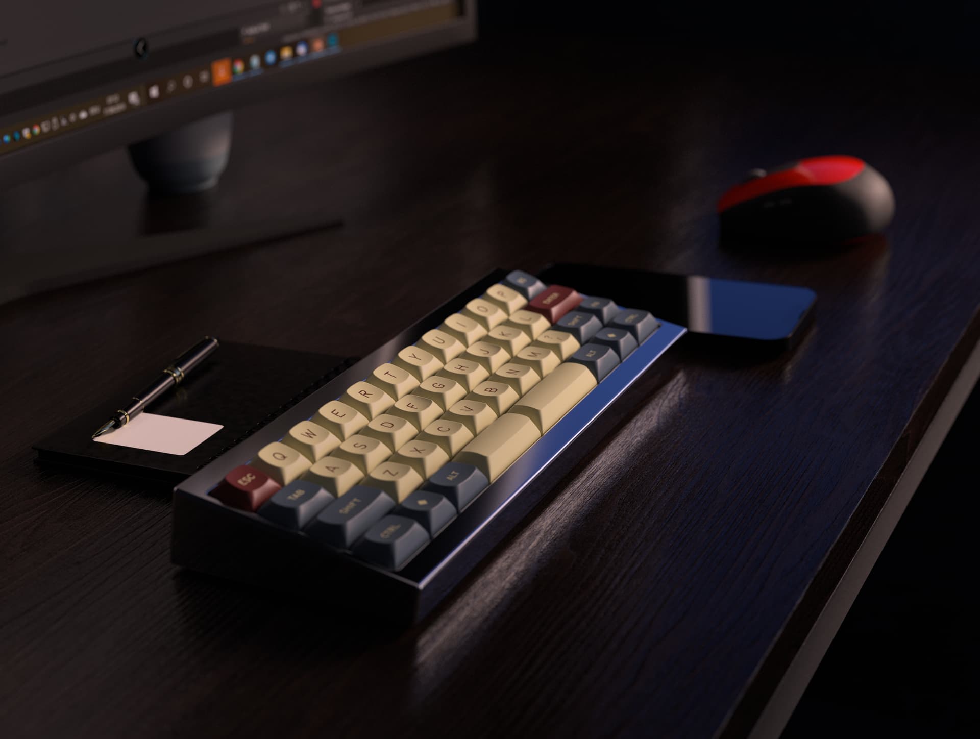
…The Lady From Shanghai- Base Kit
Named after the 1947 Welles project starring Rita Hayworth, this set is designed to accommodate most popular keyboards between 60 percent and full size. It also features limited ergo and minivan support. Slimmed down from previous iterations to make the set more accessible. Everything taken out of here is in the new extension set.
…Chase A crooked Shadow- NorDeUK Kit
Northern European ISO compatibility kit, named after the 1959 British Noir Film.

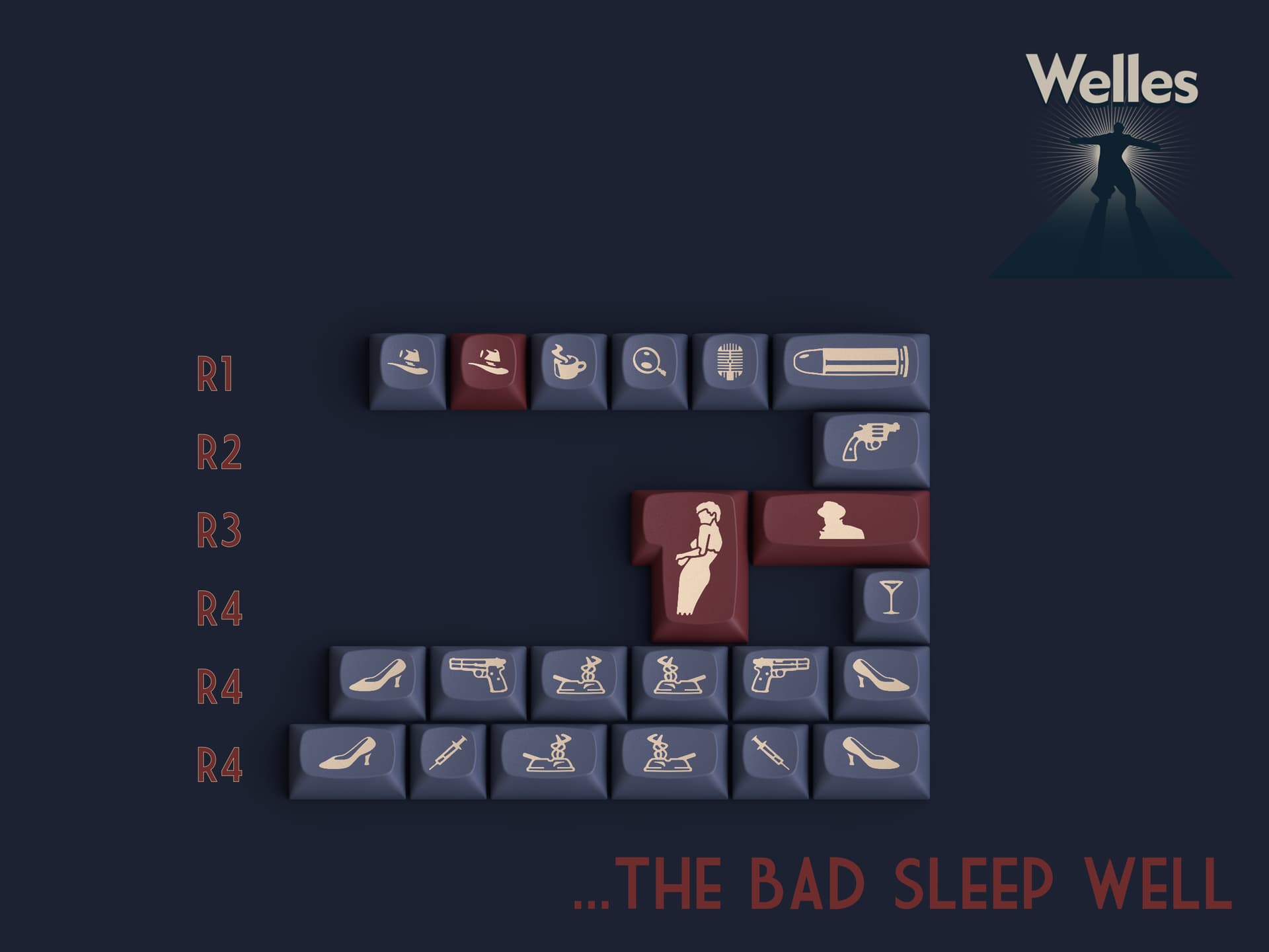
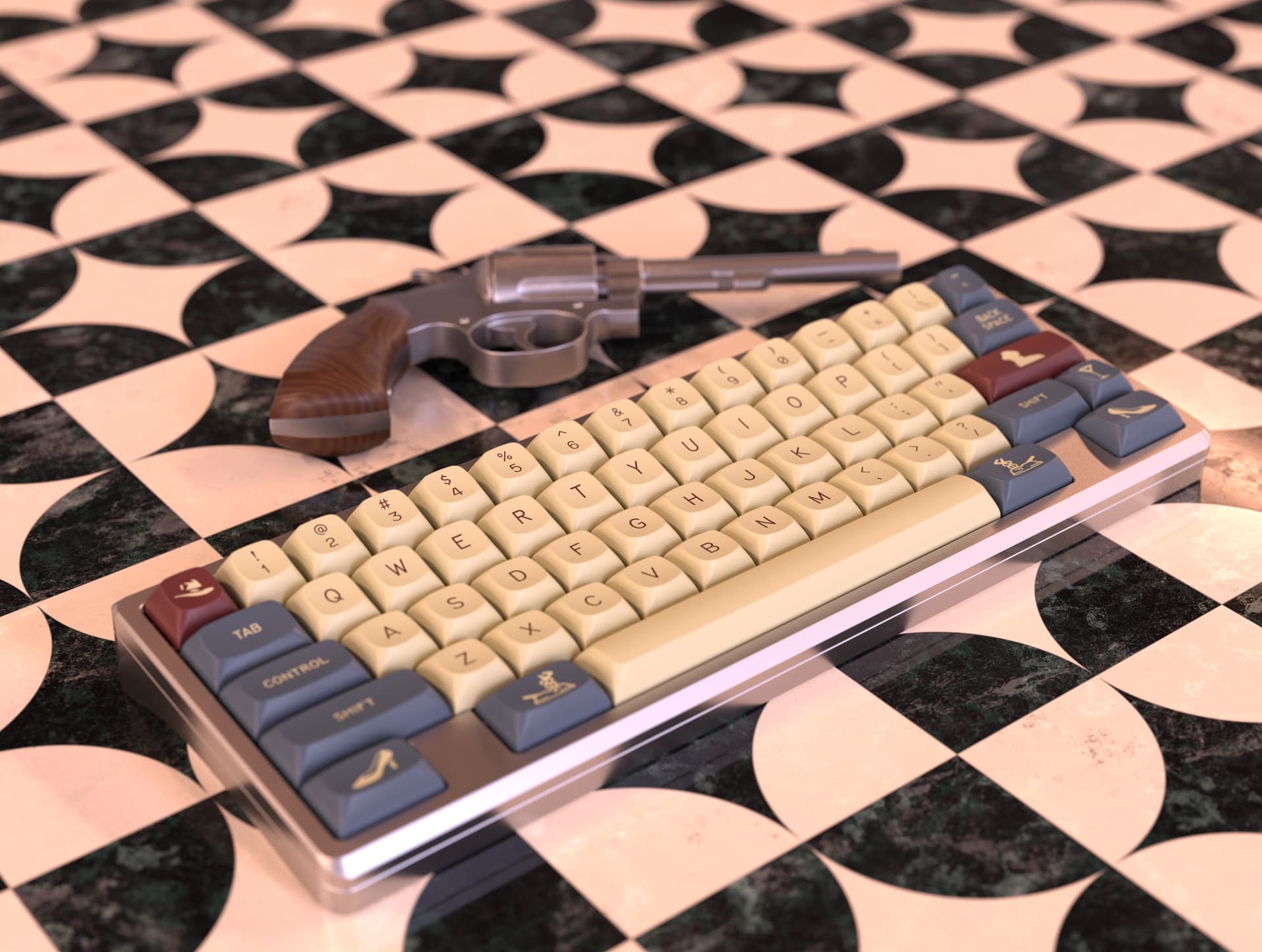
…The Bad Sleep Well- Novelty Kit
Noir-inspired imagery is named after the 1960 film Noir, directed by Akira Kurosawa.
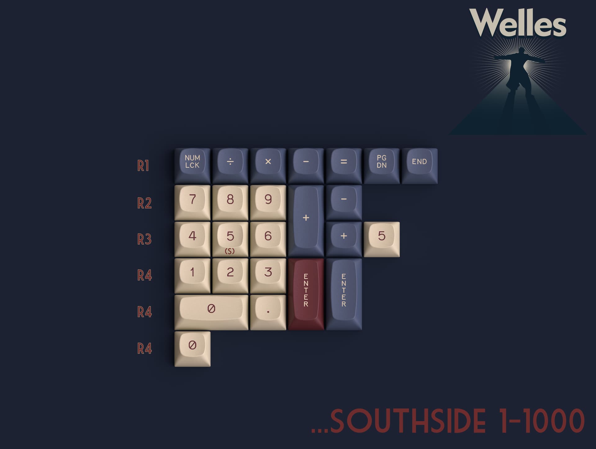
…Southside 1-1000- Numpad Kit
Number pad kit, with additional modifiers for 1800 support, named after the 1950 Noir.
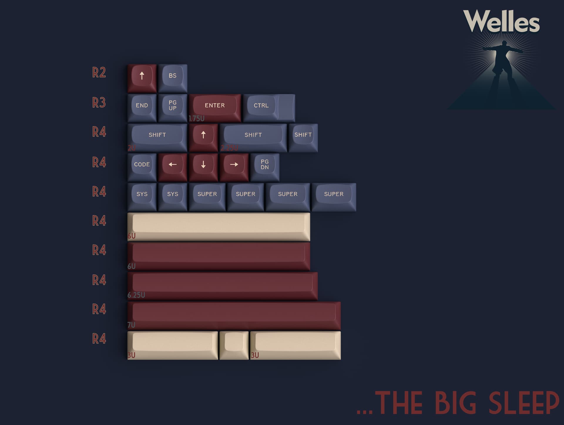
…The Big Sleep- Extension Kit
Extension kit, featuring accent bars, “good to haves,” 6u HHKB support, text supers for those who can’t stand a single symbol, and 12u 40s support.
Renders
Renders were intentionally created under varying lighting conditions because most colors are highly dependent on the type of light they receive. I will also list the kits beyond the base to dupe the look.
F1-40 by Geon Works
(With Extension Kit)
Frog Mini by Geon Works
(With Novelty Kit)
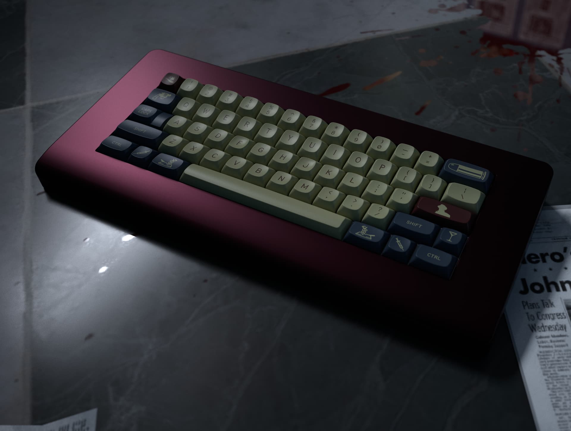
Piggy by Jackie Works
(With Novelty Kit)
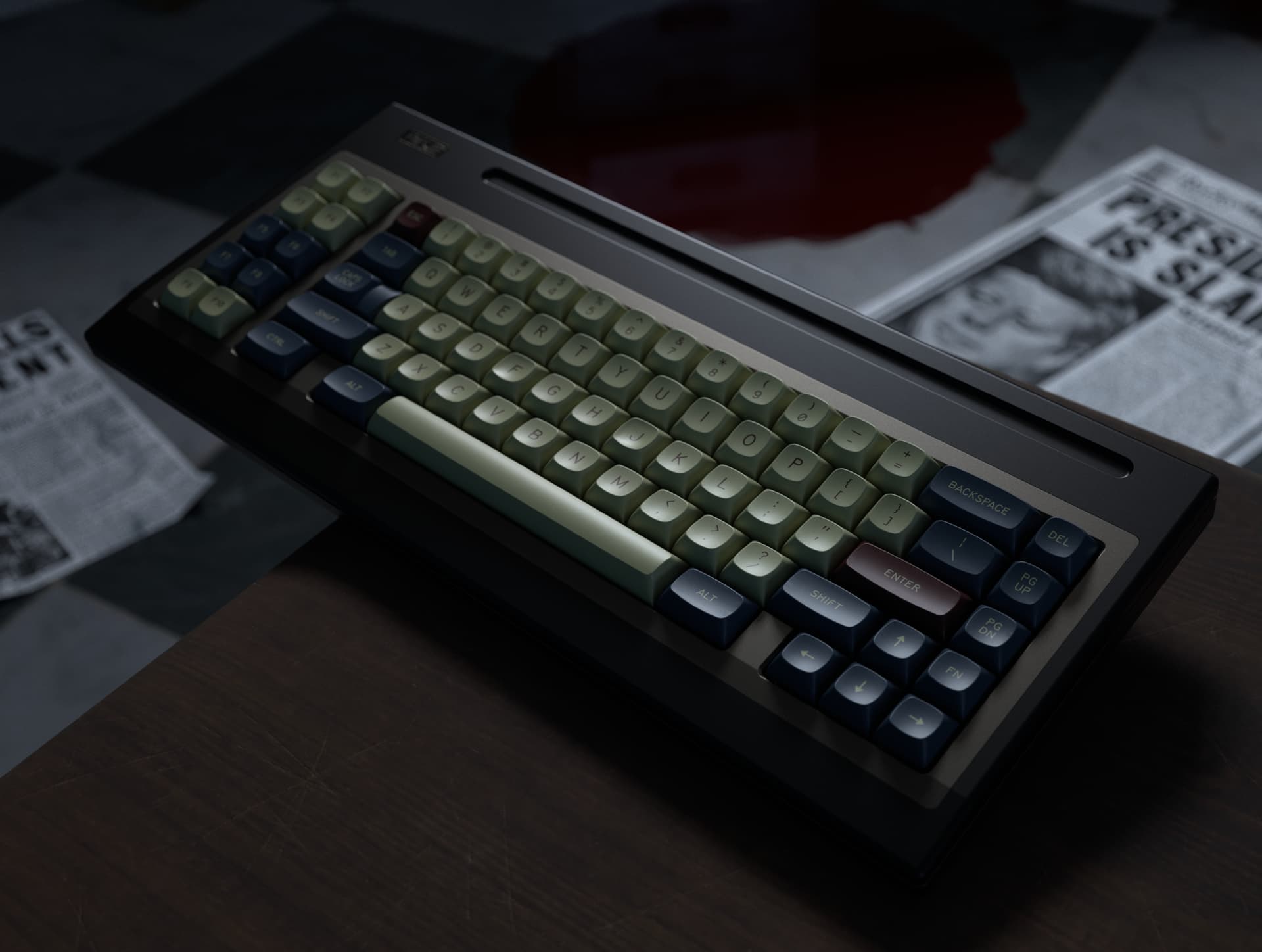
OGR2 by Alchemist Keyboards

Werk One by Werk Technica
Ingot by Relapse
(With Novelty Kit)