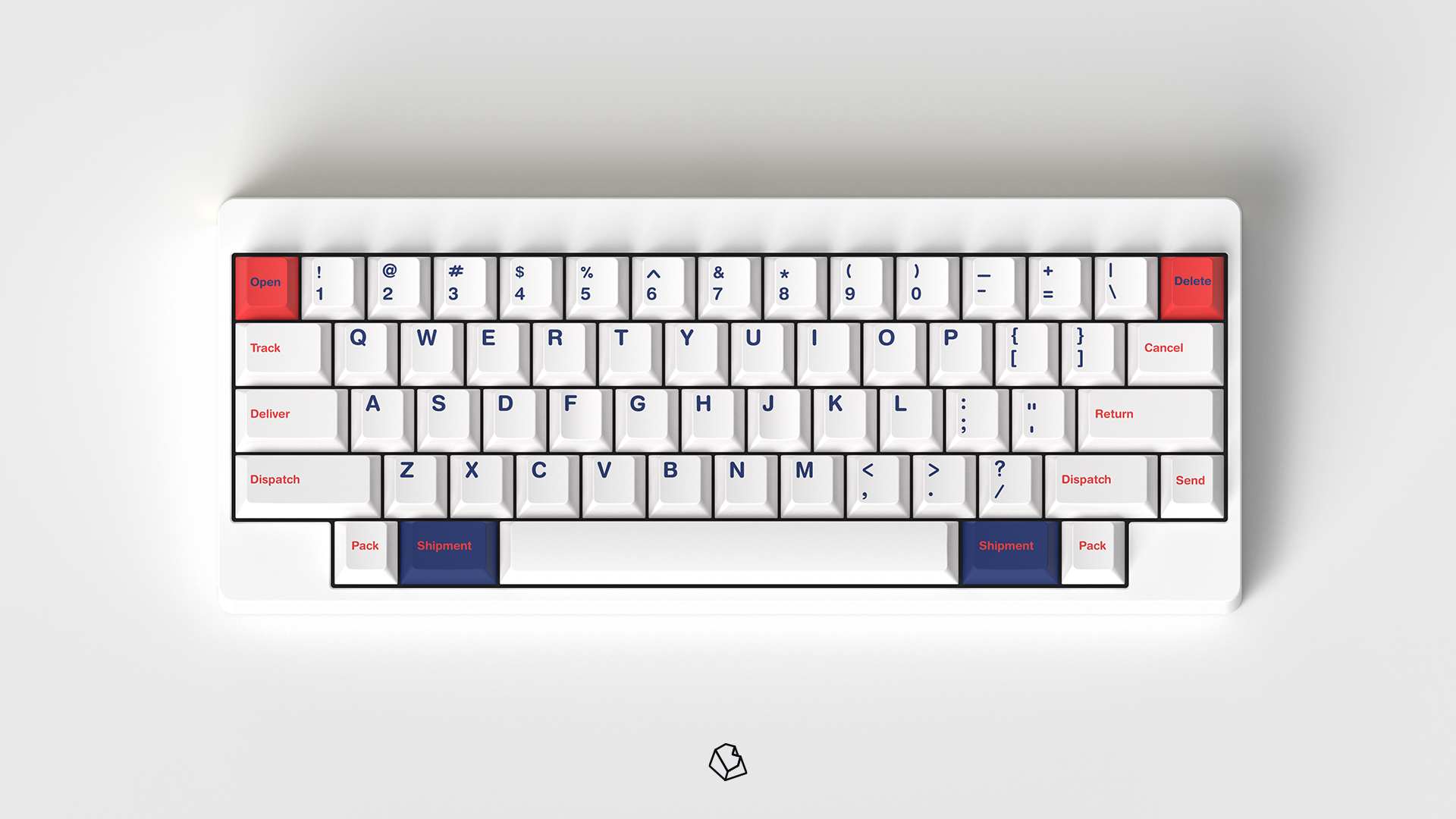
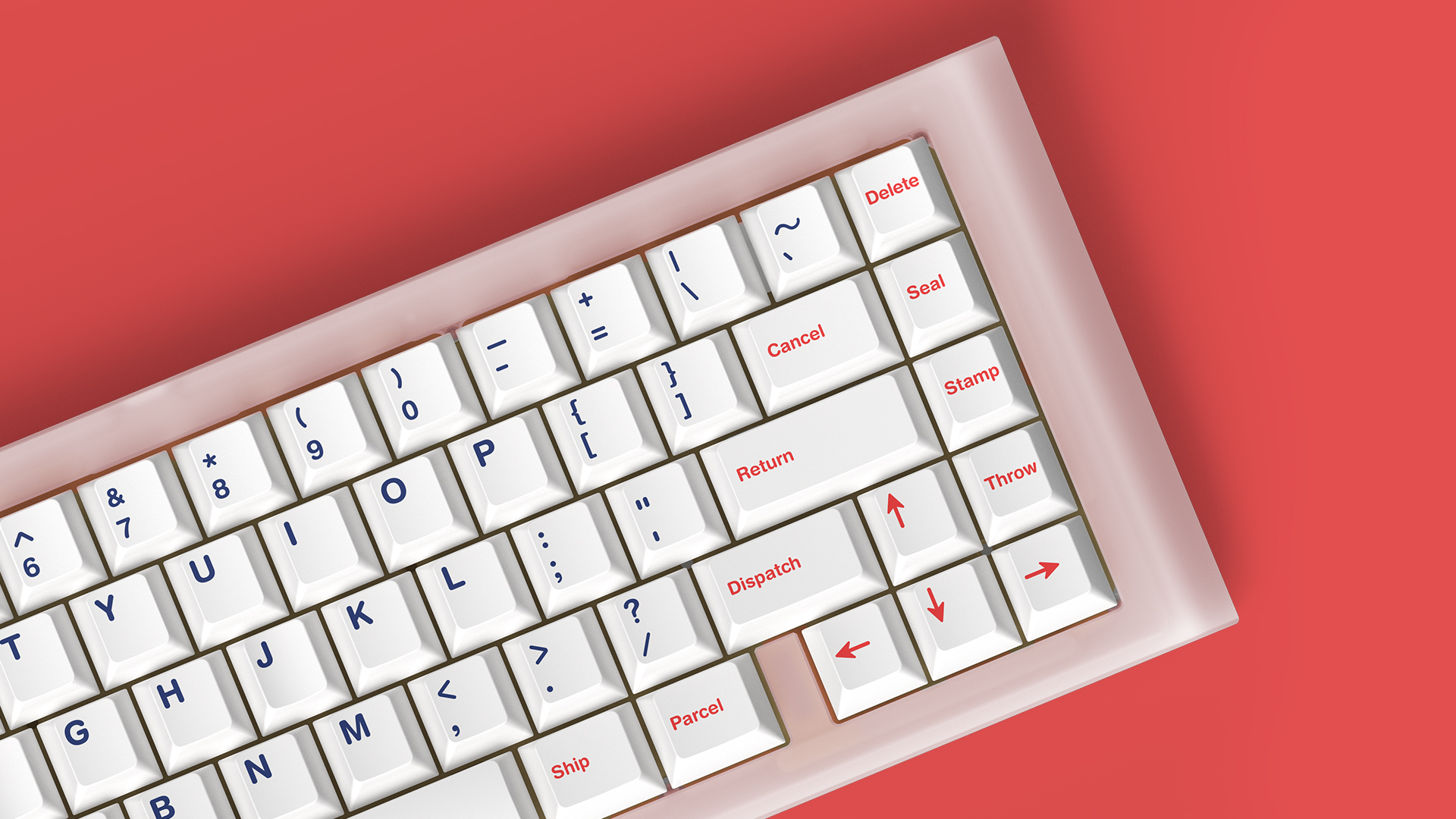
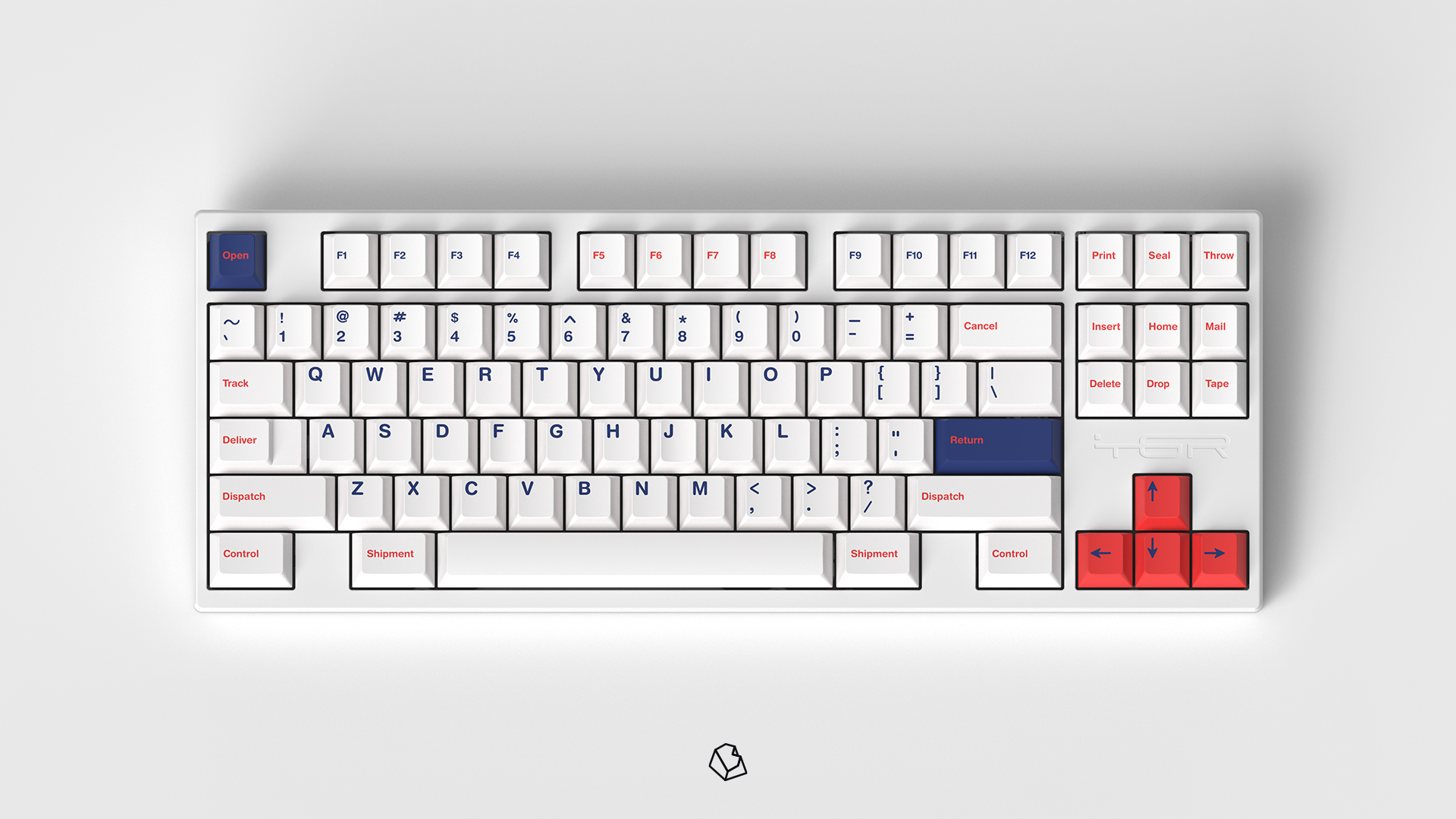
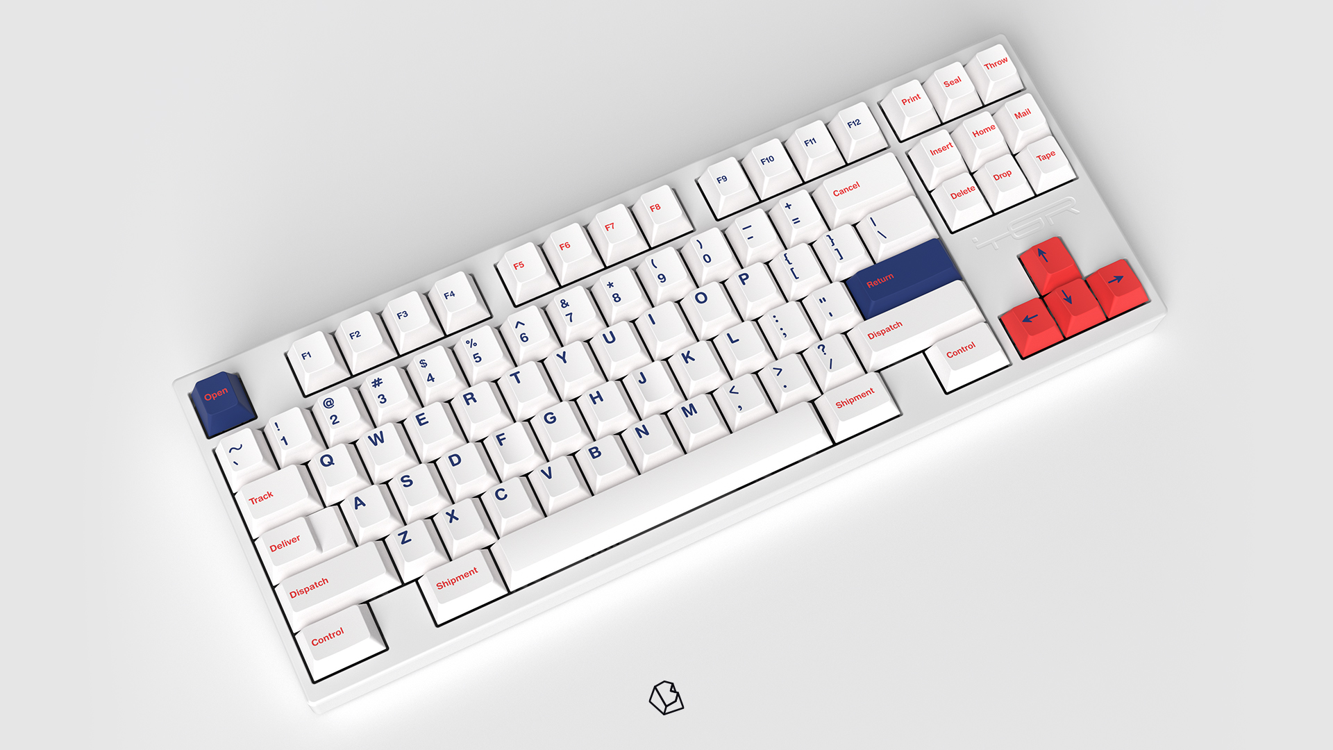
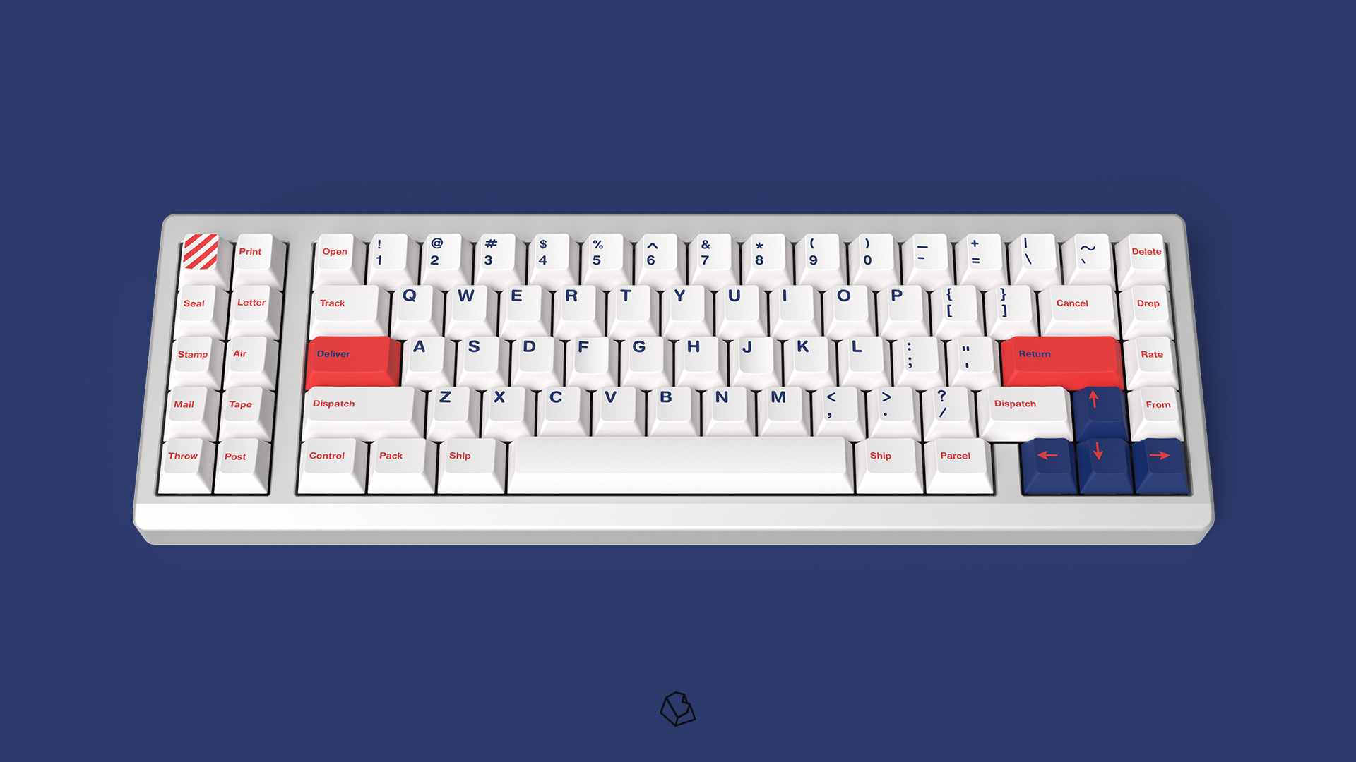
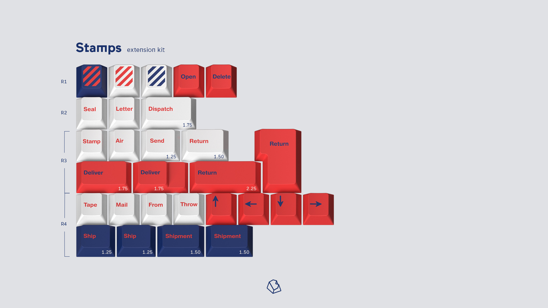
I love this as a concept, but it’s a bit underwhelming as is, to me. Your banner graphic excites me more than the keycaps themselves. I’m not feeling the theme carry through. I get more “American Airlines” from this, than the romantics of a handwritten letter in the post. Maybe the font from your title for the legends would help, or better novelties. I will say, if you’re going for the no-frills, gov-style usps, then I suppose it’s on the mark. I do love simplicity. And generally love your designs. Overall though, this one is just leaving me wanting more…
Edit: After more thought, maybe the banner just didn’t match the key set for me or set up my expectations wrong. It could be as simple as that.
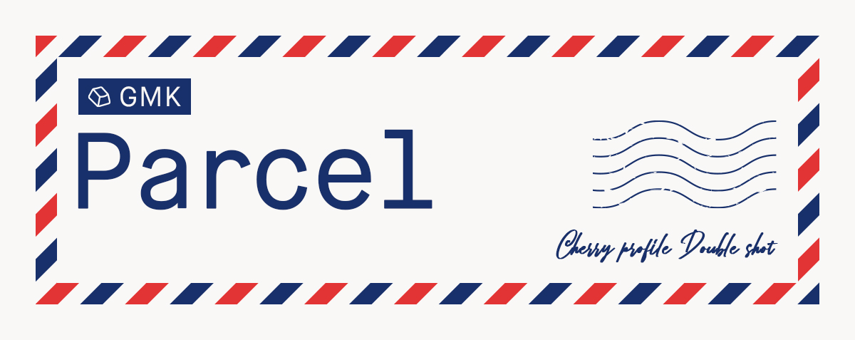
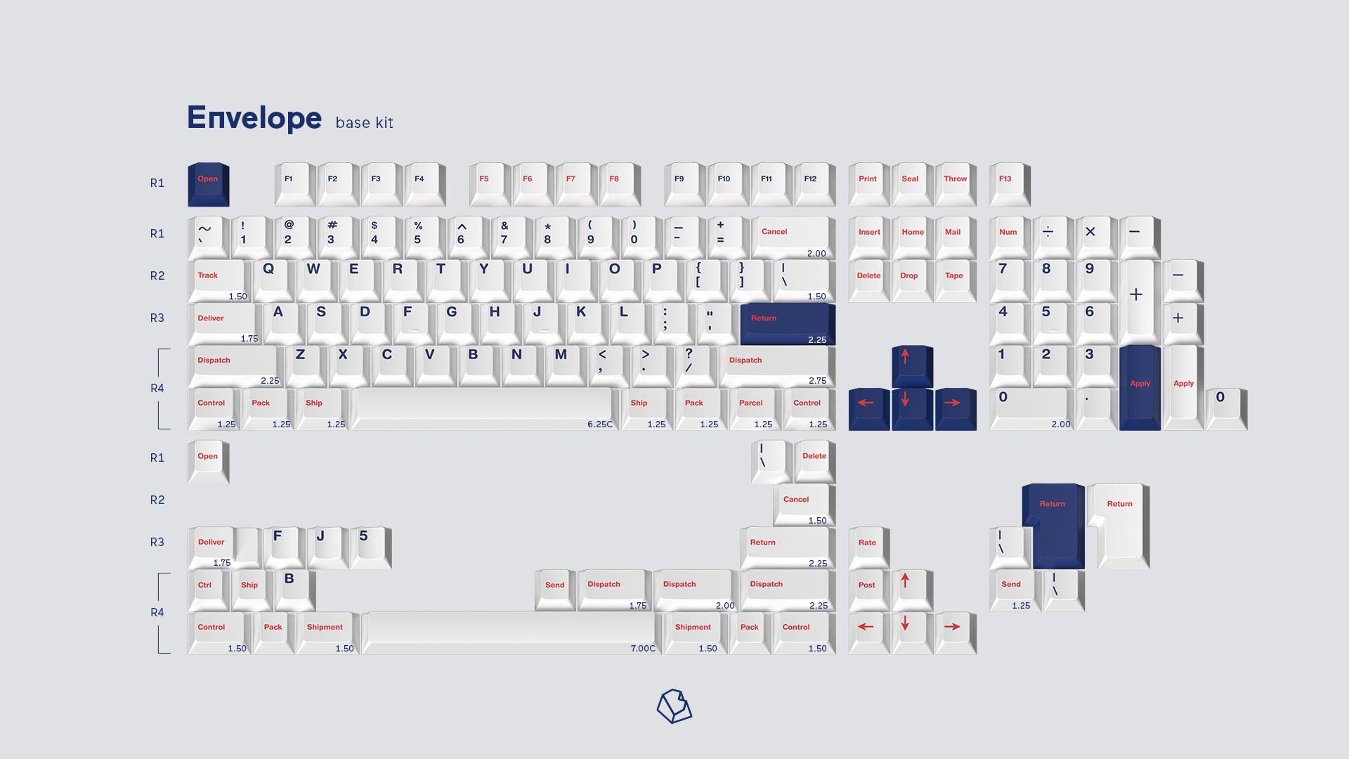
I think the header is like a British envelope (not sure though)? “Parcel” is definitely a much more British word than american. It doesn’t really do anything for me either, but I’m sure a lot of people will like the simplicity