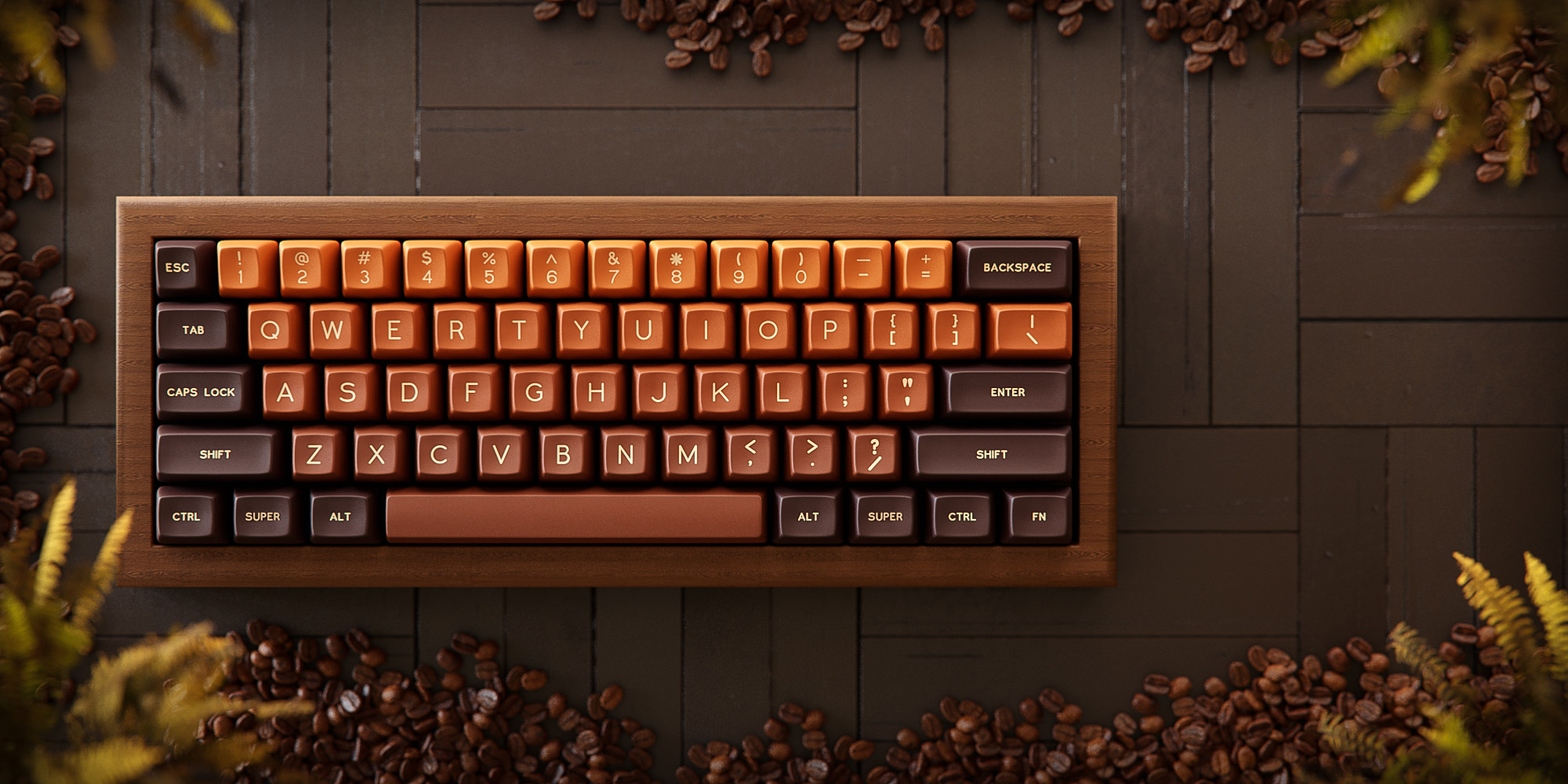
As Papa TaeHa would say, ooof. I can’t seem to find a way to enjoy using SA myself, but I’m weak for these colors right here. (All three SA sets I’ve collected over the years are brown with touches of orange and/or cream.)
The temptation is mighty, but I think I’ll admire this one from afar. If this colorway ever comes out in MT3, HSA, KAT, GMK… well. Resistance would be futile.
Anywho if you do like SA and you haven’t seen the thread already, here’s where you can find the IC form:
I feel like I’m turning into some old crumudgeon not liking a lot of these new sets, but on the other hand there are so many sets now, they can’t all be good.
This looks like someone just took chocolatier (a very nice classic and aesthetically nice set) and grafted a gradient onto it, imo gradients rarely look good and this is no exception to my eyes. The gradient is not appealing, the bottom row looks exactly like chocolatier, and then the first few rows are hardly different and I bet would just look like poorly color matched knock offs of the bottom row in person, and then the orange at the top doesn’t match the brown at the bottom imo, and then having the mods all the same gives it a weird look too.
My take is if the alphas were just the colors of the top row it would be a very nice set.
Never liked any gradient set and never will.
But I do dig the colors and like @dwarflemur said, if alphas were in top row color…
Also, uniform R3 SA or KAT and I’m getting it
I still haven’t tried a KAT set, but I totally agree about SA, fully sculpted looks nice but is not nice to type on at all, whereas uniform R3 is somewhat pleasant.
Wow I forgot how much geek hack sucks I posted I didn’t like the gradient and some dude told me that not only is my opinion wrong but I should that I should buy some two tone KAT set because not liking gradients makes me a simple person who likes simple things lmao
Yep - that’s one of many reasons I love it here. You’re more likely to find a self-deprecating joke about one’s own hard-line preferences than any kind of confrontation.
Like, I’m the kinda guy who would love to have a relaxation den straight from the 70’s in his basement (if my place had a basement), complete with shag carpet and wood paneling - but it also doesn’t bother me one bit to know that’s not necessarily what someone else would do.
You sir are a gentleman of exquisite taste!
I would absolutely love to have a place like that.
Retro styled, with Commodore PET as a display piece (and would actually code on it from time to time, just for fun).