I don’t have a single keycap set that features a language other than English unless you include gmk dots as a language (morse? lol) so I totally get where you’re coming from.
namely, that it serves no function to use keycaps that feature a language we don’t understand or use.
but if we were concerned only about the utilitarian value of keyboards, I don’t think this hobby would exist to the extent it does (however small or large depending on your perspective). so while I don’t appreciate the whole foreign language I don’t understand on my keycaps personally, I appreciate that its a thing with demand that people are willing to put money into the hobby for. aesthetic value commands a market premium, not just in this hobby but in nearly every industry where it exists. that’s not necessarily a bad thing.
Our hobby has a lot of designers / artistic people in it. From graphic, architects, industrial etc.
Typography, written language, fonts etc, are quite beautiful, so while not drawn to more anime themed sets, I have nothing against subs. Subs are beautiful.
Having extra stuff per keyset GB is nice, extra toppings if you will. Some people have magazine worthy looking set ups - look at how popular set up shows on YT are. Having something like a deskmat, cables, artisans etc that go well with it or your keyset/keyboard is nice. I couldn’t use my set up without a mat, matching or not. It’s like a rug that really ties the room together - (bonus if you’ve seen The Big Lebowksi).
Don’t know about how trendy that kind of stuff is, but I hope it stays.
It would be cool if usable fonts were expanded and art were extended to keycaps meant for typing (that is, excluding artisans). We’ve seen some examples of the former out of ePBT and whomever Drop uses for their XDA sets, but I don’t think anyone has really managed to produce an alternative that is understated enough to become as widely appealing as Cherry’s font. For the latter, I would love to see options that make some attempt at incorporating an image or images other than the cheap gradient and color block sets.
Would love to see a bigger emphasis on typography. So many interesting typefaces out there.
As for trends, I do like the bigger emphasis on acoustics these days. I see a lot of foam being used these days, and I do often wonder why. Is the foam an isolation layer between 2 stiff materials? Is it to decrease the apparent acoustic chamber? Or is it for mass loading? I look at the internal dampener that RAMA provides and I do wonder what that achieves…
Now I’m far from being even remotely knowledgeable on these things, but I think a bigger focus on case materials and thickness would be nice, along with a reduction in empty volume within a case. Look at the CA66 or to a lesser extent, even the Norbaforce MkI with Alu bottom plate. Both have a distinct hollow ping unless you mass load the bottom plate.
Foam is usually used as a dampening material, it absorbs sound. That’s why so many people are adding it. I’ve had great results just adding foam between the PCB and plate on a lot of my boards.
Hollow space is another one that definitely adds to sounds, I do not at all like the hollow ping of my CA66. I would be happy to not have another board that sounds like that.
I would love some more fonts! I think part of it comes down to processes, double shot caps are injection molded, and you then need a new mold for every cap, which is big $$$ versus just using existing molds. ePBT and most of not all XDA sets are dye sub, where the legend is dyed on after the keys are molded, and it’s not very expensive to change to whatever you want on any key.
Right, I just meant that it would be nice to have more typefaces that are understated irrespective of the actual manufacturing processes. I’m well aware that GMK probably won’t start offering serifed fonts anytime soon ha.
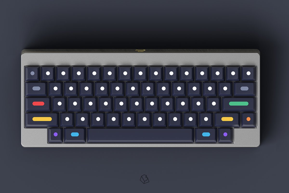
Small and possibly done more often than I’m aware of, but something I’ve noticed with the last few keycap GBs have made of use completely alternate language alpha keys instead of normal Latin alphas. I feel like alternate languages have usually just been made as sub-legends.
For example GMK Masterpiece was put out today and is almost entirely Katakana. I know Kat Atlantis had alternate Katanka, Greek and Hangul alphas.
Wouldn’t mind seeing this continue more, it’s an interesting aesthetic.
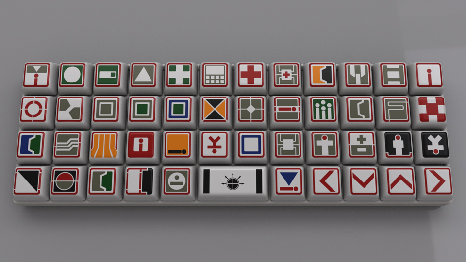
Speaking of alternate legends, sub legends, and others, I think it would be cool if someone took a shot at doing icon alphas once again like we saw with G20 Semiotic, but maybe not as busy
The closest modern example of not going for traditional legends that we have is the success of GMK Dots by Biip which was pretty awesome. I’m pretty sure we won’t see sets like this again (aside from dots R2), but it was a very interesting experiment
Although they aren’t standard legends (as in all keys have similar legend placement), ‘Cool Kids’ and ‘Redacted’ are two sets that are far from standard.
One trend I will point out: some of the most interesting keysets arrive when inspired by April fools.
One thing that I have been noticing (that I don’t know any real thing that would have caused this) is the use of thicker lubes as a general preference on most switches.
Given about 1-2 years ago, the use of krytox 105 was very common, and nowadays I feel that the only lube that really gets used for switches is 205g0 (as well as 3203 and 3204).
I get that 105 is great for springs, but I do think that more diversity in the lube scene again would be nice, especially since bag lubing is so easy for new people that they could easily do it if there were some videos of sound tests that still used them. IDK, I think that I just like more variance and preferential things that come from using different parts and pieces and recommending only 3 lubes to people, that are albeit great and easier to come by, is a bit weird.
This could be from the recent influx of streamers in the past few years. The online crowd seems to respond overwhelmingly positive to switches that are deeper in pitch and “thocky.” Thick lube is the easiest way to get that sound, and it’s easy to demonstrate on a video stream.
Having said that, I look at lube as offering two different opportunities: speed vs buttery feel and thock. I prefer 205g0 in linears because I like the thock and buttery feel, but I will be using 3203 when I build my Zealios v2 board.
You know… White on Black definitely seems to be popular again as a set now that MD has done 2 runs and is on their 3rd…
It’s so basic but makes so much sense for so many keyboards I should consider picking up a set.
Does anyone think tripleshots will ever really take off or are having more than 2 colors on a keycap too distracting? I can’t decide yet if it’ll be a step forward with JTK Tripleshot keycaps or just be a fad.
Part of me thinks conceptually it’s really cool. Another part of me thinks 3 colors (base, alpha, sublegend) is a bit busy for the surface area of a keycap
 I should consider picking up a set.