What do people want to see in a series of keyboard or keyset images? I am talking not artsy shots, but informational images.
For keyboards, what angles or perspectives do you consider the most helpful? What kind of lighting do you think best showcases keebs?
With keycaps, woulds the inclusion of a color checker or similar device help with display/camera calibration or white balance issues? Would people like to see keycap sets on multiple different boards in a single image series?
I have working experience and an education in photographic technology and color science; and while I would never really consider myself an artistically good photographer, I feel I can make some technically sound images; and I want to show off my keebs and caps!
So - what do you want to see, and how do you want to see it?
For me, if it’s a build log, then informational and direct pictures. (Here’s the switches done. Here’s what the controller looks like, etc. I had issues here with circled or clearly identified areas and things.) Mostly artsy shots for “build logs” get to be too much for me.
If you’re showing off your keyboard, show the whole thing as you would see it in first-person view at least once. Artsy shots are nice, but it would be nice to see the whole board so we can see what it actually is.
**edit as for color checker, that would be interesting. If you do use one though, something that most people can get or print easily/cheaply would be good. That way you could hold the color bar in hand and see what it looks like in person easily enough to compare things. Now that I write it out, that would be cool, if I could have the same color bar in hand so I can get a better feel for the colors, no matter how close your pictures are to color or how bad my monitor distorts that color.
build logs, and specific features that one kit offers over others. ie. explanations and visuals on how mounting is accomplished and what benefits the user may feel from that style.
i also think every build log should have a FLAWS section. What is WRONG with said kit or build. What was a headache…
If you’re going for a way to showcase the color, making sure it’s done on a neutral background with high CRI white light goes pretty far. I always liked top down shots for keyset pictures, that way you get a clear view of what all the legends and novelties look like. When you get too artsy with it, half the time you can’t tell what the numpad legends look like because they’re out of focus.
Basically, my ideal (purely for informative purposes) for showcasing keysets and their colors would be top down, all black board with no backlight, inside a lightbox. Not always possible but it would be a good way to compare colors if they’re all super uniform like that.
A color checker would be an awesome inclusion! My monitor plays with the colors too much so it would be nice to be sure I was seeing them as accurately as possible.
That’s actually a good idea. I did a Tina B build for someone that had a different PCB than Wei’s and there were issues with shorting and diodes that got in the way of the screw standoffs that were in the case for the original plate. Compatibility issues are difficult to find anything on.
Maybe just calling it an issues section. Not necessarily wrong, but where people had issues and if they had workarounds or solutions. This also allows for someone to be able to help the person for the future if it happened to be user error or a common issue or mistake.
I will have to dig into this when I have a free weekend. I have some in progress shots of my kits, and could go back and capture more details of problems that I have ran into.
For keysets I would love to capture how they look on various boards, but it would be time consuming to switch between so many different boards, but I know I would love too see the variation and different (maybe weird) combinations. Like I could put my SA Lime set on a purple KBD fans 5* case, but is it worth it just to be weird?
I wonder what people could compare against easily & cheaply and still get reasonable results? Without needing like Pantone swatches or whatever. Is anything commonly used, some standard / common colourwheel? (would global paint suppliers have something??)
While I do not expect many people to have one of these, the color patches are designed to simulate real world colors, such as foliage, blue sky, skin tones along with rgb, cmy, and a gray scale.
When used in an image, a photographer can use the targets to help in post processing; fine tuning white balance, contrast, and exposure. If I am doing any kind of work under consistent lighting, I use one of these or other similar tools.
If some common reference is used it can help people visually assess an image and be a point of comparison. Commercial packaging is very consistent and can be a useful point of reference, everyone knows how a can of Coke is supposed to look.
I wonder if something like this with the top piece removed (so you can see all the colors) would work. It might not be exact, but it should be similar enough across the board to get the point across and is under $10.
Something like that could potentially work for sure!
For professional commercial shots I would like to know they are being more accurate (I do not know the tolerances those color wheels are made under) but most of the time we buy keycap sets based almost entirely on renders and color samples - it is not often we get to see a real picture of a full set before it reaches consumers.
Right, if you’re doing pro shots, a more accurate color pallet would be better, but for accessibility and for people to be able to get a better idea of how it looks, it might work.
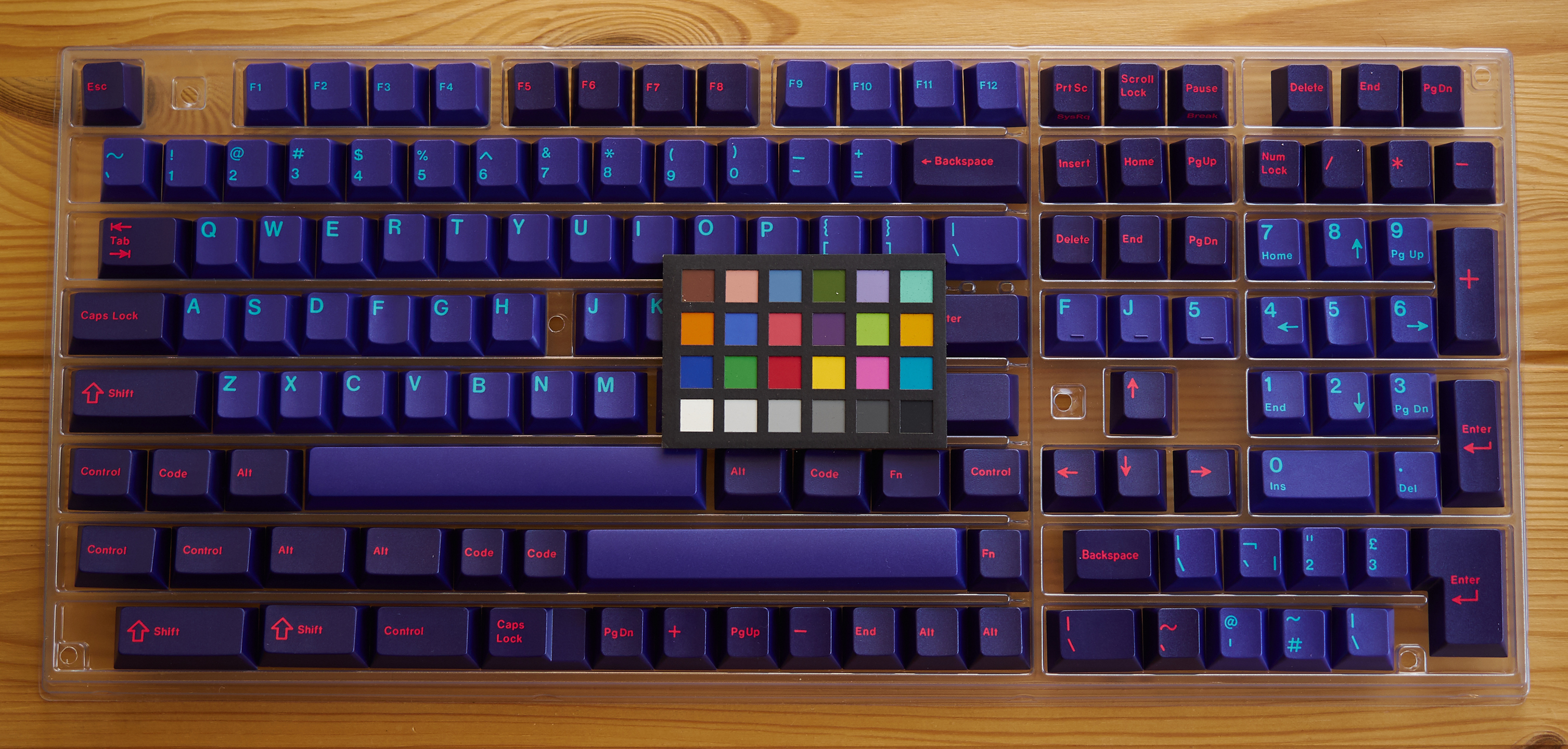
This is an example shot of GMK Laser shot in indirect sunlight with a mini color checker, which I used to white balance and set exposure. This set is really hard to accurately capture.
I think that this image makes the set look a little more muted than it actually is, but accuracy doesn’t always come out looking good - which I guess is part of the point.