4 Likes
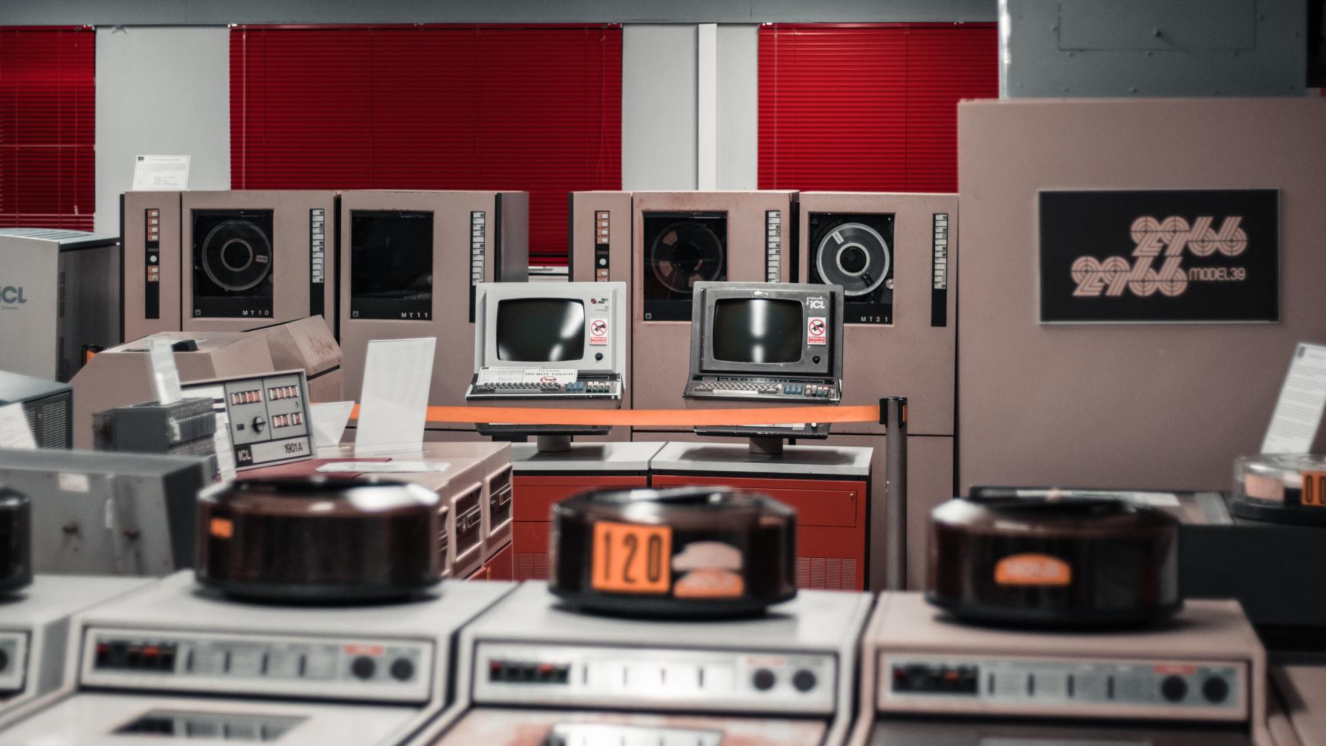
Do Not TOUCH! ![]()
![]()
2 Likes
I have those caps, they’re actually not terrible. Not great, but not terrible.
Lack of coffee this morning made me read that together with the caption, and my scroogy inner voice said “Sometimes people deserve rubber domes”
1 Like
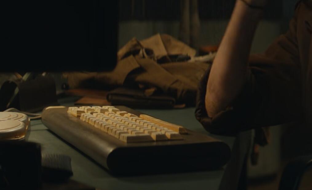
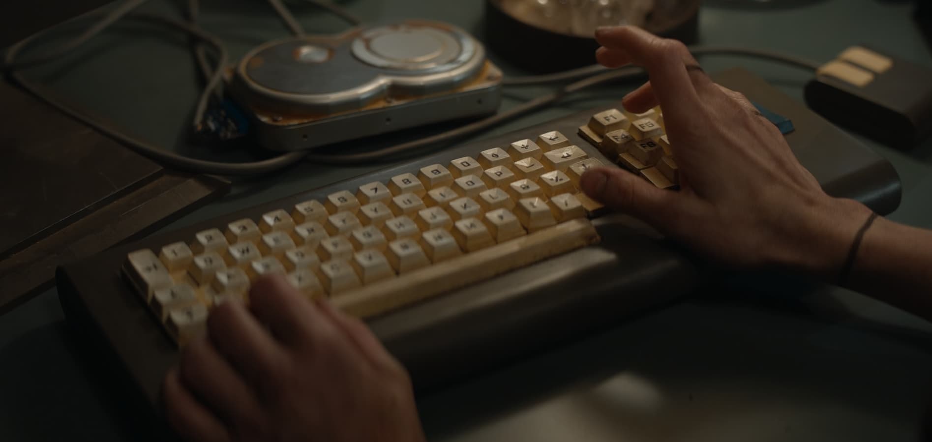
Interesting keyboard in Silo (series, 2023) - a similar model (maybe the same ?) is seen in a lot of different scenes.
6 Likes
I was just reminded of the P-P-P-Powerbook! prank from 20 years ago and thought that keyboard deserved a place here. Behold the beauty:

On a side note, it made me feel ancient to type that this meme is from two decades ago…
2 Likes
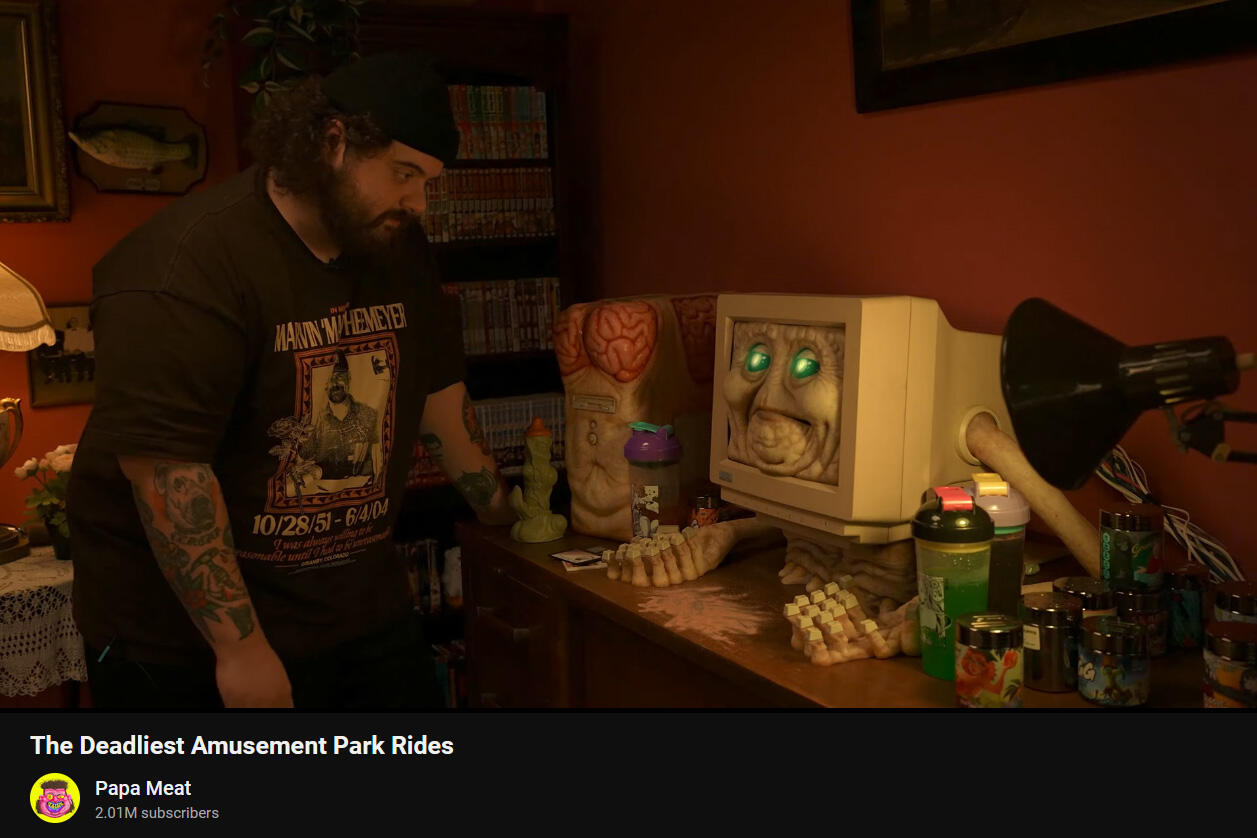
…well then.
Props for making a prop more disturbing than I could have imagined. Legit kind of amazing practical effects for a youtube video…
5 Likes
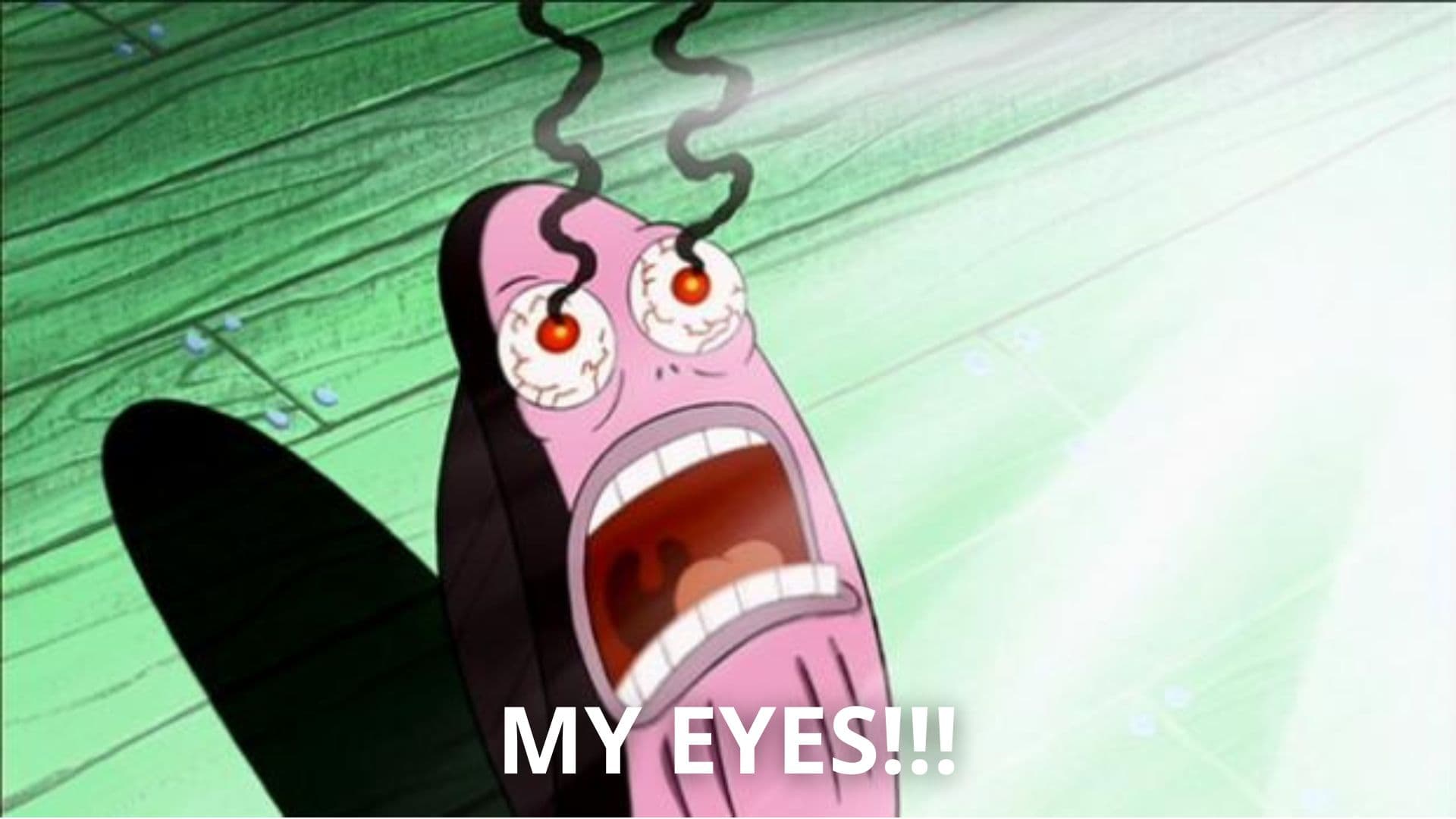
I’m just gunna put this out there, and say that there should maybe be a NSFW tag on this one, LOL!
![]()
![]()
4 Likes
")
RiTchie (from Injury Reserve) - Dizzy (feat. Aminé)
First shot: a 60% with a coiled cable – macropad too! Cool video concept
edit: did some digging and you can find xondat (of Noxary fame) in the comments here haha RiTchie on Instagram: "New Toyz 🤖"
4 Likes
Eventually, he answers the question about the macro pad’s switches. Milky Yellow. Another victim of Big Linear. ![]()
Let’s not discuss why one might avoid clickies as an audio mixer… Definitely Big Linear conspiracy all the way!
Clean 9009 look on the 60%'s keycaps.
1 Like
Hopefully this is the right place for this. It certainly could go into “… Hmm” as well.
https://www.reddit.com/r/pics/comments/1cmjuwp/old_skool_c64_advertisement/

7 Likes
Especially since it’s less twenty years old. Seems it’s from a German retrocomputing fanzine circa 2008:
Mildly NSFW in the the colloquial sense, *very* NSFW in the literal sense.
4 Likes
It should go to the “wearing top without panties” category of a whole different retro forum on the Interwebs…
Ow, how much do I miss the lack of complicatedness of the early 80’s. Nobody cared about such things. In a sense, people were more liberated then than nowadays…
1 Like
That is a digital magazine from 2008. And it’s certainly not for a mainstream/public audience. It’s pretty badass though, if I may say so.
2 Likes
I respectfully disagree. It hits me as extremely cringe…
Ha. To each his own. Although I did like the one that looked more “vintage” with the filters applied.
This is probably not the forum to discuss such things, but I do like women without clothing and I do like vintage computers. I get that it kinda has a cringy OnlyFans vibe. But I think with filters applied it could look more campy/trashy in a cool way too.
2 Likes
Yes, I saw it now. The poor picture quality made me think this was genuine 80’s material. Well, those Germans and their dirty magazines…
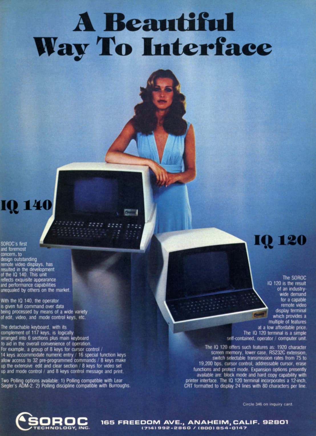
It is absolutely bad ass. Love it. Reminded me instantly of the ad for Defender of the Crown advertisement I loved as a kid. Would post a link to it, but it is indeed off topic for this thread.
Also reminded me of this old ad from Soroc - I wish the keyboards were clearer in the advertisement though. The layouts are very interesting looking.
Somehow Soroc is still around as a general IT firm.
3 Likes
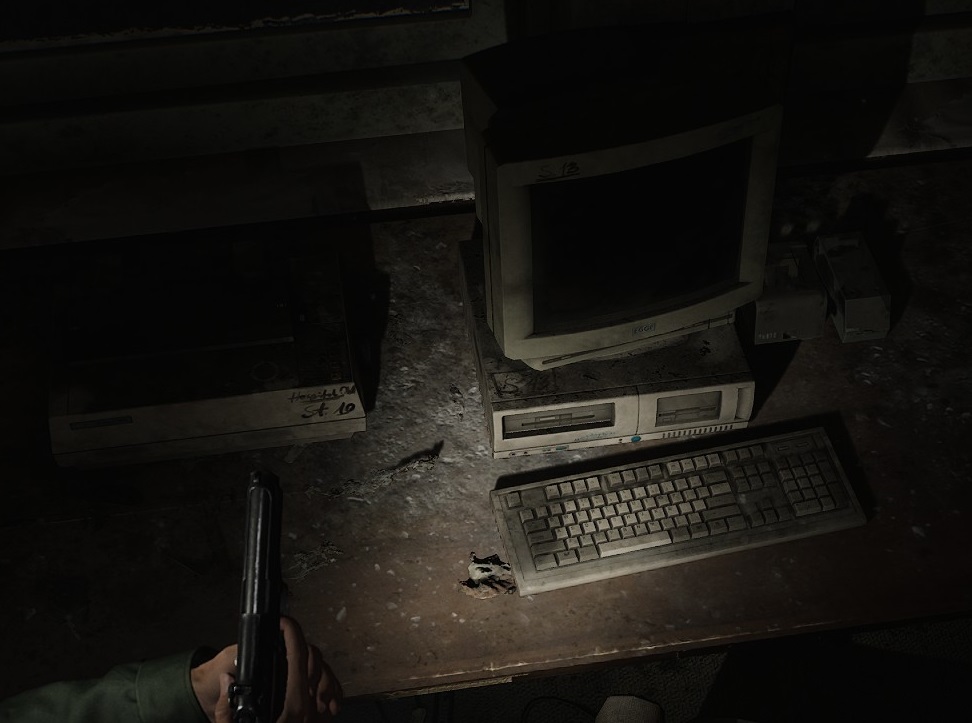
Crusty full-size from the Silent Hill 2 remake.
Seems like a mostly standard beige-era keyboard, with an off-set Esc key for a little flair. Closer to reality than most keyboards that appear in video games - the only thing that actually seems off to me about this one is the narrow space bar being nudged-out by its seven 1.5u neighbors, which would normally be either 1.25u with that many (104 key), or have three less keys at that size (101/WKL). That leads me to ask - are there any real-world layouts with a bottom row like that?
Bonus points for the floppy organizers and what appears to be a dot-matrix printer. ![]()
7 Likes