This thread is for keycap ideas for people who lack the utilities to actually make it happen.
I’m sure there’s a little more to it than choosing colors, choosing method (double-shot, dye-sub, etc.) and then creating a render for an IC, for proposition of a manufacturer.
Really this is just a shameless plug for an idea I had: ‘Zalgo’ themed keycaps. If you don’t know, Zalgo is a type of font generated through putting text through a program, resulting in a rather warped, scattered looking output.
So yeah. If you have any ideas, and you want to get it out there, maybe post it in here. Thanks.
I’d like to see a well done set based on Transformers G1 Constructicons.
GMK Devastation.
It would be bright chartreuse yellow with violet purple legends. The mods would be inverse. Could offer an all yellow/green kit with just purple accents.
Accents could be silver or black with red legends. Novelties for the different vehicles that make up devastator. Of course a decepticon logo would be cool but I’m not looking for the cost of licensed products.
The right colors are absolutely vital to the set, so you would have to do a few color samples to get it right. Im not sure you could color match to G1 toys. Maybe a good spot to start, but the original cartoon Construticons color need to be considered as well. I knew their colors before the toys came out.
I recently picked up a set of GMK night runner and I was really impressed with the pop of color from the safety yellow.
If you added just a touch of green to that color it would be perfect. The violet purple used in HFO (based on RDA from signature plastics) might work. Might need to be a bit darker. Maybe the purple from Purple Night
You could call it something like “Workbench” or “Solderwork”
I still find it odd that this doesn’t exist yet. It’s a bit too theme-y for me, but I think it stands on it’s own okay (as in, if you didn’t own any Hakko tools, you could still appreciate the color scheme). Low effort kle-render, but you get the idea.
I know that yellow CV looks great on gray (My favorite part of the original GMK Soware set is the arrow keys). Soware uses a custom gray that approximates an SP color, but it’s very close to 2B. And 2B is a nice, neutral gray. I think CV would look very good on it.
The blue would have to be custom. V4 (classic blue) doesn’t have quite enough of the purple in it to achieve the klein blue of the Hakko brand.
Makes me wonder if anyone ever did Danger Zone in a cylindrical profile, though obviously this is inverted and a brighter blue. Still, it definitely looks nice!
The SA version is on my (value-adjusted) bucket list.
Now on to the idea I’d really like to have come to fruition
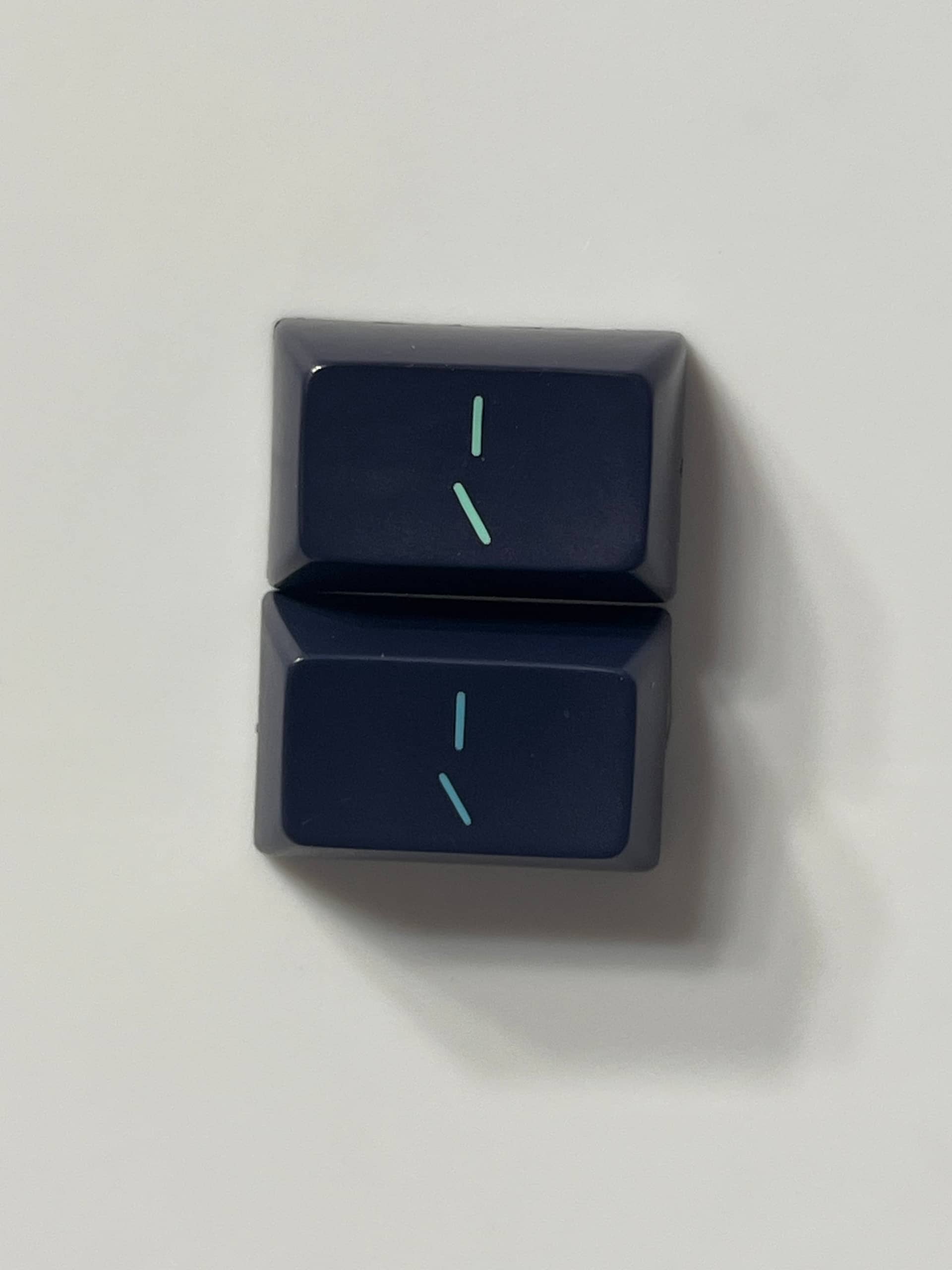
Speaking of SA, I was recently looking at my old SA Abyss set. Now this set has some ideas that could be put to good use. I’d kill to see doubleshot DSS in a monotone colorway using the dark navy modifiers and the turquoise green legends found on SA Abyss.
No need for color samples because the combo already exists and looks fantastic.
I would call this something like “DSS Deep” or “Deep Waters”. A nod to SA Abyss and Calm Depths.
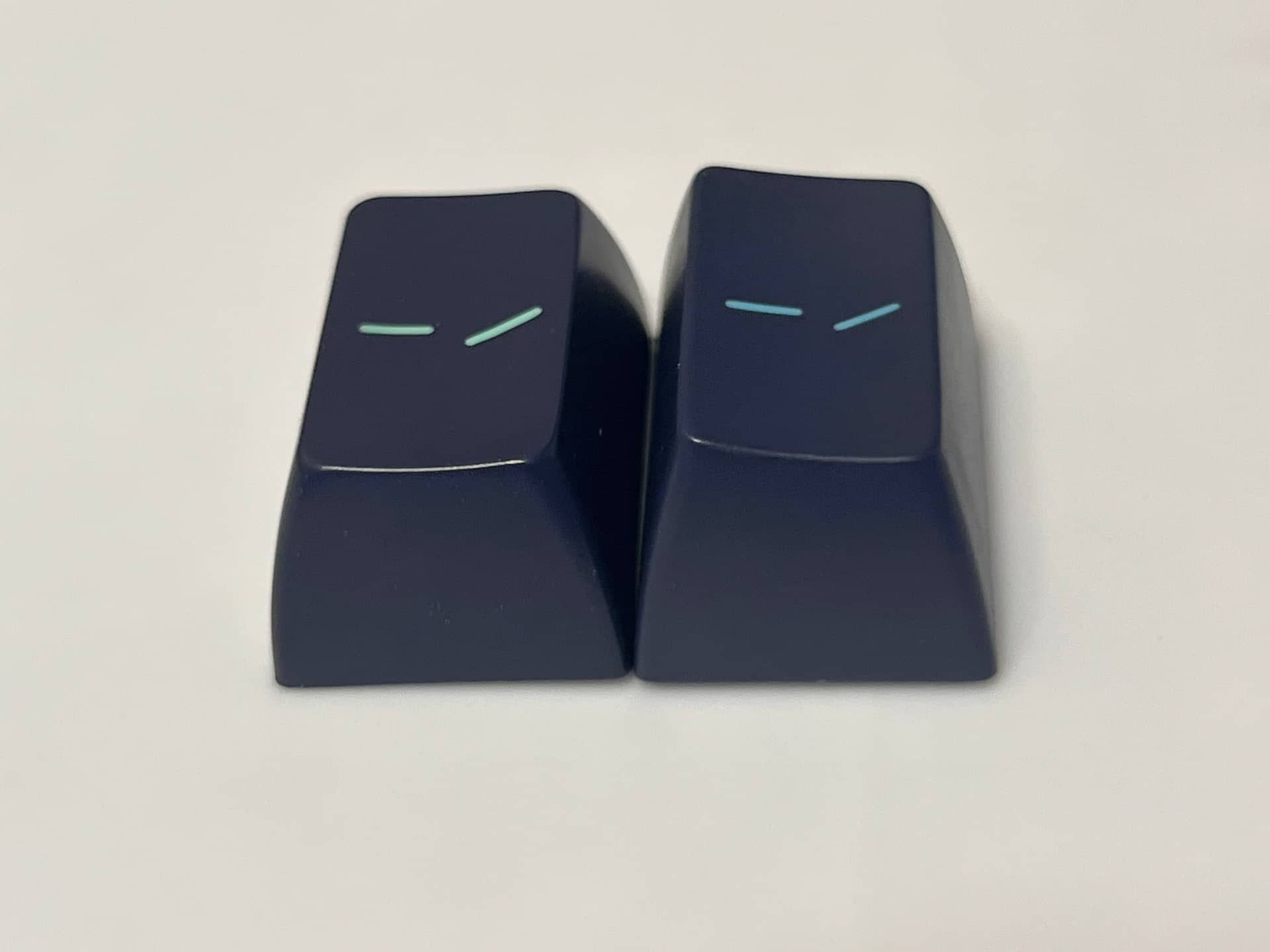
It’s hard to tell from the crappy KLE render, but the navy of BFR is really nice. Not too purple, no hint of green. The VBV legends give a lot of character to the mono colorway. Most people might choose white or a light blue like BFQ, but the green in VBV really pops on this blue.
It can be difficult to imagine what some colors look like together without getting samples from manufacturers. But when you own 400-500 sets of keycaps… you can just put them side by side and get a good idea of what works. The mods of SA Abyss are an absolute home run.
Comparison photo: top:SA Abyss vs bottom:SA Calm depths (Kono). Notice how nicely the VBV pops on the top one in comparison
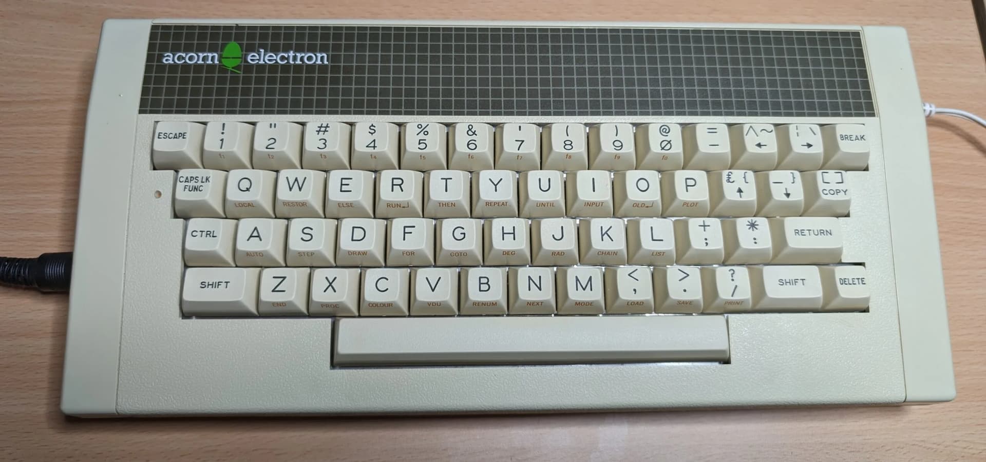
I’m going to hijack this thread, but only a little. What would look good on a base of white SLK? I think I want to use one of my no-stabs FRL1800 PCBs with some half-height switches to make a low-ish profile board.
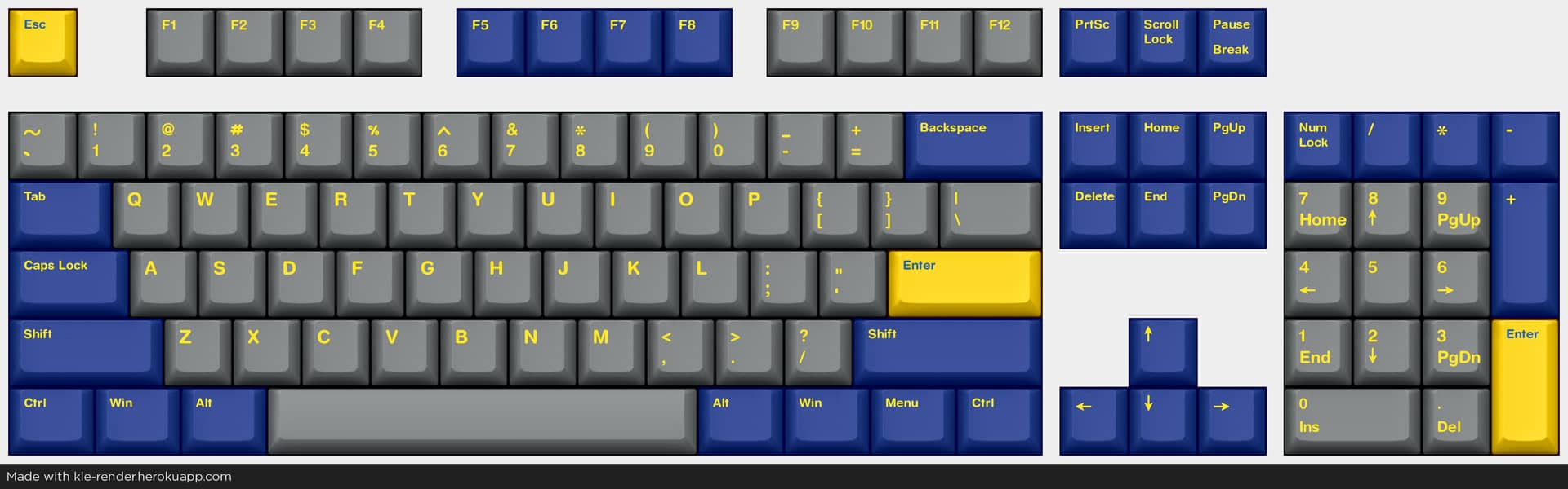
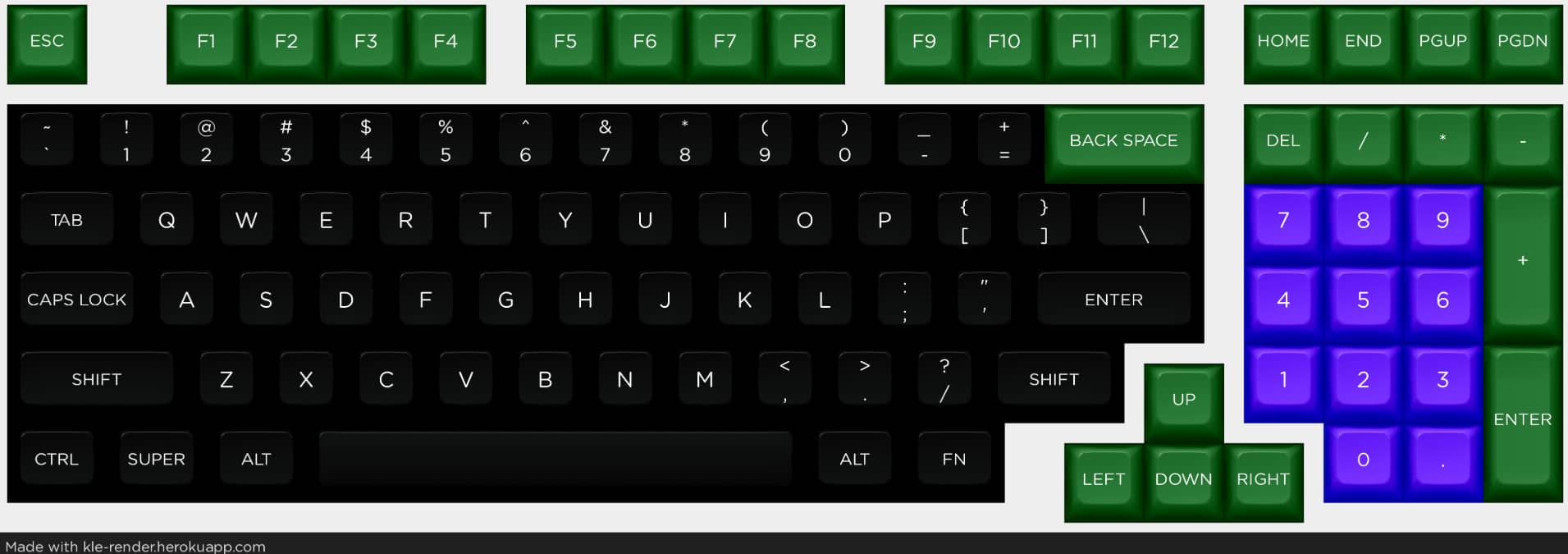
I’ve been playing around with my favorite vintage board that hasn’t been reproduced yet, and I thought I’d try to come up with kitting that would actually serve many different audiences, and good lord I have a new respect for those who pull it off. I was trying to model it with a JTK’s HSA monokit kitting, and even with some pretty serious “gives” right away (e.g. utterly perfunctory ISO support), it’s still damn near impossible to serve even a decent cross section of the layouts people use. Even the 1800 below, which looks pretty nice, only had a green backspace because otherwise it’s hard to include enough R1 keys. I personally think that particular layout looks better with a black backspace.