TL\DR: Don’t buy the new K2 hot swappable, due to inexcusable choices the keycaps are unusable in normal light.
I just received my K2 hot swappable and I have to say that the keycaps are really terrible.
I’m not talking aesthetically (although they are bad also in that aspect) but from a usability perspective. The keycaps can actually be considered defective.
The problems
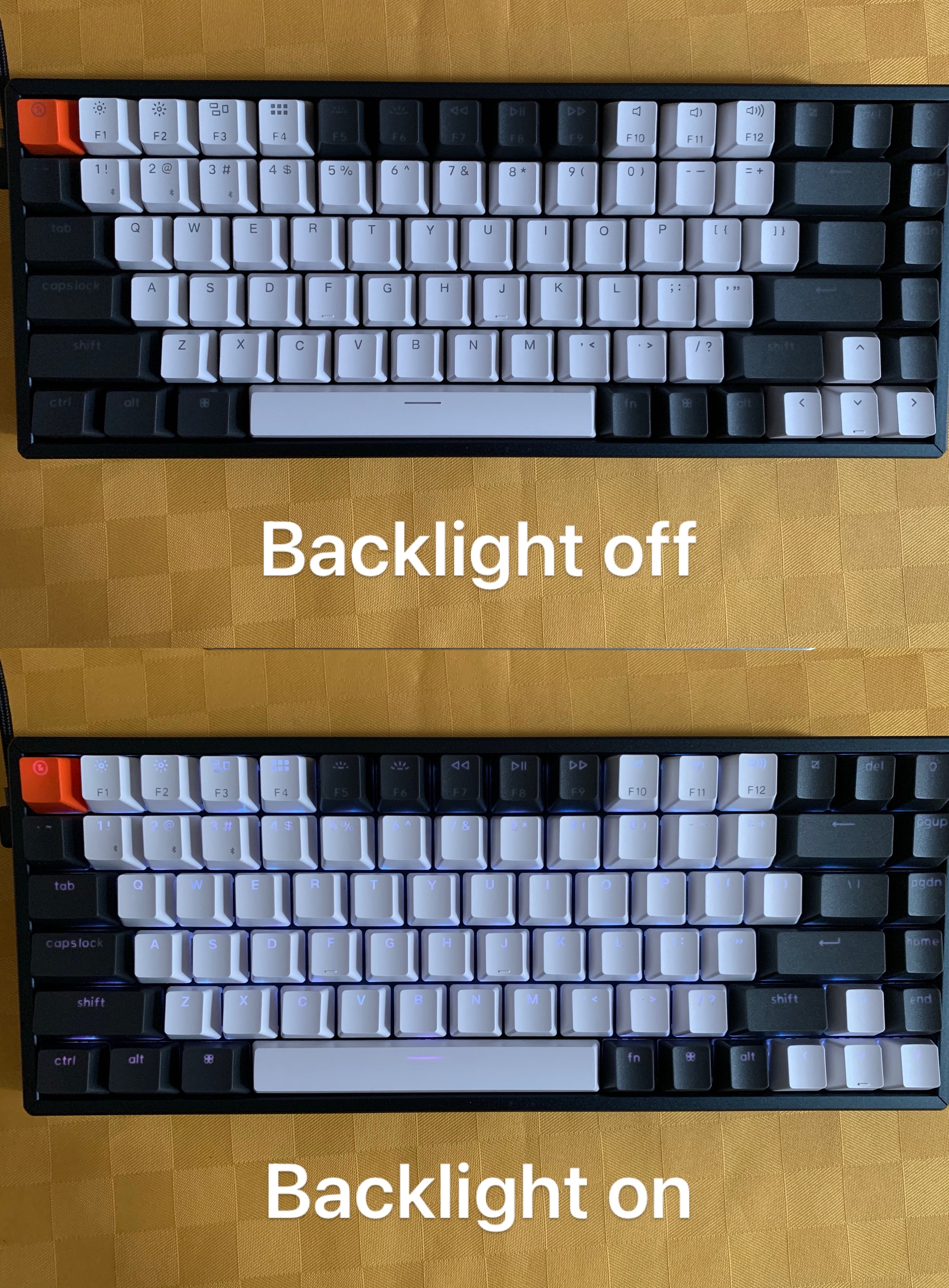
1 - Between the white keycaps and the black ones there is a serious difference in legibility and there is NO way to have all legends legible at the same time:
with Backlight on:
- if the light is bright enough to make the black keys legible, the white ones are too bright and difficult to look at
- if the light is set to be right for the white keys, the black ones are truly invisible
with Backlight off:
- white keys are ok, black keys are invisible.
2 - The print quality of the black caps is awful: some keys have a pinkish hue in the legends and the transparency of see-trough legends is not consistent across keys. Also, without backlight they are basically black blank keys.
A case of bad design and even worse production strategy
I wonder if they even saw a prototype before approving production and shipping to paying customers.
Once realised how bad was the quality of the black caps, and how absurd the difference in legibility between white and black caps is, it would have been much better to use the white plastic for all caps.
The pictures
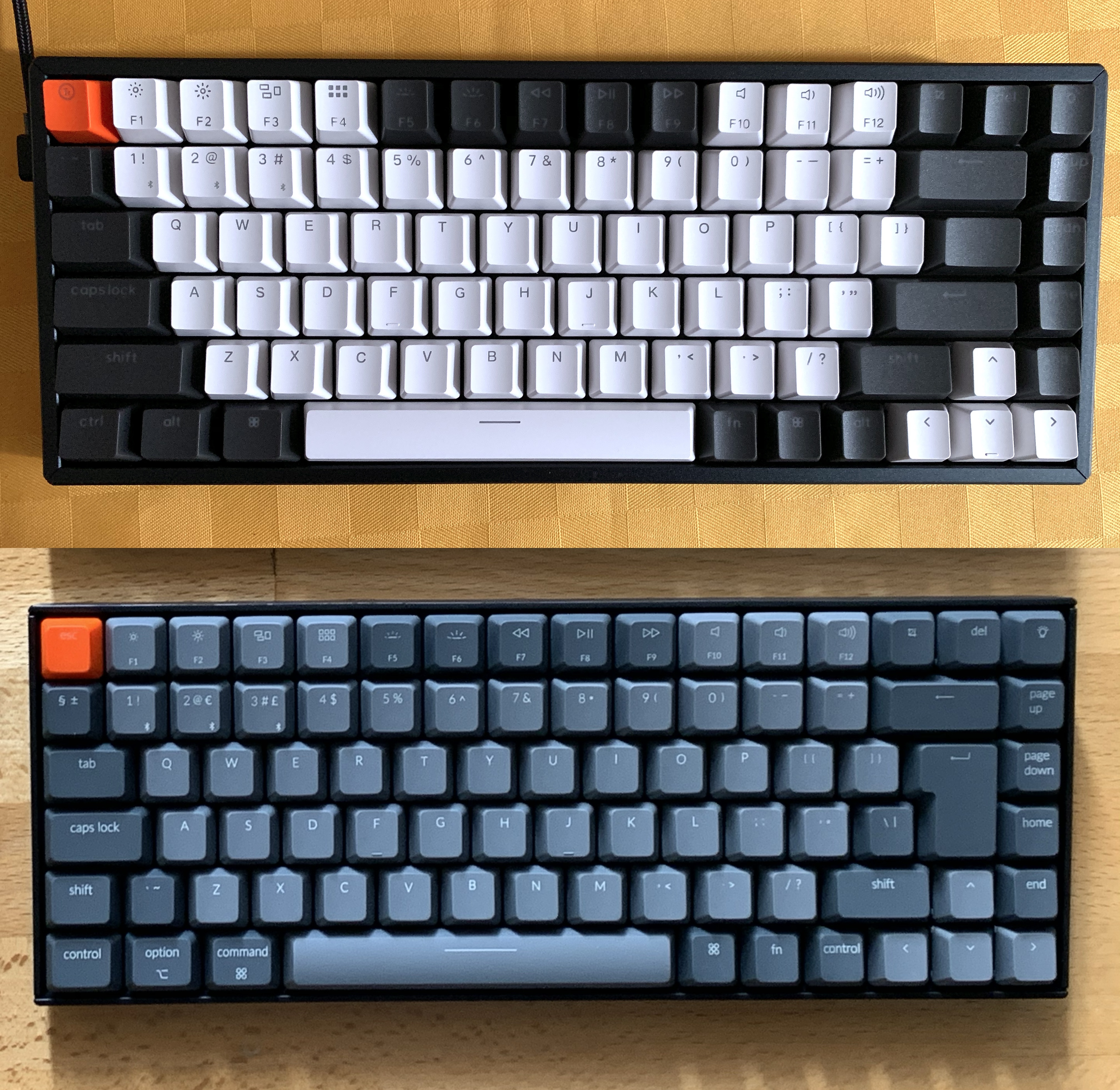
I previously bought a K2, not hot swappable, and the keycaps are much better, on the hot swappable they are ridiculous.
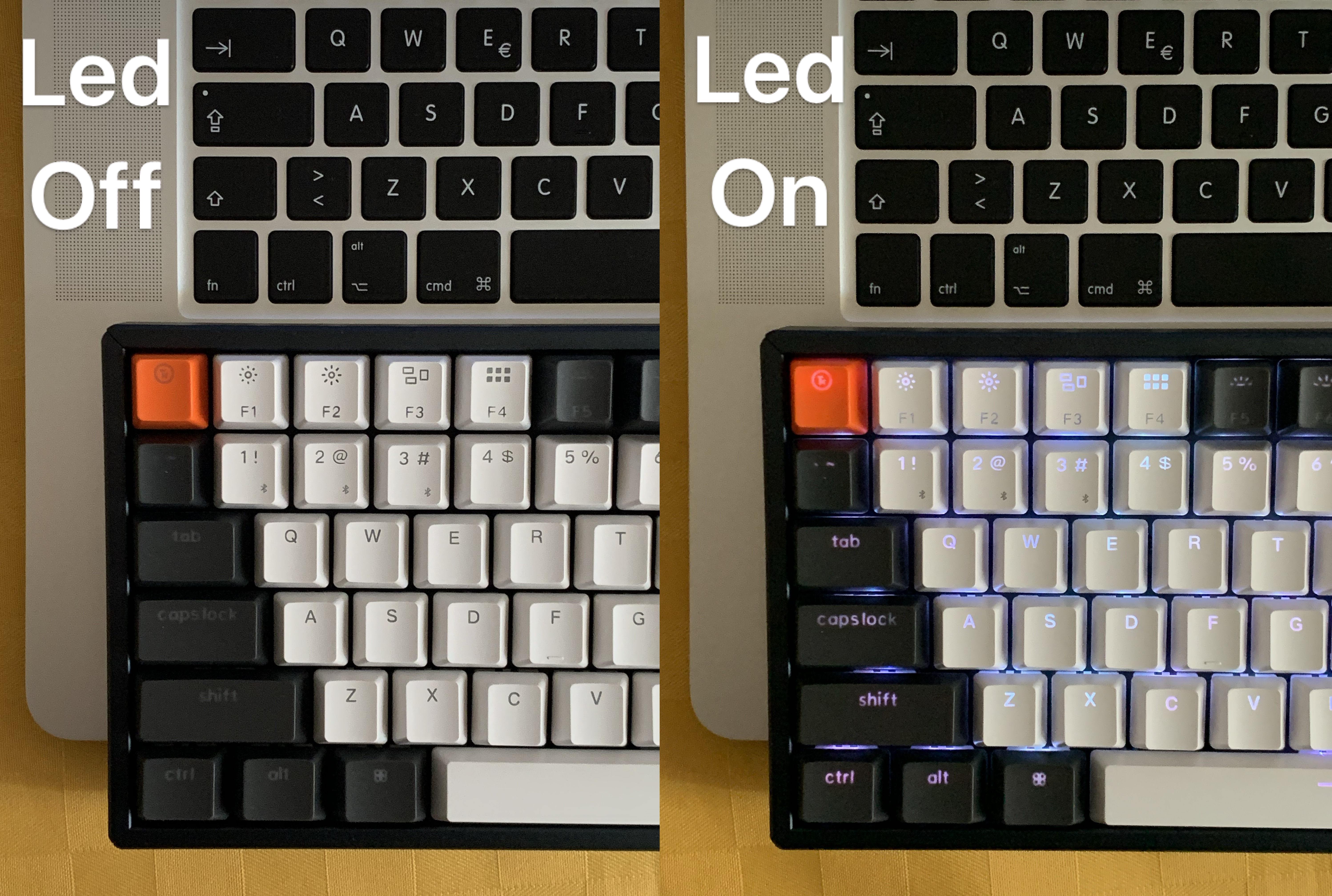
No Led, normal ambient light. See how clearer are the legends of REGULAR K2:
K2 hot-swappable - no backlight, normal ambient color:
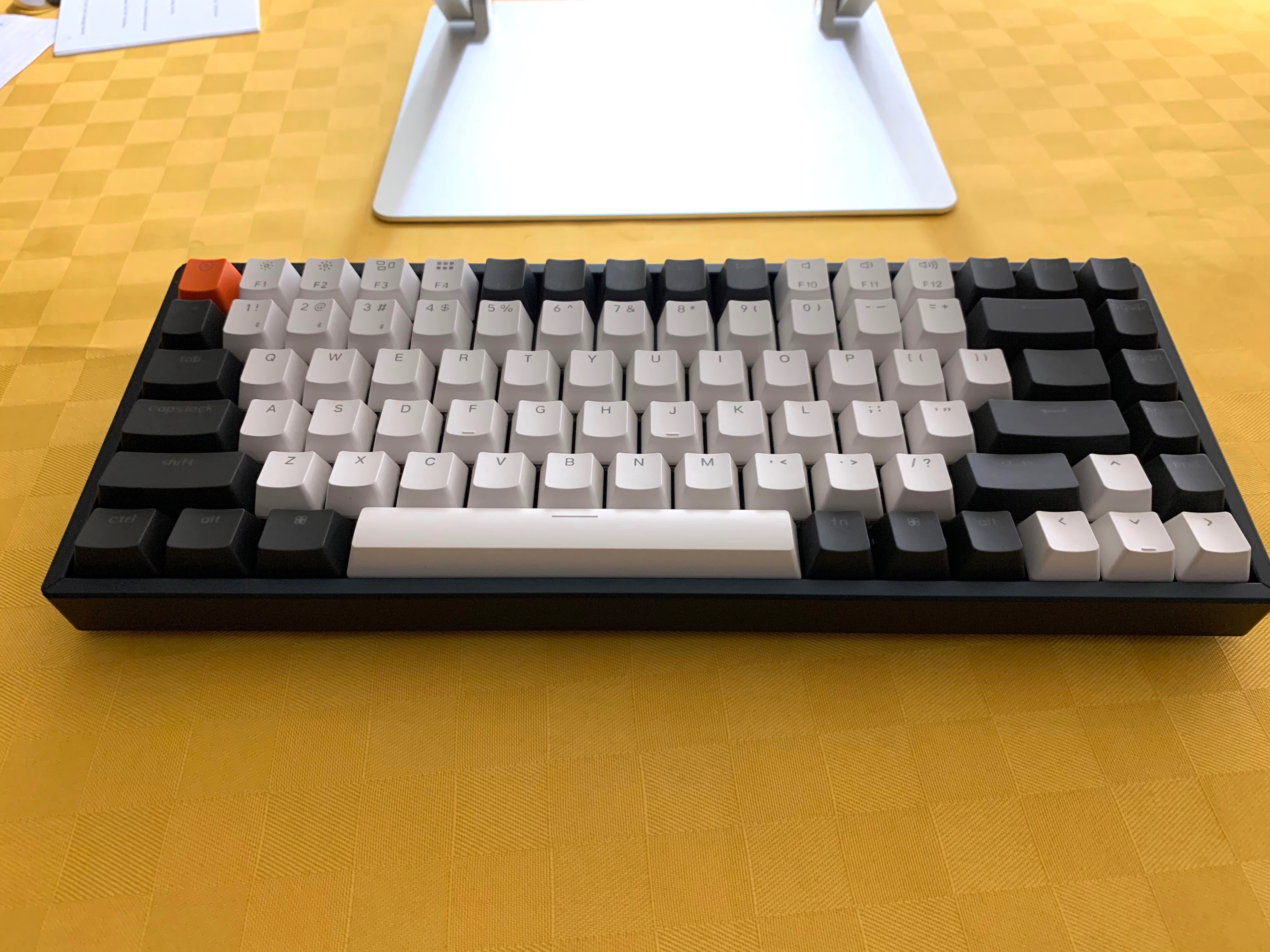
K2 hot-swappable - low ambient light:
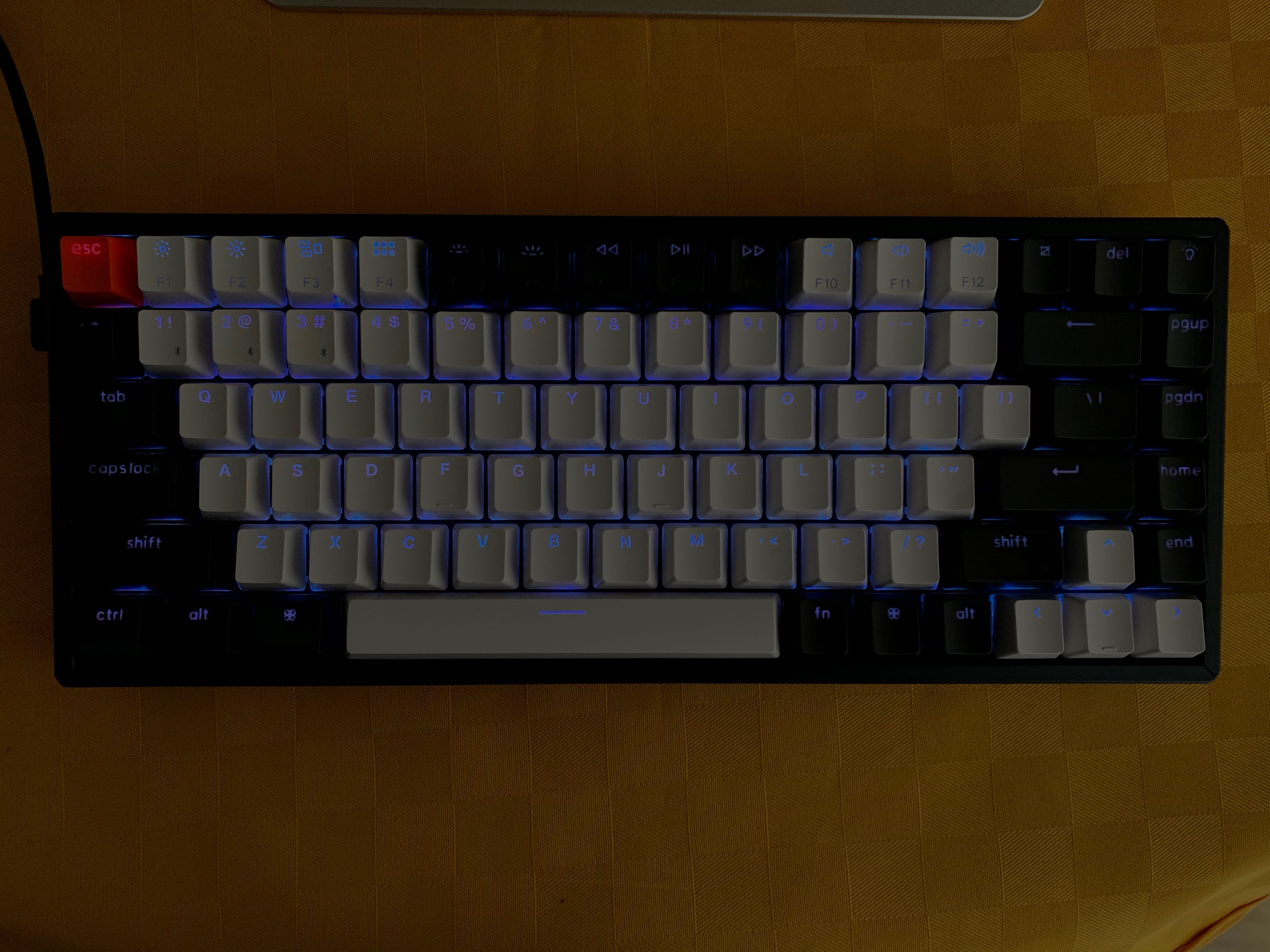
K2 hot-swappable - with different backlight colors:
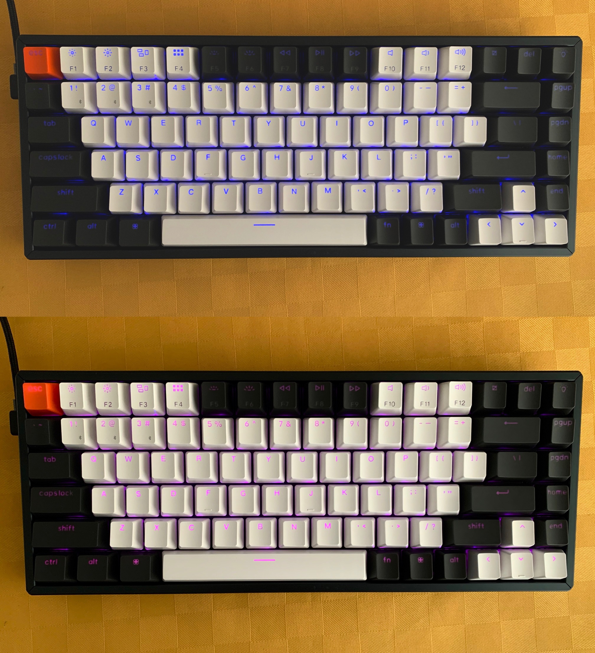
K2 hot-swappable - if backlight too low: white caps illegible:
Apple black caps vs Keychron K2 HS:
At the moment Keychron has a blog post titled “Answer to the Confusions about Our Double-Shot Keycaps”
They go to great length to explain the process of double shot moulding and then explain that the reduced contras is just a problem of color matching.
They also show a picture (quote) “from other keyboard companies. They are also black keycaps that used transparent material in Double-Shot ABS, which also looks a bit blurry”
First of all, the “other company” keyboard looks much better than the K2, second, all picture in the post are extremely low res.
Remember the Apple keys, legible with no led, the Keychron… horrible.
There is no confusion, the Keychron black caps look nothing like the picture in the blog post. Without backlight they are practically blank.
Also, is perfectly possible to produce black retro illuminated caps that also are usable with no lighting.
what they could do
To fix this they could:
A - make a run of white caps to substitute all black caps in this first run of hot swappable K2. Just the 30 keys to substitute the black caps, and offer them for free or for a VERY SMALL fee.
B - offer the complete keycaps set, used on regular K2, to buyers of this first run of hot swappable. Again, for free or for a VERY SMALL fee.
I’m interested to know what the community think of this.