I wanted a keyboard with a numpad. However, most of the customs out there would remove the 2u 0 key in favor of (2) 1u keys which I think was done to provide an fn combo arrow function in roughly the same area. This made the numpad more awkward for me. Still, I didn’t realize how much i would miss the dedicated arrow keys. After using a vibe, I knew it would need to be addressed. I didn’t want to waste any more space on the right, even as little extra as the 1800 layout does. I like the idea of extra macro buttons, but for gaming I thought the ideal location would be on the left. The redundancy of numbers on row 1 bothered me slightly. I realize this layout would only work for uniform key profiles like DSA or SA Row 3. Maybe that could change in the future?
Is this too far fetched? The only thing that I think might be concerning to me with a layout like this is that the special characters on the original r1 numbers would take a lot of getting used to. But would I miss it as much as I did the dedicated arrows?
What do you guys think? Should it have a more HHKB layout? Does the numrow need to come back? Should I just take the whole navigation cluster (3 columns) and just plant them on the left?
1 Like
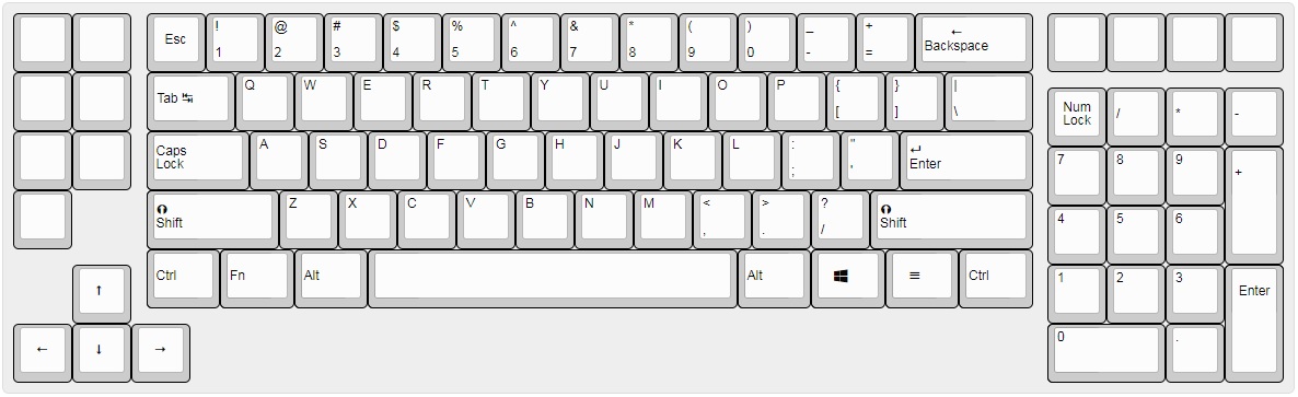
I think this with a number row would be ideal for gaming applications. Otherwise, this is a fine looking layout. I like it.
2 Likes
I agree with @hsBlank. If you want this board more for gaming bring back the top num row, if you want it more for actual typing, coding, data entry, etc. I think it’s in a pretty good place for that. Overall I’d be interested in this layout either way, but I think it has something to it’s aesthetics the way you got it now TBH. With a nice alum or PC case I think this could look killer! 
Edit: Just tossing ideals out there, but with the extra room made on the bottom because of the arrow cluster & numpad maybe you could adda small track pad there or a couple macro keys on either side under the spacebar to add a little extra functionality?
2 Likes
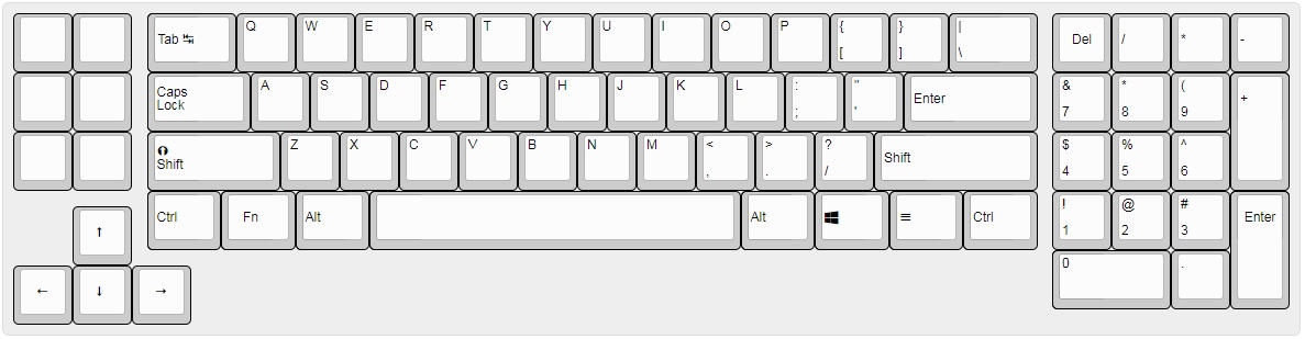
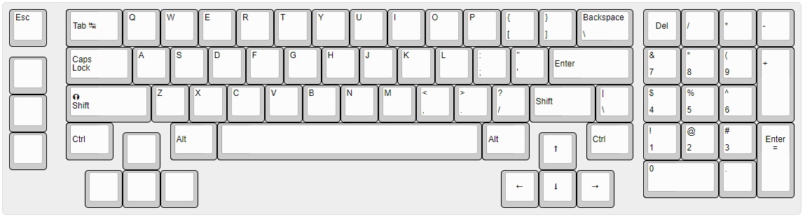
I definitely see what you’re saying regarding the numrow. Me, personally, I have small hands and don’t like to leave the home row to hit numbers. I end up using mods galore to bind keys. To face the truth, you’re absolutely right. I think most gamers utilize the numrow. @Rob27shred I like the balance a shifted numpad has and to keep the balance I thought maybe I could just add an extra row of macros/navigation buttons above it. I don’t know if I should add buttons or a trackpad below the space bar. I feel like anything in that location would be inadvertently pressed. Maybe it’s not ideal to even have that space? This board only really shortens the entire length by one column, but it should give the mouse 3 columns of space because of the rearranged nav. Maybe it would be simpler to just throw the nav cluster on the left. Thank you for the input! Here’s what I came up with considering your suggestions:
And here is the board with a simple shift to the left for the nav cluster:
2 Likes
I personally really like the uniqueness of the top layout! I think it looks really good.
1 Like
I like having the arrow keys hugged - that’s something you definitely gotta keep. If it was me, though, I’d make it more HHKB-y and drop the left control to hug the arrows up there.
1 Like
Personally I don’t really understand the benefit of having the bottom of the keyboard be uneven like that. I feel like I would always be pressing the arrow cluster by mistake with my left hand, since I often sort of rest it near the mods in that area.
1 Like
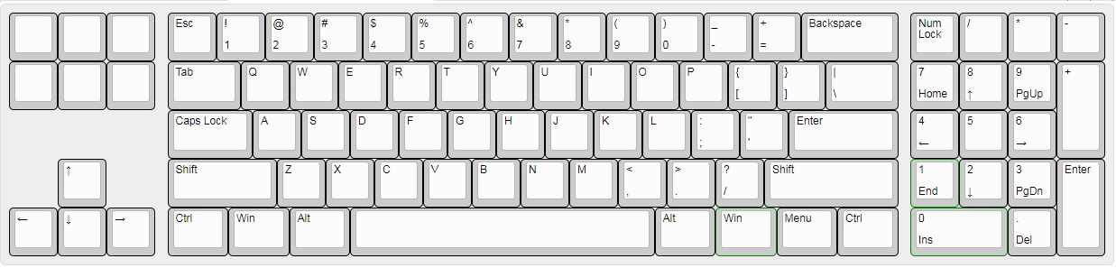
Here is an HHKB-style iteration I played with. There’s a big gaping hole to the right of rCtrl that I think could use a rotary encoder. I don’t mind this layout, but my focus is more towards gaming and that lCtrl not being in reach of my pinky would be sorely missed. My in-game character would be jumping off cliffs cause I’d be hitting the up arrow instead.
@MightyJabba I rest my pinky on left shift and never accidentally hit ctrl or alt just rest my left hand. There should enough clearance. Anything too close to the space bar does concern me though.
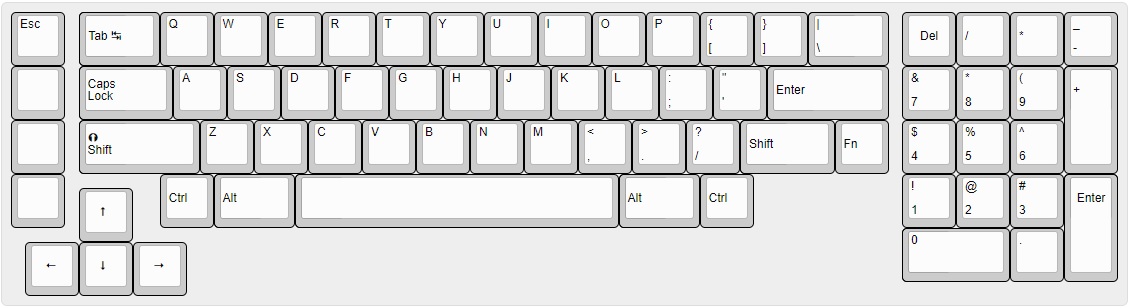
Here’s a WKL filler I was thinking could include nav buttons:
1 Like
That big gaping hole in the HHKB clone layout is a massive waste of space, yeah - which Is why I was thinking of something more similar to the original, just with the hugged arrows. The WKL double-arrows are… audacious, to say the least. It’s like the lovechild of a double 1800, XT, and HHKB, and I kinda love it.
1 Like