Maybe this will help someone. First the facts.
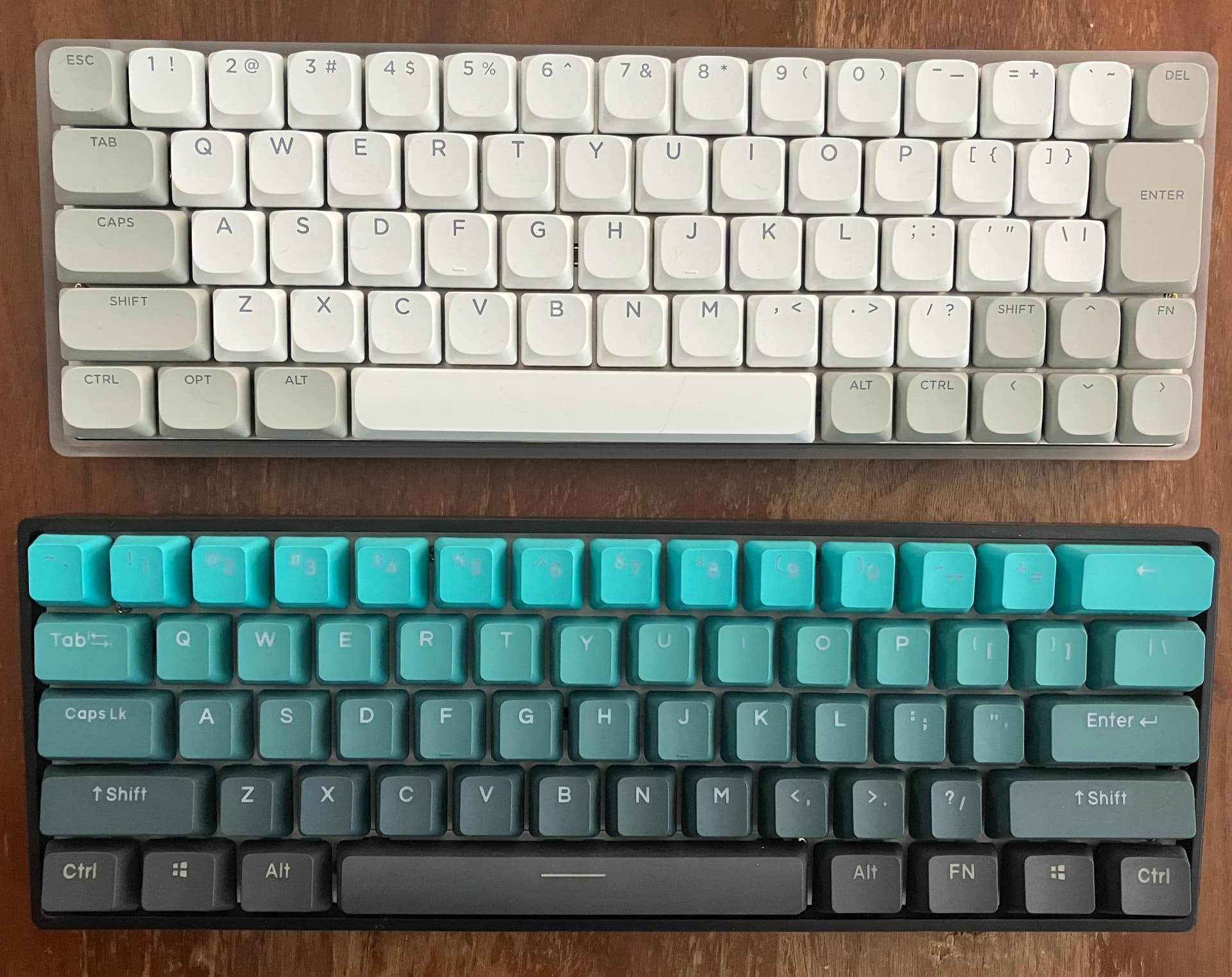
I got these keycaps to try on my Keychron q5 HE keyboard. A few pics:
My impression. They’re cherry profile abs double-shot keycaps. They’re plenty solid, no key rattle or shake. Did NOT have the 2x 0 key my board needed, and of course the esc and skull key are not from the set. They’re a pretty wide, square top with a mild dip, easy to type on.
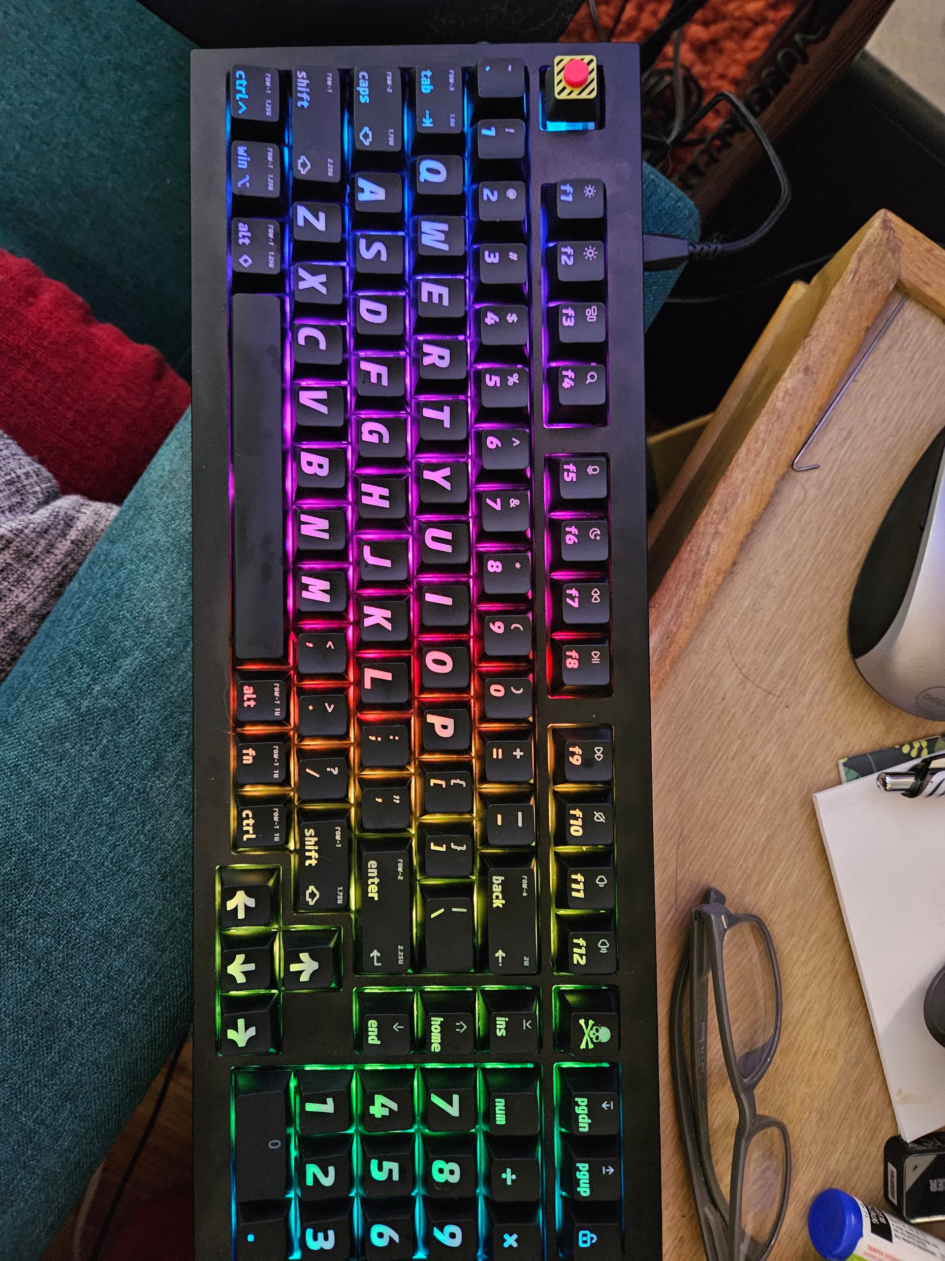
Appearance wise, you can be the judge. I find the light gets through very well in dark or poorly lit rooms, which is nice for my area, but the lettering and font…isn’t my favorite.
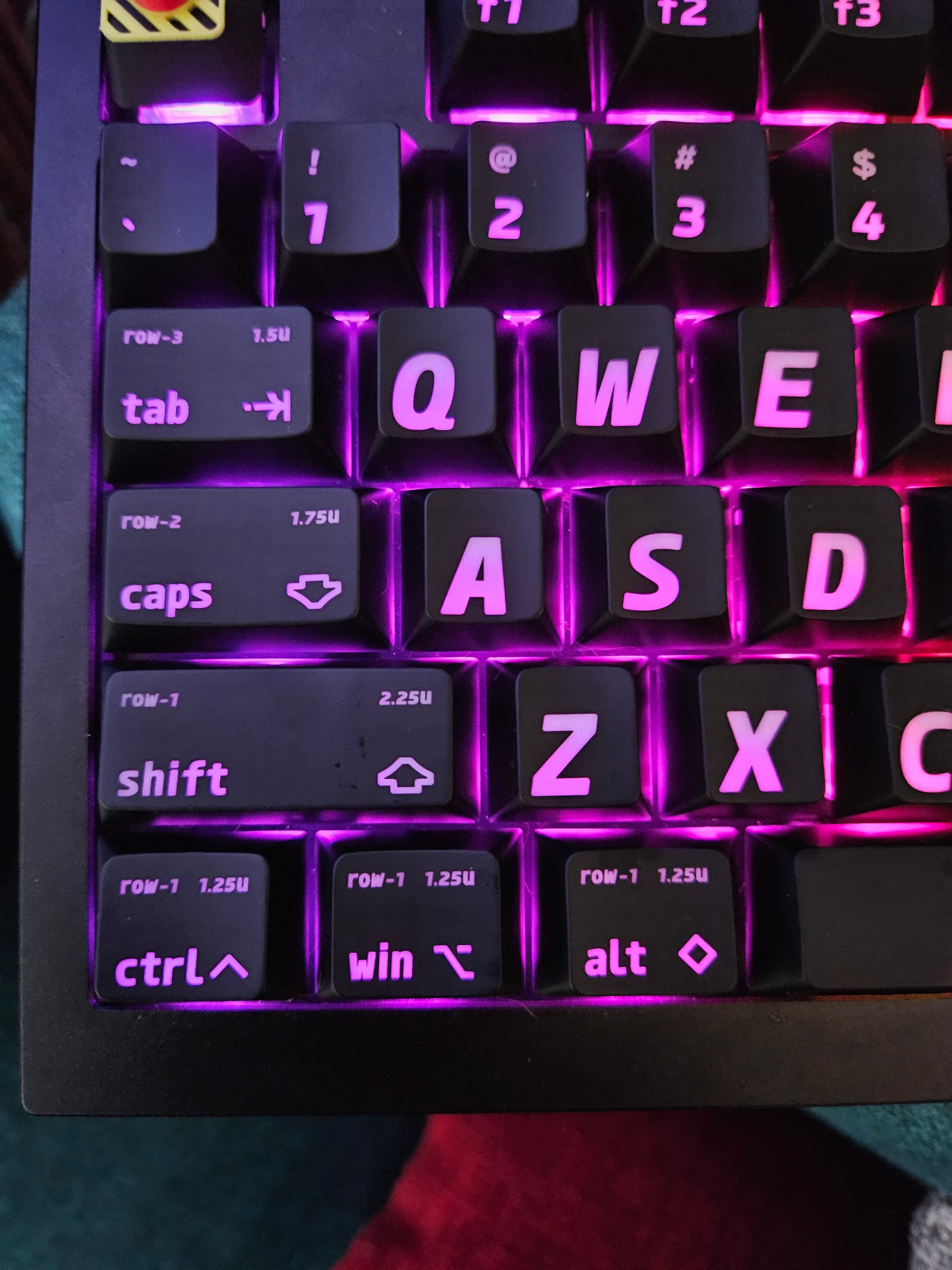
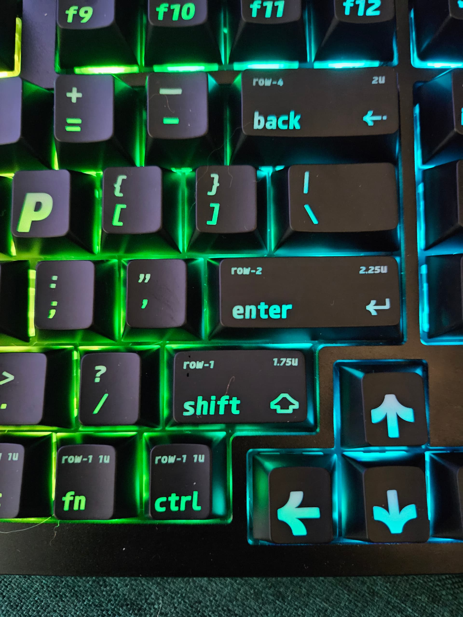
I do NOT like that the keys have the size imprinted on the tab, caps, shift, ctrl, alt, win and enter key. Seriously, we can tell, we don’t need to look at that allllll the time. If I’d have noticed that going in I’d not have ordered them, it’s like a bad typo or a misprint.
All in all, between the ugly overblown font and the garbage printed on all the outer keys, I’ll be packing this set up soon and trying the Next set.
I’m probably giving up on shine through, some caps have enough contrast I can see it well enough without attempting shine-through.
BUT, If you’re Really Really wanting caps for a south-facing led board, this is by a long shot the most visible I’ve found yet. It’s more a function of the lettering being HUGE though, than the actual color getting through much. It shows color though a lot in the photo because the camera is upping contrast/hue a lot, it’s not nearly as colorful to the eye.
Oh and a sidenote for via/keychron launcher, i REALLY wish you could control the color fades better, maybe a Range of brightness for breathe, so it doesn’t go completely dark, maybe a range of colors, not just “rainbow” or one color. But whatever. individually addressable etc etc etc but bad interface.