Someone told me the Noire cream is a close match to the Rama Soya colour. I have never seen a soya coloured board so can’t confirm.
Probably will be a good match.
ePBT Grand Tour fits like the hand in a glove.

(keeb belongs to adventure)
14 Likes
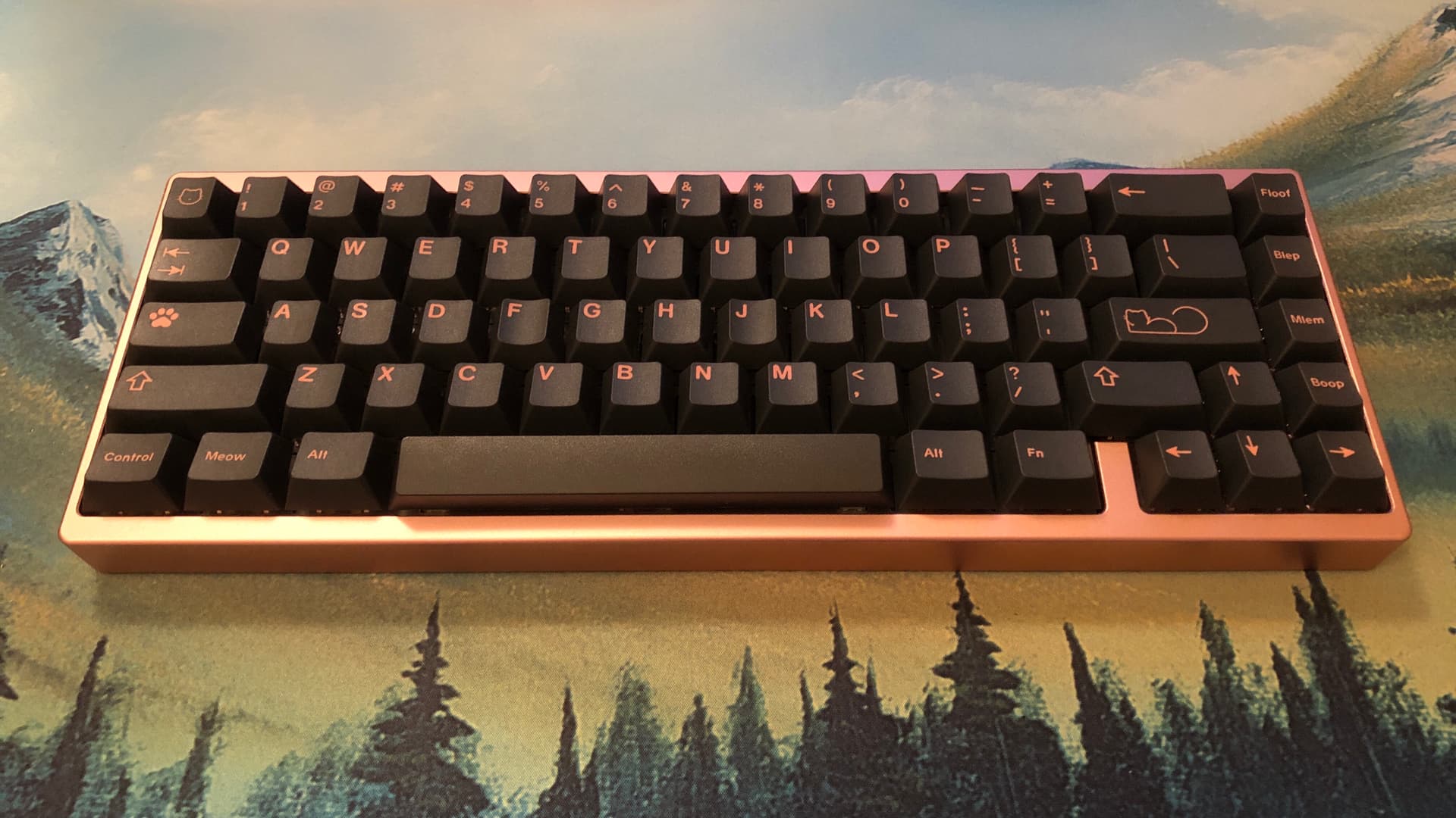

Portico68 Black Label Rosé color
- GMK Pono
- NK_ Olivia Silks
- Equalz V3 stabs
- Flex-cut poly plate
- Standoffs omitted
I thought Noire looked really good on this keeb, but Pono might be perfect for it. The Silks are nice and smooth (and pink), but I think I might swap the TTC Hearts back in; the way they pair with this build sound and feel wise is just [ chef’s kiss ]
It was a tough choice choosing between the “Derp” key and the cat face outline, but the cat won.
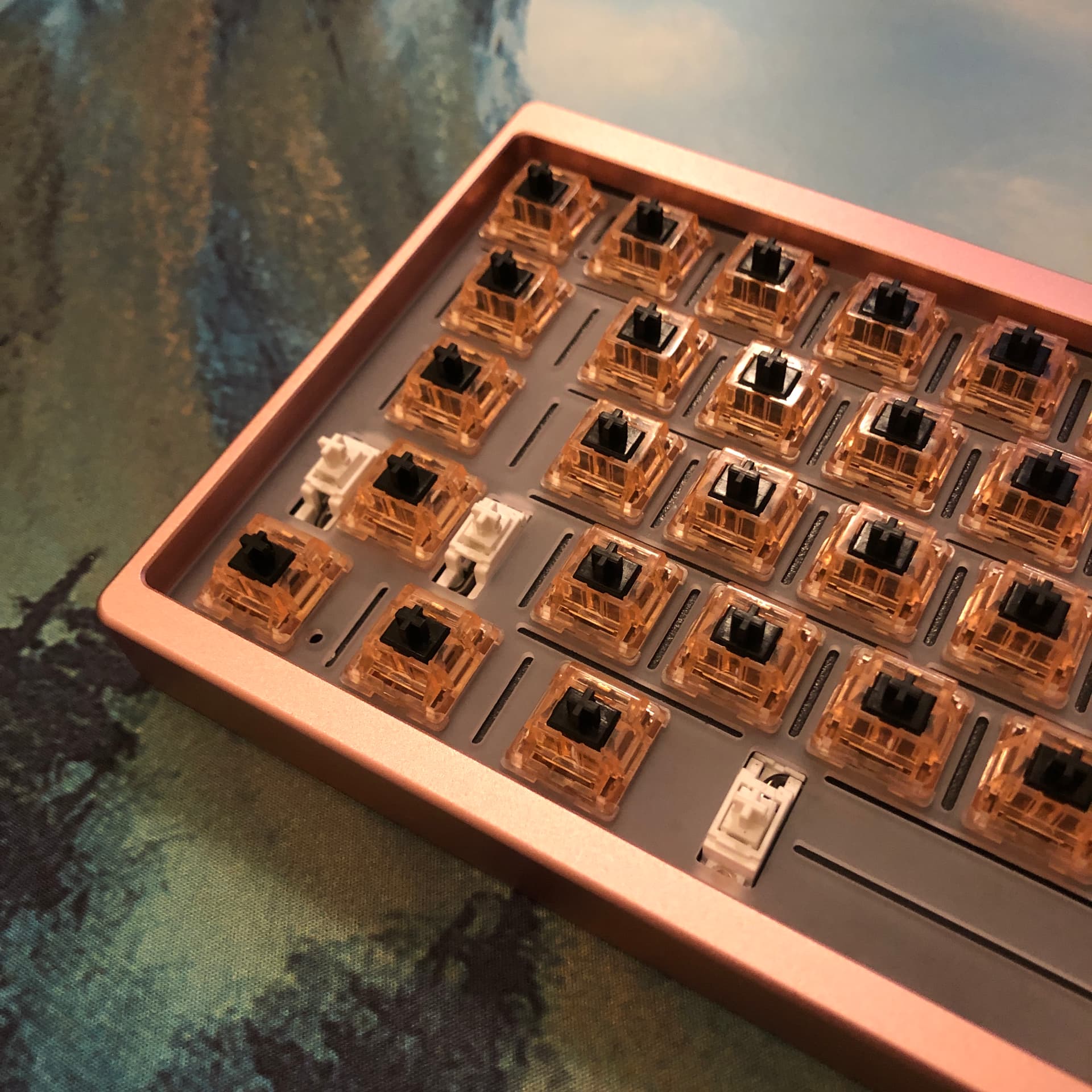
I much prefer using the poly plate with this keyboard, but it’s definitely more time consuming to install switches in. I used a small spudger tool to pull the thin strips of plate up to meet the switch clips in some places.
Edit; it sounds like this:
The Silks might be growing on me. ~ ʸᵉˢ ᵗʰᵉ ˢᵗᵃᵇˢ ⁿᵉᵉᵈ ʷᵒʳᵏ
13 Likes
I like it, though the case sounds a bit hollow, is it like that in person?
That’s probably more the recording environment; my desk is in a little alcove with three walls close by, so tight echoes are impossible to avoid in here at the moment.
I’m actually in the process of building a small sound booth for keyboard sound and voice recording, at which point I’ll be systematically re-recording my switch and keyboard collection, including this one.
3 Likes
White’s 
RAL 9003
RAL 9016
RAL 9010
AFAIK Ivory is classified as off white. Something like RAL 1013 or so.
Transformation complete.
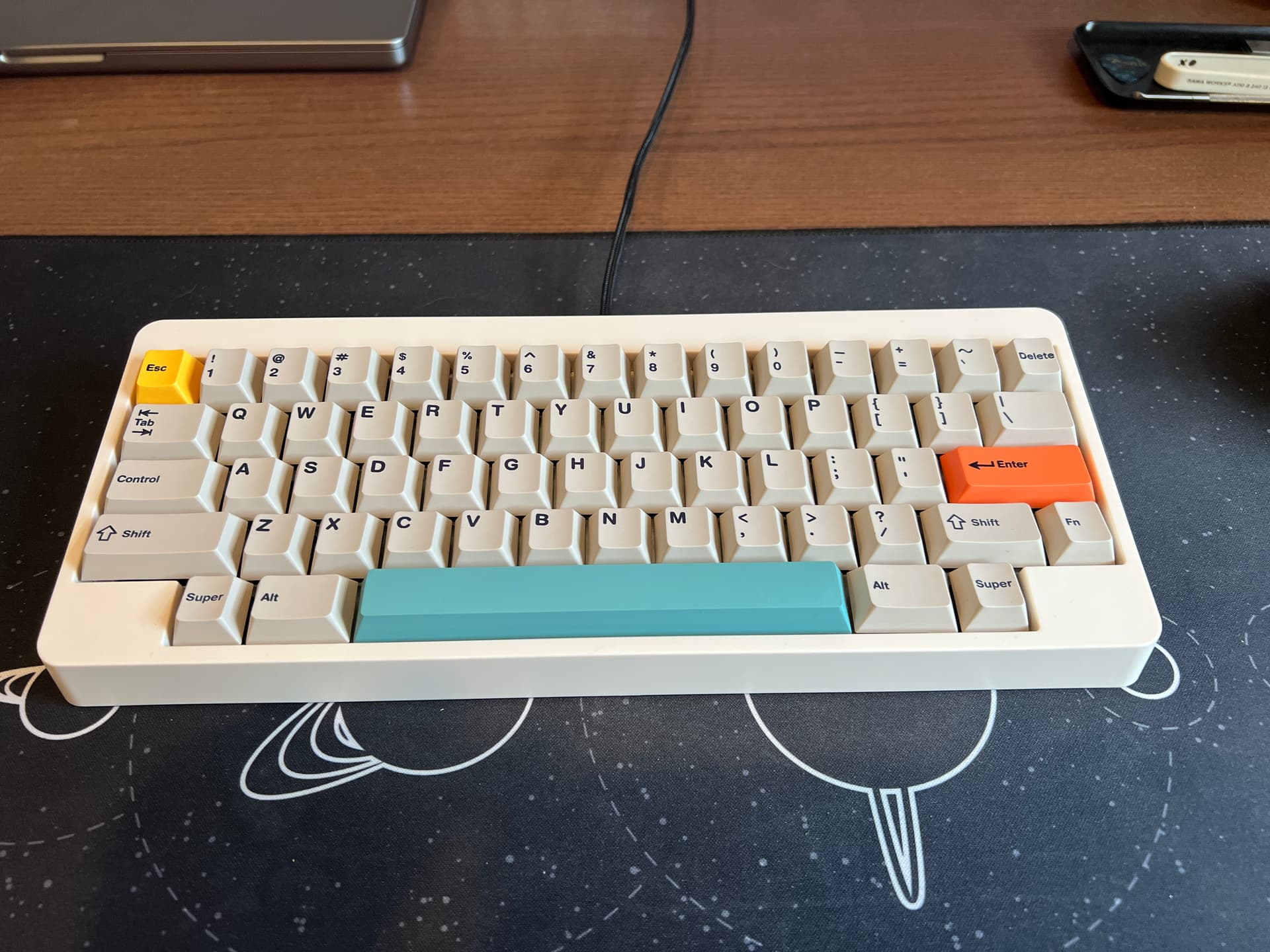
My daily driver @ home office MAJA.
I’ve been using the SMRT POM plate from Green Door Geeks for about a week now. I don’t think I can ever go back to metal plates. POM is just so nice to type on. The white also looks super nice. I still like how unique the brass looked though.
12 Likes
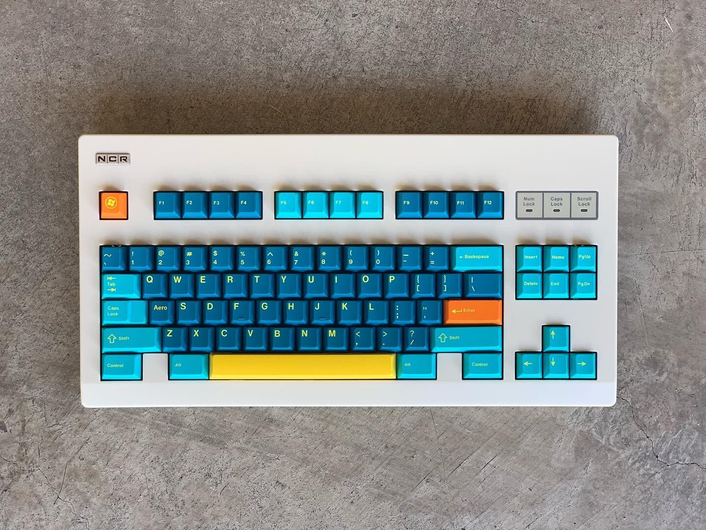
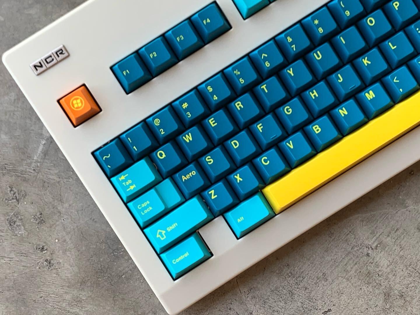
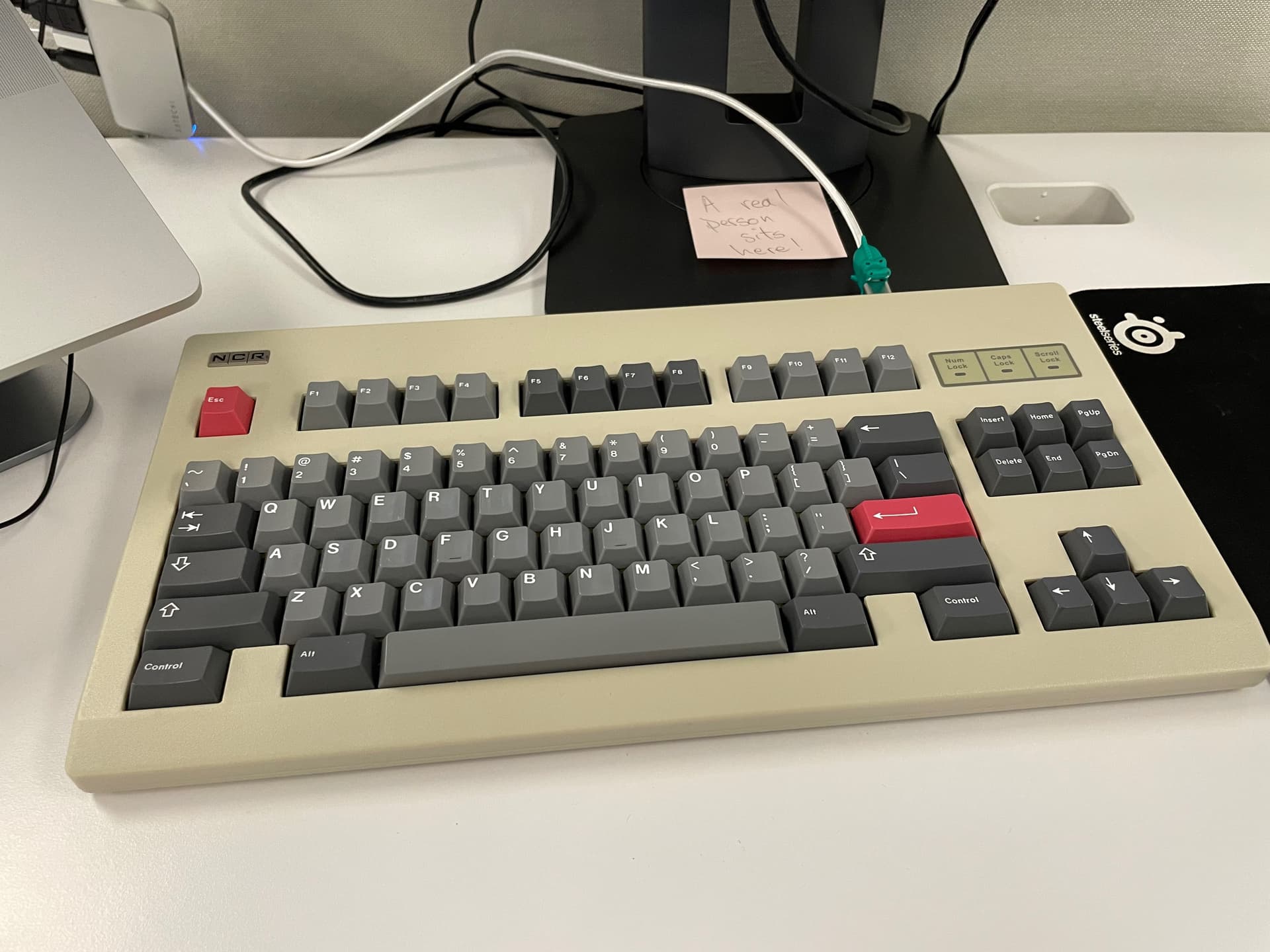
I put Retrocast on my NCR80 but it didn’t look right. Instead I went for Aero. Picked up a yellow space bar set from Oco for retrocast but it also really looks nice to me with Aero (same yellow CV)
I think retrocast will look better on the KBt: Re66. I’ll post that another time. Perhaps after I get the sunscreen off my camera lens… Hey, San Diego was nice as usual, by the way! 
21 Likes
That’s just fantastic. I really like that combination. Makes the keycaps really stand out from the neutral color of the keyboard.
1 Like
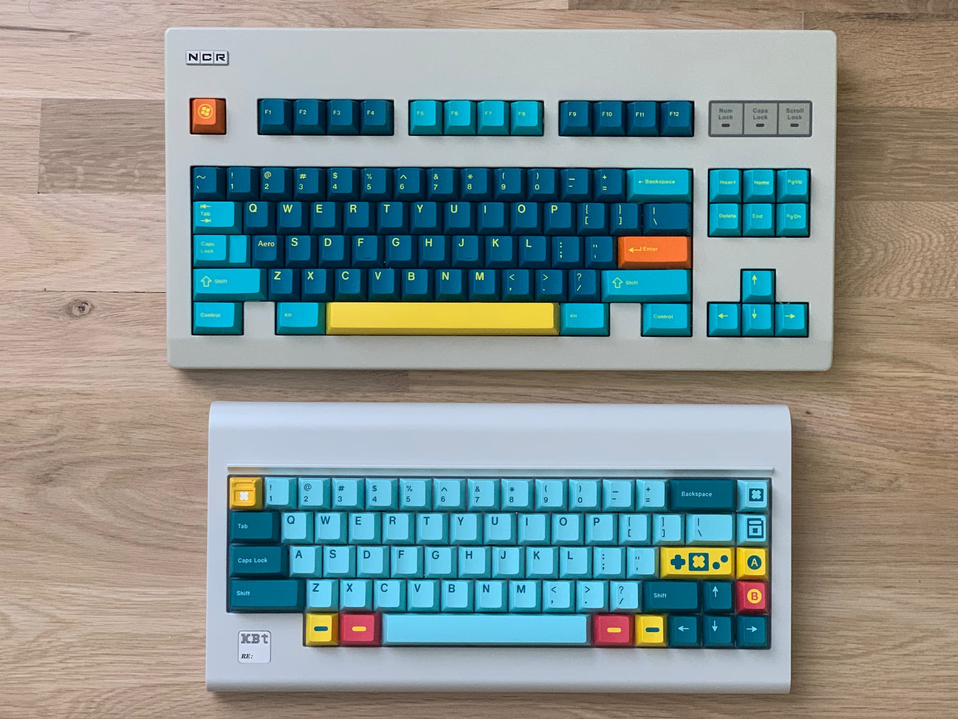
Here’s a comparison of retrocast with Aero. Also a comparison of the NCR80 with KBT:re
I like this setup 
19 Likes
These combinations look really nice, and they really pop on the beige cases.
2 Likes
Hey Pixel, curious what lighting you took these photos in? I am thinking lots of natural light, on a sunny day?
Just curious, I have been enjoying my NCR80, but I have noticed the color seems pretty heavily influenced by the lighting. Mine appears more like a coffee dunked, greenish most of the time when I would prefer it to look more like your photos.  My darker keycaps might be having an effect too. I should try and toss some beige caps or something like that on there… maybe that would lighten it up
2 Likes
Previously I was disappointed in how NK’s Cherry Stone looked on Rama’s Soya color. I tried it again with the color mods and am relatively pleased with it.
12 Likes
@djmantis : The photos were taken in shaded natural light. You can see in the comparison with the KBt:RE board, the NCR80 is slightly warmer/browner. I would call the KBt:RE a classic beige. Is your case beige or is the the “light gray” color which is quite darker with a green tint?
Don’t know why Keebtalk decided to reply to you @sarvopari 
2 Likes
How light affects perceived color is something I work with almost every day in the printing industry; we have special lights at the presses that have a very specific color temperature so as to avoid that effect. By the same token, you can shop for light bulbs / tubes by color temperature - so if your beige is looking too green, look for “warmer” bulbs.
I had a pair of pants that looked unmistakably green indoors under florescent light. Those same pants looked undeniably brown the moment the Sun touches them.
I was photographing NK_'s Charcoal keyset a couple days ago; under the ceiling lights the black of that set looked almost identical to the black of the keyboard case - but under cool photography lights, the set looks almost blue-grey.
3 Likes

1 Like
Fun! Like that dress that broke the internet!
(I am referring to the photo of a dress that could be blue/white or black/gold depending on lighting or who was looking at it)
2 Likes
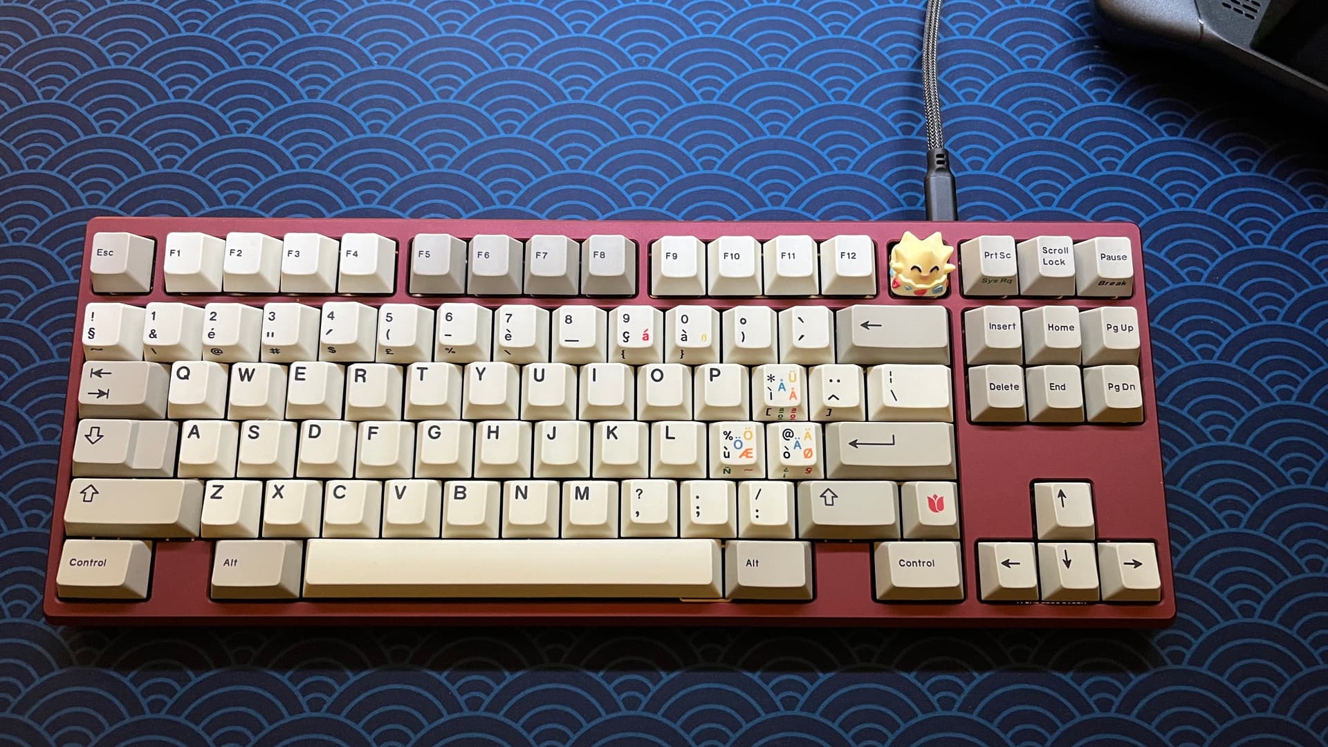
Not the best quality picture as it was taken on my phone with poor lighting, but the quality of the Frog is another matter. First experience with a board from GEON and it definitely exceeded expectations. Built with FR4 half plate, black ink V2’s, CRP Tulip R4 and a little EnkeyCaps Eggo to tie it together.
17 Likes
Pretty sure I have the beige, but it still comes of slightly green to me  I bought it second hand and the seller said it was beige. Maybe it was from a older round or something though.
@Deadeye - Thanks for the tips, I think what your describing is definitely my situation!
12 Likes
Yeah that looks like the same color as mine. I like it!
1 Like