Did anyone else here grow up in the previous century? So many things have changed and improved since then, I don’t even want to start listing them all. In the area of keyboard ergonomics we also have a lot of progress: there are a lot of options of split keyboards, many of them also with finger-friendly column-staggering. But what really bugs me is that those are mostly niche products. Unlike smartphones, TV streaming, AI chat, which have all achieved mainstream usage. Today’s “standard keyboard” is still almost the same as a 1990s standard keyboard.
And I am talking especially about the layout of the keyboard, something which doesn’t need any new technology. It just needs a change of culture to value usability more. It’s the same change of culture that has happened in software companies and IT departments: in the 00s, UX was not a well-known term and design a minor concern; however in recent years, every software team for consumer applications had to have a UX expert. And consequently, software became easier to use. Why did the same not happen for keyboards?
I couldn’t let go of this question, so I looked around for different keyboard designs and the history of the ANSI/ISO standard… and I found that before the standard was set, there were actually a lot of different designs on the market and some of them actually had some better design elements. So I took some of those design elements and recombined them into a 21st century keyboard layout that removes some of the worst problems of the ANSI/ISO standard keyboards: too much load on the right pinky, not using the thumb’s potential, and wasting space with oversized keys. Basically, it all went into the direction of the Planck/Preonic keyboards that have perfect symmetry and only 1u keys… gaining some of their advantages, but still keeping the most familiar features of the traditional layouts.
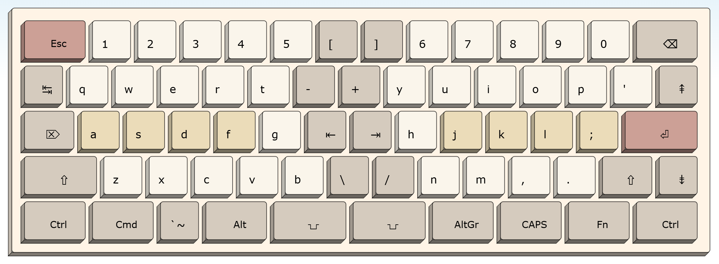
I call it the Thumbs Up 16/5 keyboard layout:
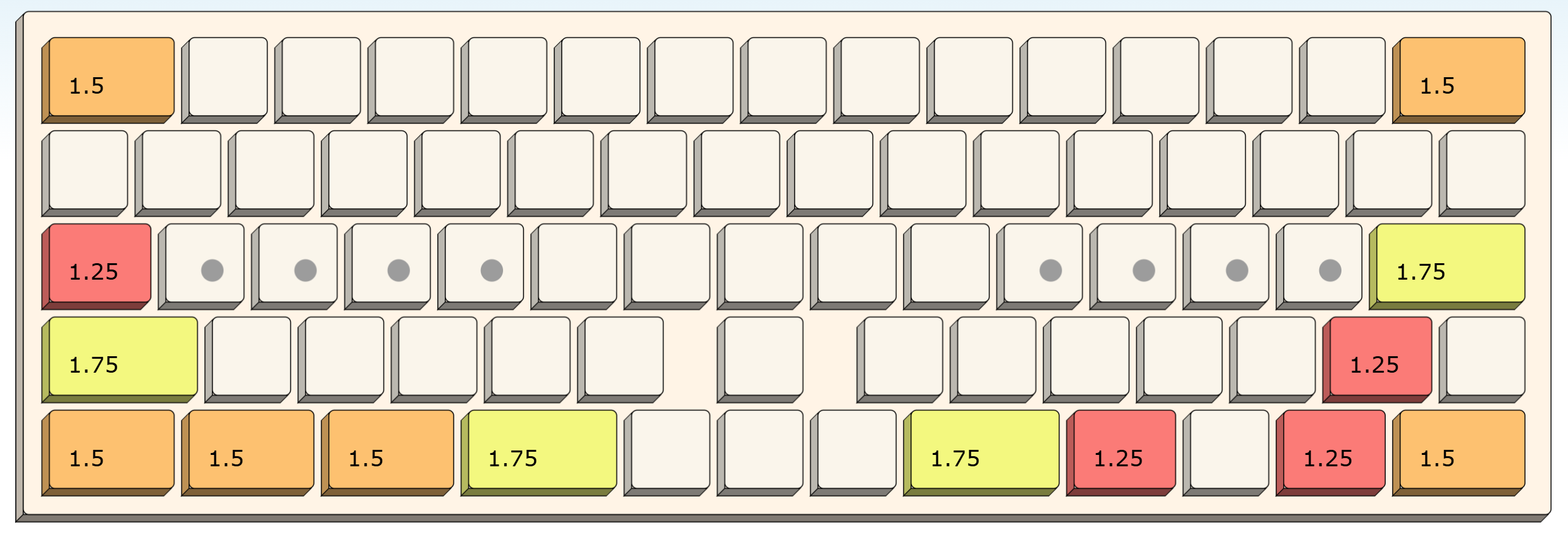
As you can see from the key size chart below, it is 16 key units wide, just like an ANSI/ISO 65% or 75% layout. It’s the same form-factor that a lot of people already have on their desk, but providing more keys and making them more accessible in the center of the keyboard. While it does require a little effort for getting used to, I think this is about the same effort that one has to invest for getting used to a new laptop keyboard – because those have their navigation and other keys also in a variety of positions. The Thumbs Up, on the other hand, is designed intentionally to work both as a laptop keyboard layout and as a stand-alone model.
What strikes me is that I had to do nothing crazy new to create this layout:
- the key sizes on the left edge (Backspace, Return, and the key between both) are taken from Apple’s keyboard layout in use since the actual 1980s.
- the key sizes on the right are just doing the same modification: shaving 0.5u from all keys, so that the stagger is unchanged and the keyboard whole number of keys again (Apple’s layout is only 14.5u wide).
- finally, the right half of letters and numbers move by one key to the right, something that Colemak-keymappers have done in software for years; now we make it official.
- the above changes together create two “new” columns of keys in the center: one with the moved character keys from the right, and the other created from down-sizing keys, so it can be used for extra keys that are missing on standard 60% boards, such as `~, Delete/Insert, and navigation keys.
- and since we have that middle part of the keyboard now, we can as well add another column in the center, widening the whole keyboard from 15u to 16u and place the arrow cluster in the middle as well. This creates some nice gaps to find the arrows by feel while still keeping all keys in the rectangular box.
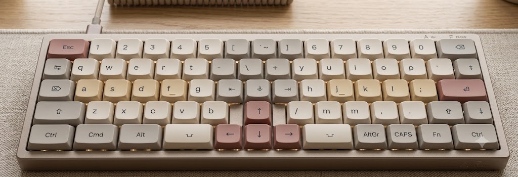
While there’s no fixed standard for n-percent keyboard key counts, the Thumbs Up 16/5 has exactly 72 keys. I consider the key labels shown above only an inspirational example. If you don’t need an Insert or Delete or Home/End keys, use them for macros or shortcuts. I think it’s great to have a default keymap that makes sense and optionally a lot of keys up for customization. (That’s also why I created the example picture above with flat keycaps: I want to make it easy to switch to other letter maps, like Colemak, or even switch around some of the other keys just as it fits each user best. The layout should be a pattern of sensible key sizes, basically the shape of the switch plate, and mapping the keys left to the user or seller of the board).
Anyway, I didn’t write this post to advertise my own ideas. All I wanted to show is that there’s a lot of room for improvement on the old typewriter-based keyboard layouts. I wish I could buy such a keyboard, even if I had to assemble it from parts and even if I had to buy lots of keycap sets to extract enough of each type of >1u key. What I don’t want to make is a PCB and switch plate from scratch.
Does anyone else miss layout innovation in the mass market? (Apart from different ways to split Shift keys…)