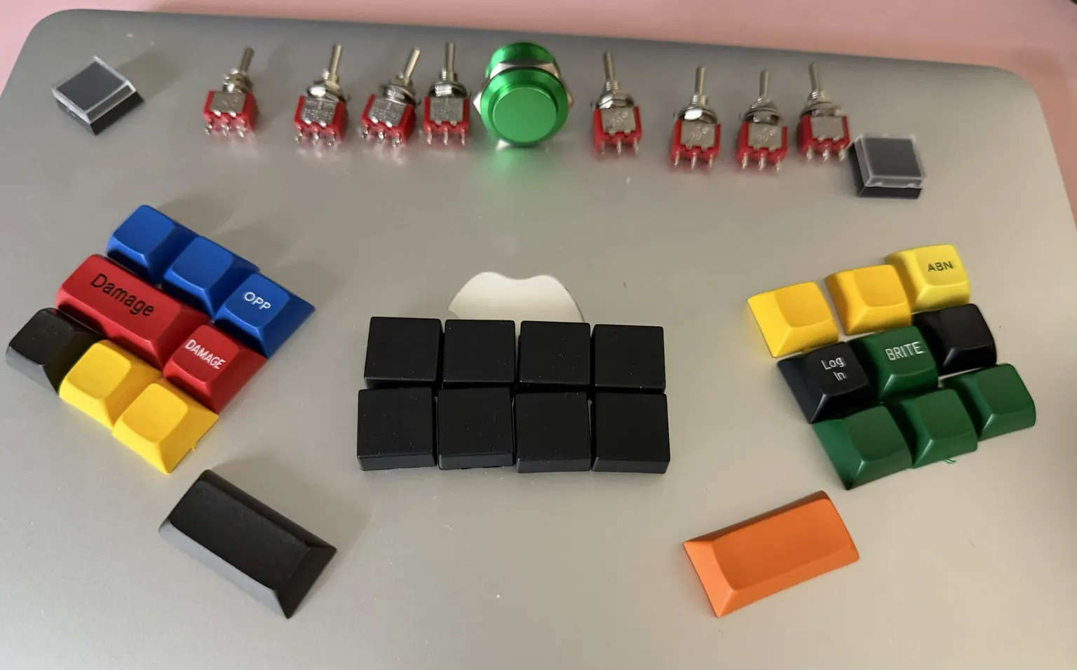
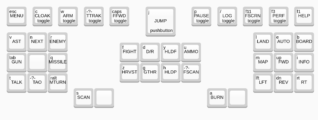
Got in some momentary mini toggles and a 22mm aluminum pushbutton. Every couple of years, I bust out the retro, open source game “Endless Sky.” You can play with keyboard-only when in the ship, and the game only has 38 total keybinds, so I’m going to throw together a silly but fun control panel using the switchgear plus some leftover Gat G Pro 2 black and grab-bag keycaps (DSA and F10). I’m pretty well set up to do a faux 80s military look, and I think that aesthetic will actually serve the game well.
10 Likes
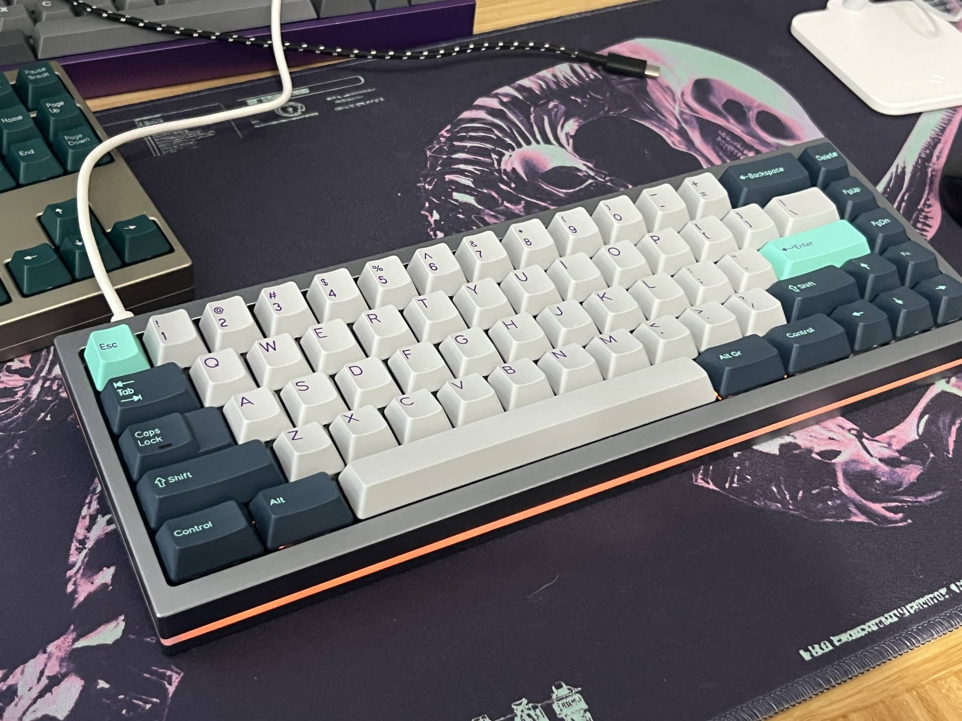
I got some stuff that was on sale at Novelkeys in the mail today. TypePlus stabilizers, TypePlus Peacock switches, and a WT-60 Hotswap PCB. Put them together in a tray mount case (retro60 from The Van Keyboards). I have to say, I’m impressed with the switches. The springs definitely need to be lubed or they ring a lot. I’ve got to test them in some top mount and gasket mount boards to know for sure, but the seem very promising.
2 Likes
Is it one of the Zebrawood Retro60s or one of the alu boards?
I do have a walnut one but this build is with gray aluminum
1 Like
Special board today in the mail.
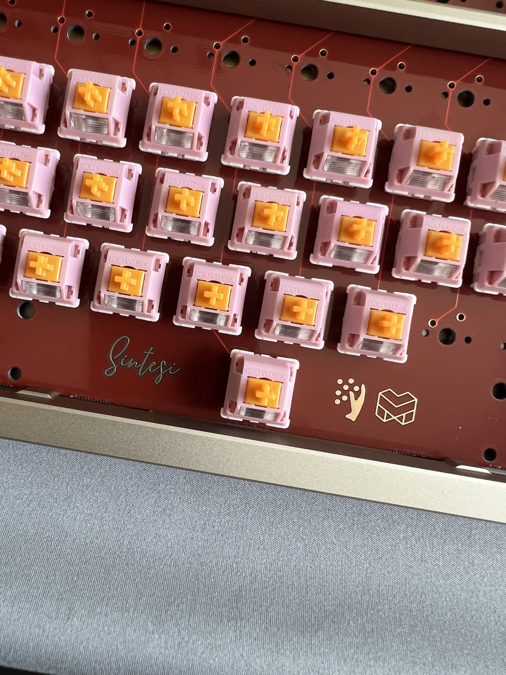
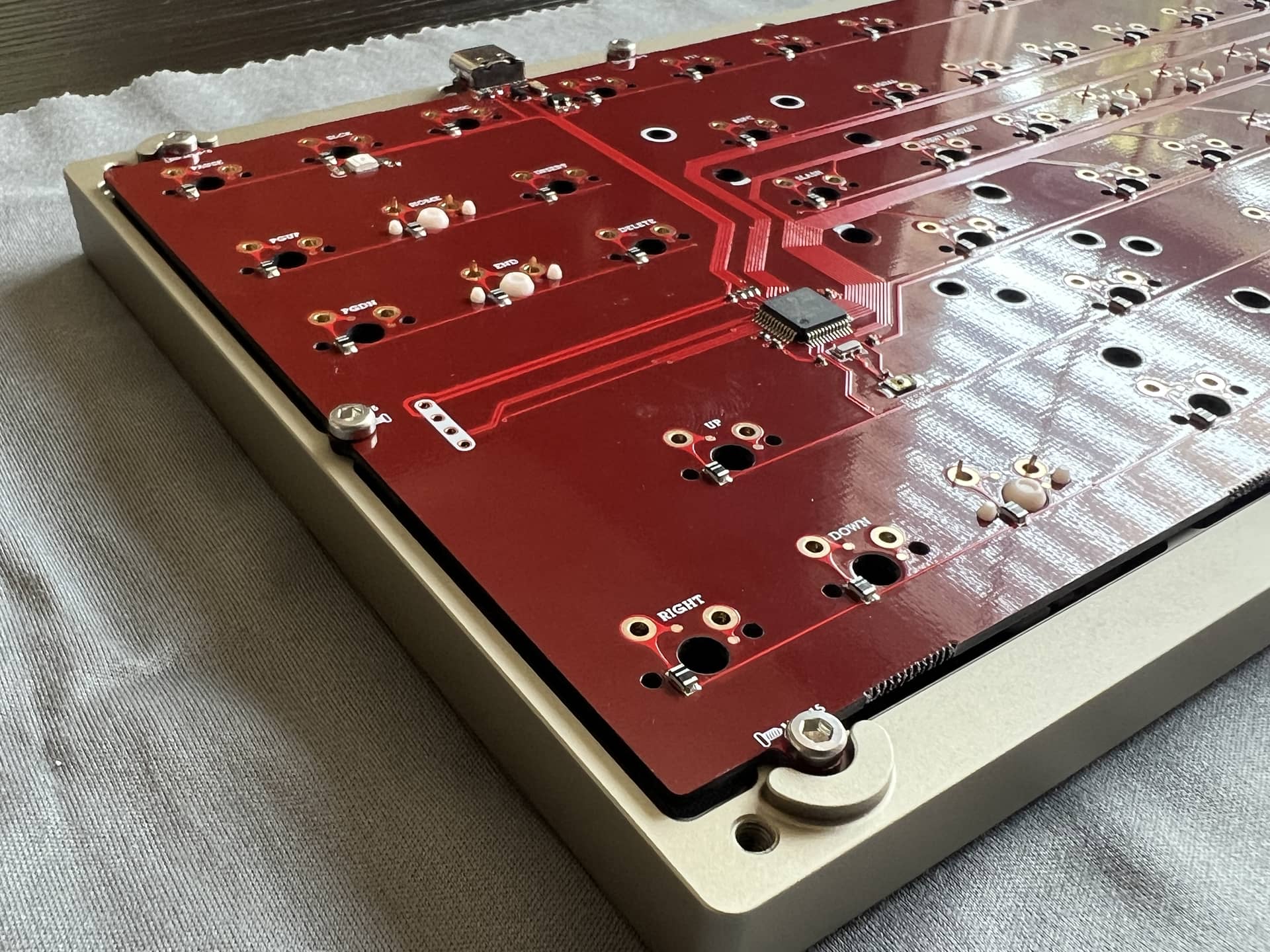
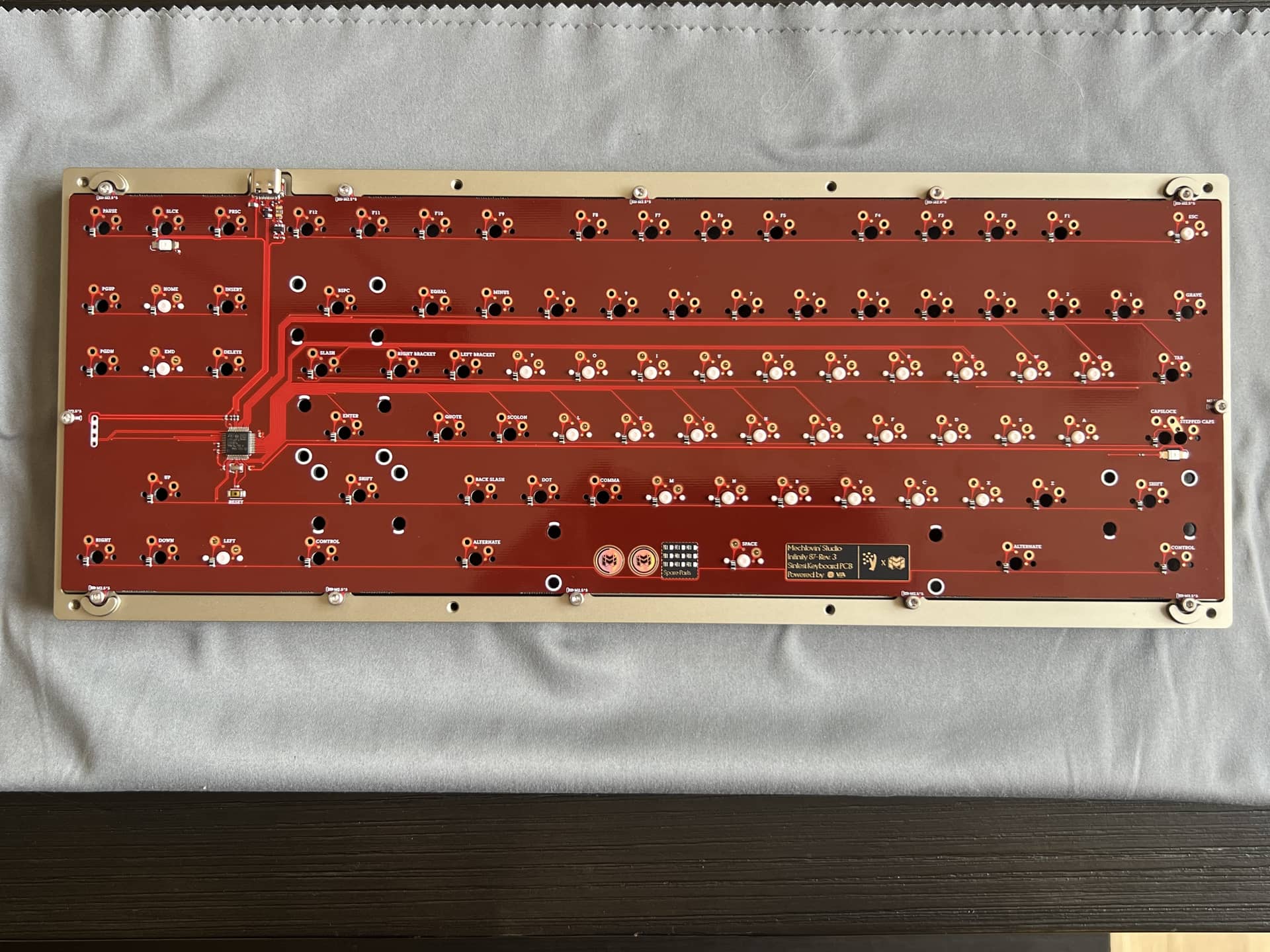

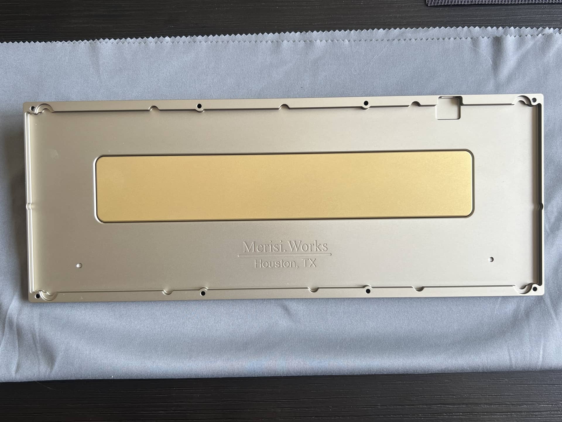
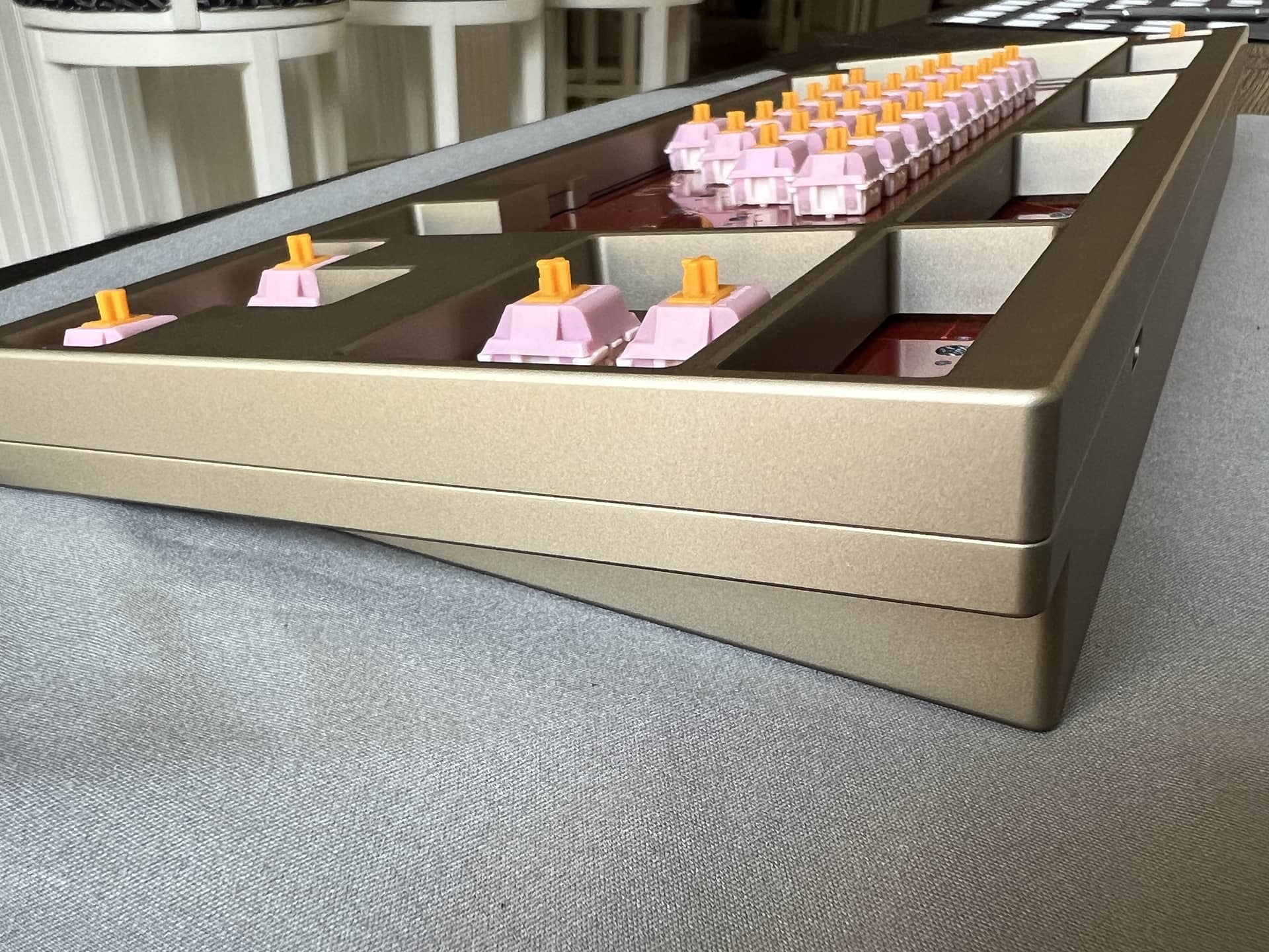
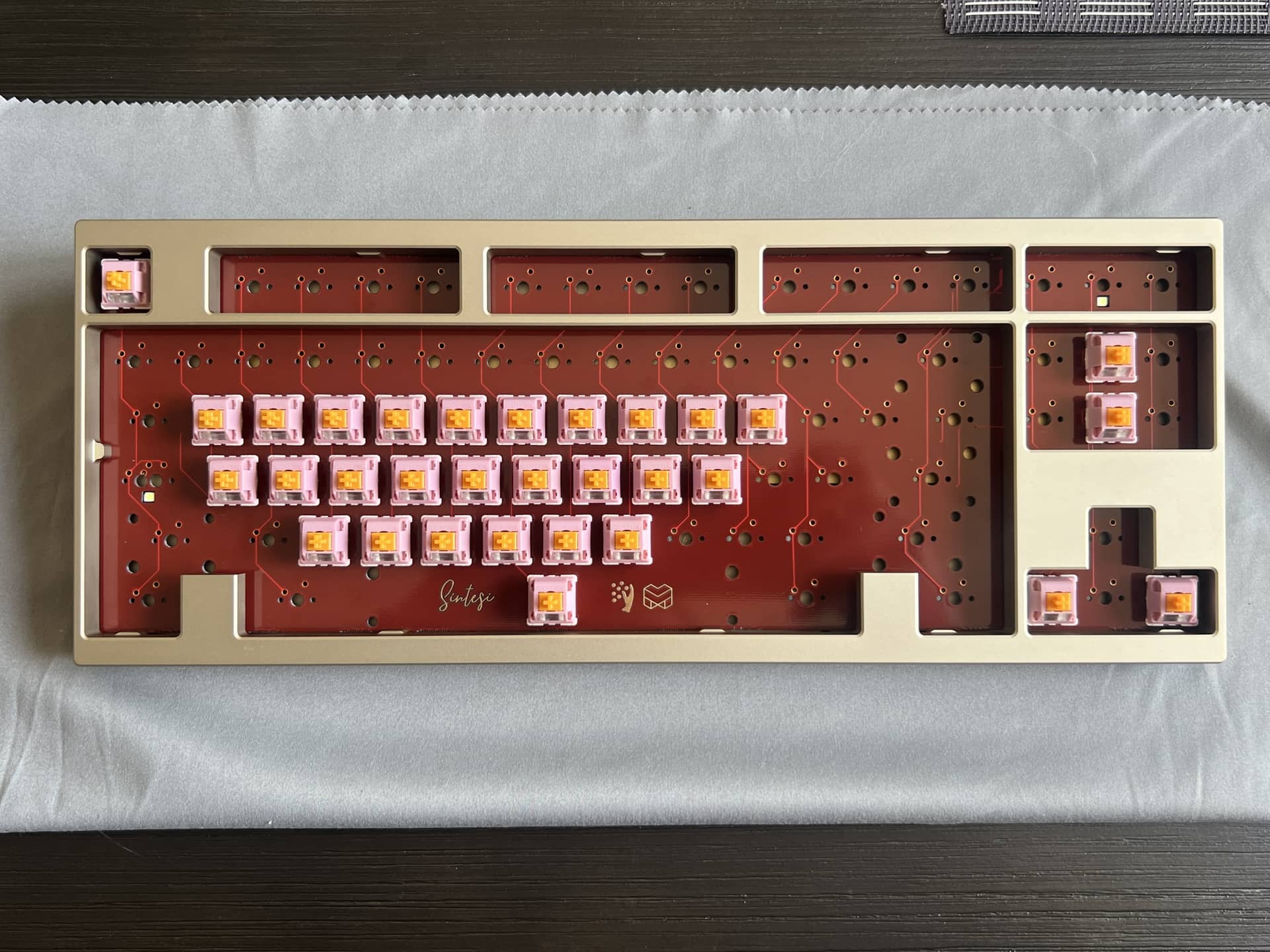
This is the Friends and Family Sentisi TKL. It’s a collaboration between Mechlovin and Merisi, hence the logo on the back (still have protective cover on it)
Plateless top mount (PCB directly mounted to top). OTD spacing (slightly tighter spacing on switches)
Unique color that I don’t have. A warm gray that is close to a desaturated champagne.
Looking forward to building it. Best part is that it’s plateless, so I don’t have to fret over stabilizers since I can always adjust them!
10 Likes
picked up a set of pbtfans tape and radio that came in the mail. I like the base colors of sport walker better, but I can’t seem to get my hands on the novelties for that set.
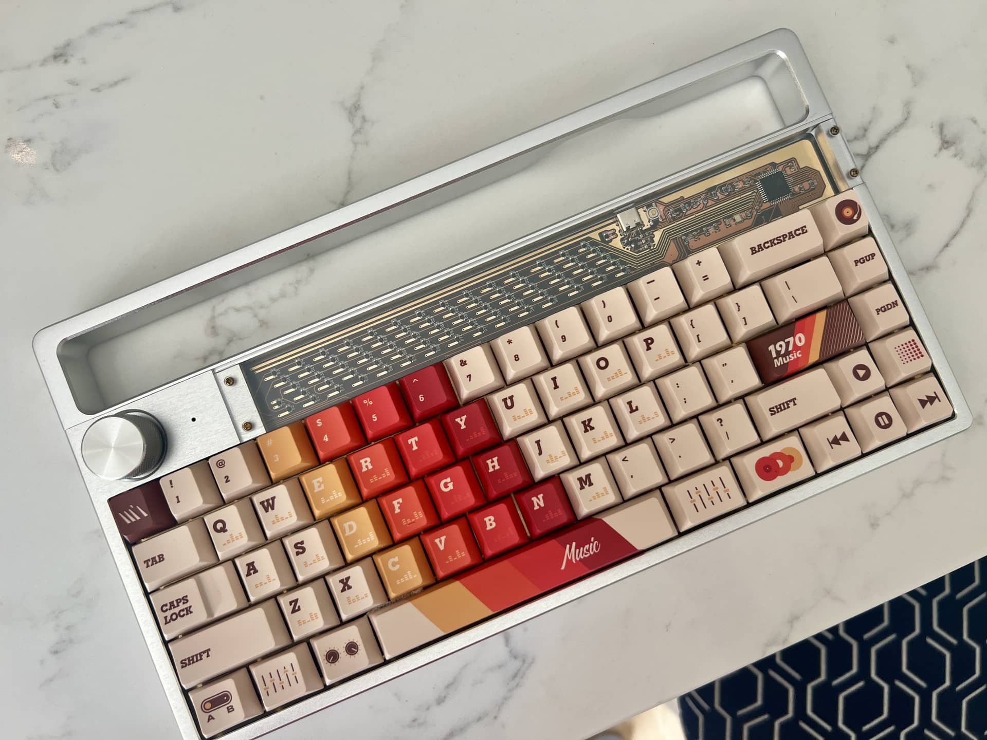
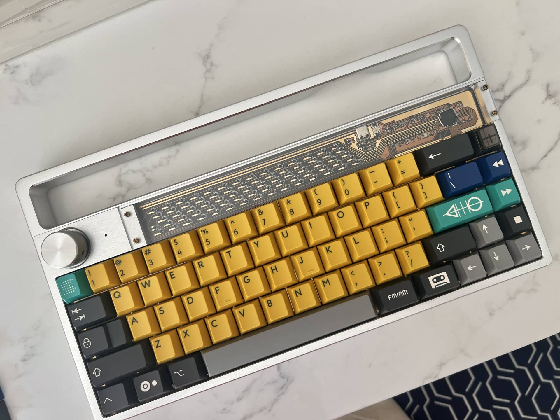
Which set looks better on the Disarray keyboard?
- 1970 retro keycaps
- PBTfans Tape and Radio
0
voters
4 Likes
1970s Retro looks iconic, like it’s a product photo. You’d think the keyboard would be sold together with that set.
Tape and Radio looks good, but only if you haven’t seen it with Sport Walker.
2 Likes
That warm gray / muted champagne sounds like a really nice middle ground — distinctive without being loud. The Mechlovin x Merisi back logo is a neat touch too, especially on something F&F like this.
Plateless top mount with OTD spacing should be a fun one. I’m curious what switches you’re thinking for it; plateless always makes me want to pick something with a bit of character since the board tends to let more of the switch feel come through.
1 Like
Two different ideas for switches, quite different from each other. They will be linear for sure, but I’m on the fence.
Option one - low pitch HMX
I’m a big fan of HMX for stability, smoothness, and overall hassle free building. The pole bottom out on a plateless, top mount board makes for a percussive, resonant board.
Option two - Cherry mx2a
An mx2a very carefully lubed to preserve texture with a crisp bottoming out that uses a 57g ultra long TX spring to keep keypresses feeling snappy. The sound of mx2a can often be muted, but really springs to life with this mounting system. The sound is a “k-chuck” “k-chuck”. Lately my preference for Cherry switches it a “cleaned up” stock feel rather than a more heavily lubed approach that I used to prefer. Granted, this can only be done with mx2a switches. Older cherry switches simply aren’t a good stock experience and must be more heavily modified.
Two very different builds overall but both viable in my eyes. Problem is, I’m still waiting on HMX blossoms from Milktooth (back ordered) and I don’t have a full set of mx2a on hand. They’ve all been used in other builds.
I sit and wait. The only thing consistent about this hobby is that you MUST wait. Always
5 Likes
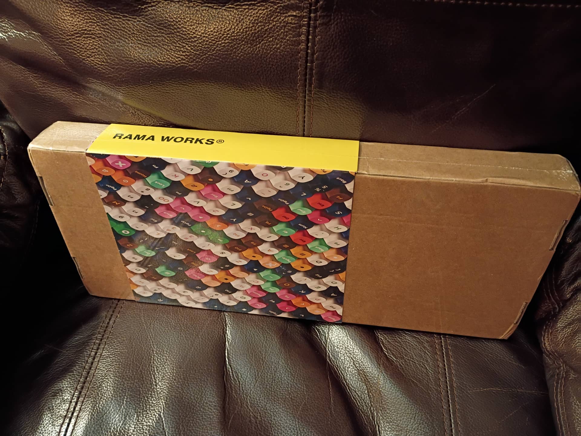
what theeeeeeeee, the KATE keycaps are actually real and alive.
2 Likes
… and in Rama packaging! Good lord what a cluster. 
3 Likes
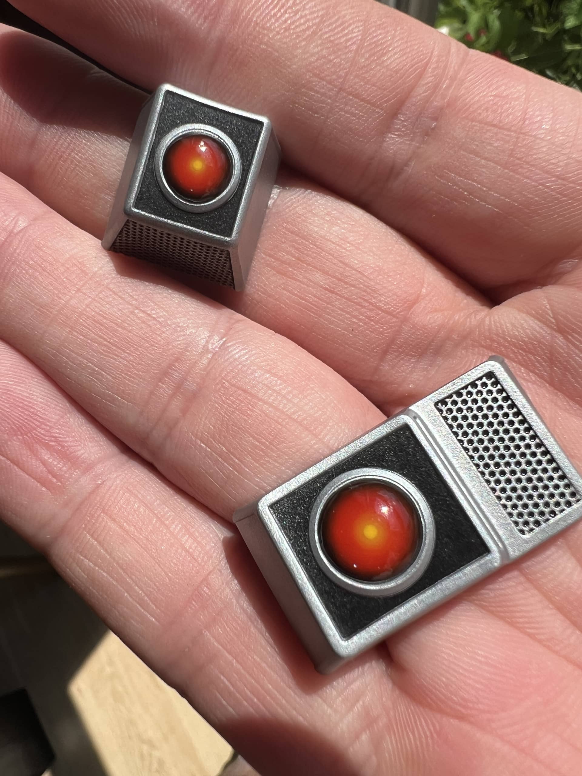
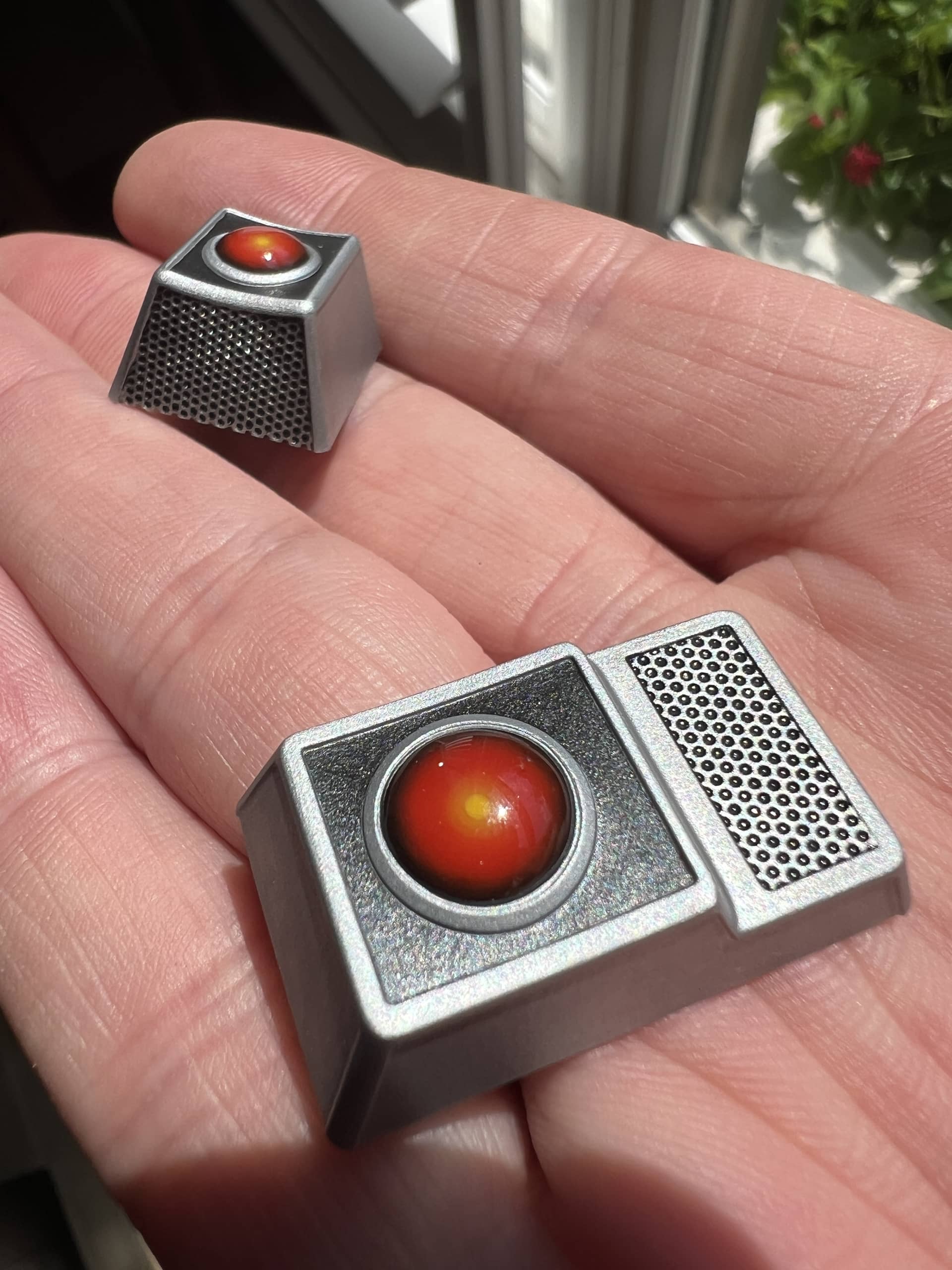
If only someone had kept a JER J80/A-06 case around for six years, I could do this build!
I would use MX2A Brown with 14mm TX springs. Top-mount or similar, plateless, deep-sounding roomy case. Only 3203 on the Browns.
3 Likes
I ended up using hand lubed and filmed Mx2A blacks with 14mm springs. The UXL springs (22mm) were snappy and felt good, but in a back to back test, the 14mm just felt right. Maybe it feels more vintage/authentic and less like modern, snappy HMX switches.
It’s a super interesting build. I’ll share some details and photos next week maybe.
4 Likes
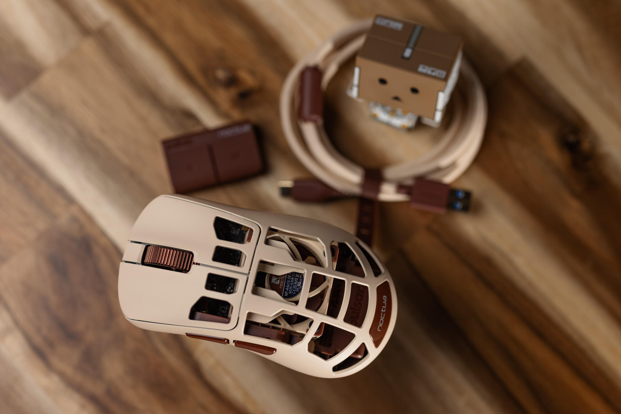
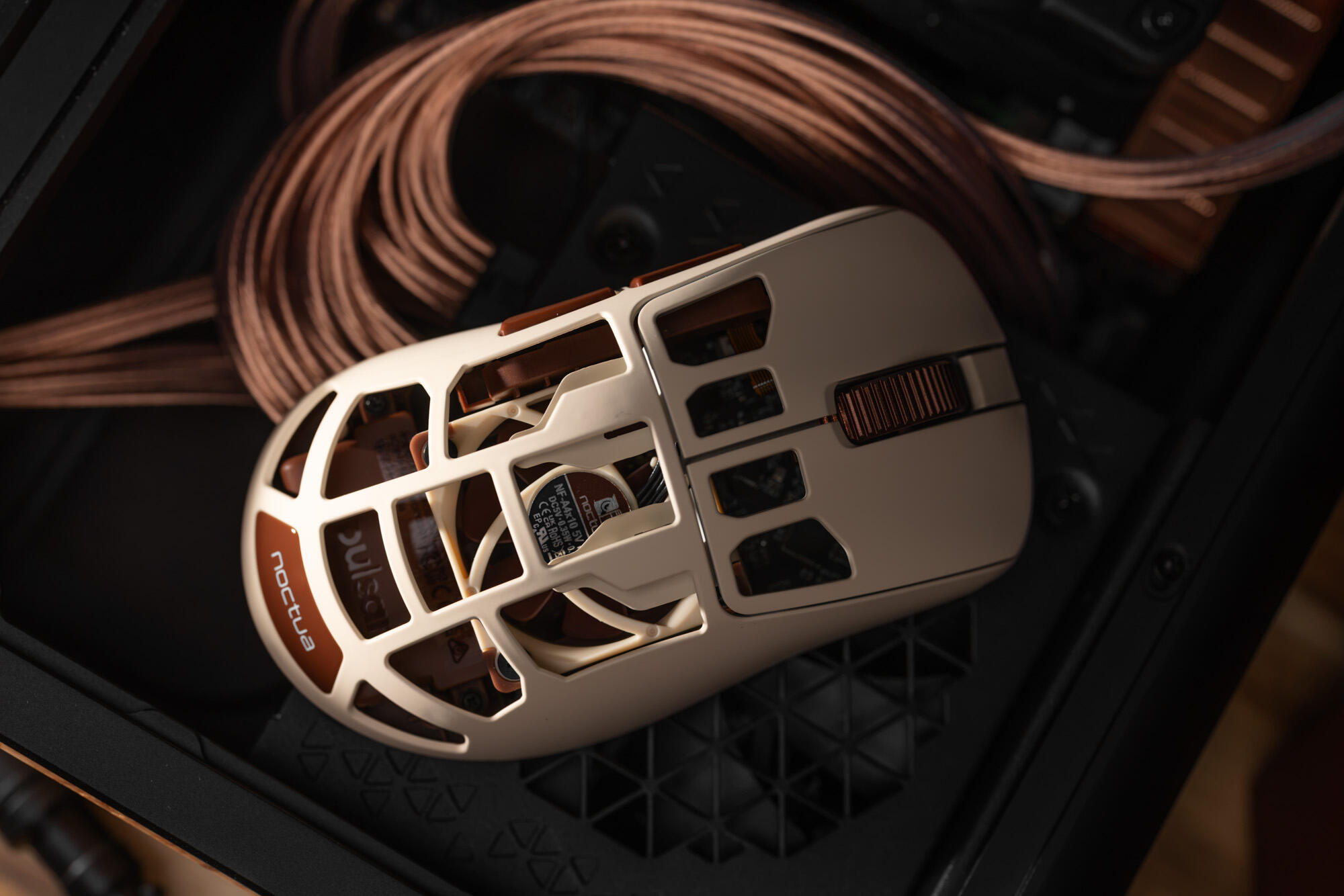
Mann, your picture are always so clean everytime. It’s like my eyes are receiving a cleaning just looking at it.
1 Like
I’m slowly working through my summer backlog.
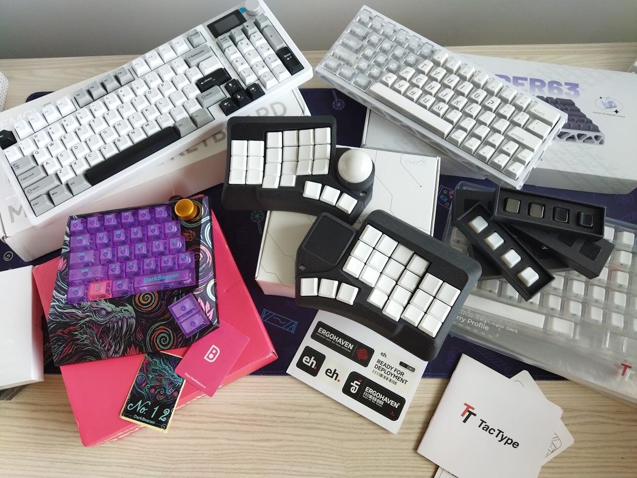
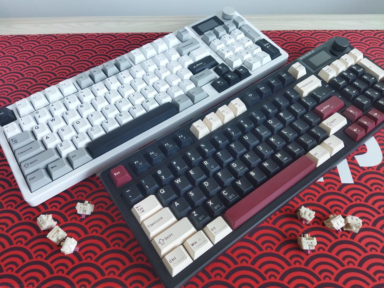
DarkBeacon gaming pad, XVX Trooper63 HE, Kemove K94 - done.
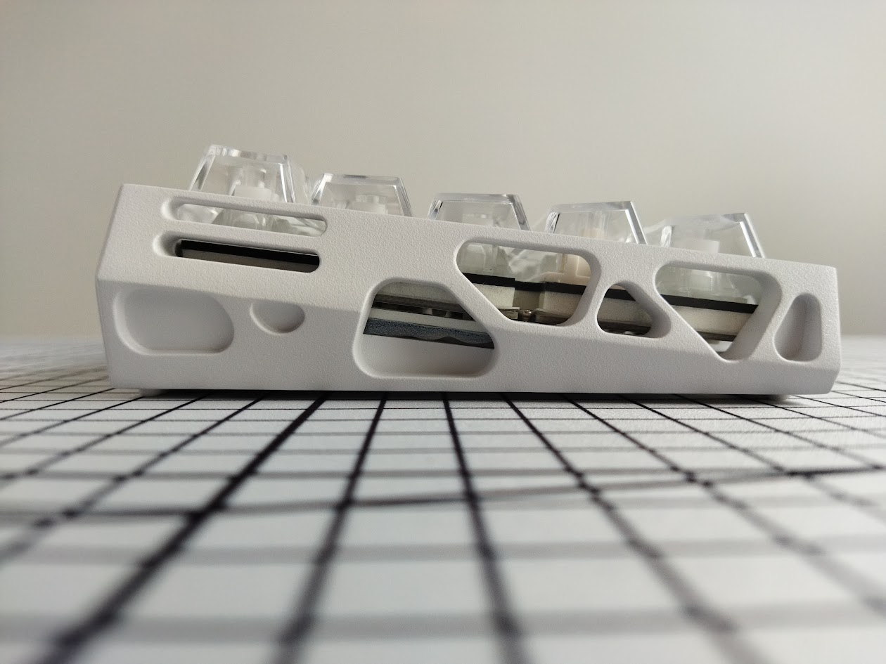
I’m not sure if the coupon settings are flawed here, but the K94 is ridiculously priced for a great (although plastic) 1800 for those looking for this form factor. On top of the low price, the bundle includes a P10 switch puller (limited sale for a few hours yet).
Up next: the Dygma Sonsei and the Ergohaven Phenom Mini. Plus the ceramic TacType caps.
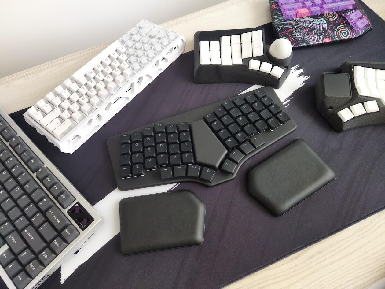
And there’s an IQUNIX EC75 in the corner - that is a HE board. CE is just its name.
2 Likes
Sorry it took so long. But you know… life always manages to happen 
Here are some comparison photos
Top is Superweld, bottom is Hyperfuse Origins. A few different lighting variations. Not the best photos, because if you know the sets you’ll recognize that the purple legends aren’t reading enough red, but you should be able to get the idea.
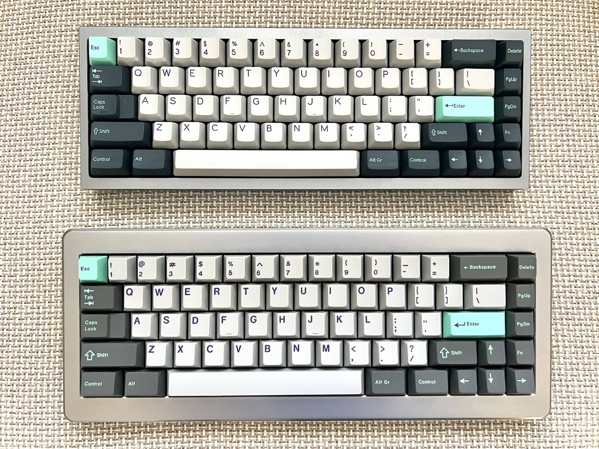

If you’re like me you’re thinking… wow, that almost looks like hammerhead or something. So here’s a comparison with GMK Hammerhead.
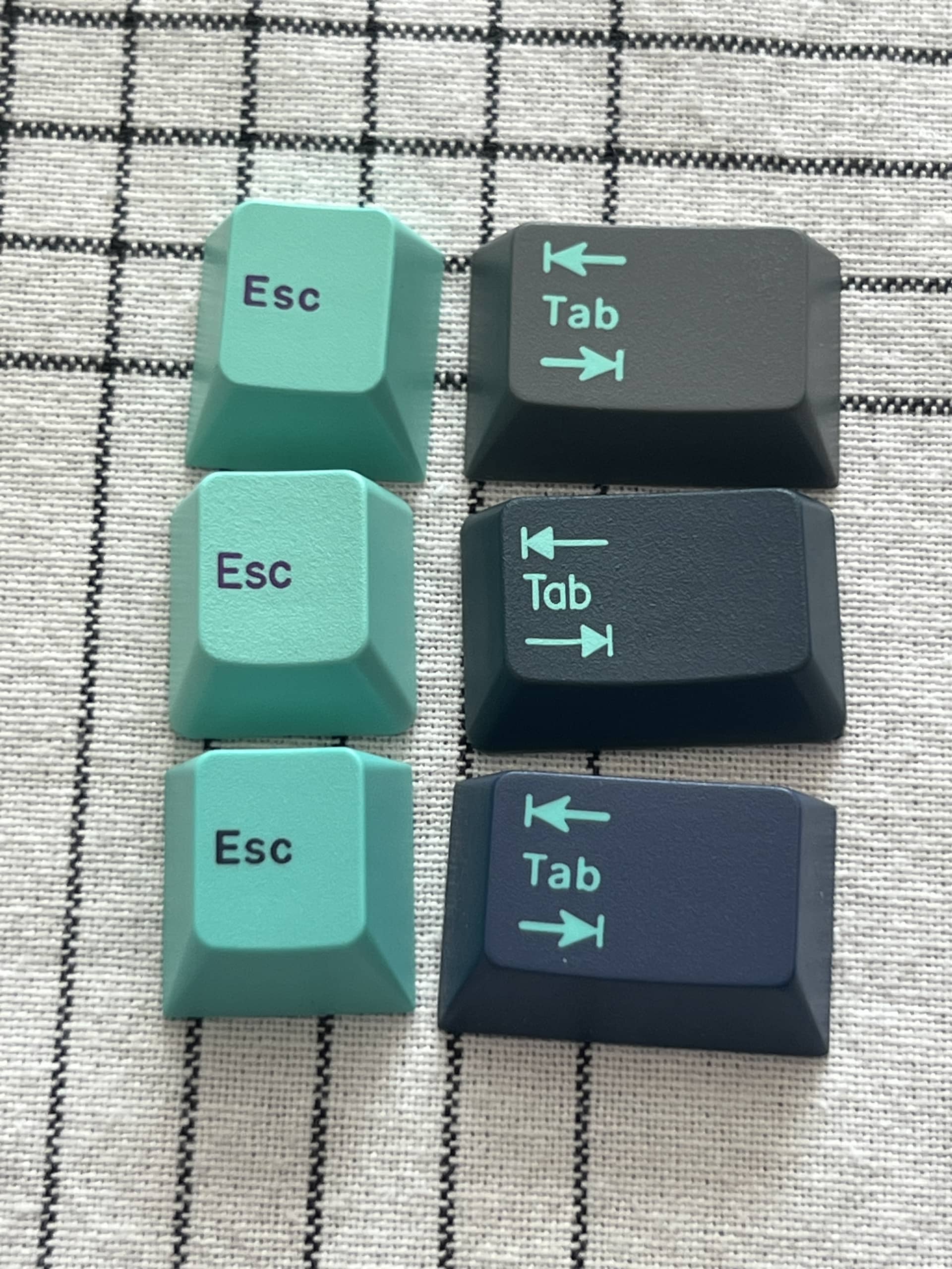
Top: Hyperfuse
Middle: Superweld
Bottom: Hammerhead
Superweld goes well on gray boards where hyperfuse is sometimes an issue because the modifiers are higher contrast. It’s not giving me the vibe I wanted from a DCS hyper fuse inspired set, but I do like it.
8 Likes
Man color is weird, because I can see what you’re saying right off the bat. The purples for both have a touch more red to them.
I wonder if it’s the common “lighting auto-correction” settings picking the wrong sort of profile for it? It’s not the tungsten filter, but could be a fluorescent profile maybe? (I struggle with this and frequently would just rather it be off rather than messing up colors ridiculously)
Stupid mundane reason: the lighting just lacked enough red/deep red bouncing around for the camera to capture, vs. other wavelengths. If it’s natural light of any kind, this is hard to believe, though.
Wacky conspiracy theory: light outside the visible spectrum is affecting things: there’s a difference between seeing with our eyes in person vs. capturing the image with a digital camera, which has various cut-offs and filters (and then so so much software).
E.g., quite a lot of cheap cameras don’t seem to have a UV filter, which could make direct sunlight pictures…interesting. Typically seems to register as a whitish/blue hue in cameras, vs. the violet that I see. A lot of glass will block UV, though, which makes this only applicable for pictures taken outside.
IR cut-off filters are way more common (since there’s a lot more IR bouncing around thanks to the giant ball of nuclear fire in the sky). So there it may be more humans perceiving some of those “near-IR” levels (which would be very deep reds, perhaps browns?) that cameras might not pick up due to their stricter wavelength based cut filter.
3 Likes