It dawned on my recently that a keyboard can become more attractive when the right switches and keycaps are given to it. This isn’t strictly a design consideration (e.g., color theory), but rather, the way a certain combination of elements compels me to want to use a keyboard on my desk. That’s what I mean by “more attractive”.
Anyway, here are two recent examples from my keyboard cubby.
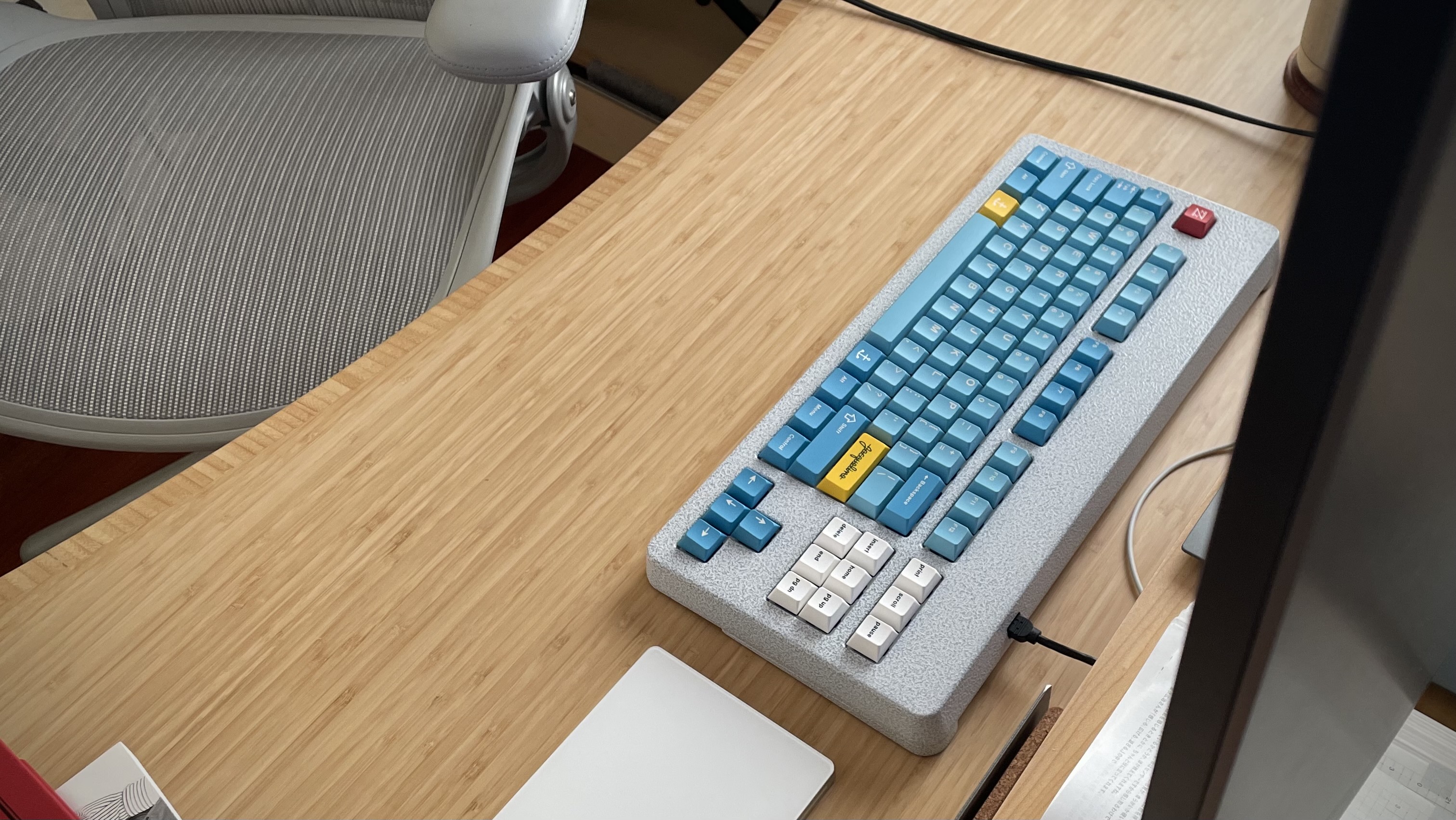
I daily the NFII more than any other board save the HHKB, so I can safely say I already enjoyed using it. But ever since I put Belafonte/Hennessey on it, I just love having it on my desk. It just fits so nicely with everything else on the table.
Ah, I occasionally try ortho, and it never sticks—until recently. I replaced the tactile switches (Penguins) with linears (Silent Alpacas), because I’m #TeamLinear for MX; and I replaced the sculpted keycaps (GMK/MT3) for uniform (Grid)…and it’s made all the difference. I likely won’t daily the Preonic anytime soon, but its appeal has definitely made a 180º turn 
What are some of your perfect storm keyboards? And if it changes your mind about the keyboard/layout, even better!
7 Likes
Lilac Tactile switches with ABS MT3 caps in my modern M0110. This combo is insanely good.
78g V1 Zealios with PBT MT3 caps on my M65-a. This one took many attempts to find the right combo. Went from Cherry profile to MT3, then decided to lube the zealios, then decided to spring swap. Went from a 2/10 board to a 9/10.
Lubed MX Zilents in my U80 with cherry profile caps. Something about the mute mount and the thud from MX Zilents is heaven.
It’s defintely true that switch/cap combos can make or break a board. Sound is important, yeah, but not nearly as important as the right combination setups mentioned here.
And it’s all so unique to each board. The material of the keyboard, the material of the plate, the plate cut style, the plate moutning style, case internals, case dampening material, plate dampening material, switches, switch mods (lube, film, springs), keycap profile, keycap material, desk pad material. So much variety and so many ways for it to go wrong or right.
3 Likes
I’ve really enjoyed typing on my prototype these last 5 months, but no set has really completed the aesthetic better than nautilus, thankfully I was lucky enough to pick up an R1 kit recently, with that minivan support.  I’m in love.
Between that, the bouncy feel of the board, and the boba U4s with 55g springs, I can’t get over the feel and look of this keyboard.
6 Likes
This reminds me of gestalt - or the whole being more than the sum of its parts.
It’s a German word, pronounced “gesh-talt”. I learned it back in design school, but it’s more often used in psychology - and I think its very suitable here in keeb-space, as well.
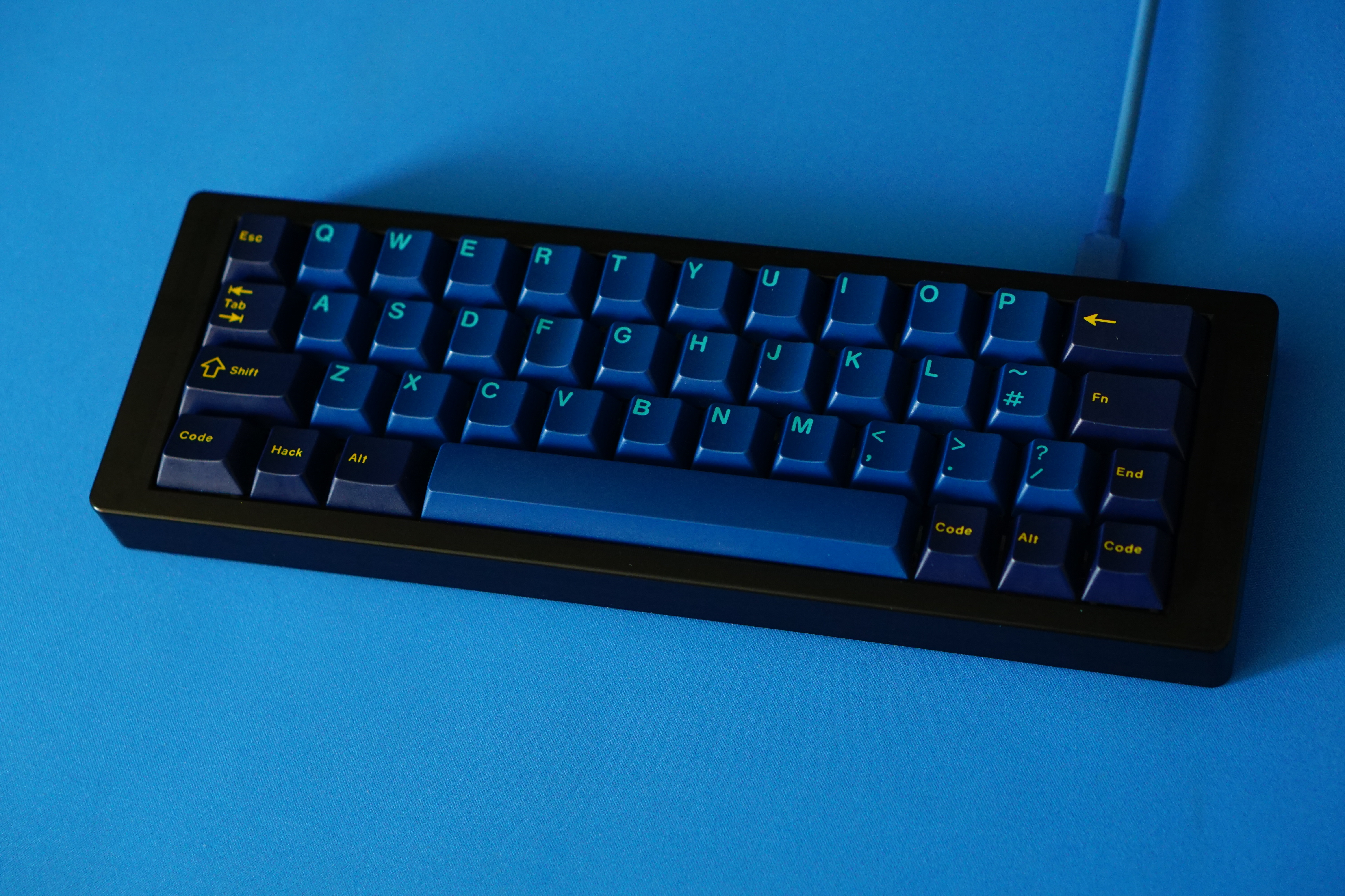
Truth be told, I’ve been chasing that for some time with any given build, but I’ve only ever come close. Closest would probably be what I’m using at the moment; my NK65EE with pre-lubed dark amber T1s and MT3 Susuwatari. The typing feel is luscious. The keys actually jive really well with the “fire” orange case. Only a bit of spring ping and a weirdly hair-trigger backspace that I’ve so-far been unmotivated to fool with keep this board from a state of gestalt.
Maybe that’s an ideal adjacent to, but also more realistic to chase than “endgame” - which implies some kind of apex perfection. At least for me, a board doesn’t have to be perfect or meet all of my ideals to reach a state of gestalt - it just has to be in excellent harmony with itself.
6 Likes