I have recently made my first own 40% keyboard, and I fell in love with low-profile switches and ortholinear layout. I did try a 5plit keyboard before, but somehow that one never clicked for me - being in two parts somehow spoiled the effect. So now the logical next step would be to design an ortholinear keyboard with tilted keys, basically Atreus, but also using low-profile switches – so Flatreus.
I also have this failed keyboard project (failed from the point of view of usability of the final result, I still learned a ton from it, so it’s not a waste of time) with the sunken low-profile Kailh switches, and the double-shot keys for them. But it would be a bit of a waste to not use all the other keys.
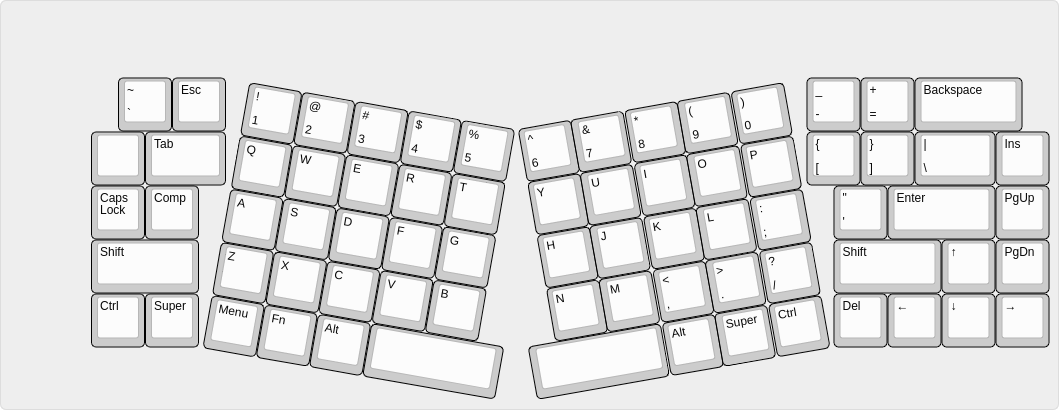
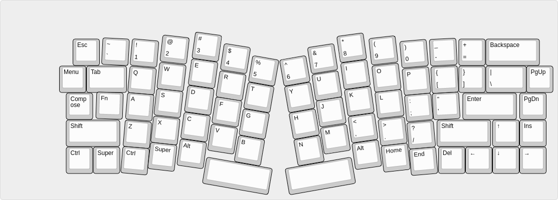
So I’ve been looking at the Alice layout, and I thought that it really seems to work great, so why not try and do the same trick, but more Atreus-like? So I came up with this:
It’s nice, because it fits all the keycaps that came with those low-profile switches. You can also fiddle a little bit more with it to get a tighter packing of the keys:
Hmmm; I’m also getting ergodox vibes from this in regards to the columnar stagger. This is certainly interesting, but I think the sides are pretty busy. Personally I’m not the biggest fan of this area because I think it creates distance without ergonomics (at least at a cursory glance)
But then again, you have already called this a failed project (at the moment) because of the usability of the final result. Speaking of, I think it would be really beneficial to record yourself using the prototype and see how your 3rd, 4th, and 5th fingers move about because I think studying their motion, could help optimize the layout for your comfort
A, no, sorry, I didn’t express myself clearly. The failed project is a traditional 60% layout keyboard, I just experimented with other aspects (packed the keys tighter than standard 1U, among other things) so it’s not usable. The plan is to scavenge the switches and caps from it, and do this new layout.
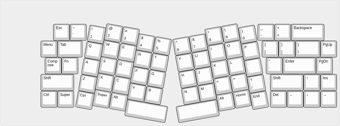
I suppose I could do a more gradual transition, doing something similar to X-Bow’s Knight:
Looks really good, like an ortho Sagittarius, I really dig this look though, as someone who usually thinks ortho looks ugly, I like how introducing the subtle curve to both halves reduces the blocky grid pattern of ortho. don’t think its a failed project just yet!
I really like the look of that!
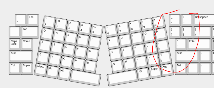
I have an X-Bows - the budget ‘Nature’ version rather than the Knight - and I will say the ‘pinky’ column being lowered, as per one of your earlier images, does feel good under the fingers - even if it messes up the otherwise nice clean lines. I think if I ever try to build my own “endgame” keyboard, I might be temped to offset all the colums slightly to create a gentle, lazy “m” shape along the key rows.
I just displayed that full size on my monitor, tipped it up and tried “typing” on it - I think I’d be tempted to pull the “E” and “I” columns down just a fraction (not so far that E is in-line with W and R, but half way between there and where it is now). When my fingers are bent for typing they form more of a curve than a zig-zag - so I think that would be more comfortable, and probably look nicer too.
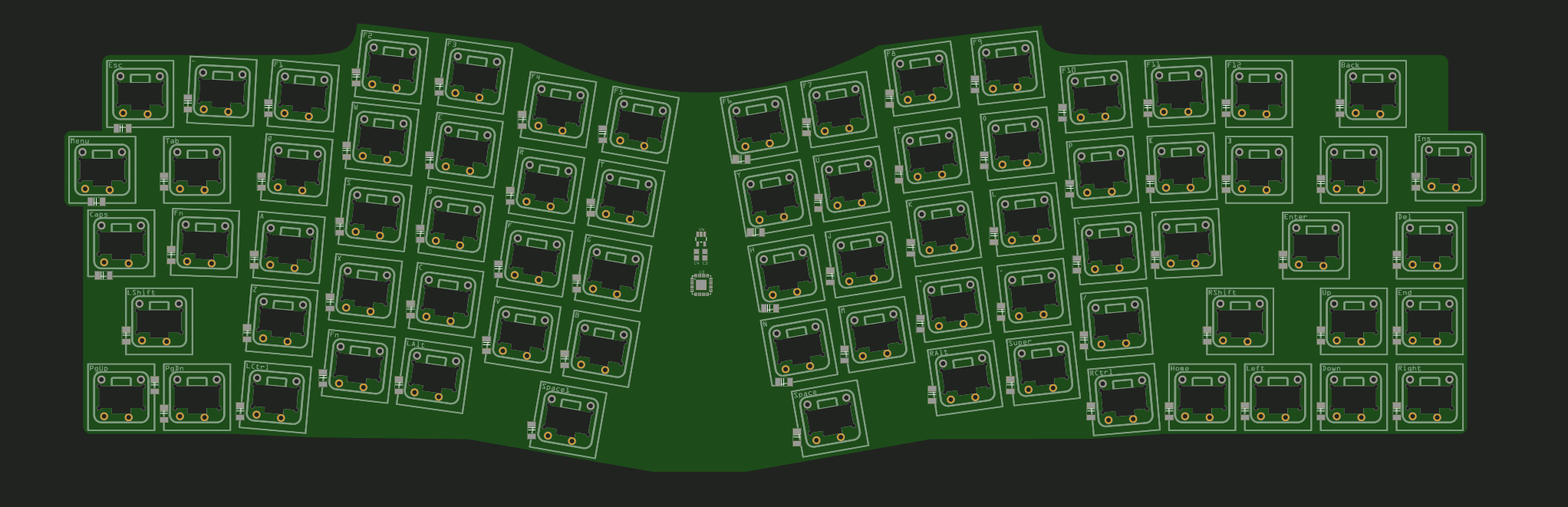
It’s 5. I’m happy to share if someone wants to build it too, but shipping from Switzerland might be more expensive than just ordering from the same fab.
Since the switches were scavenged from an older project, I’m missing four extra ones. They should arrive some time in the next two weeks, but I hope to be able to do testing with what I have so far.
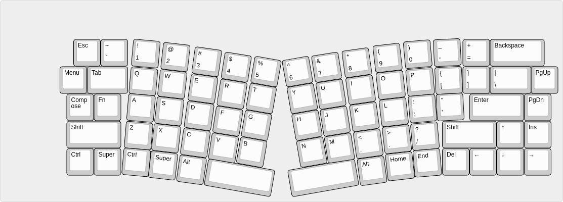
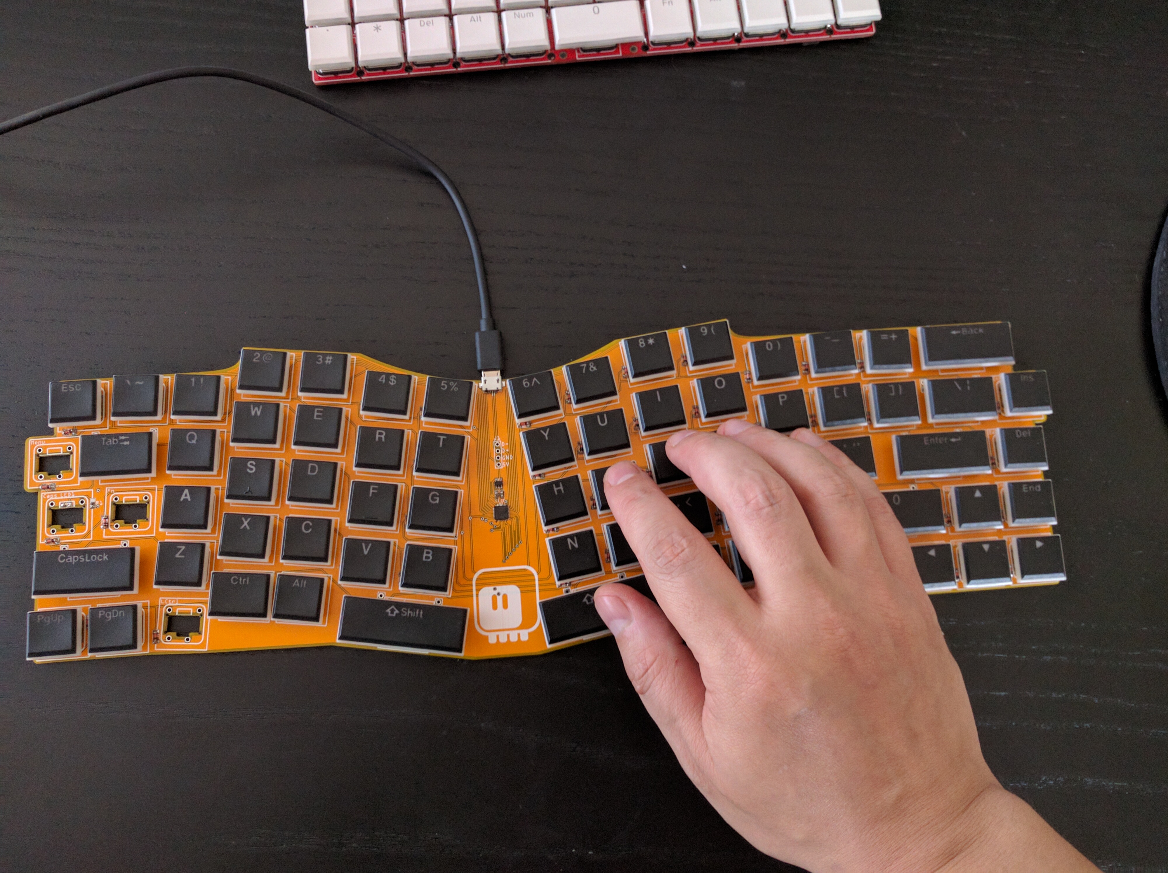
So time for a summary. The keyboard is unusable, but I don’t know how the layout works, because I made two horrible mistakes.
The first one was re-using those sunken switches which simply click before the make contact, which makes them very annoying to use.
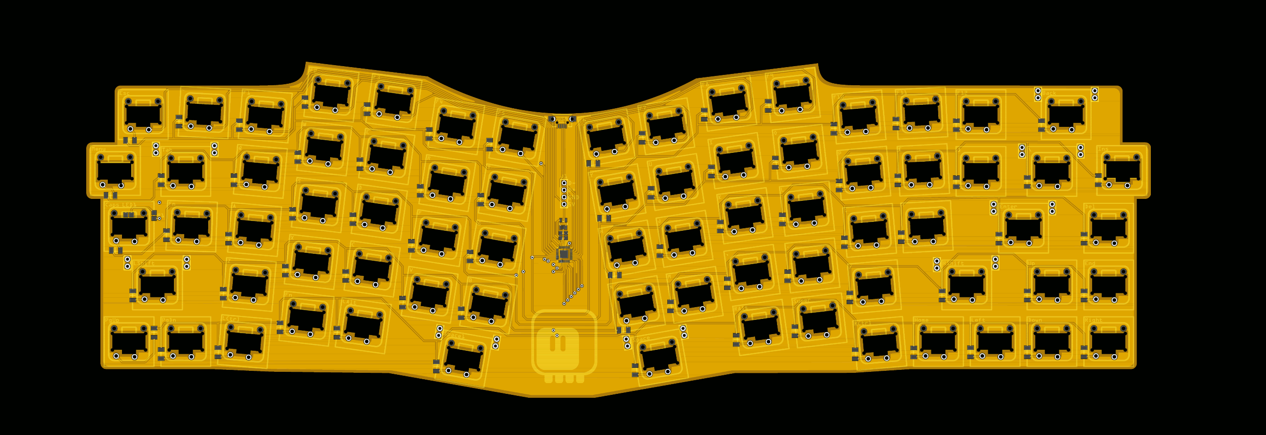
The second one is that I didn’t notice that Inkscape changed their default DPI after an upgrade, and my PCB is actually around 10% larger than it was supposed to be, resulting in completely wrong key spacing. You can see on the photo that the keys are suspiciously far apart from each other. I have no idea why I didn’t notice before sending it to the fab.
I am going to try again, with better switches and the right scale this time around, but with a slightly smaller keyboard.