I really love the color palette, and theme. And I LOVE the design in the desk mat, but I really find the novelties to be out of sync with the rest of the set. Much respect, but I’d love to see different novelties. Cheers!
1 Like
I really love the colors on this set. The novelties seem good to me, and I appreciate the addition of 1u novelties, which the original set lacked as I recall. But I would kind of like to see one additional novelty design to give a little extra flexibility, and so that you can replace the Alt, Ctrl, and Win keys all in a row without having a text modifier remaining.
1 Like
This is now on Drop.com. Does anyone have suggestions for boards that will match the color scheme?
1 Like
Personally, I think it looks the best on a black board. Especially now that Zambumon lightened the mods color since IC (for some unknown reason); the black helps darken it up a bit (which to me is more on theme), otherwise its more reminiscent of a shamrock than the ocean depths.
2 Likes
Not my colors, but damn, that color combination looks clean!
I don’t know about this set anymore. The lighter mods are okay, but man, the contrast is waaay different now from the original set.
Top is IC version, Bottom is new version that is now running on Drop:
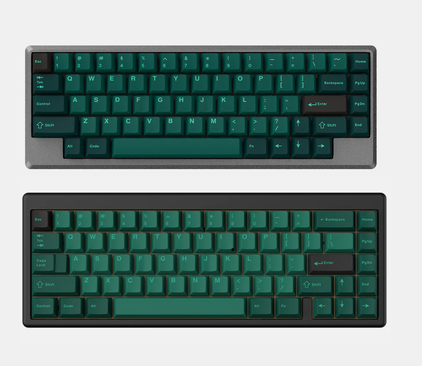
I’m not saying it’s bad or anything, but I really preferred the original version.
7 Likes
The top definitely looks better!
The bottom just looks washed out.
1 Like
I agree. I dislike recent trend toward lower legend contrast which is why I didn’t join GMK Oblivion V2 GB.
4 Likes
Could it be that it’s just too hard to get that much contrast with the physical plastics?
I’m also on the IC version looks much better boat, although these aren’t really for me and I probably wouldn’t have gone for it either way.
2 Likes
I dunno. I know I’ve seen several sets with darker base colors for keys where people react negatively when the set ships (“It might as well be black!”) even when the key is clearly the intended color when viewed in daylight, and even the brightest GMK colors aren’t super bright if you’re trying to aim for saturated colors, so it might just be a case of designers trying to trend towards lower contrast in the hopes they don’t get flamed for things coming out slightly less saturated/colorful than customers thought they’d be after looking at mockups on screens?
Yeah, that’s kind of what I’m wondering, deep space and violet tendencies come to mind
1 Like
Yeah the higher contrast is way better. I wonder how numbers will be for the Drop version. That being said, the Drop version also looks muddier. Definitely preferred the first run.
I don’t think so. They could’ve gone with WS1 which is plenty bright. GMK Oblivion V1 had brighter alpha. Same gray legend thing is happening with Solarized Dark. I hope the next rev of GMK SpaceCadet, only GMK keyset I’m interested in at this point, stays the same.
1 Like
I was extremely excited when the set was in IC, but I think it looks super washed out and kind of bad now. I don’t understand why Zambumon changed the colors after the IC phase, which had an overwhelmingly positive response, and revealed them to the public right before the GB without asking for feedback. I asked him this in the Reddit thread where he posted the new renders, but I haven’t heard a peep. He also did this with Striker when he axed the white accent keys from the set closer to GB which removed a lot of contrast (though I think this was because the Rama keycap came along at the same time which became the only white key available) – he basically response with “it is what it is” when I called him out on that one. I get that it’s his set to change, but ultimately it’s my money to spend, lol. I’m just disappointed that what I’ve been looking forward to for 15 months is gone, replaced with what looks like a cheap knockoff (if I’m being honest), no reason why given, and an attempt was made to retcon the original colors on all posts.
5 Likes
Damn, my feelings exactly. Loved the original, waited over a year to buy, now definitely feel like I’m looking at one of those “expectation vs reality” memes 
Oof same here, I wasn’t aware they mods were made lighter & just put my order in for the set…  I’m not sure if this a deal breaker or not for me…
  Gonna keep my order in for now & give it a week or so to grow on me, since the drop end is 24 days out.
While Zambumon no doubt is a prolific keycap set designer & outside of his projects seems like a genuinely good guy. I have noticed he tends to have a habit of making fairly drastic last second changes on his sets without any community feedback, then active kinda abrasively to anyone who questions the changes.
Not sure why or what that is all about & I do get it is his design that he is free to whatever he wants on at whatever time he wants to. Although I feel he could do it with a little more tact & at least ask for some community feedback. I mean it’s not like he isn’t counting on us to buy them for the runs to be successful? Given he seems to be a nice guy outside questioning his design decisions. I think it’s just the stress of running these sets that are almost guaranteed to be huge getting to him a bit when he answers people like that. ༼ つ ◕_◕ ༽つ
I may be in the minority who has a preference for the updated version. I don’t like the idea of tweaks after IC is cleared (not really my set or decision though); however, if this is the way the final product comes out, I’m glad that changes were made before GB was over.
Rocketeer’s colors differed a lot more than I would have liked from what was advertised and it sucked to learn that only upon receiving the board way after GB was over.
I totally get if he was already color matching with GMK (some designers do/can) and discovered some limitation and re-rendered after a compromise on doable colors, but I’m only left to speculate. Not answering or being curt when you finally do leads me to believe that it was redone for personal preferences. Which again, is within his rights to do so, but it’s just kind of shitty.
1 Like
Yep totally agree with you Transparency goes a long way. Lots of drama over nothing if it is just a coloring limitation & even if it is a personal decision just let everyone know why. We are a very open & forgiving community, he’s the designer, it’s his right, tactfully done this wouldn’t even be an issue.