I talked about this a bit in my introduction post, but this might be a better place for the discussion.
The question is, what minimal changes would you make to the 60% section of an ANSI layout to make it mostly-ortholinear?
Most vertical-column keyboards I’ve come across make other more radical changes to the layout as well (think thumb clusters, function layer dependency, vertical stagger, etc…). How would you go about avoiding that (assuming you wanted to, of course) if you were trying to design an otherwise “normal” TKL or full-size board?
Some design guidelines:
-
Fewer changes are better - if someone familiar with ANSI went to use the modified layout, how disoriented would they be (in terms of both visual and tactile impressions - does the keyboard look “weird”? Are the keys roughly where their fingers expect them to be?)
-
I say “mostly-ortholinear” assuming vertical stagger would be too disruptive to familiarity, but if you can figure out how to make it work in a layout that could be used in a TKL or full-size board, more power to you. The real goal here is vertical columns, not ortholinearity.
-
I also say “mostly-ortholinear” (as opposed to “strictly ortholinear”) working from the assumption that there’s much less benefit to vertical columns for keys outside of the natural vertical travel of your fingers. So modifiers, etc can still stagger horizontally. Also, I suspect without that freedom most feasible solutions would look a lot like Preonics…
-
As a generalization of the previous points, if you can sneak in other kinds of improvements (ergonomics, keycap compatibility, etc) that’s a bonus, as long as it doesn’t have an outsized impact on ANSI familiarity.
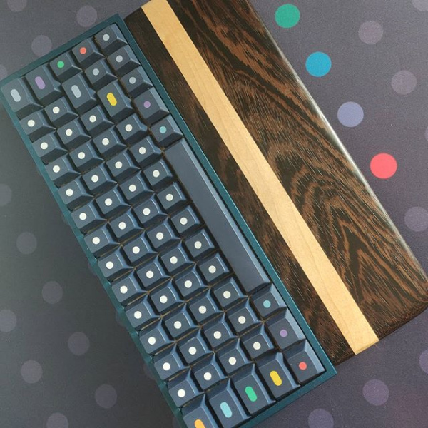
Some background: I’m currently working on a custom design/build with the intention of keeping the layout as close to “normal” TKL as possible, but with vertical columns. I’m trying to make something that someone who doesn’t want to learn a new layout could look at without getting freaked out. The function row, arrow keys, etc seem fine as is, so it’s mostly the 60% section (is there a proper name for that?) that I’m looking to adjust. I have some ideas of my own (I’ll post below), but am interested to hear what other folks think!
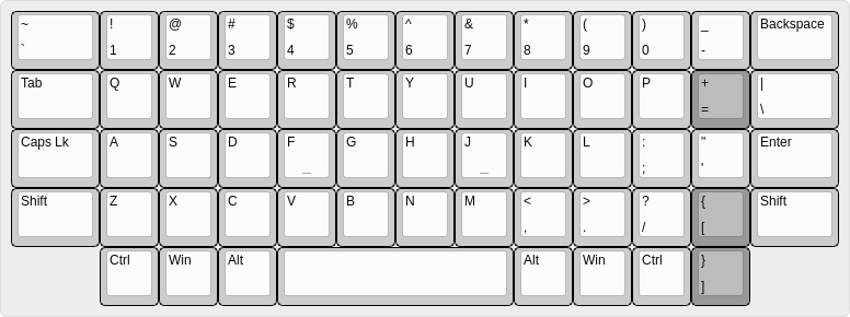
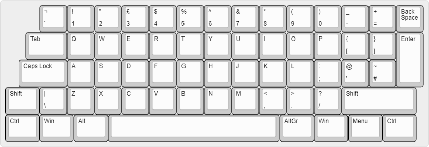
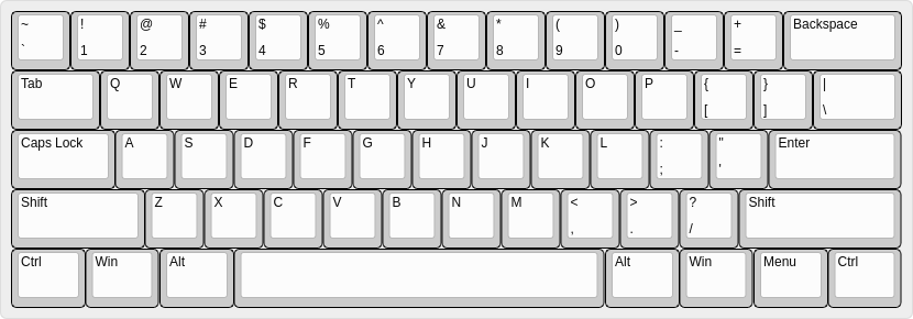
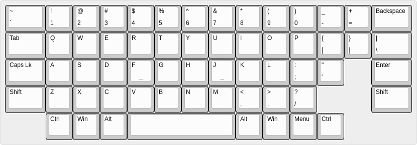
Finally, here’s your typical ANSI 60% for reference (just in case you’d forgotten ![]() ):
):
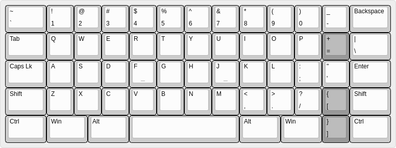
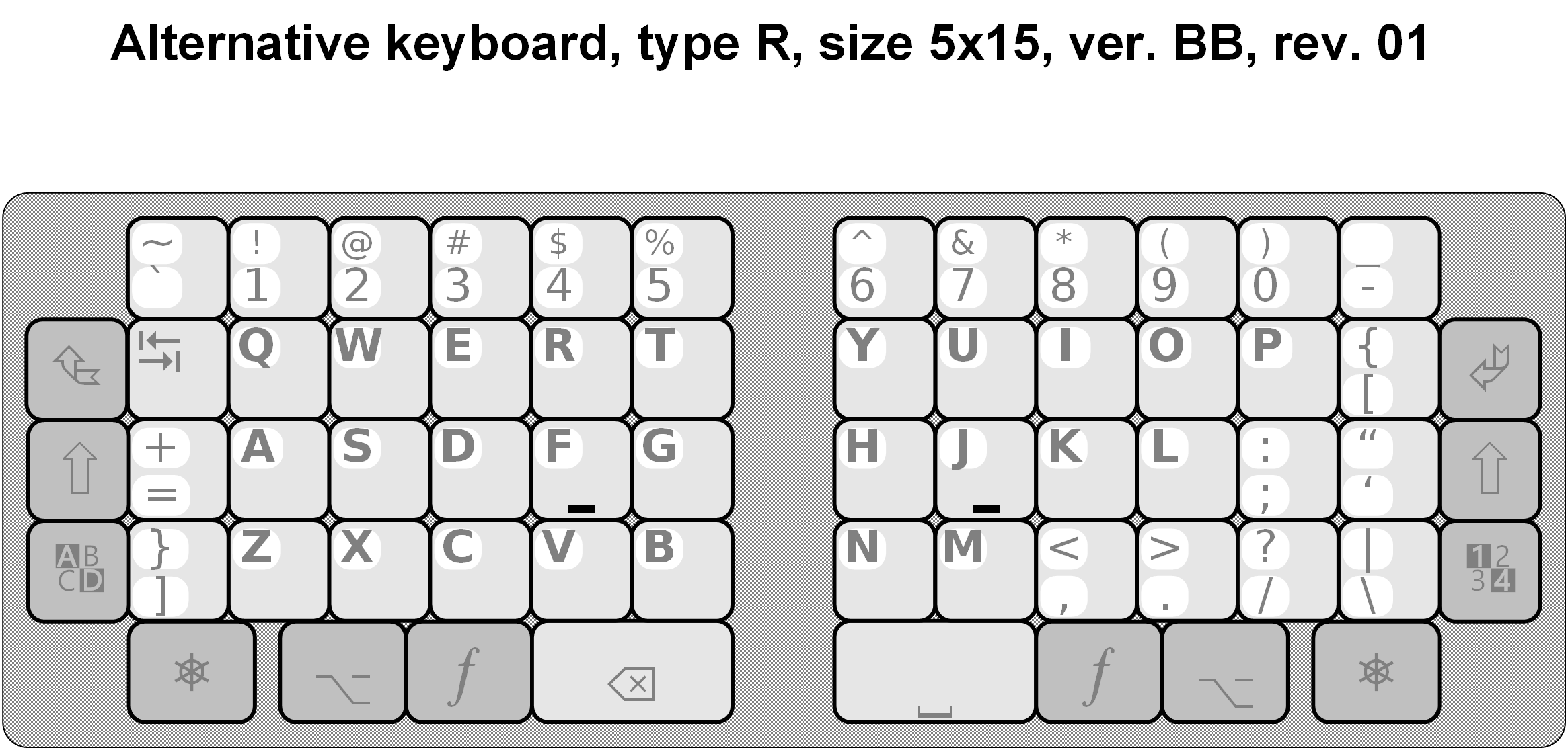
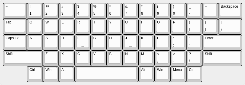
This is where I’m at with this right now:
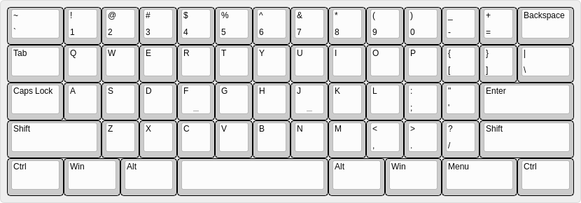
R1: Widen backtick/tilde by 0.5u and shorten Backspace accordingly. This feels wrong given that most people don’t use backtick much… but they do hit Backspace a lot. But it seemed necessary in order to line up the number keys with R2. I also considered moving backtick to the immediate left of Backspace, and shifting all the other keys left one spot, - that way it would be the 1 key that was larger, which might be a better use of real estate, but that option ultimately seemed more disruptive and less symmetrical.
R2: No changes. This row is nice and symmetrical as is, and I wanted to concentrate the resizing on keys that were already unusually wide or narrow.
R3: Shorten Caps Lock by 0.25u and lengthen Enter accordingly. It’s Caps Lock, I have no problems marginalizing it… A larger Enter seems fine as well.
R4: This is where things get interesting! And potentially deal-breaking for existing “proper” touch-typists. Left Shift is lengthened 0.25u… Shifting the rest of the row to the right by a full column. So, while on a standard keyboard a touch typist would consider V to be “under” F, with this layout it’s actually C that ends up “under” F.
My main motivation here was avoiding shifting the row to the left, which would result in a stubby Left Shift key and a Right Shift key that was almost as wide as the spacebar… That said, I think this decision might also be justifiable given that the R4 alpha keys are offset from R3 (home row) by 0.5u - so geometrically, a shift to the right is no more of a dispacement than a “proper” shift to the left would be. Given that hitting R1 and R2 involves shifting fingers to the left of home row positions, I suspect many people hit R4 by shifting fingers to the left as well (the keys aren’t any further away, after all). The common complaint about B being on the “wrong” sides of split keyboards is one data point here. To be honest, I’m still on the fence about this change, and waffle between it being either clever or utterly disqualifying.
R5: Increase the size of all modifier keys to 1.5u (except Menu, which grows to 2u to keep the spacebar centered around the homing keys), and shorten the spacebar to 4u to match.
Other general comments:
- One of the goals with this design was to minimize the number of keycap sizes involved (aside from the spacebar and awkward menu key, everything else is 1u, 1.5u, or 2.5u). But while that makes it easier to swap keys around on the board, finding many of those keys in the first place is likely going to be difficult (legends aside, can you even get 2.5u caps?). Of course blank caps would be easier, but that flies in the face of the theme…
- I find the sloped-in, V-shape of the side modifier key layout on R2-4 of ANSI strangely pleasant and comforting, and was glad to preserve that at least somewhat (more symmetry would be nice, but hey, the slope isn’t symmetrical on ANSI either).
- Still on the fence about the R4 shift. Personally I don’t think I’d care… unless I needed to go between this and a “properly”-aligned vertical column board. In that case I would probably hate it.
Would love to hear people’s thoughts or suggestions!

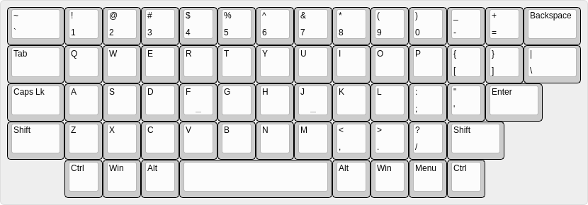
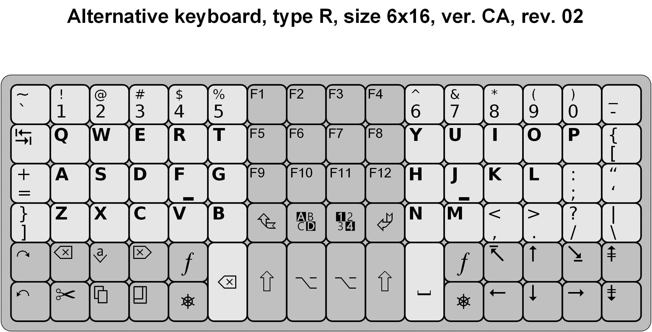
 ) but has a nice overall balance to it. Ctrl not being in the very bottom right could be a dealbreaker though (or just having a non-modifier in the modifer row at all…)