I tried that too, and it looks off ![]()
1 Like
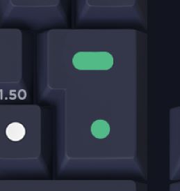
Maybe one litle horizontal like on the 1.5u key beside it at the top and then either a dot or a smaller vertical but seperated line in the lower part
This set is growing on me and my wallet doesn’t like that 
3 Likes
makes it lose all the minimalistic aesthetic it had with a single dot ![]()
True. Its just a weird Key. 
Fair enough.
This is the first gmk set i intend to buy, finally there is one without offset legends
1 Like
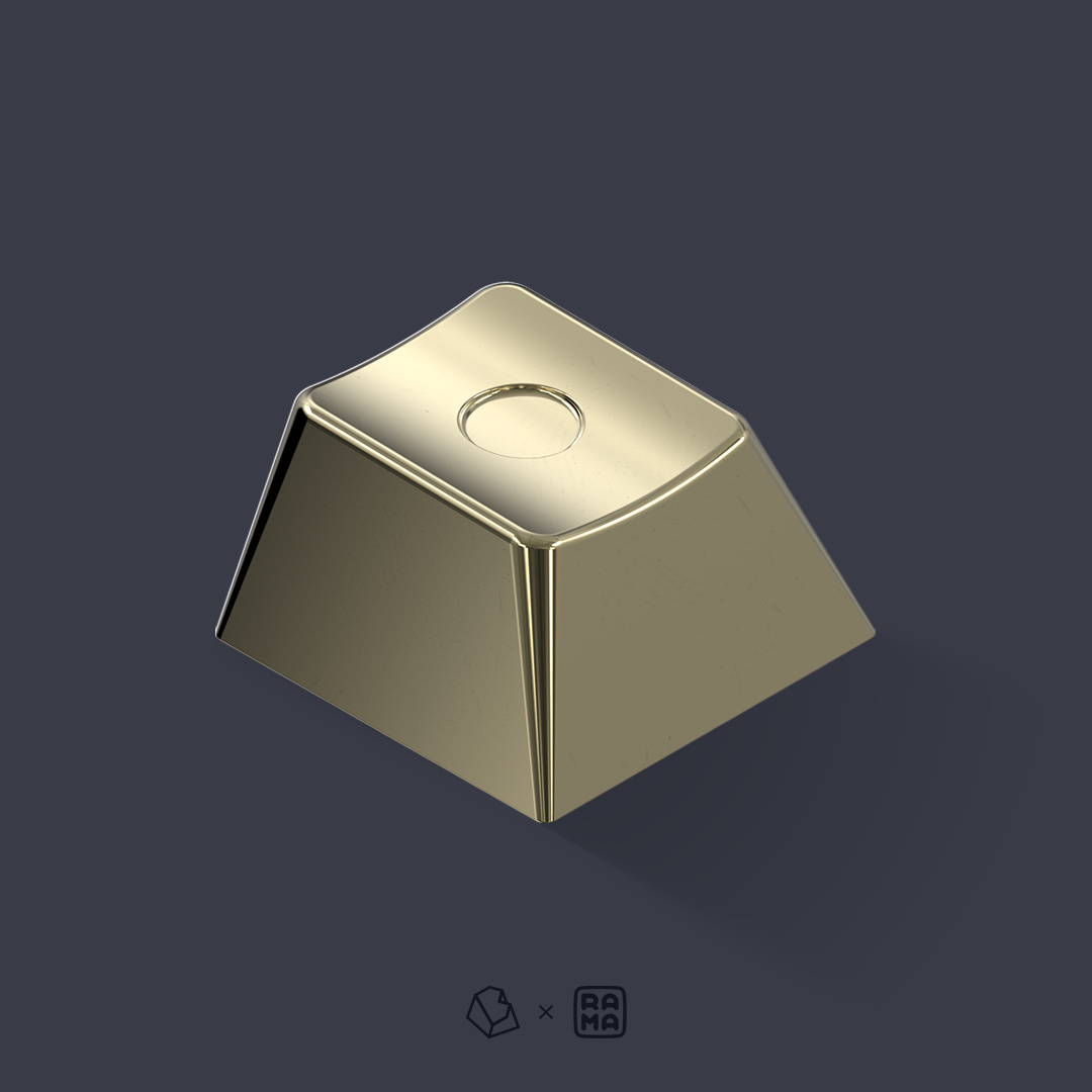
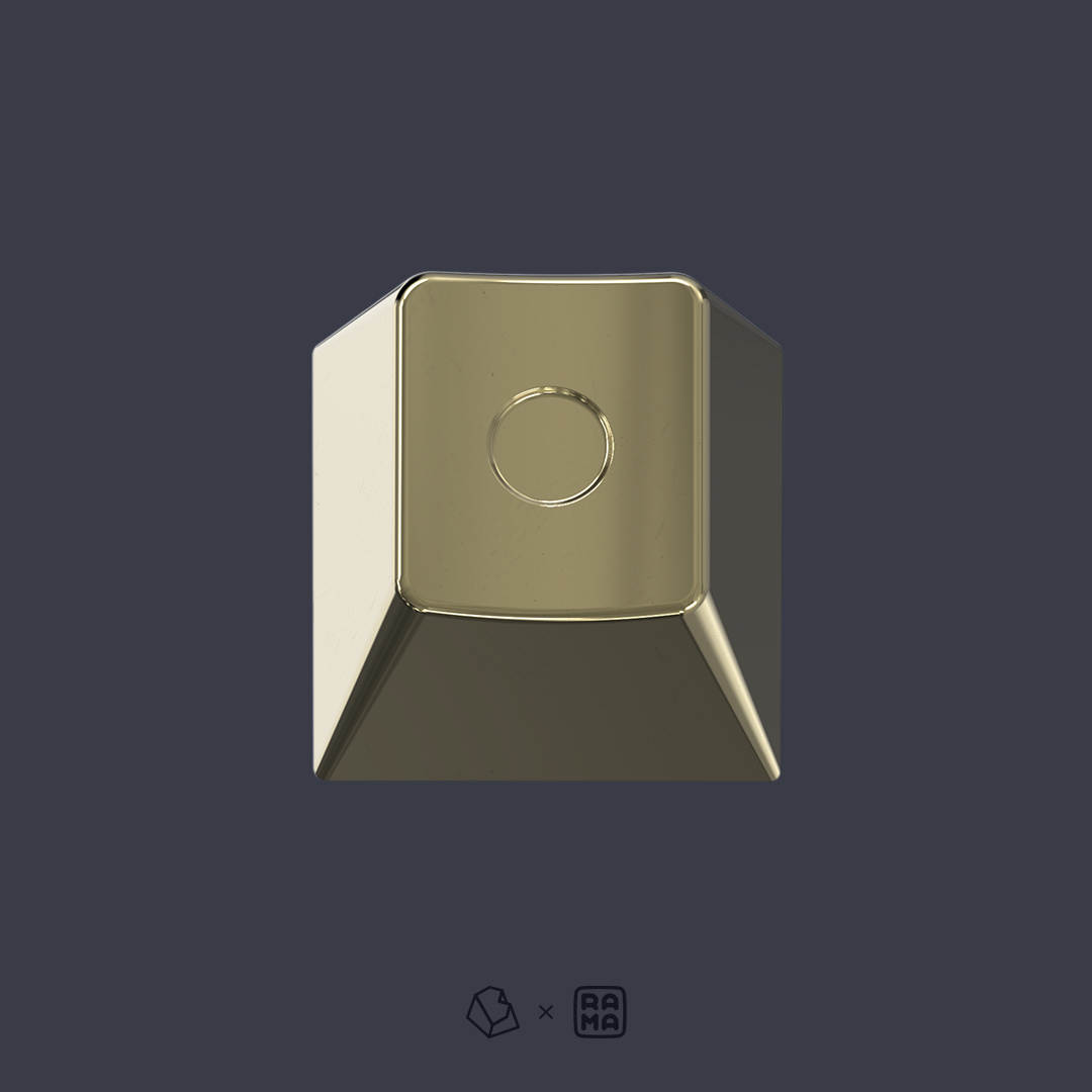
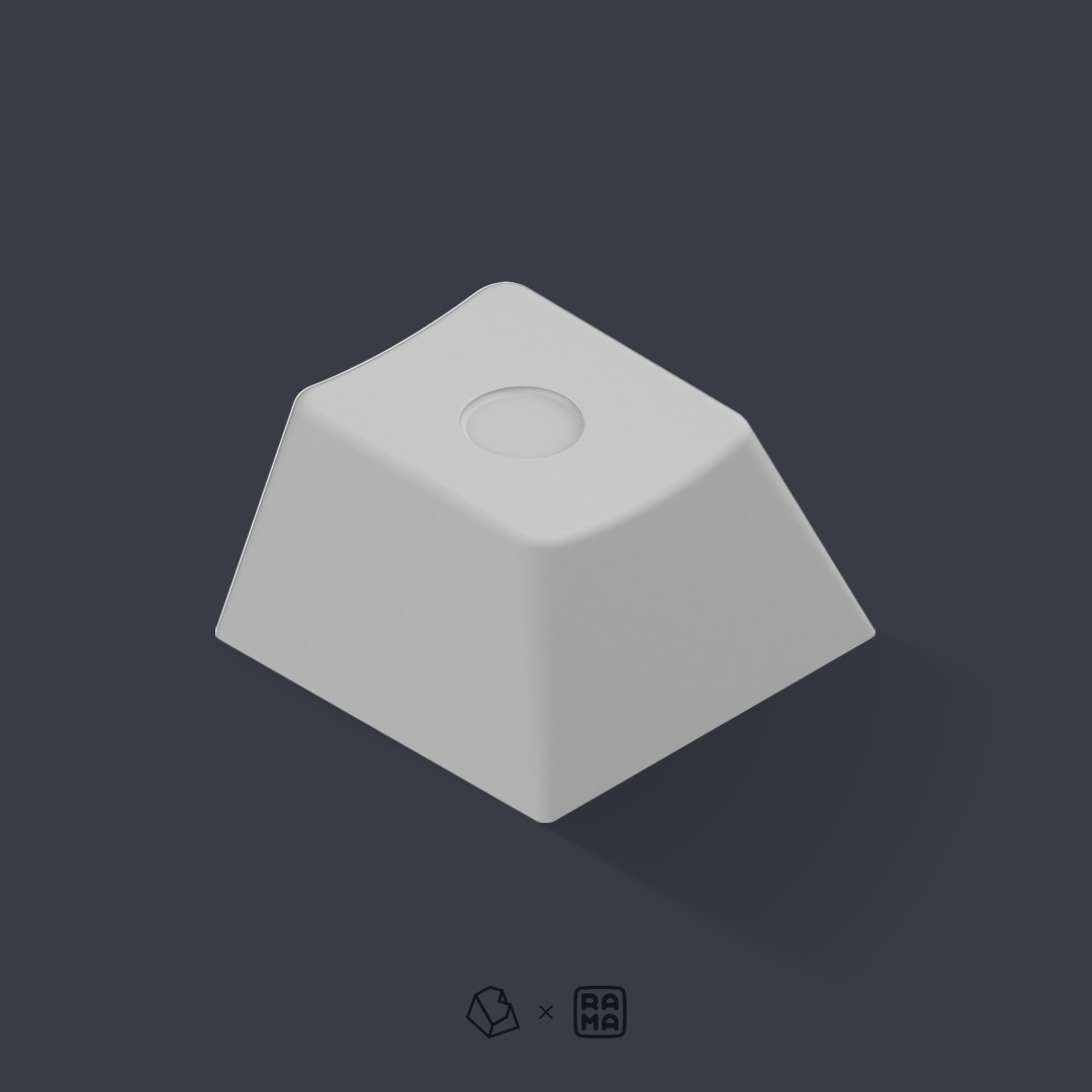
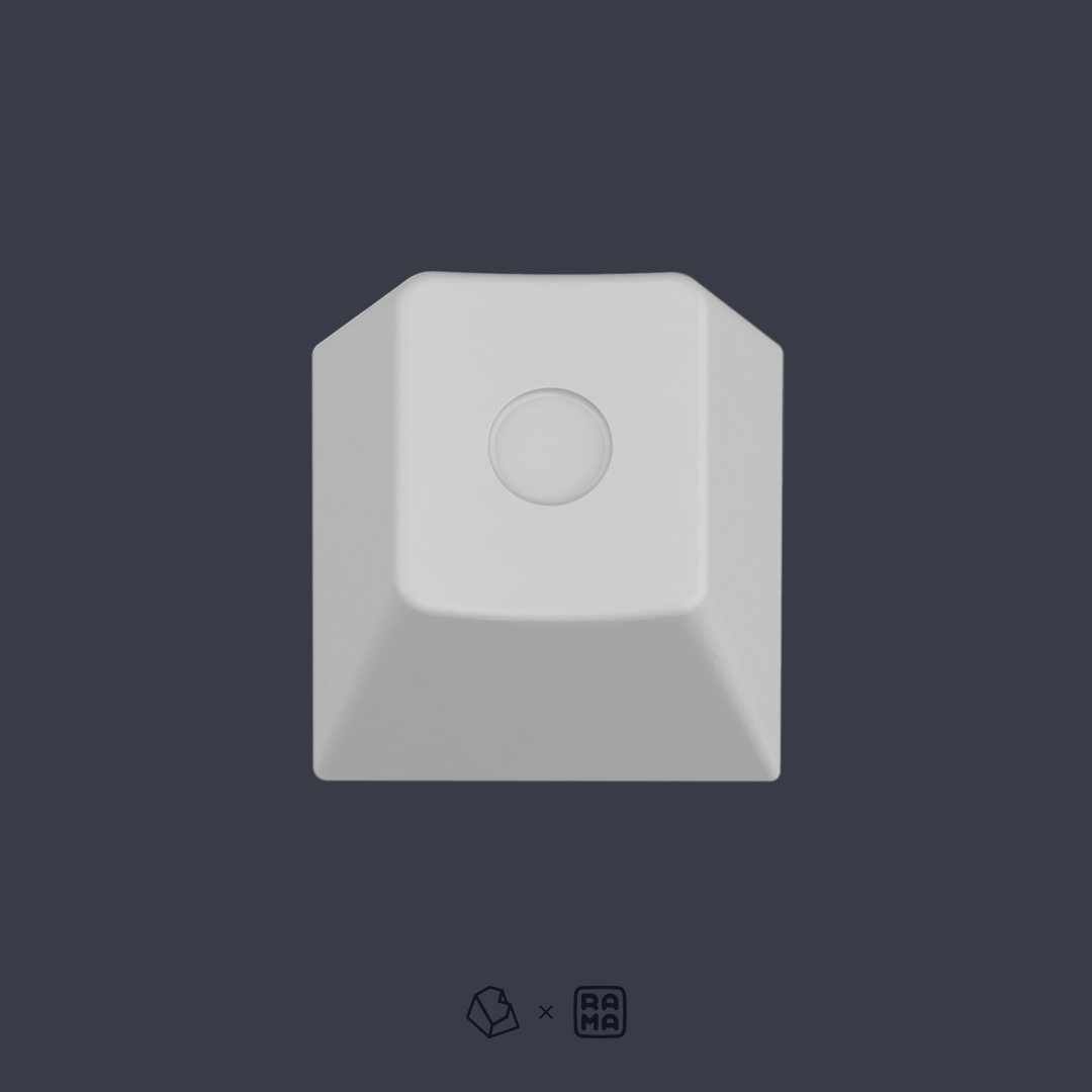
Quick update:
Hand mirror polished PVD Brass keycap
E-White Aluminium with white gloss enamel fill keycap
7 Likes
I would honestly prefer an ISO enter key like this.
I think it still fits because the line and dot is split on R2 and R3.
But if you think it takes away the minimalistic aesthetic it is fine. The ISO enter really is a weird key.
I really enjoy the rest of the design though 
2 Likes
Lets just say that we disagree on that particular design for the ISO enter key. It’s really not what I’d prefer.
Pricing from Novelkeys 
| Kits | Price |
|---|---|
| Base kit | $135 |
| Ergo kit | $110 |
| Nomad kit | $35 |
I’ll add the other vendors soon™
4 Likes
I guess I’m in it to win it 
This set is actually mega nutty and I’m definitely joining the GB for it. I’m a sucker for the dark base color with color accents.
1 Like
Group Buy is live!
- zFrontier CN
- zFrontier EN
- Novelkeys
- Dailyclack
- Candykeys: (soon)
Feel free to check the GB thread
2 Likes
As the group buy thread has been created in a new post I’m going to close this thread and direct any new conversations over here:
https://www.keebtalk.com/t/gb-gmk-dots
2 Likes