[IC] Palm Desert 1968 - DSA Arabic sub-legend keyset

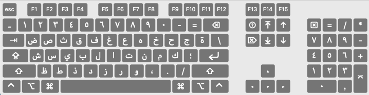
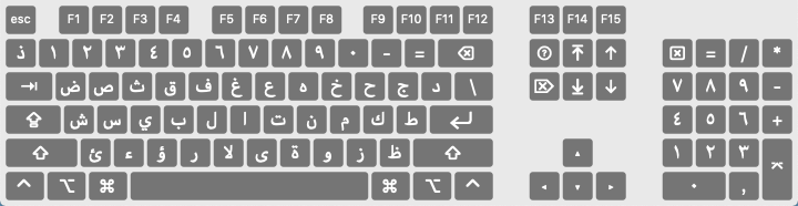
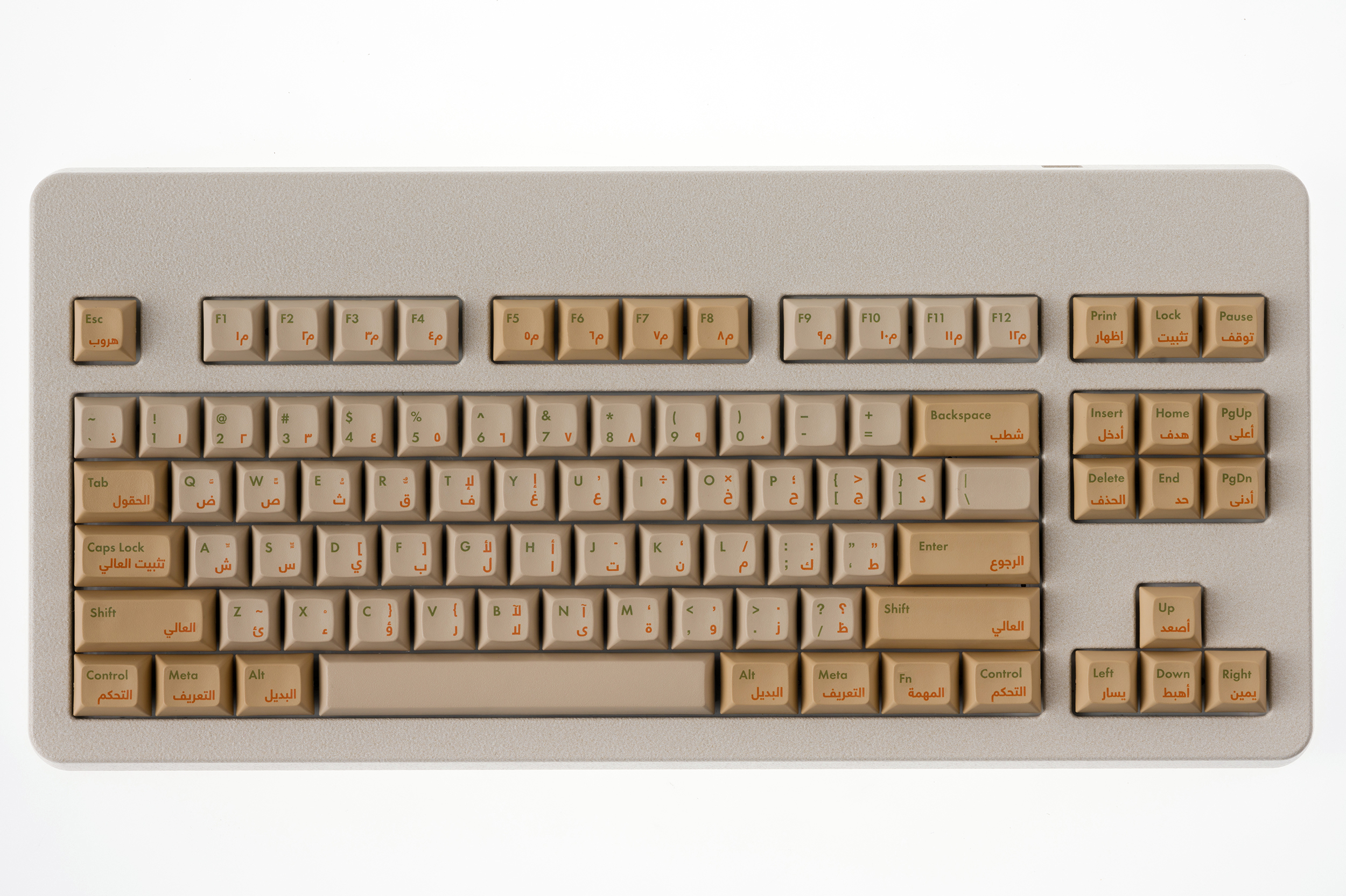
A keyset embodying the spirit of modernism in the Arabic-speaking world


Some of you may have noticed that I slipped an unusual finish into the Norbaforce Mark II group buy. I’m calling it Palm Desert, which is a nice dual reference both to a city here in California where I am based and also, more ostensibly, to the desert sands commonly associated with Arabia. This finish was added to pair with earth-toned sets in general, but also specifically with a new keyset I’ve been working on with my estimable colleague @Sour in Lebanon, which we’re calling Palm Desert 1968.

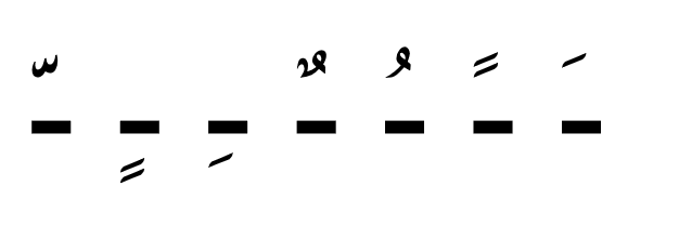
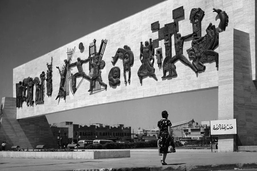
For this set, we were originally inspired by the work of Lebanese type designer Nadine Chahine, who created an adaptation of the Neue Helvetica typographic aesthetic to Arabic.

As you can see from her talk above, she wanted to created a font that embodied a stereotype-defying spirit of modernism and progress in the Middle East, which is often different than the common depictions that region is given–especially here in the US.

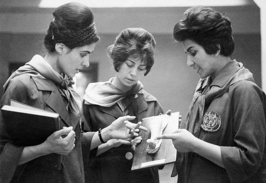
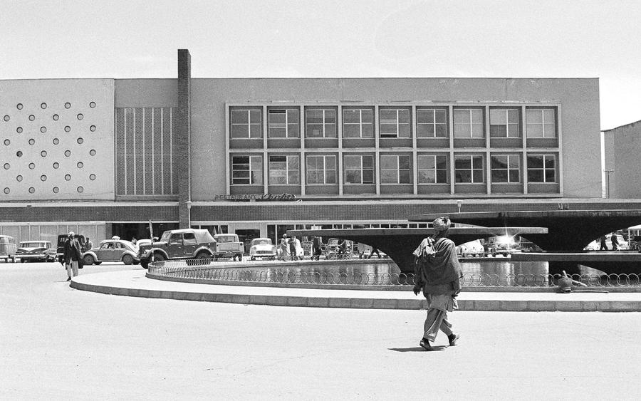
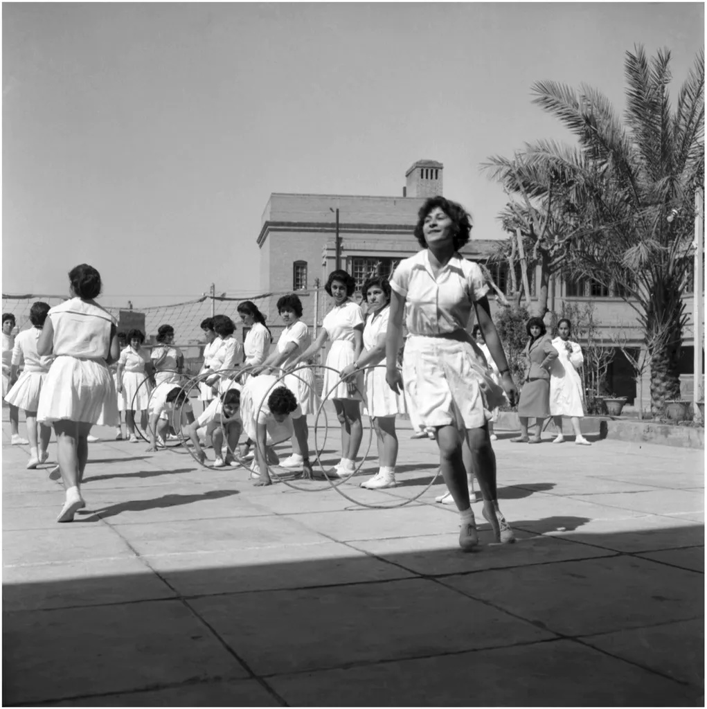
As many who follow my other work may know, I’m really into the concept of retro-futurism, which is to say: a study and celebration of the past’s optimism for the future. (It’s a big part of the reason why I’m so into the retro instrument that is the mechanical keyboard in the first place.) So, listening to Chahine’s talk, I couldn’t help but think back to the liberalization and modernism seen in the Arab world in the 1960s, when mini-skirts, female medical students, and hula hoops could be seen on the streets of Baghdad and Kabul


So I got very excited about the idea of creating an Arabic sub-legend set that evokes both the future-optimistic California mid-century modernism that I so adore and also the hopes for the future of the Arabic-speaking world seen in that same era. Chahine’s font seemed like the perfect thematic pairing.

For the Latin super-legends, we’ve chosen Wes Anderson’s favorite bit of modernist typography: Futura, for reasons that must be self-evident.

I’m currently working with Signature Plastics on this project, because as my previous group buys have shown, I think they do the best dye keycap sublimation work in the word, and this set is all about a faithful representation of these beautiful letterforms. I believe that rounded rectangles of the DSA profile further understores the modernist aesthetic (and I am always a huge sucker for the feel and sound of PBT).

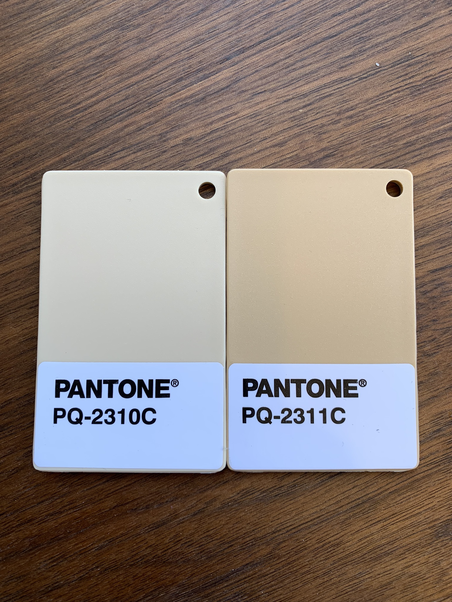
We’re currently working with SP on a set of samples using these Pantone matches.

Please fill out the survey if you would be interested in picking up a set and think we should pursue this project further!

13 Likes

Yes please! Damn, how am I meant to choose a R2 case color now.:slight_smile:

1 Like

I love this. Given its SP some good opportunities to have some additional kits at low MOQs as well. We’ve needed a good Arabic set for a while; and when laid next to Futura the typography really jumps out.

1 Like

I’ve been waiting for someone to roll out dye-sub Futura for a full retro experience. This will be amazing.

I tend to go through phases with sublegends - hope you will consider Latin-only and Arabic-only kits as well.

Either way, very nice work.

1 Like

Hey, I love the set and as someone who types Arabic and English almost every day I’ve always longed for a nice Arabic keycap set. One note, and this may be picking at nits, your Arabic and English titles in the nicely done logo at the top don’t mean the same thing. You have it written as نخلة الصحراء which means “desert palm” whereas the English you have above it is Palm Desert which should be something like صحراء النخيل or صحراء النخلة .

Keep up the good work. I’ll be watching this project with much interest!

2 Likes

@rockway Hehe. Yes @Sour and I actually experimented with the name both ways “Palm Desert” and “Desert Palm,” even in English.

1 Like

Hey there! Thanks for the encouragement and support of our little project!

So we actually played around with the titles a good bit before deciding to go with it this way. Didn’t feel the other titles fit. Felt like using palms in plural in Arabic, didn’t reflect the name and feel, in English. Nakhlat al Sahraa just has a better sound to it imho, feels more like it has to do with the set than saying Palms Desert, or Desert of Palms. Makes it feel like this Palm is a special one in this desert. What do you think?

5 Likes

My nitpicking was clearly unnecessary as you guys have clearly thought through this at length. And yeah I think نخلة الصحراء looks and sounds great =) Translation isn’t always cut and paste and I appreciate the thought you both have put into it. As I said it’s a beautiful set, good work all around!

2 Likes

I’m all about everything that this set is. DSA is by far not my favorite profile but I’m in, I love it.

I’m always on the hunt for Arabic keycaps (even though I haven’t typed in Arabic for years) and just struggle with the layout (Modern Beige is the worst, DSA Lingua Fraca is AZERTY but at least its uniform profile and I’m touch typing English, KPRepublic is IBM PC). I’ve always loved the iOS and (ANSI) Apple Arabic keyboard (it’s ortho, ya’ll!), but the IBM PC keyboard is more common on ANSI for sure. Have you thought about doing an Apple Arabic layout kit?

Apple Arabic layout


IBM PC Arabic layout

Awesome design guys! I’m just about as anti DSA as anybody is in this community, but would be willing to make an exception on this set. I love everything about it & so glad you guys are experimenting with the typefaces a bit! With doubleshot sets we are pretty much stuck with what is out there unless someone has a huge wad of cash to throw at molds & it seems most designers want to to stick to those conventions even when dye-sub legends are in play. So to me it is a breath of fresh air to see something different like this! If this goes over well any possibility of a PBT sculpted SA set? That would be my ideal version of this at least.

2 Likes

Yeah, honestly, DSA is probably the worst part about this. The only additional feedback I would give would be to not do it in DSA. XDA is passable, but MDA, KAM, HSA, SA, literally anything would be better than DSA (I think it’s my second least-favorite profile).

1 Like

First of all, lovely colorway and I’m glad that someone is making a keyset with Arabic sub-legends.

I have one question, is there a reason why “Left” is “يسارا” instead of just “يسار”?
Just curious about the reasoning.

I hope this keyset becomes a reality!

1 Like

I love the second layout (IBM PC Arabic layout) even though my iPhone uses the Apple Arabic layout. I like how every Hamza “همزة” is on one of the keys. You can get to them without having to use your shift key.

1 Like

Will be adjusted prior to production :+1:

Just as another note for something to be adjusted before it goes into production, the “QWER” keys have the shift layer showing shadda attached to the harakat for fatha and kasra, but shouldn’t the shadda be under the shift layer for the tilda ~, and the QWER keys should just be the the harakat with no shadda?

Couple local keebs with accents around shadda.

Pressing shift Q in Arabic, on PC, will only bring up the fatha, if you want shadda you still have to press shift tilde and then proceed to add the accent to it from shit QWER. Now that I think about it, I think the shadda is there to illustrate if the accent is a fatha or kasra type of deal, under or over shadda

Yeah, I get that the shadda is showing if it’s above or below, but it just feels wrong to include the shadda with it. In Word, if I type a short vowel without a consonant it gives me the following:

Something like that instead? Or even something like the following:Screenshot%20(4)

Either one of those feel better to me than using a shadda there. Thoughts?

The circles look like what mac does, not sure how much I personally like the dashes either to be honest. Most pc keyboards I’ve seen with Arabic have the shadda. It doesn’t look aesthetically displeasing or anything having the extra character there, I would prefer that over circles or dashes, visually.

It’s been a little while since this post was updated.

Sample set was received recently. Attached is a photo. Please keep in mind colors might not be 100% accurate, and vary slightly from screen to screen. Overall we are pretty happy with how this sample has turned out. Obviously there are a few things we are discussing and updating before finalizing. Figured it would be a good time to show our progress so far though, cheers! :slight_smile:

Pictured here on a Norbaforce MarkII with Palm Desert finish.

5 Likes

Wow! Those legends look really good. But what’s up with that Fn key? :slight_smile:

I don’t read Arabic, so I don’t know about that part, but the Latin Alphas look great. Lovely set. I’ve recently swapped my 3 norbatouches and my norbaforce over to DSA caps. I think it’s my all-time favorite profile. Zero degree incline with DSA caps on 45g topre. Heaven.

1 Like