[IC] SLK Dessau

Whoa. What am I looking at? These are amazing. It’s like super tall square chocs. Anyone out there know what these sound like and can share their typing experience?

https://geekhack.org/index.php?PHPSESSID=tinl6q3nn6u01u42111n4moa8a4abppr&topic=110702.0

5 Likes

Looks kinda like XDA or whatever it is called now I think? The round top is pretty cool looking though

1 Like

Agreed! Also, I absolutely dig this R4 colorway. So good.

1 Like

New plastic molds aren’t cheap
image

I wonder how much these will cost

2 Likes

Seems like lots of round caps are coming out in anticipation of RAMA KATE profile.\

In fact these don’t look all that different (except better color ways) than the “MA” profile switches that I linked to a while back:

2 Likes

I’m so confused. SLK = MA. Good to know!

I’m pretty sure these are unrelated to MA, although they certianly look very similar. The devil will be in the details. The person running this Interst Check is 3d printing prototypes and adjusting. His latest update is an slight increase in height to make the top a bit deeper dish. I do love the colorway and font. I hope this is something that gets done right. I’ve seen other amazing renders to come out looking hella cheap… looking at you, XDA

2 Likes

Neat! That was the only thing that had me on the fence about these. What are your thoughts on the feasibility of an Apple IIgs MX keycap set?

4 Likes

No interest from me. I’m stuck on Cherry-like cylindrical profile so, if I was forced to choose another profile, I’d go with KATE.

1 Like

down for the font and Mac key support but would this cap translate well to a non-retro shaped board…? might be interesting if it is less vintage-leaning.

1 Like

I’ve actually never typed on a IIgs. Looks like they are cylindrical, right? Lots of space between cap tops… Seems like it would work well. At least for people who like uniform profile.

I’m really not a profile snob at all. The only thing I don’t particularly like is XDA. The small space between tops requires me to type more carefully and slower.

1 Like

Totally agree. Maybe something with chunky bezels, Mojo60 perhaps.

1 Like

Hi all, I’m the designer of the keyset, was going to cross post the IC here but I noticed there was already a thread! I’ll let Nostril of Synth Labs know in case he can answer any questions about the new profile.

Judging from the profile comparison though, SLK’s height is much lower than KAM/XDA (9.1mm) and even DSA (7.6mm). The base also sits lower than all of them. I imagine it will be a very different typing experience, and I’m excited to try it out :v:

7 Likes

I am definitely going to go in on this I think they look striking.

2 Likes

Hi, I designed the SLK profile. Looks like there’s a few things to address here that I might be able to provide insight into:

@Manofinterests While pricing is still TBA, I would expect it to be reasonable. Yes, as you mentioned, molds are expensive, but we aren’t allowing this to become an excuse to make the keyset (or this run) more expensive to pay that cost off. It goes without saying that making a new profile is going to be expensive upfront - FK Caps and I are aware of that - and we aren’t going into this with the expectation that those costs will be paid off immediately.

Regarding the development/inspiration of the profile, SLK isn’t related to MA or KATE. I can go into a more detailed story of the SLK’s development, if anyone is interested/curious.

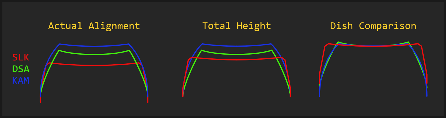
As far as the design goes, keeping the height low is a big priority for me. I do like DSA, but I certainly would like to have something noticibly more low-profile than that, and that’s what SLK aims to do. Wall thickness, dish depth, and taper (which is dependent on dish width), are all factors that need to feel good, but sacrifice low-profileness. In designing SLK, I’m trying to minimize the profile height, while not going as far as to compromise the feel. It’s like height budgeting.

I’m personally comfortable with the size/spacing of the tops, but unfortunately I can’t really give an opinion on how similar it feels to XDA, since I haven’t tried XDA before. I have had a similar experience with the stock keycaps from my Morgrie Rie though - where I had to significantly slow down to type or even play games, since the spacing between the tops was causing my muscle memory to not kick in. Haven’t had the same issue with SLK though. This all pretty much anecdotal evidence for something that’s subjective anyway.

If this helps imagine what it might feel like - the diameter of the tops of SLK profile is 15mm. This is a bit smaller than the diagonal length of DSA, KAM, and Cherry tops, but a bit bigger than the horizontal length of DSA, KAM, and Cherry, and about the same as the vertical length of Cherry tops.

11 Likes

The design is clean and it pops while not being over the top. I am curious about row height differences , but maybe there are none?

1 Like

There are no row height differences. The only exceptions are the convex keys - the spacebars, which have the same amount of curvature as the concave keys, but in the opposite direction.

1 Like

Would you please @Nostril? This looks like a very interesting profile, and a backstory would be great to go with it. To my eye it has similarities with vintage circular caps like those on Siemens and Tandberg boards (modern imitations by Rama and Devlin).

3 Likes

+1 to this. Love a good “behind the scenes” backstory kind of thing.

Sure! I put together a writeup here. Putting it in imgur so it can be updated as a living document as more progress continues, and because there are a lot of images: https://imgur.com/a/hc20fvX

6 Likes