Too much detail IMO. I like how the tail of the speech bubble nests into the text though.
Appreciate the feedback. I liked your option quite a bit @chrysanthe I do not disagree that it’s a bit busy. When it needs to displayed really small (favicon or something along those lines, it should be close to what it is now, simple k in speech bubble.)
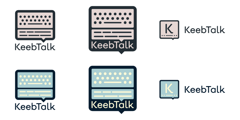
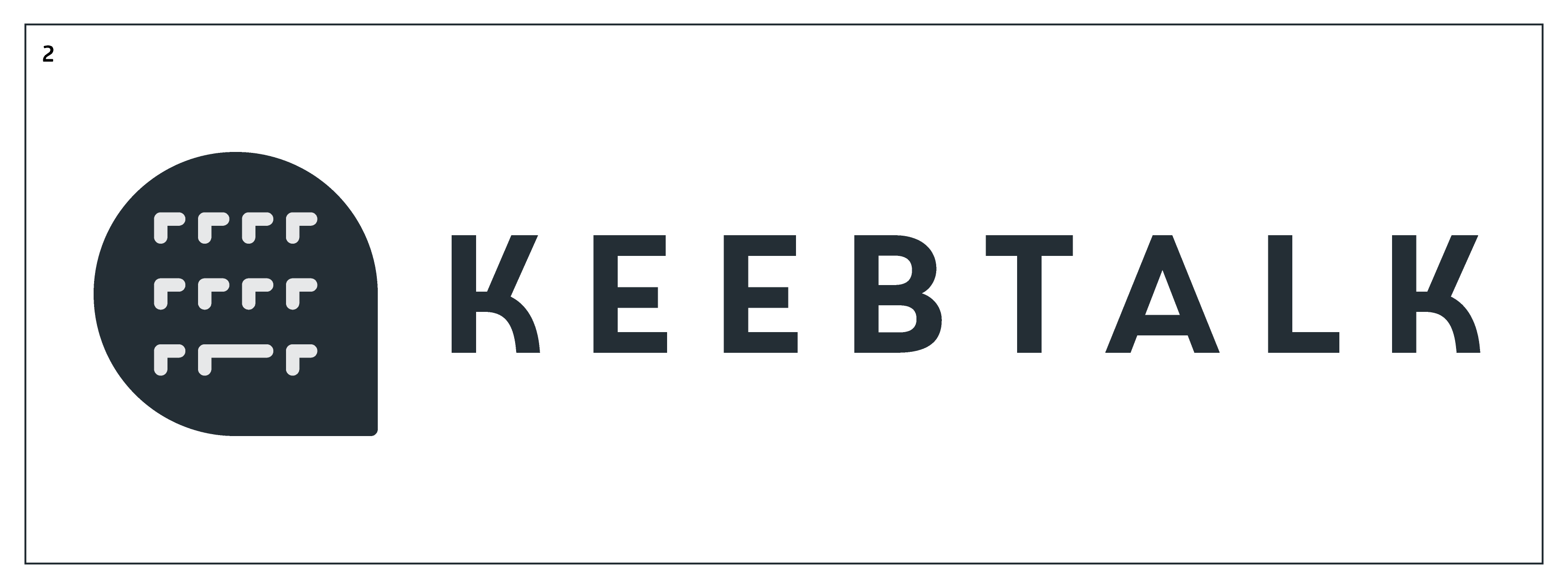
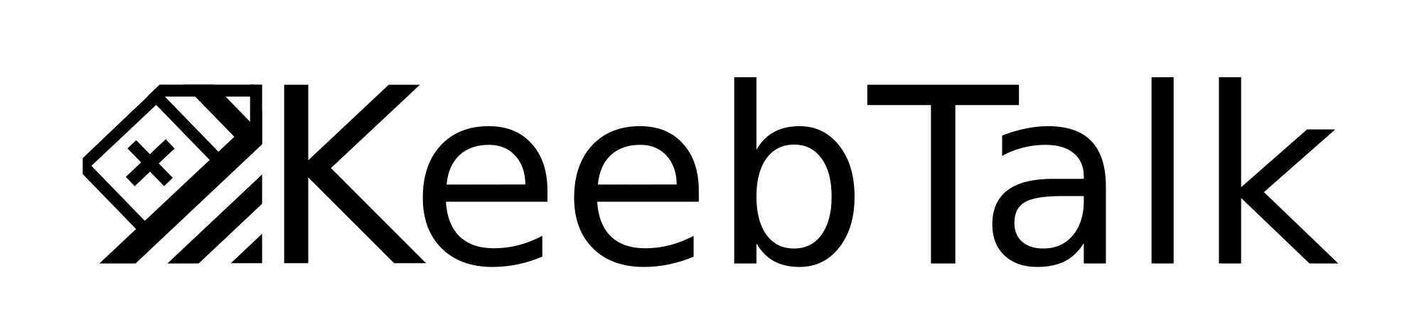
Made it a little more simple, taking out two of the rows on the keeb, and one chat row, added wordmark into the 1:1 square icon grid. Added smaller icon concept. K in bubble with bottom row.
2 Likes
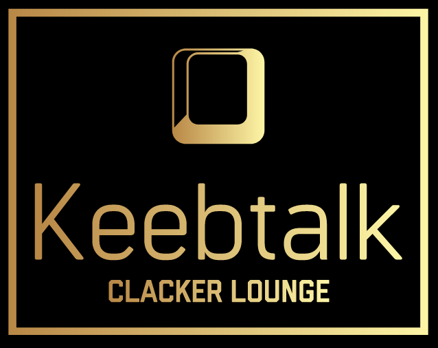
@olivia rose gold alert!
2 Likes
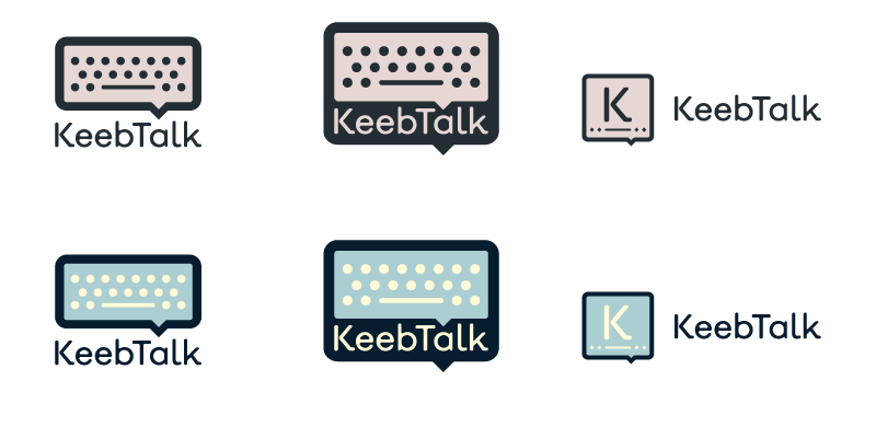
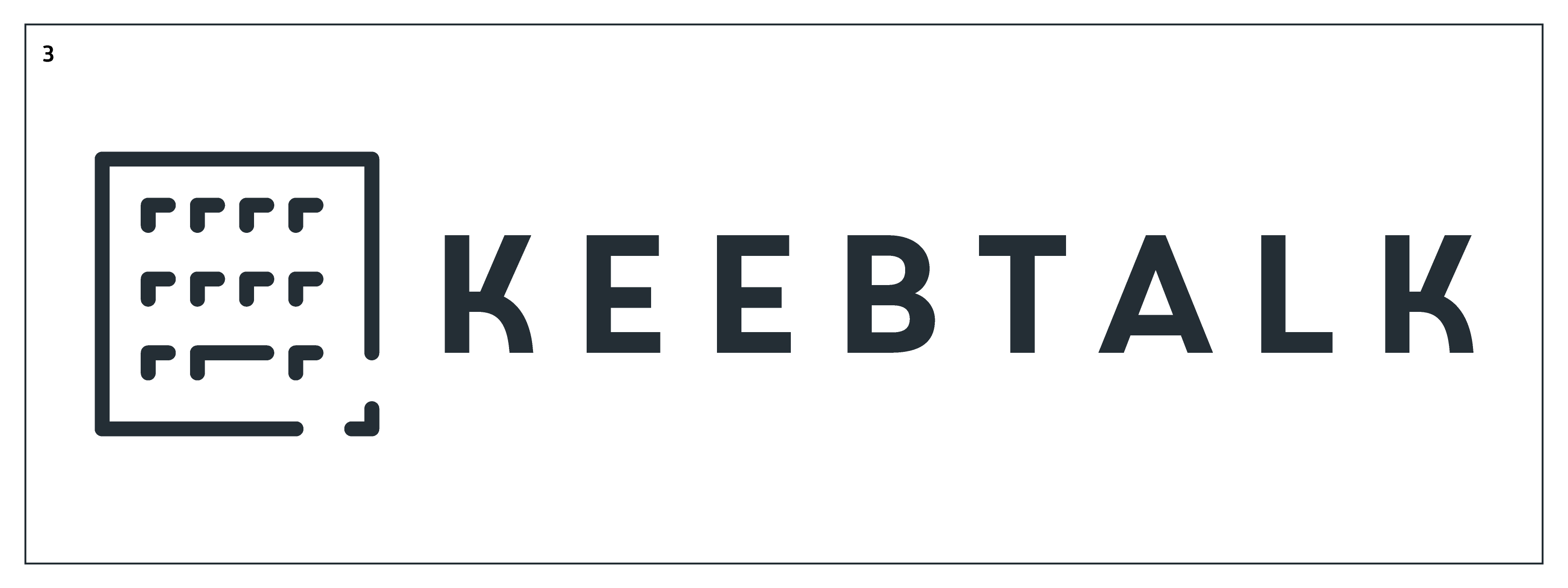
What would it look like without the wrist rest/chat on the bottom? I figure the “keeb” is the most important part, and the “talk” part is covered by the speech bubble tail.
EDIT: I’m back at a pc now, so I made this in paint 
Personally I think this looks a lot less busy, the message comes through clearly.
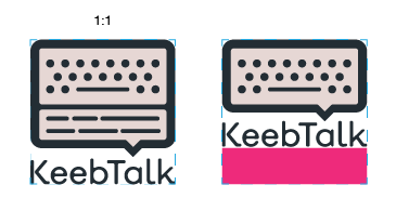
I had understood what you suggested earlier and it’s not a bad idea or anything. The issue is it’s not a 1:1 anymore, see attached example. Logo needs to sit in, and fill out a perfect square
Oh, I didn’t realize that was a requirement. I no read well!
Most of these were designed with an online logo designer and finished in Paint ![]()
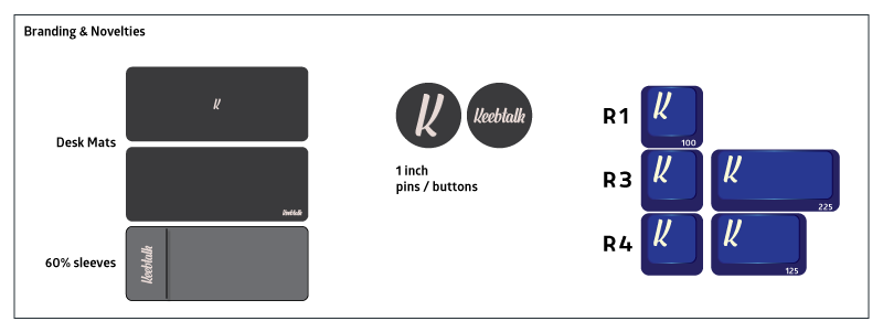
This one could maybe be a novelty cap ![]() ?
?
!
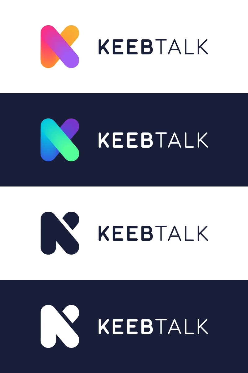
KT8|690x185
1 Like
That last one looks really familiar
 maybe they used the same website to generate logos as well !
2 Likes
This is tough
3 Likes
That’s what she said.
2 Likes

I think the kerning needs a bit of work on this one. Keep it up!
welp, enjoy your gmk camping
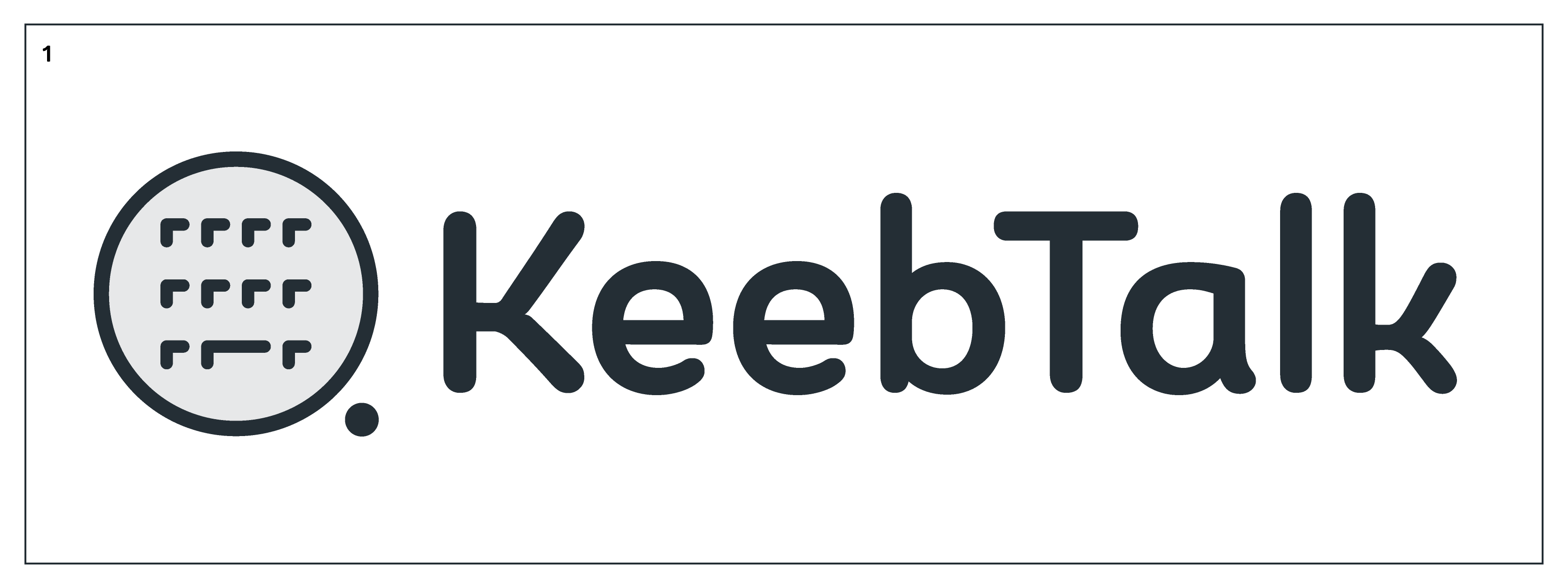
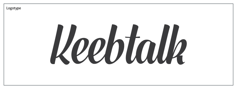
I’d like to present a typographic option for your consideration.
Little bit of a hand drawn / home made aesthetic to it, while remaining clean, friendly, and professional. This option will translate well to potential future branding ideas, as it will look good in both small and large format. I took the liberty to play around with a few quick ideas. I think the “K” enter key is my fav.
12 Likes
@Sour this is some amazing, super-professional hand-lettering work. 
2 Likes
This is definitely my favorite so far. Good stuff!
1 Like
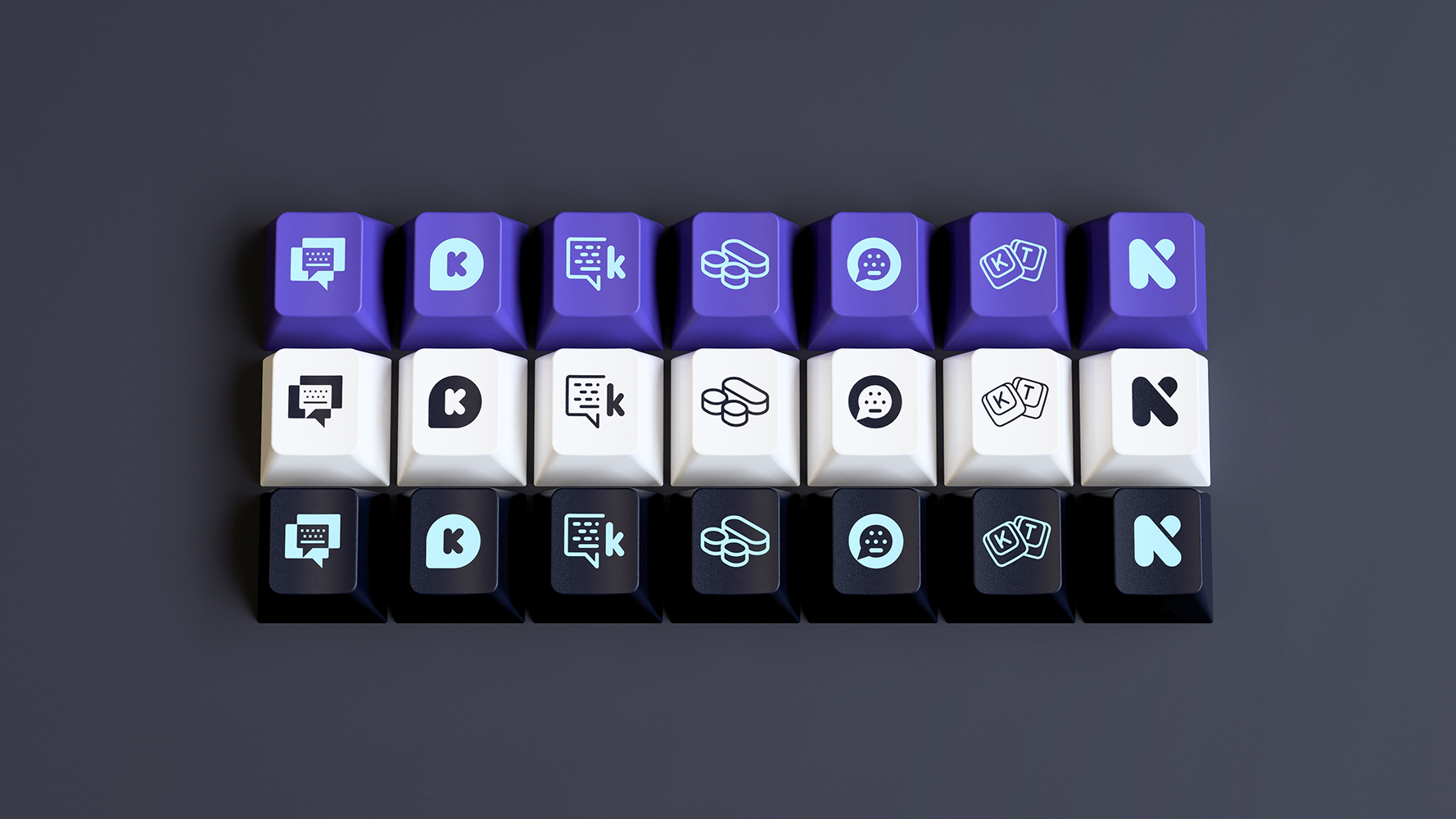
small addition, gonna add some color on others soon™
also, a preview on the possible novelties 
credit to @janglad
13 Likes
The heat really turning up now with all these great submissions 
1 Like