Okay a last one and I stop 
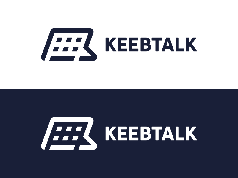
@Sour How would you feel about a hybrid of your hand-lettered design and one of the graphical elements you submitted previously, something sort of like this:
I would think if it were appearing just on a t-shirt, say, it would only be the lettering. But for the site we would have both, which would transform to just the 1:1 graphical icon on scroll-down. Or would you rather, in that case, have the K in a circle?
Another option might be combining the @Sour lettering with one of @biip’s excellent icons.
Just thinking out loud here guys. 
3 Likes
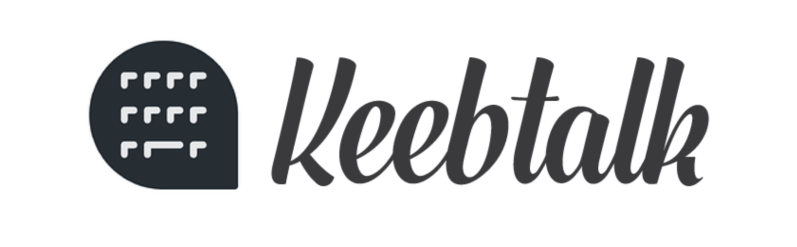
More than happy to collab (this is a community after all). I felt @biip covered a lot of good icon design, which is the tougher part of this logo imho. A keyboard that has enough detail to look like a board at both small and large sizes. Which is also why I submitted a pure type option. I quite like my solution (design) of the the keeb, as I feel like it’s different than what has been submitted, and remains true to the idea, a clear keeb in small and large sizes. More than happy to mix my logotype with one of my icons.
Depending on how many options are being voted for, could have one collab for example, biip’s icon design with my lettering (if he’s up for it).
There’s no real rule saying that the 1:1 logo can only be a k or a keeb. could have a tshirt with just the K in a bubble and another with just the keeb. It’s your logo to display in as many creative ways as you see fit. (I can always help with that stuff too, I love branding.)
TL;DR
I’m ok with whatever you guys want to do. This will be something that represents you and this community. My goal is for you guys to have something you are proud to display / use on a daily basis.
2 Likes
The icon reminds me of YOUR icon quite a bit 
1 Like
Ha. I hadn’t thought of that.
Cool. Yeah, I don’t think we need to be too formal about this. I’m actually agonizing a bit about how to organize the selection process. Maybe we’ll try to break things up into a poll in a semi-sensible way and then I’ll confer with the board and see if I we can interpret the numbers a way that represents a general consensus but that also makes coherent design sense, which may include, as mentioned, combining elements from multiple top contenders into a single unified scheme. I’m increasingly realizing that something as ineffable as branding design is hard to shoehorn into something as readily quantifiable as a single poll vote. ![]()
1 Like
I was wondering how the options would be decided to vote on. Though maybe the board could have a chat about the 2 - 3 options they like the best, and the voting could happen from there. Although I hope at that point the voting would be fair, on an objective basis rather than familiarity, as I’m well aware of who the accomplished competition is 
Lots of really great ideas!
How about…
A blatant attempt to appeal to your acknowledged, mid-century sensibilities, Ryan, and nostalgia for the very few “ancient” individuals, here, who might actually get the joke.
“Girl Talk - 1962-1970” Television Series
The half-hour talk show titled “Girl Talk”, which ran from 1962 until 1970, and lasted for eight years in first-run syndication was basically the forefather of all of the morning talk shows and if you wanted to know where the predecessor to today’s “The View” originated, it came from this show. However, if any TV show of the 1960’s deserved to be called a “bitch session” then GIRL TALK was it.
Ha. Fascinating. Midcentury aesthetics notwithstanding (and I do even quite like old 60s TV—grew up watching Nick at Nite), I’ve never actually even heard of this particular show. 
I like the idea of a combo the best for sure. Are there two sets of GMK Camping to give out to these guys?
Hehe. I’m sure we can figure something out if it comes to that.
Yeah, I’m going to be 54 in a couple of days, and I’m not familiar with that show. Interesting though, like something my mom would have watched, kind of how my wife likes watching the Hallmark Channel even though the programming is eye-rollingly terrible. Or all those home redecorating shows. Don’t get me started
Hey! Thank you all for all these kind words.
First of all, I would like to say that I have nothing against collaborating, it allows to have new ideas and styles most of the time.
That said, I’ve to admit that I’m skeptical about merging two parts of logo (the logo itself and a typo), since we usually make sure that the text comes to sublimate and highlight the logo. Taking two entities that have nothing to do just because they look good or are interesting, individually, is rarely the wisest choice IMO.
For me, it is essential to have the essence of the logo in the typo (whether curves, simplification or stylization, or the weight of the font). And combining two things of a different style can be tricky and/or generally looks bad.
As I said, collaboration can bring very interesting things, and from a ‘community’ point of view I have no problem working with someone else. I just want to have a consistent end product which appeals to (most of the) people. I mean, it would be a real shame to have a middling logo…
if you have any suggestion or remark feel free to tell me in the comments
1 Like
Design by committee is always a bad idea. If the type for the winning design isn’t perfect, ask for type submissions and run a second poll up against the original winner. This allows for people to design the type for the logo instead of just smashing two things together.
Btw, I think it’d be awesome if the logo changed like Google and we had more than one logo. It’d really highlight the community aspect of this place. We aren’t selling a product, so branding really isn’t a concern for keebtalk, as long as the logo isn’t an eyesore, we gucci.
I doubt anyone involved would be willing to compromise on a logo that felt like it was stitched together.
Having the icon designed first and then working on the type would feel like it was stitched together much more if anything, specially if it endued up being designed by two different people. I agree with the sentiment that both the icon and the type should be designed by the same person, as they look like a cohesive unit and share the same philosophy.
I think @norbauer might have thought of a collab, because he likes some of the icons submitted, but likes the typography of my options. If that’s the case, I feel some of the submitted icons would look good with my selected type faces, which in turn would be a successful collab. Although I would rather one designer / or multiple designers working with an art director, make the work, that way it all has the same breath.
Branding is also an important part of things, not just necessarily to make money. Can use branded items for giveaways, competitions, meet up giveaways. The site making a little money is also not a bad thing, if people can buy a couple of quality novelty items, and help support something they care about, why not.
As long as there is an overall coherence, yes.
2 Likes
I pity the fool that has to tell the non-winners that they didn’t win. There has been some excellent work here,
1 Like
Deadline is comin’ up 
I feel like @biip iterations keep getting better and better. There might be a winner in there.
Thanks dude!
Does it mean that I should make new ones? ![]()
If you do, you might want to hurry; we’re considering closing this early since there hasn’t been any submissions in over a week
Once we close this (most likely in a few hours if no new submissions come through); the board members and myself will pick the finalist and put those finalist to a community vote.