MT3 “Severe Burn Unit”
MT3 “Shades of Lame”
1 Like
Gals and fellas,
What board is this? Ortho full size, but I don’t remember seeing it anywhere before…

3 Likes
I love that someone was willing to commit to ortho enough to make a full size and then decided to put a goofy stagger for the arrow keys lol
8 Likes
Right? I didn’t want to comment that as I felt I was missing something deep in the ortho culture, being an outsider to it 
1 Like
I thought it was a render at first but there looks to be a nick on the numpad ‘+’ key so maybe not? Idk
I’m pretty certain it’s a photo, it comes from the page @djmantis linked in the review from user dvorcol:
Disclaimer: Drop sent me a set of MT3 Iron Man keycaps to review in advance of the product release; the opinions in this review are my own.
…whose bio says:
[…] and use an ortholinear Dvorak keyboard whenever possible.
After watching a couple streams, I’m thinking these look better “in person” than in Drop’s photos (and that one I posted) - but either way, I’m reminded that it’s quite the step up and in the right direction from, say, this:
8 Likes
What is that mess?
3 Likes
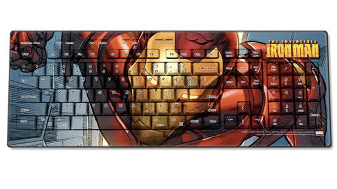
It’s iron man!
1 Like
Graph man! (Dvorcol)
Yes, it’s literally iron man. Even though it makes for a cool photo, I don’t like it that way for a keyset.
I will say they did a much better job with the Black Panther keycap set and their newest one, Infinity war I think is the name? Most of the people I know call it the Thanos set lol. I might try to pick both of them up since my favorite color is purple >.> but I’d definitely use the regular mods on the Infinity war one.
1 Like
I… don’t hate it! Not into the novelties, but the colors do work together well for me.
I can’t quite put my finger on what they remind me of; seems a bit more subdued than Thanos’ actual colors but that might be a good thing here. Edit: maybe taro?
In the shots that don’t include the novelties, this looks like a really solid colorway to me, even if it’s not my favorite.
1 Like
Same, without the novelties I’m digging the set, with the novelties… “Bold and Brash? more like Belongs in the Trash” ~Monty

9 Likes
WTF. No words, just confusion.
3 Likes
._____.
hm.
3 Likes
Yeah her fondling at the 0:17 timestamp doesn’t really instill me with a lot of confidence…
1 Like