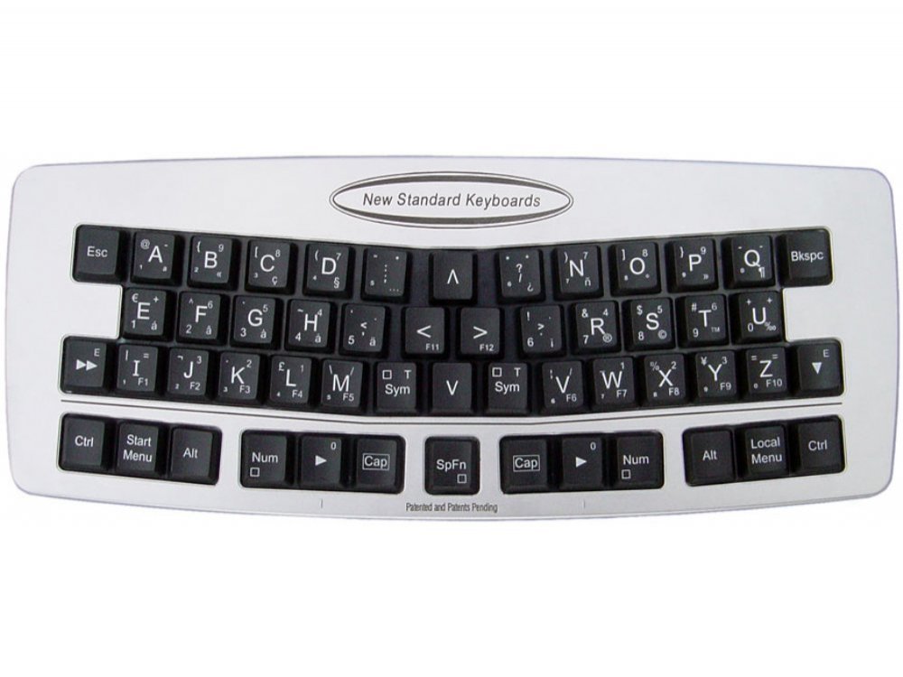
hm this is so close to a budget hhkb prebuilt
This is 100% a reflection on me but non-split backspace on an otherwise HHKB layout makes me twitch a little.
Ha. That’s my favorite layout for 60%. I have 7 boards like that.
I like HHKB for the control placement and nav cluster with the function key. But in all my time I still can’t get used to backspace in the pipe location.
Hear me out guys, GMK micro
Looks like a 0.065% layout.
I have one of these coming in a week or two. I will post thoughts when it arrives.
Perhaps more a mildly interesting hmmm than anything else:
The first thing I noticed is that the progression of the bumps reminded me a bit of stock Halos, at least in terms of how a rising cushion seems to follow the bump itself. I put a pin in that, noting this may make the steams great for frankens after all - experiments on that to come.
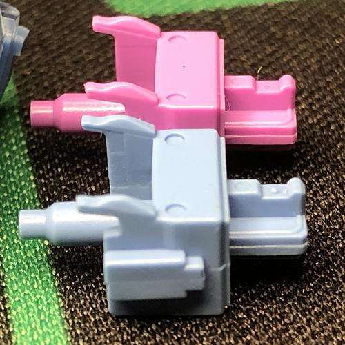
The next thing I noticed is that, trying these two switches in-hand, they’re at least as different as their sales pages say - but something about them feels very related. I wondered then and there if they might have the same stem. Time to pop them open and see what I can see.
After some fairly brief experimentation, I’m reasonably convinced that the only functional difference between Akko’s Ocean Blue and Lavender Purple switches is the spring.
da springz
As I’d mentioned in the mailday thread, I got these out of curiosity, both when it comes to their stock performance and their frankenswitching potential. First impressions of both as stock switches are very positive, with the exception of some serious ping - excusable at the budget price. Generally, these appear to perform great for what they cost. More details on that another time - this post is about something more specific.
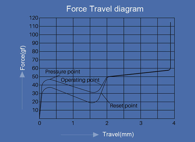
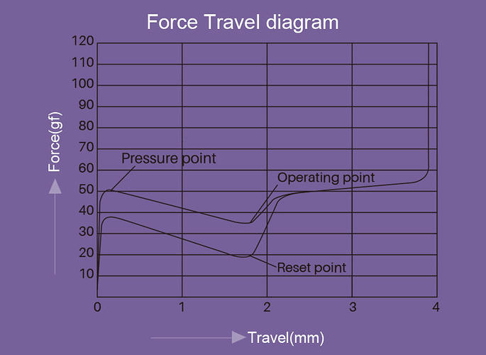
I’d like to start by looking at Akko’s own supplied force curve graphs from the product pages.
Ocean Blue:
Lavender Purple:
Always a grain of salt to be taken with brand-supplied diagrams, and I’m not sure how accurate they are, but I’d say they’re more or less descriptive of how they differ.
They already look fairly similar, but give the impression that the Purp has a sharper onset - which it does. At least based on some past experiences, these graphs hinted to me that the Blue might have a more rounded stem or mild leaf compared with the Purple - but after swapping around some components between these two switches, I think it really is just the spring.
Honestly I think that’s quite clever in terms of cost-saving measures in context of developing a line of switches. Using one tool for multiple switches saves a lot - and the more parts you can keep the same, the lower the cost will be. These switches seem to be a case-study on just how much one part that isn’t the leaf or the stem can change the character of a switch.
Kailh-made Halos and Polias are very similar. I believe these are completely identical.
There are some nuances about the stem design in general that I like; the rails seem to be thoughtfully shaped in multiple dimensions, with a high level of detail and control over the bump’s shape. This makes sense not just for trying to make a quality switch, but especially when developing a stem meant to carry multiple switches.
In case you’re wondering about it specifically, yes, I believe even the leaves are the same between these switches. It appears the springs alone account for their differences not just in weight, but in the character of the bump itself.
Ever have that feeling when researching a thing, when you realize the thing is much deeper than you thought, and there’s a simultaneous excitement for the opening possibilities and intimidation from the newfound complexity?
A chicken-walk that I promise is related - or more specifically, a random walk. Given an infinite number of steps moving one at a time in a random direction from one point on an infinitely large two-dimensional grid to another, it is 100% guaranteed you’ll return to the same point sooner or later. That guarantee goes right out the window if that grid becomes three-dimensional, even given an infinite amount of time and steps to return. Might happen, might not.
This illustrates how much more complicated the science of tactile bumps just got in my mind upon fully recognizing how much of a role springs can play.
I’ve already been surprised by this in the past, and noted it here and there, but I don’t think it had really sunk-in how much / how many of the bump’s qualities can be dialed-in and adjusted purely through the spring.

I did a review on the Lavenders recently and really enjoyed using the switch, especially given its price point. I am also convinced that the springs are the only difference between the two, and of course the colorway ![]()
They can honestly just re-release the exact same switch, but change the spring and say “it provides a unique tactile experience” compared to other switches in their line-up. People will buy it.
A more hmmmmm would be this switch: Akko CS Jelly Blue Switch (45pcs) | Akko Official Global Site with its “dual tactile bump”.
Is YMDK really selling a Pornhub keycap set? Why yes they are:
Obviously, they thought it was a good idea to tarnish such an amazing username…
![]()
So, yes - but it appears to be inspired by a similar GMK IC from a while back that ended up moving over to DCS:
Oh wow. I never thought I’d see new DCS kits of this being sold.
Techkeys dug up 6 sets from 2012.
I use the Lavenders (my favorites), also has Ocean Blues sample, it does seem that the spring is the only difference, the leaf on the Ocean Blues could may be tiny bit stronger, altough the OB feels less tactile and punchy than the LP.
I’ve put the LP spring in the Ocean Blue housing and the switch became tad more tactile than the LP, could have been just small inconsistenciesor I accidentally rubbed the factory lube off the stem, not sure.
The progressive spring is indeed noitcable and affects the tactility, I don’t see what’s bad with having 2 sets of the same switch but with a different spring that gives a different typing experience, this is great from Akko.
BTW I’ve watched your review, nice review.
The bump is indeed a lot more pronounced than the MX Brown’s (altough MX Brown takes more force), but I found the Bluish White and SP Purples to be a lot close to the T1 than the LP.
Also if I may, I found your table very interesting, I’d suggest adding Quality ranking, you know, housing tightness, spring crunch, leaf ping, is the housing tight after opening? etc.
This is very important as there are switches like the Bobas that excel in the quality aspect and on the other side there are switches that are low quality like the T1s that in my experience (Durock may have gotten new molds) have loose housing that requires film to not rattle, spring crunch and the worst, loud leaf ping (which makes me wonder how you gave them a score of 7).
I’ve thought about this many times before, but there are two huge problems with it.
One: I don’t intend to stick the MX platform forever. I also want to look at other non-MX style switches sometime in the future.
Two: Quality change (sometimes without the end-user knowing). The perfect example is the Cherry MX Black. We know there are Vintage Blacks, Normal Blacks and Hyperglide Blacks, but how would you know if JWK, Gateron or whoever it is change up their switch quality without telling us? I just don’t want someone in the future thinking they’ve found the highest quality switch, only to be disappointed when they find out it’s not the same in the video.
I’ll probably still make changes on the table, like adding a “tactility level” that ranges from 1 to 10, so you can easily see the least and the most tactile switch, but I can’t do that reliably yet since I don’t have a force meter.
They may have gotten new molds or not, but I honestly wouldn’t know!
As for the sound. I like the sound of T1s. Mine didn’t have any of the annoying spring crunch or leaf ping others have mentioned (or perhaps it did, but it failed to bother me). I also don’t modify any switches I review for consistency’s sake. I just use them as they come.
The score of 7 is an absolute score against ALL switches, not just compared to MX style ones. So, compared to all the switches I know of, the T1 is better sounding than most switches out there. I explain in more detail here.
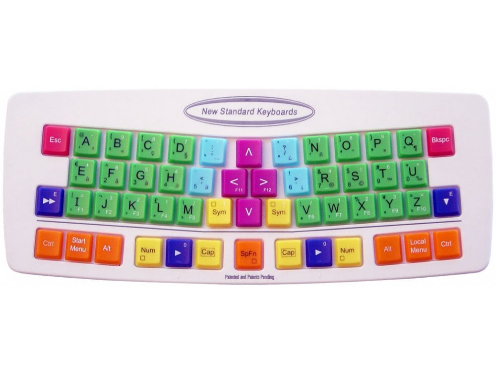
The longer I look at the NSK 535R, the more unsettling it gets. At first I thought “another alphabetical layout, gross” but then after reading a couple write ups about it I finally noticed that they somehow took things even farther. The first half of the alphabet is on the left side and the second half of the alphabet is on the right side, which puts 4 of the 5 vowels under the smallest fingers. Then… there are the sub-legends, and by golly are there sub-legends galore. Thats right, not one but two numpads! The left numpad is even mirrored! Num-row on the home row is what I’m using right now so I guess I can’t knock it, as well as 1u space. I kind of like the general shape and stagger, but there were certainly some interesting choices made when they designed this situation.
Imagine trying to game with this keyboard… WASD keys - yeah they’re there, but…
I see these kinds of designs all the time, and they just make me laugh. Why? It’s obvious there wasn’t any real thought put into them…
IMO - the way to design something like this would be to take a big dictionary of words (say 120,000 or more) and figure out the distribution of letters in those words. Then use that distribution to organize the layout so the letters are distributed across hands, and take into account commonly occurring combinations.
It seems that oddly the QWERTY layout has actually managed to do this pretty well - not perfectly, but better than you might have expected for when the layout was designed.
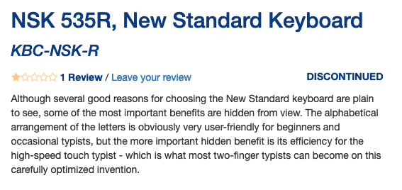
Its a “carefully optimized invention” for “two-finger typists”. : )
If anything the tactility level is a lot more confusing, force required is hardly a way to measure the tactile leve, you’d be surprised to learn that altough MX Brown are considered hardly tactile they take a lot more force to overcome the bump when compared against much punchier swithces.
Tactility has so many variables, stem shape, contact leaf, spring, and that’s how strong it is.
Stem shape and bump location, size, stem length, all those affect how the bump shape feel.
It’s really hard to accurately compare them, even a small change like the progressive vs regular spring on the Akko switches can change how the switch feels.
You could add review date and mention that molds can change, also in my experience switches quality usually get better rather than worse.
Hang on, I think the last part of that review has some typos:
“…but the more important hidden benefit is its efficiency for the two-finger typist - which is what most high-speed touch typists can become on this carefully optimized invention.”
Just seems more accurate…


