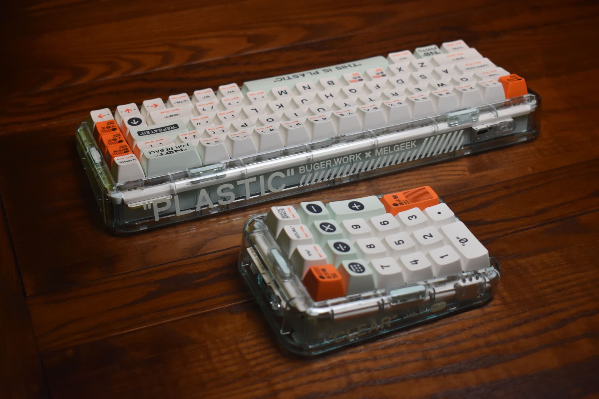
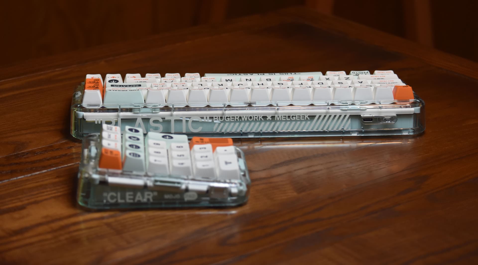
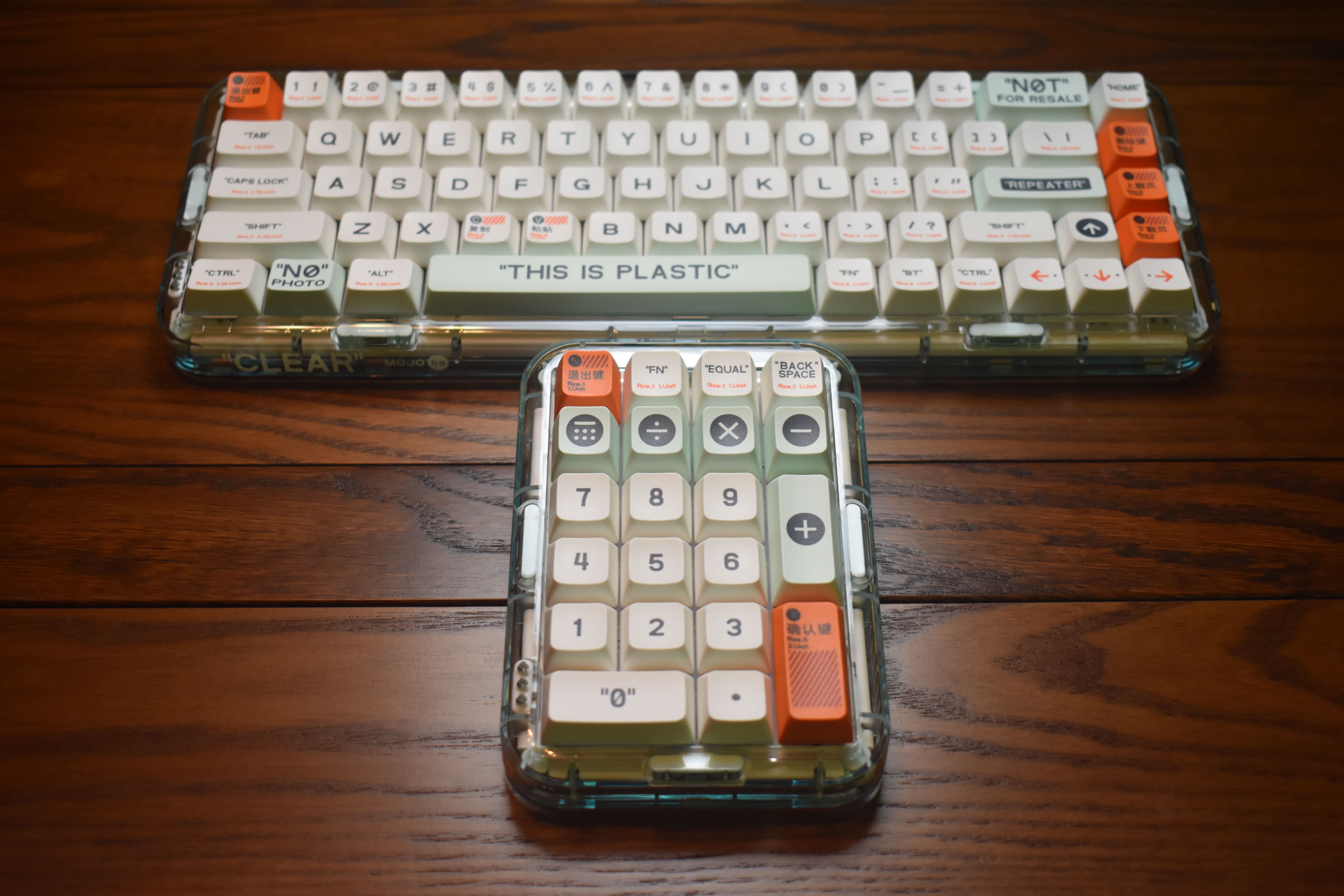
Oh, I like this. This being a Mojo68 & MojoPad “Plastic” edition. I feel like focusing on aesthetics this evening, so that’s what I’ll be doing here.
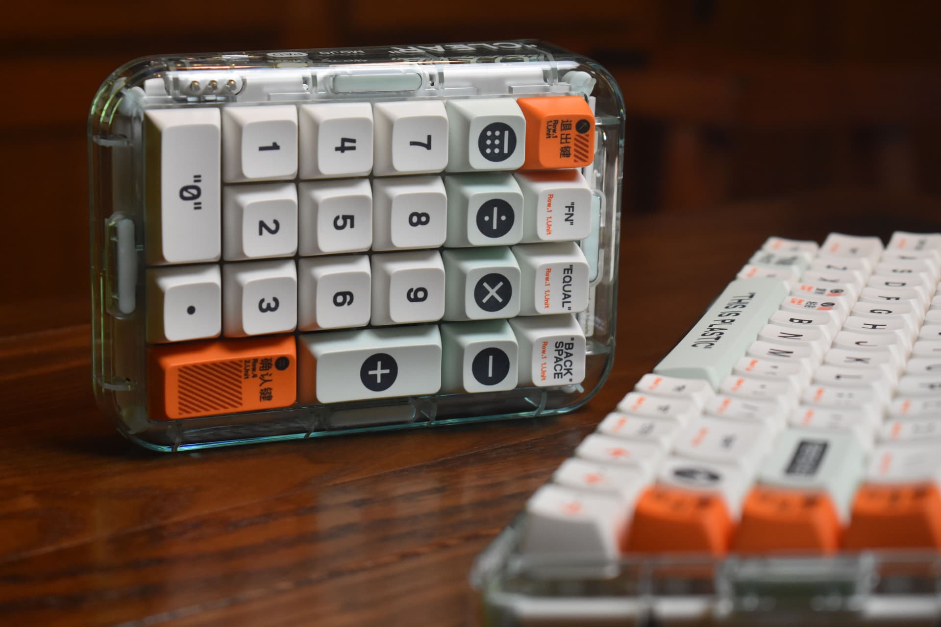
I’ve been meaning to get a nice bluetooth numpad for a while now - this’ll do nicely.
Seriously, this is a really good little input device. My smallest gasket-mounted dodad!
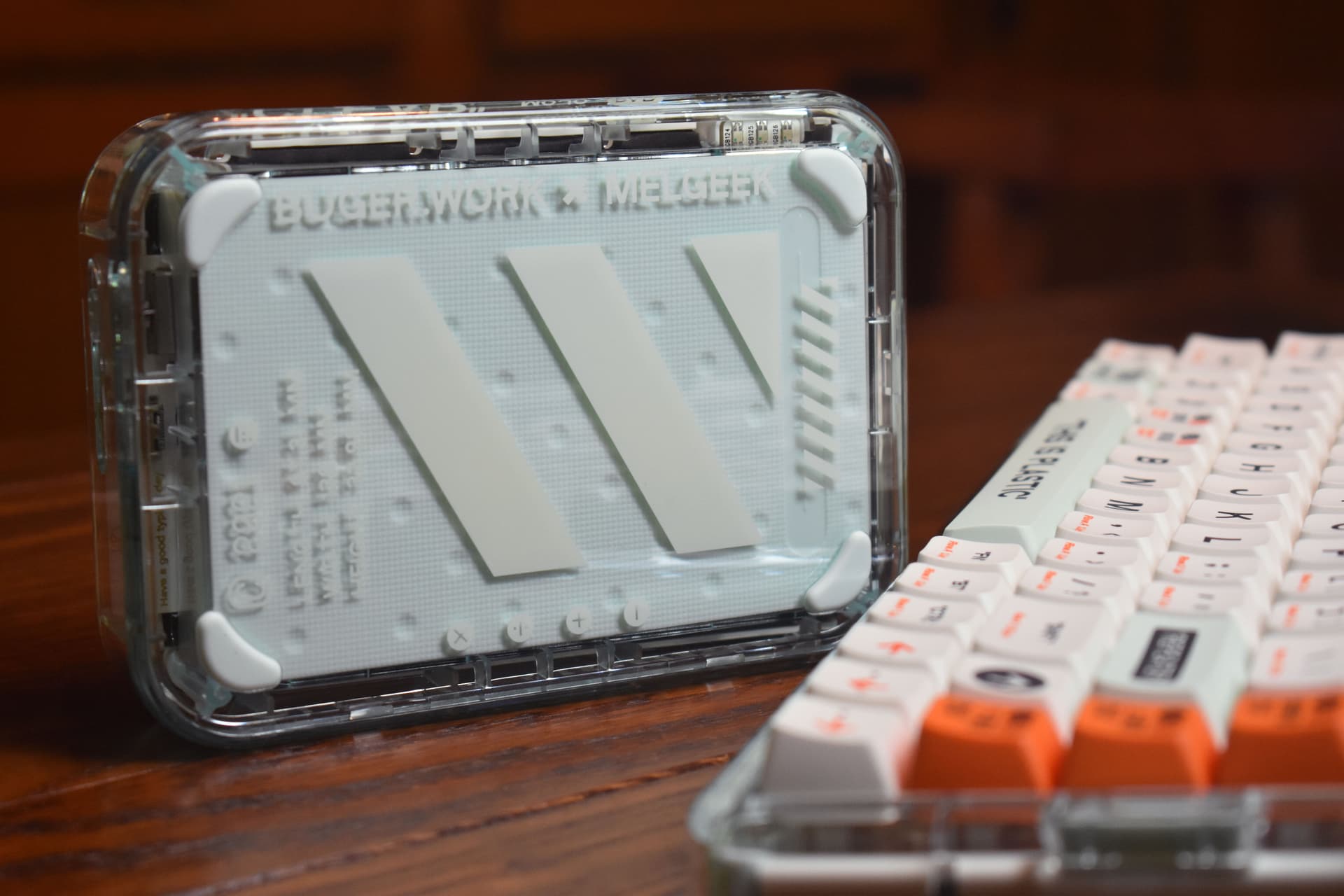
I’ll say it. That’s a nice bottom.
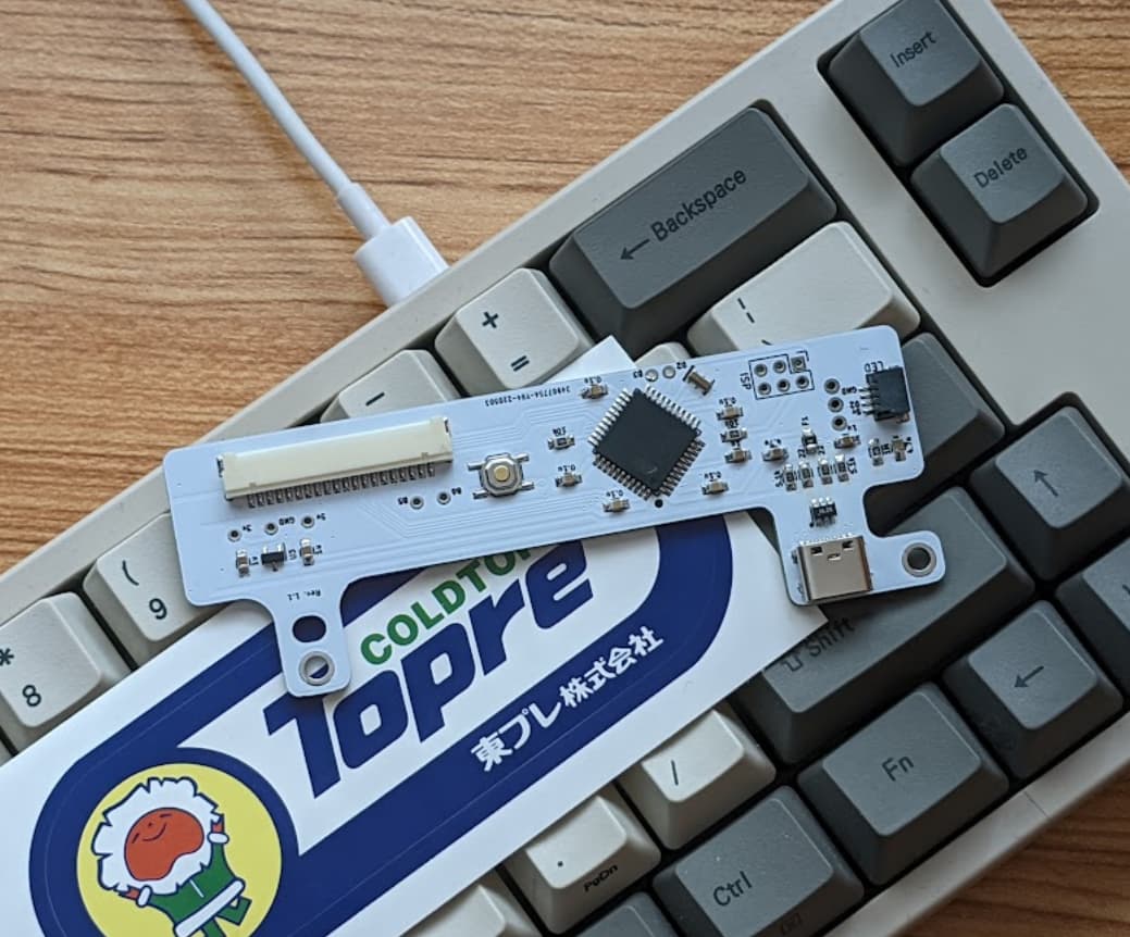
Both pieces have the “Need keyboard, not friends” and “ Have a nice typing day” PCB tabs peeking out in the back.
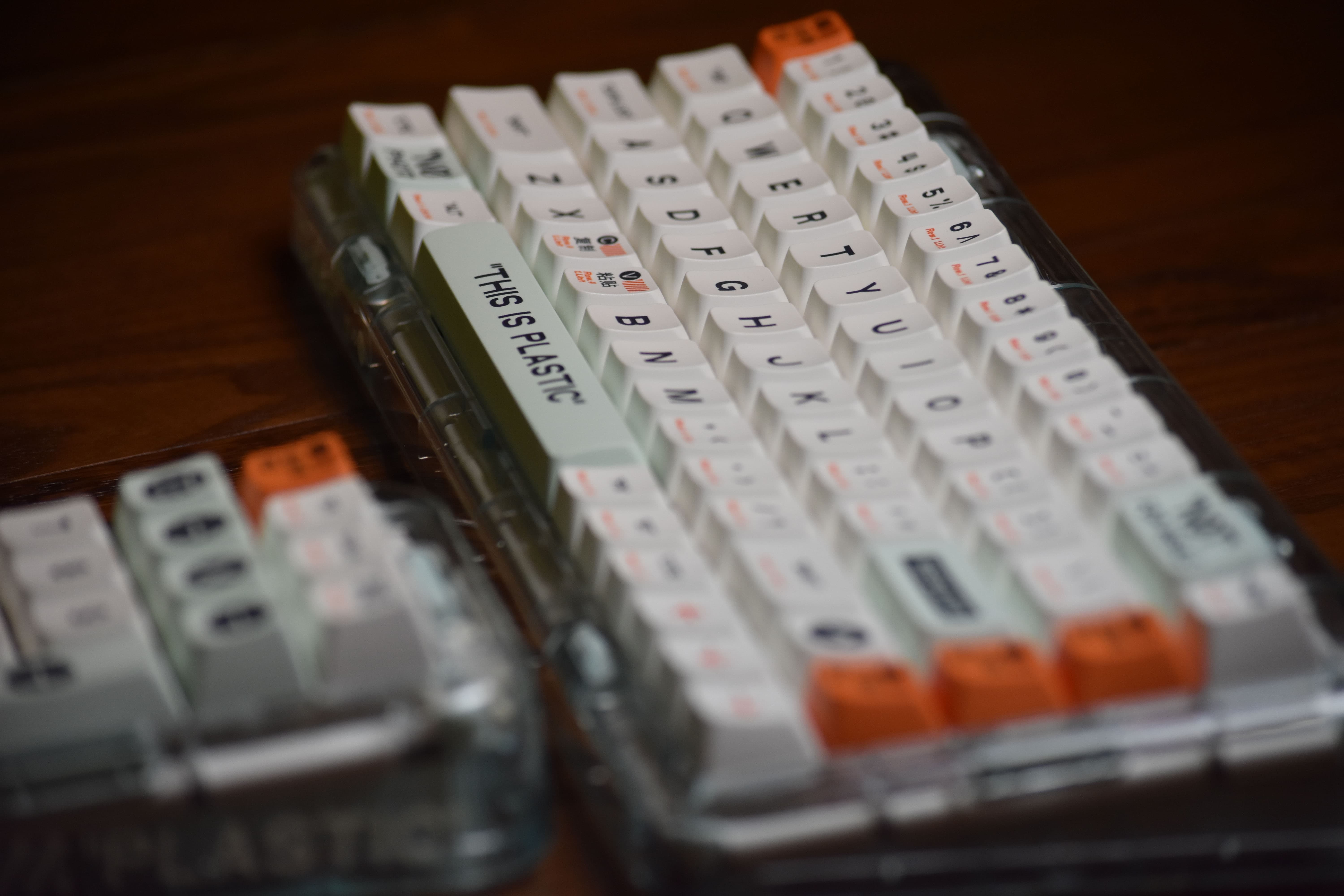
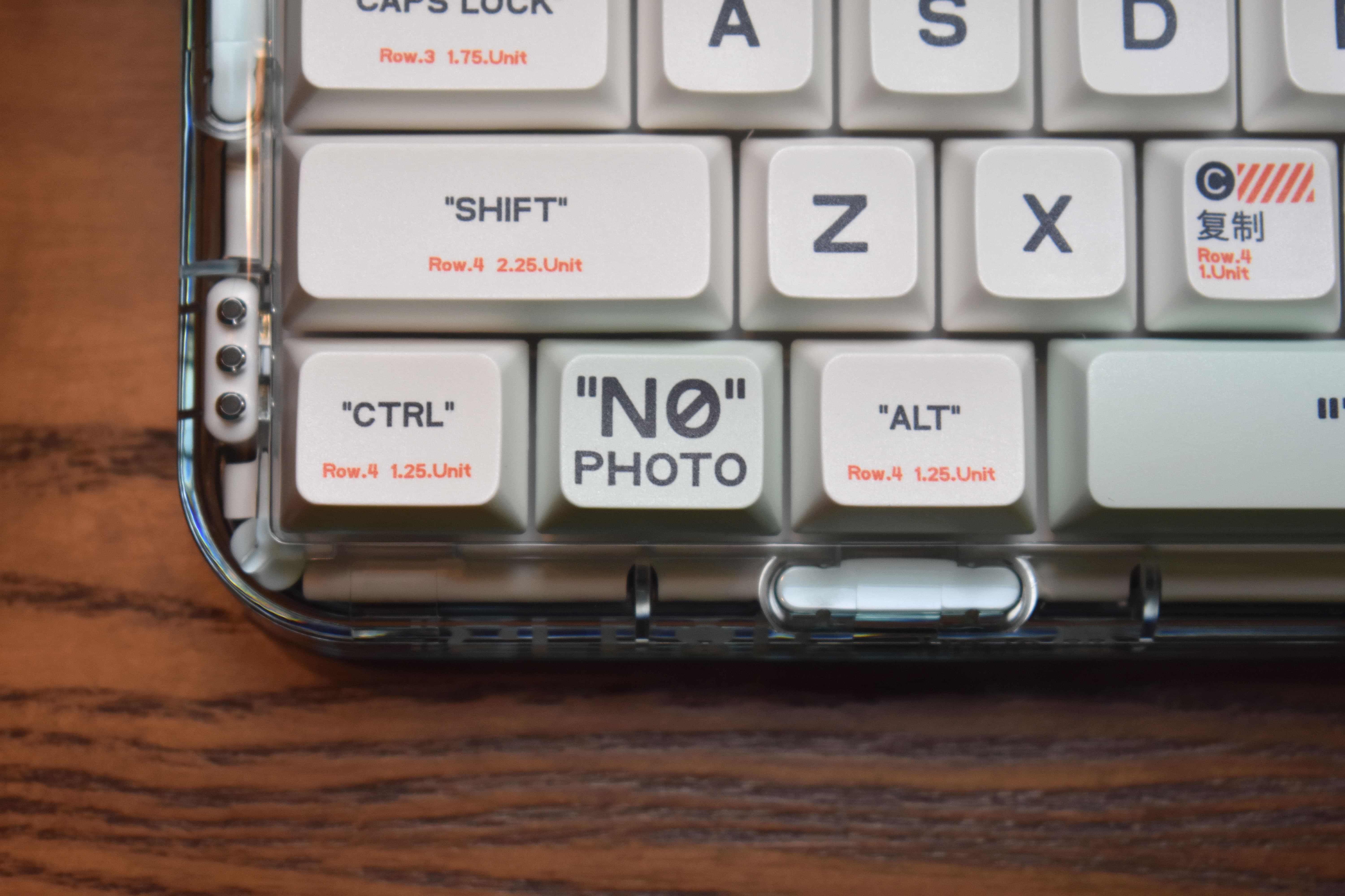
Is “kitschy” the right word for this? Well, whatever it is, I kinda love it. For me, the graphics and redundant labels are fun. I think I’ve said this before, but MelGeek’s design manages to walk this line between being well executed and not taking itself too seriously. If less but better embossed in aluminum is a bit stuffy, "Plastic" screen-printed on some plastic is… well. Every time I reach into my bag of words to try and describe MelGeek’s vibe, I pull out “cheeky” - and I do mean it in the best possible way.
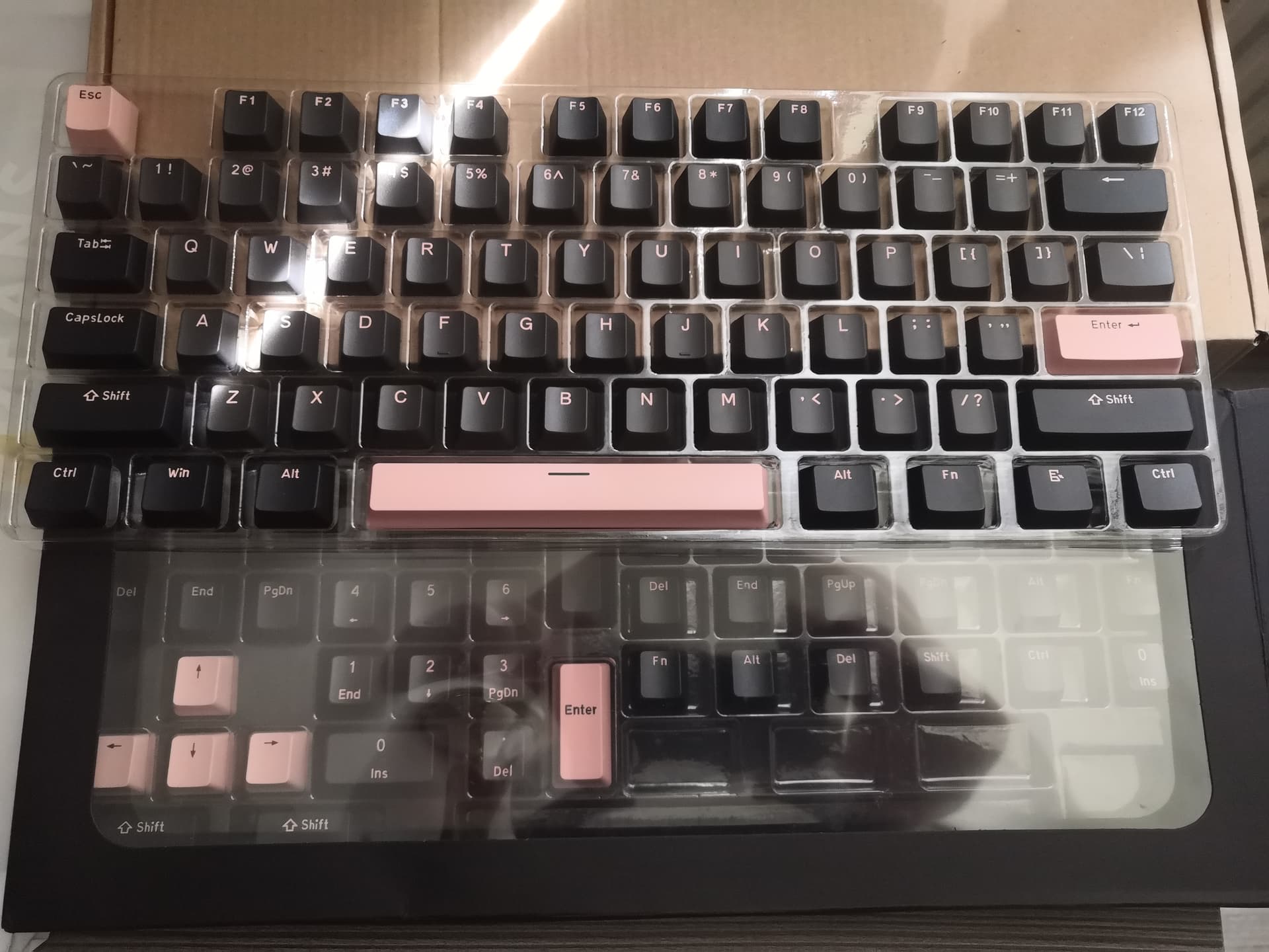
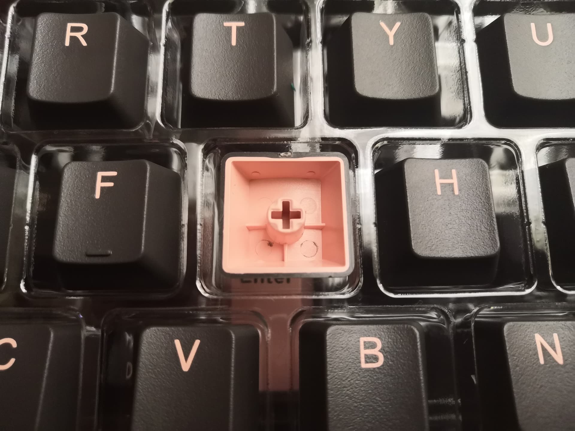
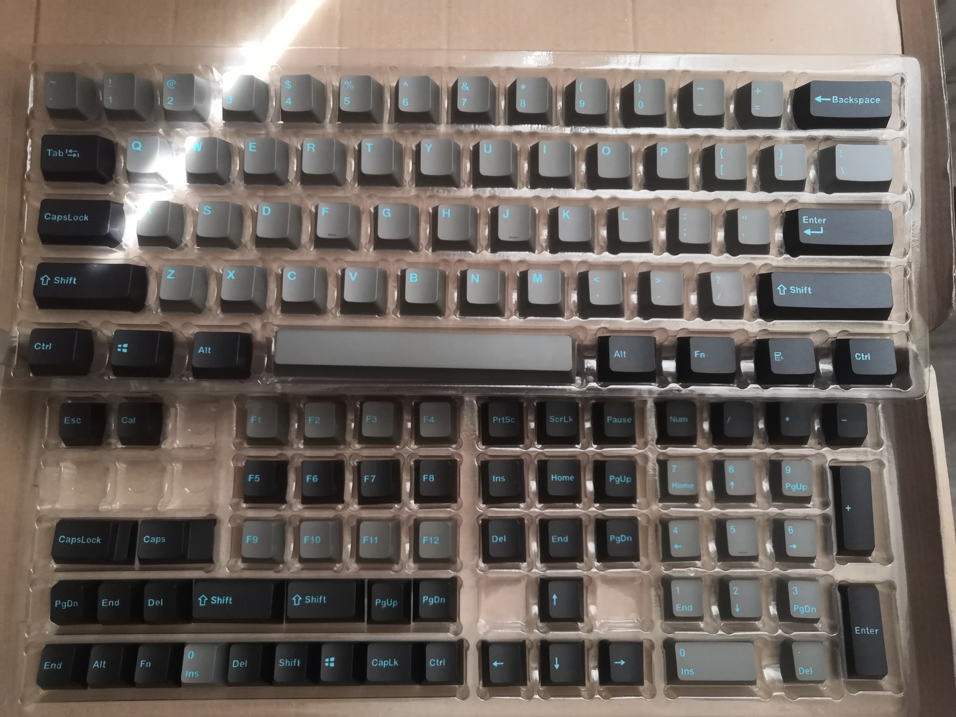
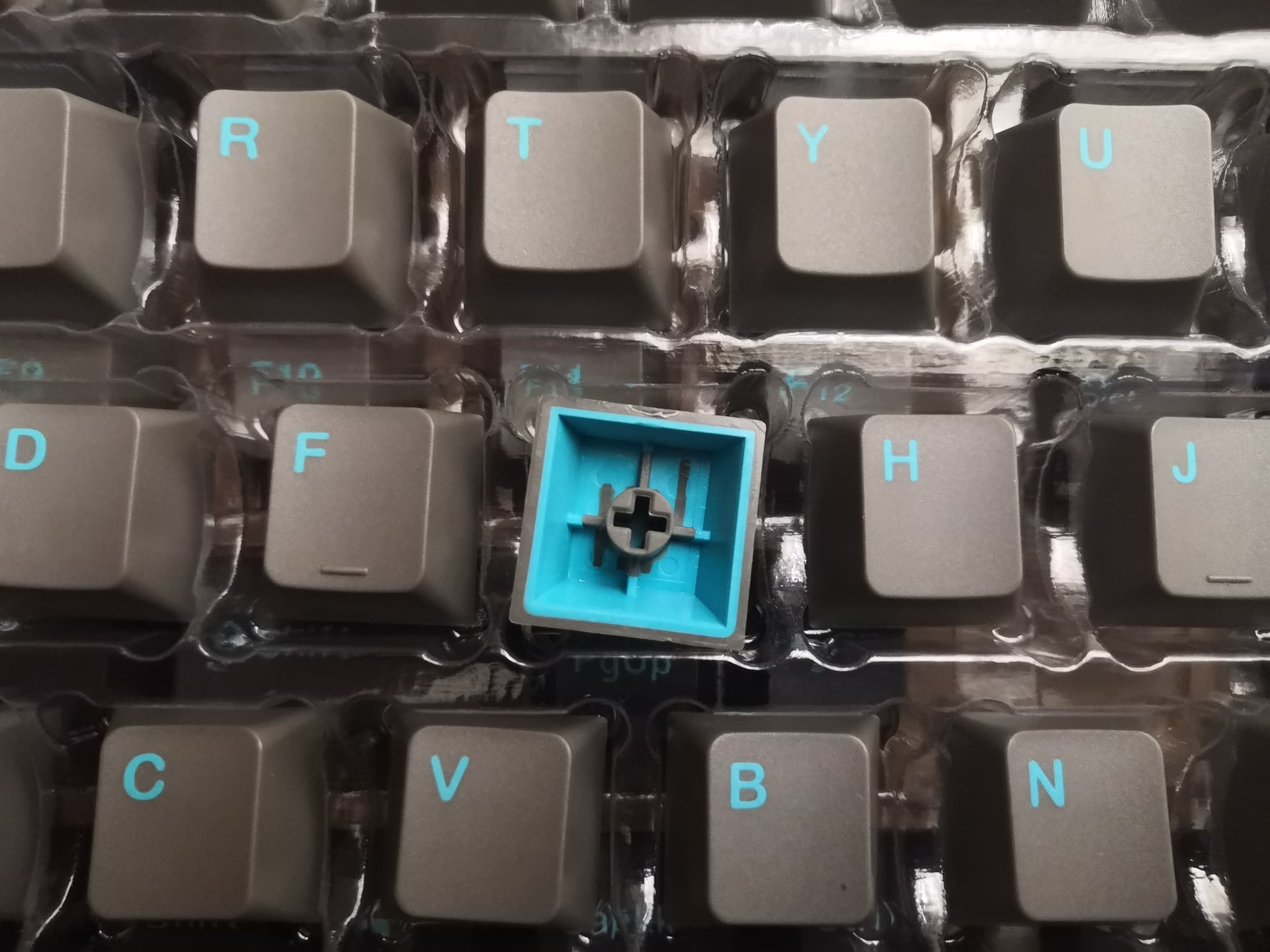
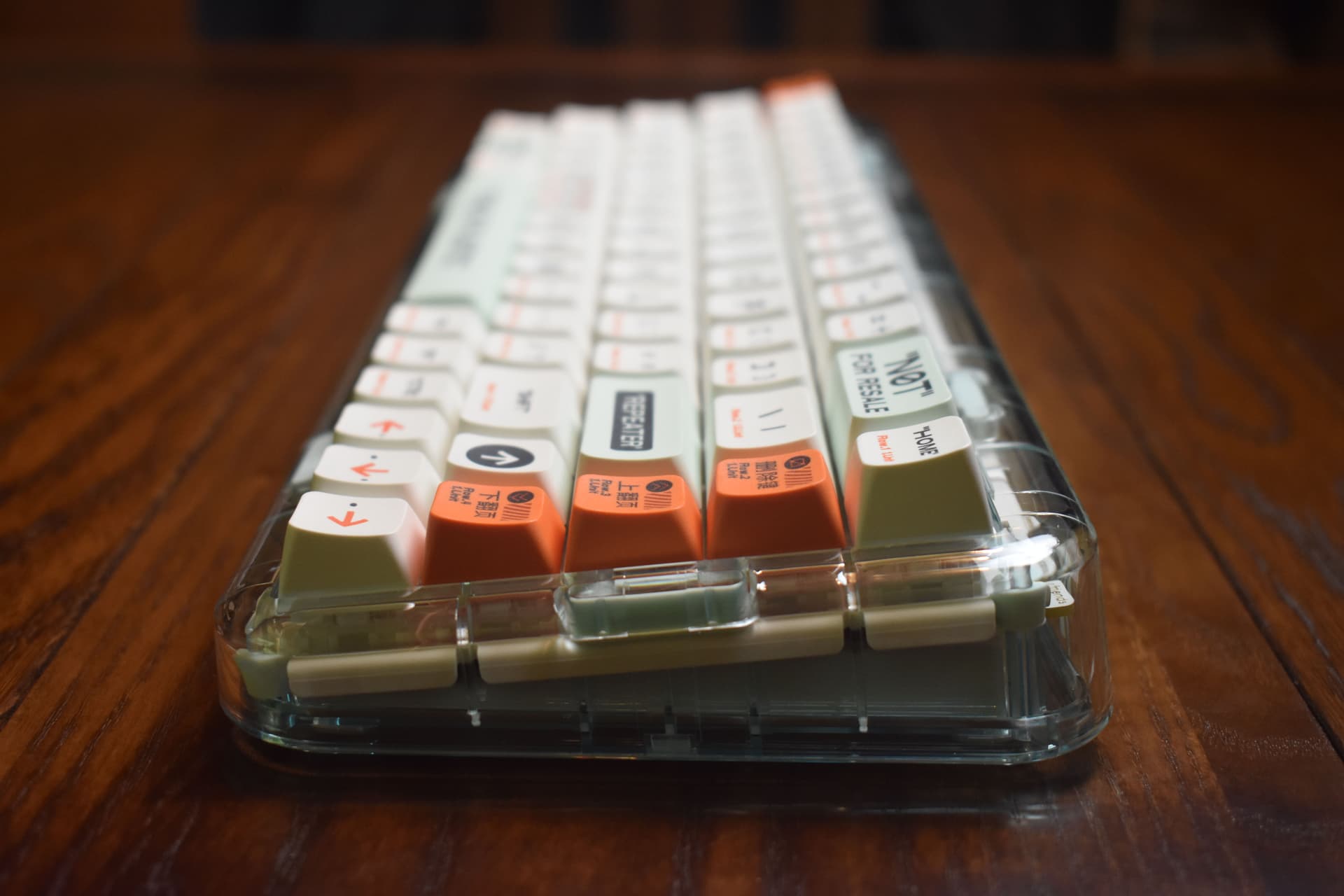
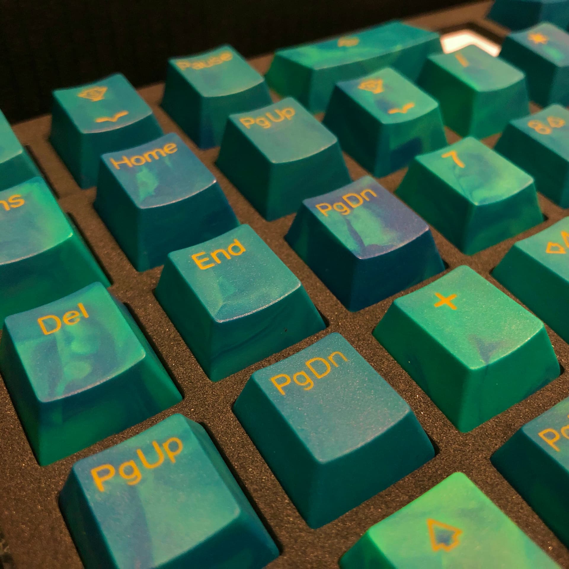
This version of the Mojo68 comes with MDA keycaps; think XDA and SA had a baby. Big, broad surfaces with very slight spherical sculpting. Unlike the other three MelGeek key profiles available with versions of the Mojo68, these are dye-sub PBT.
Speaking of which, the keycap legends are at least half the fun of this keyboard.
I think there was a time when I would have disliked this kind of aesthetic, but in the here and now, I’m quite fond of it.
The legends aren’t perfectly aligned, but nothing that stands out. What does stand out area all these fun little details.
Aaah, weelll… Don’t make a keeb this fun to look at if you don’t want me taking pictures of it.  But hey, at least the backspace key will have its way - no mechmarket for this keeb. This is mine forever.
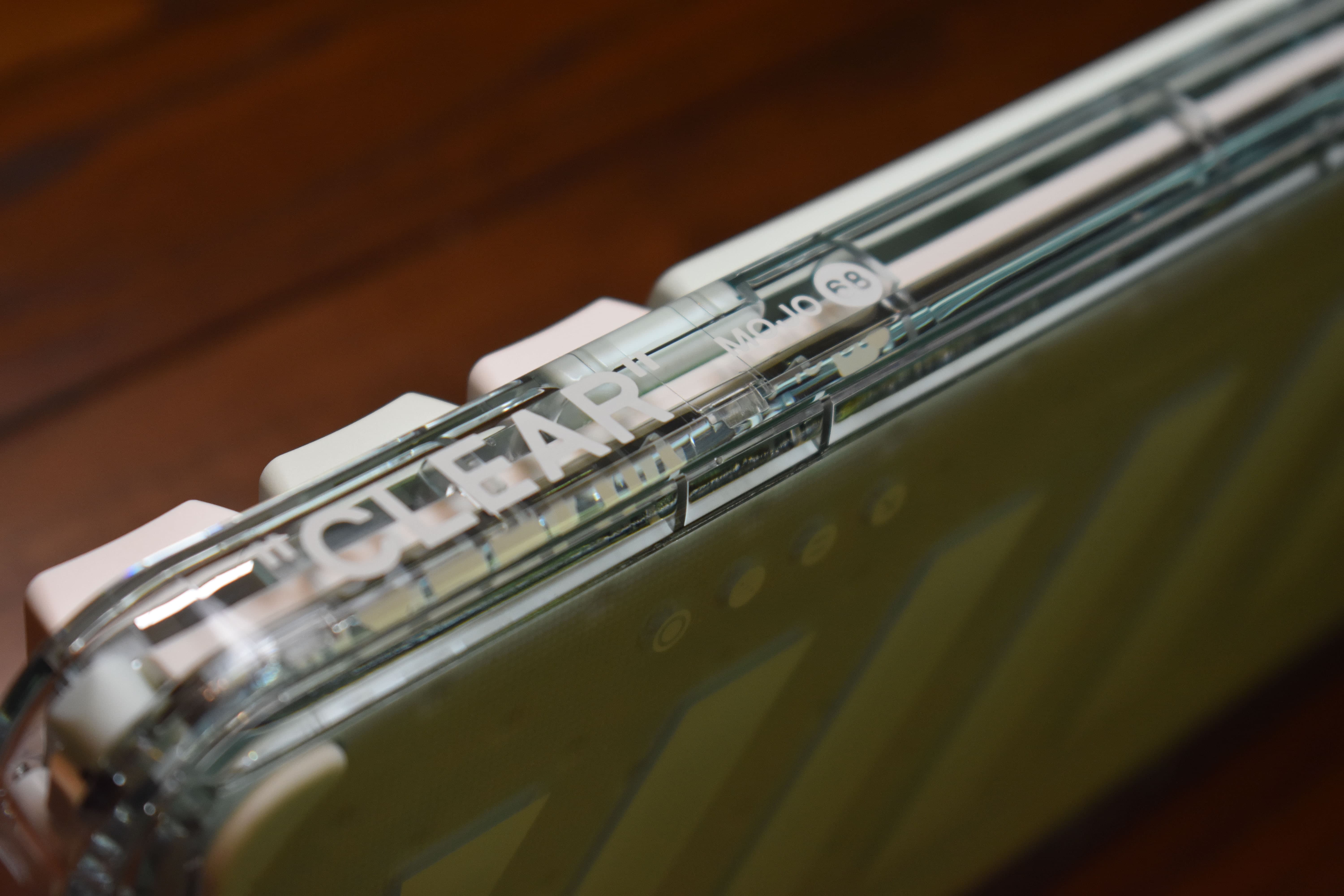
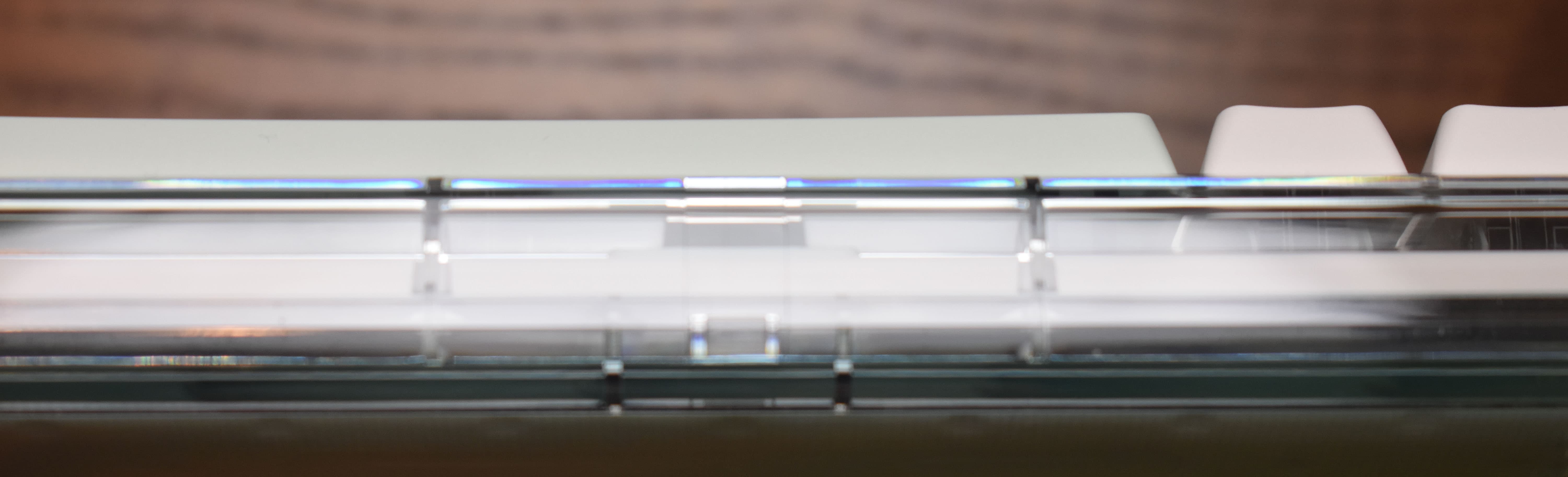
I love how you can see inside this keeb. I love a lot more that the inside is as thoughtfully designed as the outside. Every angle of this thing is designed to be looked at, and I think it shows. Just look at that little light-pipe cluster!
Keebs are a space that naturally draws-in deisgners, and I think that’s why the custom wing of the hobby has so many wonderfully designed keyboards - but I’m less accustomed to seeing this degree of aesthetic thoughtfulness in the middle-market.
There’s plenty of A E S T H E T I C in that space, too - but there’s nearly always some kind of compromise or purely functional form without refinement. See: inside an NK65EE, KBD67’s seams, Portico’s foam pads, etc. Not that those are bad, but that they do stand in contrast to how above and beyond MelGeek went designing this nearly all-plastic keeb.
By the way - that visible white plate that looks a bit like tool-bent sheet metal is actually molded plastic, and I think the sound and feel of the keeb both benefit from that.
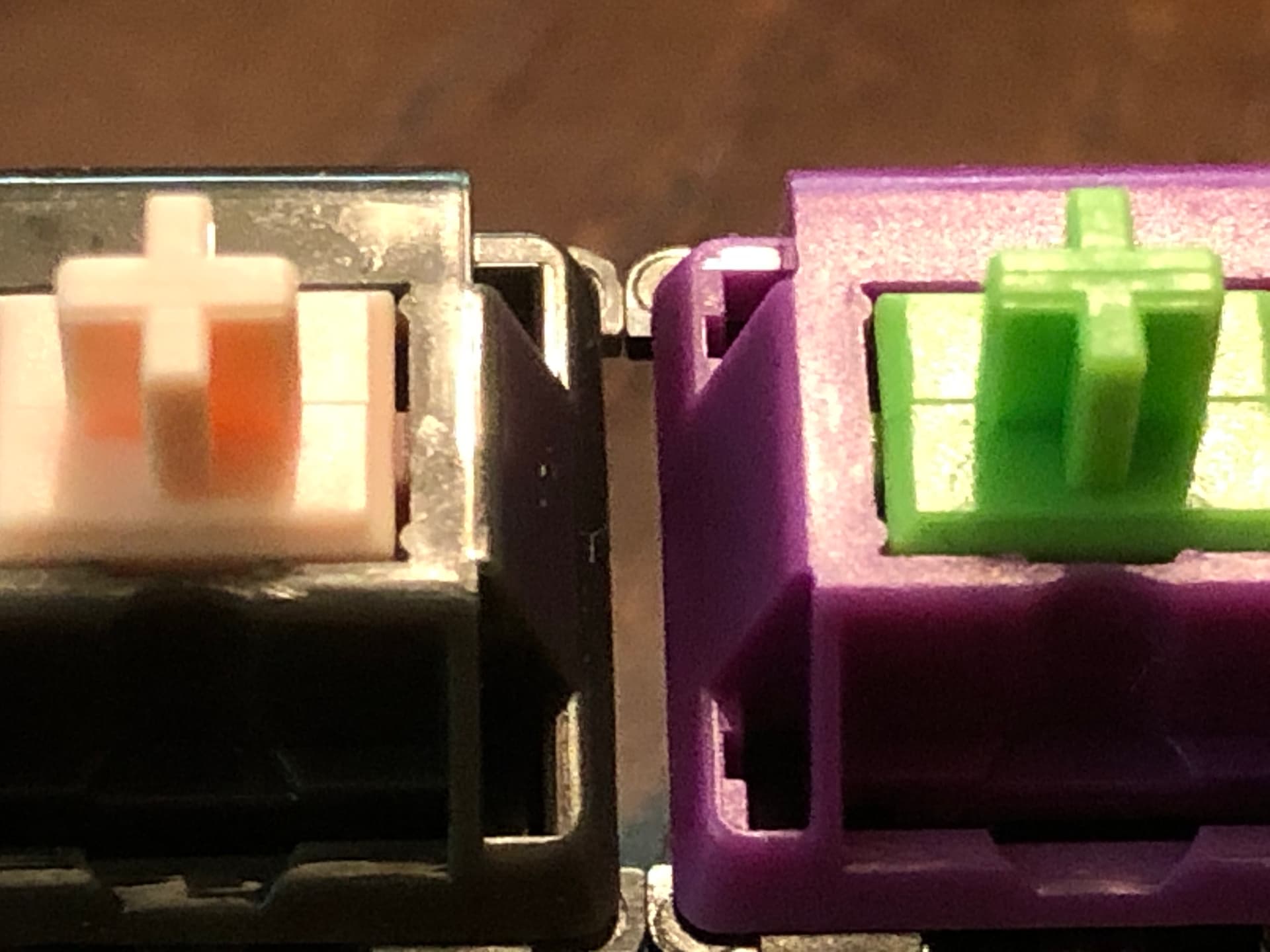
This glassy, crystal-clear form of polycarb shows up plenty in switches, but less often in keyboard cases. There are good reasons for that, but I still think it’s the right choice for this design. there’s tiny little rainbows in there deude
Were I the sort, this bit of object could easily convince me I’m a more sophisticated person for having it visibly perched on my desk… but then I’d also probably miss all of MelGeek’s cheeky visual jokes, totally not worth it.
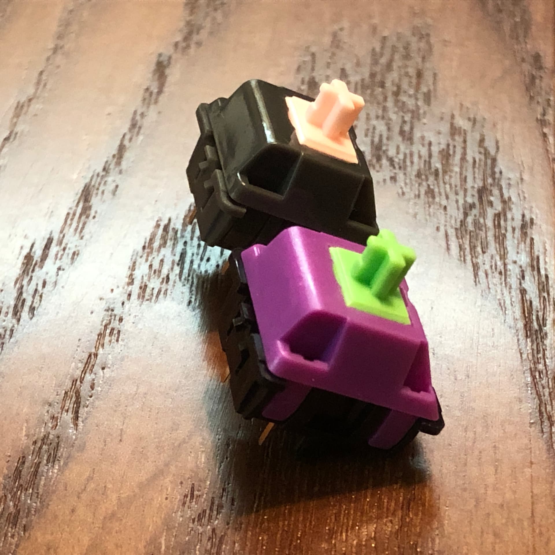
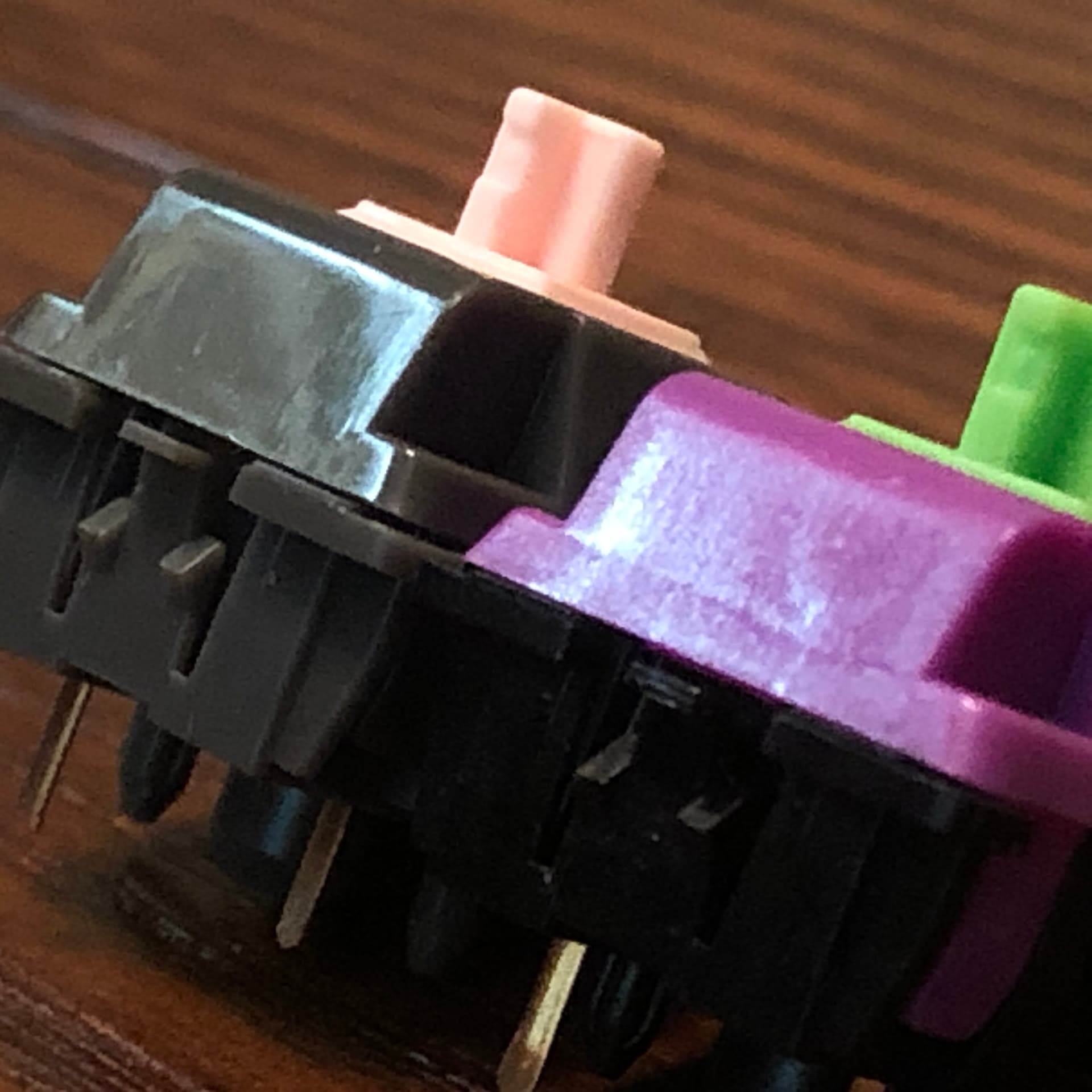
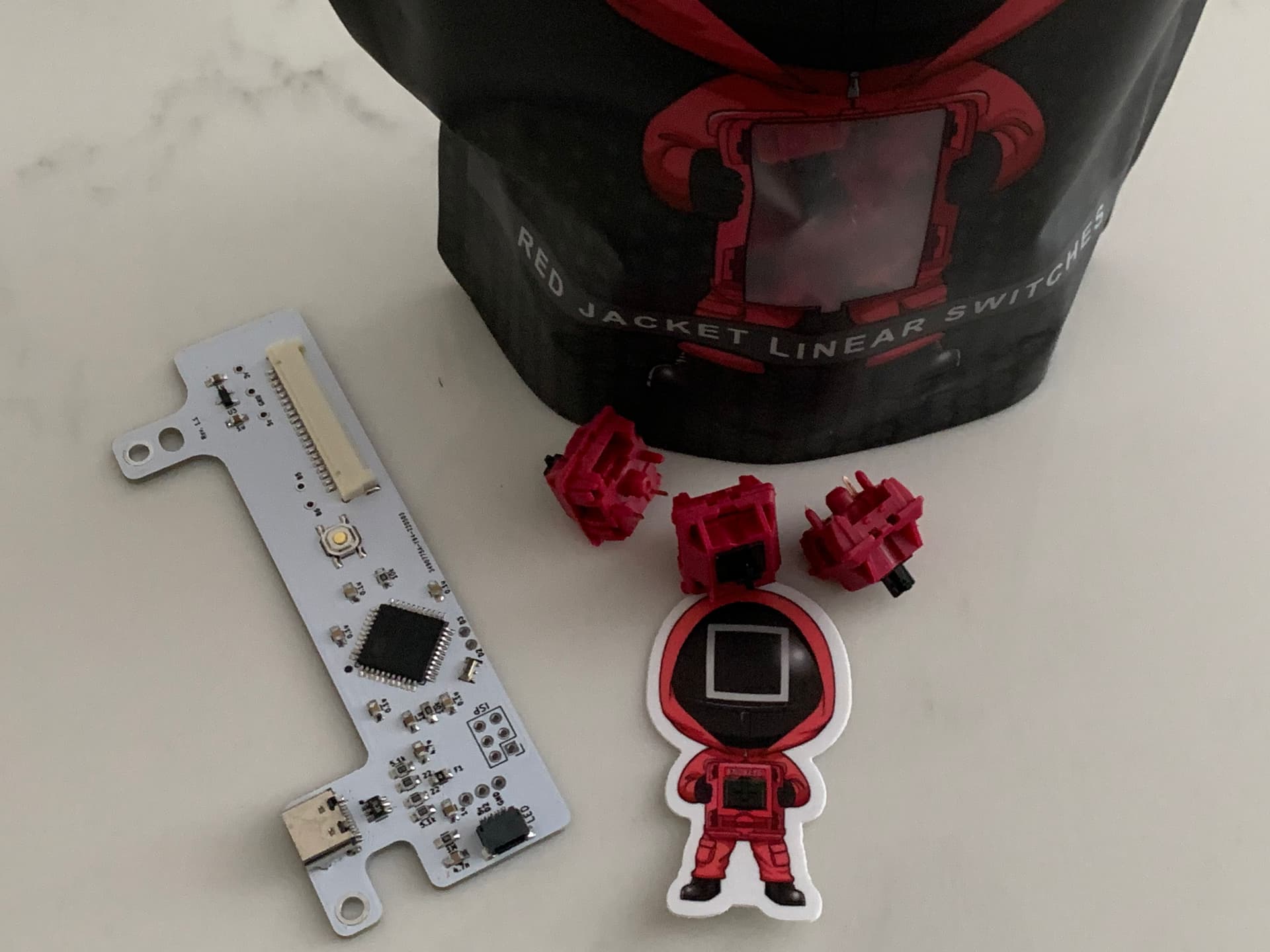
Oh yeah! This one has Gateron Pro Browns.
That’s right - I chose BrOwNs on purpose, and I don’t regret it. In seriousness, though, these are surprisingly nice for a stock light tactile. Like the Pro Yellows, these are factory lubed in buttery fashion. Very smooth, but just a touch rattly.
I get why Browns don’t get a lot of love in the hobby - even without Thomas’s entertainingly hyperbolic rants about them, the average stock brown is indefinite and scratchy. But a lubed brown - that really is something different, and I’m a fan of it. These Pros get maybe 3/4 of the way there, which is great for a factory stock switch.
Total impulse buy, totally worth it.
This plastic pair does well something I love about keebs in general: being fun to look at while also being functional.