So pretty - I admire your pink blanks! Together with the white keycaps, they look like marshmallows.
(edit: just to be clear, I love marshmallows and I meant that as a compliment!)
So pretty - I admire your pink blanks! Together with the white keycaps, they look like marshmallows.
(edit: just to be clear, I love marshmallows and I meant that as a compliment!)
thanks! now imagine this in the Evija PC Pink hahaha
oh man!  Are you getting a pink PC Evija? Sounds like eye candy (candy hehe)
yes, I joined the GB
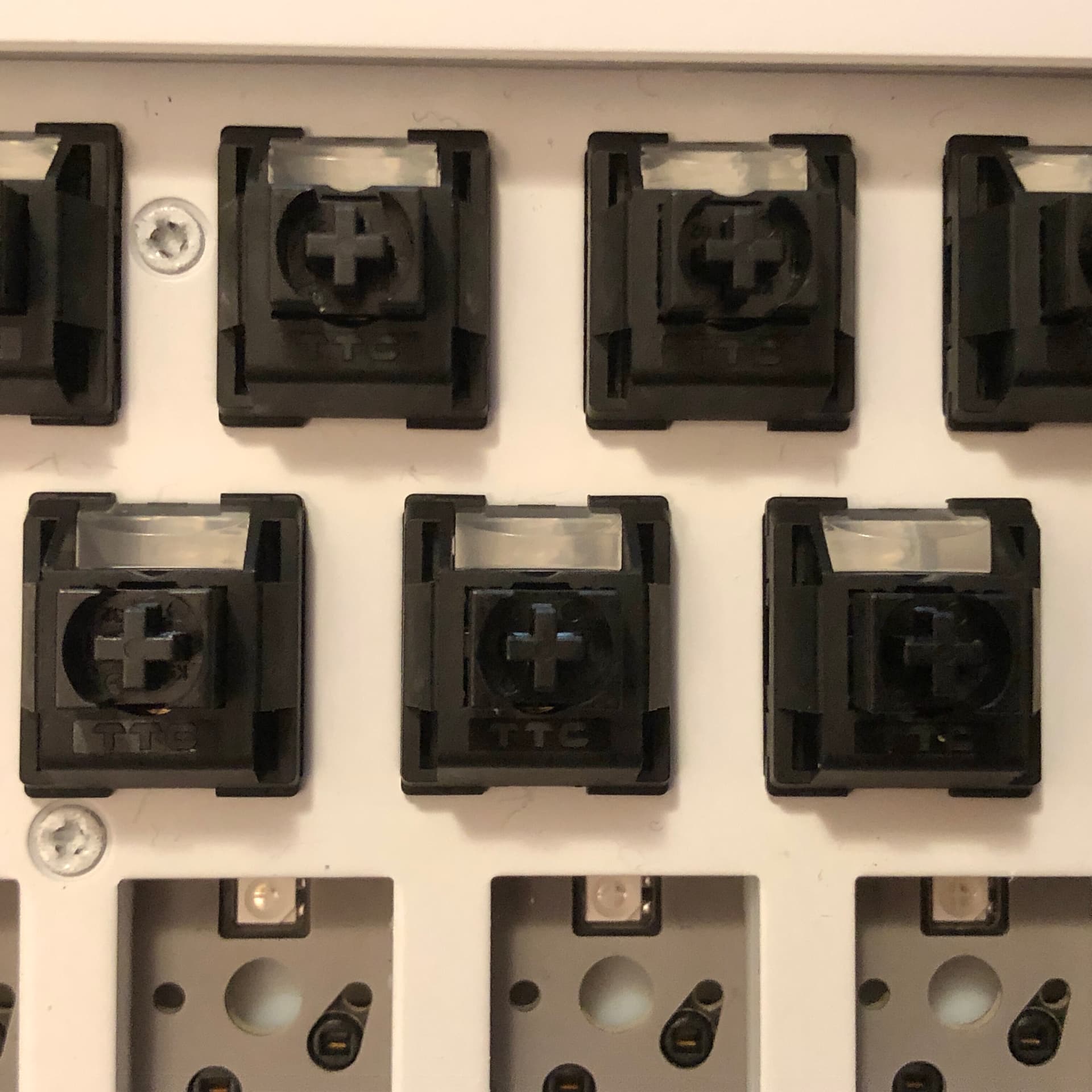
TTC Old School linear switches in a NuPhy Halo65.
The switches are nylon-housing, pom-stem linears intended as modern tributes to the Cherry MX Black. I’m giving them a first try here; so far they seem pretty typical of TTC linears that look like these do - which is to say very solid if not exceptional.
The keyboard a pre-built hot-swap 65% with classic tray-mount construction, an aluminum plate with standoffs, and silicone dampening everywhere. The stabs are stock - they perform admirably but unsurprisingly could still use some attention.
Here’s what that setup sounds like:
Nice! Looking forward to seeing your build. Out of curiosity, how would you describe the feel of those keycaps compared to stock HHKB?
definitely sound like a TTC linear. I guess the tribute to Cherry blacks is in color mostly 
the two sets have different profiles, it’s like comparing SA to Cherry on the MX side. Personally I love tall keycaps so this is it for me
I like the way sphreical tops hugs my fingertips (especially the deep-dish homing keys) more than cyclindrical ones. Texture-wise it’s not as smooth as my HHKB stock caps (I only have old Pro 2 that are well-used and quite shiny), wobble is a lot more obviously.
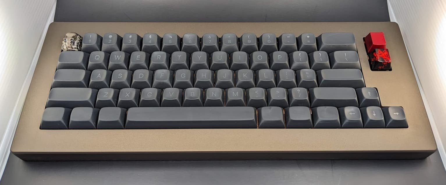
Giving those Diced Fruit Kiwis a try. Snappy!
You know, switch variety is at such a point that even I think most frankenswitches are redundant now. A couple years ago you could get a switch like this, but as far as I’m aware, only by mixing parts from different manufacturers. Now you can just buy them, and at a pretty reasonable price, too.
These are some crispy little switches - at any normal typing speed, I don’t think it’s possible to avoid bottoming-out - and that’s kind of what makes the character here. Lots of snappy little clacks. High-pitched without being too harsh.
They manage to feel very tactile without actually being heavy. They are very short-travel for an otherwise full-height switch, with a total movement distance of only 3.3mm. I’m starting to get used to it, but coming straight from 4mm was a little disorienting.
Well, technically it’s in my tiny little photobox, but my 660c was recently upgraded by @Andreas in the most amazing way. Topre specific, awesome profile, and fantastic color. I’m a lousy photographer though.
This was a gift so unfortunately for now you’re going to have to wait to get your hands on your own set.
Did I mention centered legends? 
Great keyboard and keycap set there!
Just personal take but for whatever reason I can’t stand centered legends anymore. Maybe OEM hipro got to me so now I either use that, resin hipro blanks or KAT refined hahaha
I think for me I just love the classic look so much that centered is just “the way”. In my highly opinionated opinion of course.
What a gift! That’s awesome.
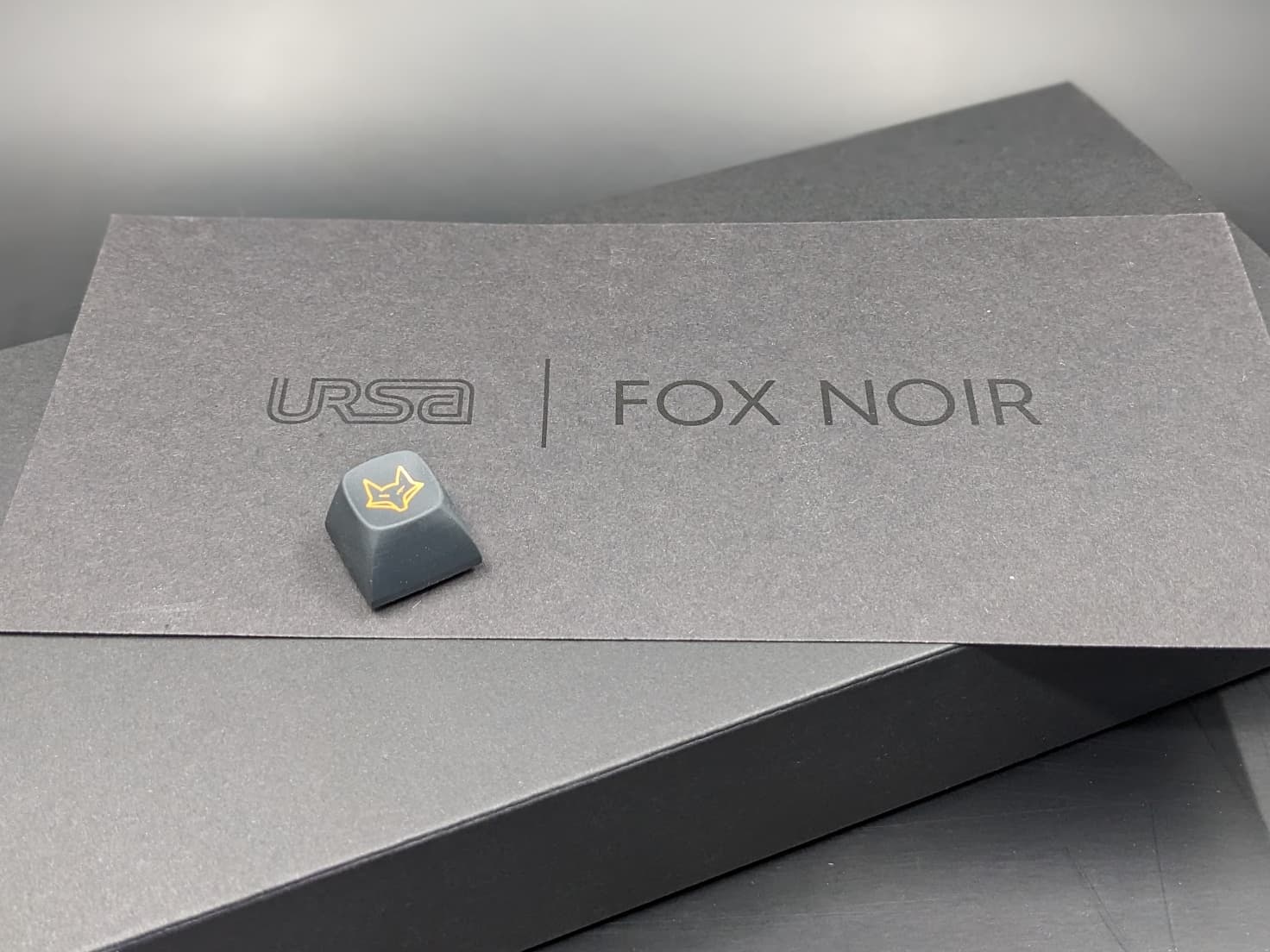
OEM HiPro showed me the way to accept off centered legends on sphericals. It’s why I made URSA Sachiko and I love changing this up once in a while.
No worries, different strokes for different folks!
This is amazing!
Great work @Andreas !
Thank you. I hope @Extra_Fox spreads the word on the feel 
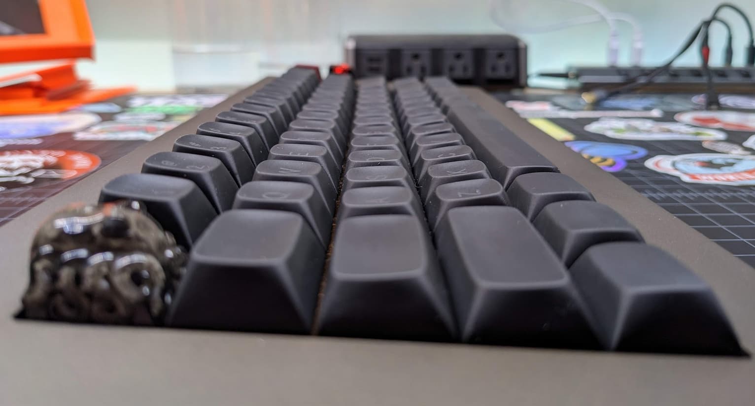
TL;DR - URSA Minor is a low profile, spherical key cap that feels fantastic both in terms of fingertip feel and texture.
As far as the material goes I’d describe the satin finish as being ideal and the resin itself is almost soft to the touch. Going forward, if these were to be injection molded that satin finish would be really nice, but the plastic used would need to be really thick. Because you get such a solid feeling with them as they are at present.
As far as finger-tip feel goes, I did a quick comparison of these with SA and MT3. I think they’re closest to MT3 in terms of feel, but MT3 still feels flatter. The cupping and roundness of the ridges on these caps feels more comfortable and enjoyable.
The decision to use a full convex lower row is also great. When I engage those keys I’m typically using the side of my thumb. So having a concave key doesn’t “feel” as good as the convex. Now aesthetically one may still prefer their keys to have the same face profile, but I also think it looks very nice.
Although I’ve never tried the Topre Hi-Profile caps, I’d say after using these now for several hours, I have been cured of any urge to splash out for a set of those.
Visually, besides what you can see I think the biggest thing I can say I wasn’t expecting to enjoy was the lower profile nature of these. I’m really used to SA and MT3 and like the big chunky caps. But this lower profile fits better with the more modern case styles and I’m sure they’d be just at some as your more classic cases as well.
They’re just wonderful to type on. I mean, I’m probably being more verbose here than usual just as an excuse to be able to keep typing. 
I’m actually going to post this as it’s own topic now. Stay tuned.
Your verbosity here is much appreciated. The profile looks so comfortable in a way MT3 never did.