It probably would help if I had a gator-skin guitar amp, a classic Fender, and a few decades of cigarette smoke staining the wood-paneled walls of my makeshift recording studio - but there is something about SP SA in particular that I find underwhelming in person compared to the renders, and I think it might be the look of the surface.
It’s kind of hard to explain, but it has a kind of “cheap” look, for lack of better words. (Again this is just the surface; the caps themselves are thick and heavy.I) There’s just a little bit of sub-surface light-scattering combined with a semi-gloss finish; not like the completely opaque high-gloss surface shown in the renders. (There’s also the fact that SP SA mods have a completely different surface look to the alphas; closer to matte than semi-gloss.)
Phrased another way, in the renders SA looks like it’s made out of the same stuff as billiard balls, but in person it reminds me more of flea-market toys. That’s hyperbole, but I think it paints the picture.
So the MT3 sounds pretty good on my Hidari with U4Ts and the PC plate. It is a bit quiet for my liking, the clack of GMK Noire was more pleasing to my ears. I will give it a try with the POM plate and see if that is better. However, the feel of MT3 is so nice, and the sound on this board is OK, so maybe my Susuwatari will stick around a bit longer.
Thanks for your post, it made me give MT3 another try.
What about cancelling whole profiles? DSA, XDA (plus all it’s offbrand variants), SA R3 sets, & G20 would be sets I’ve gotten, hated, & immediately gave away. I need some sculpt with my caps, even if it’s just Cherry sculpt. Uniform profiles just feel wrong to me when I try to use them.
Sculpt really depends on the height and angle of the board for me. I actually like DSA better than any other profile, but it usually sounds terrible. Also, there really are so few options for nice colorways in DSA
I can’t stand typing on XDA but for some reason I don’t mind G20.
I have a pale yellow / dark brown set (penumbra solarized maybe?) which definitely has the billiard ball look in real life. And a Filco dark brown set is also nice. They have more rounded edges than e.g. maxkey which helps the whole billiard ball impression.
But I also have a nuclear data set which manages to look very meh. Nothing like the beautiful glossy look of photos.
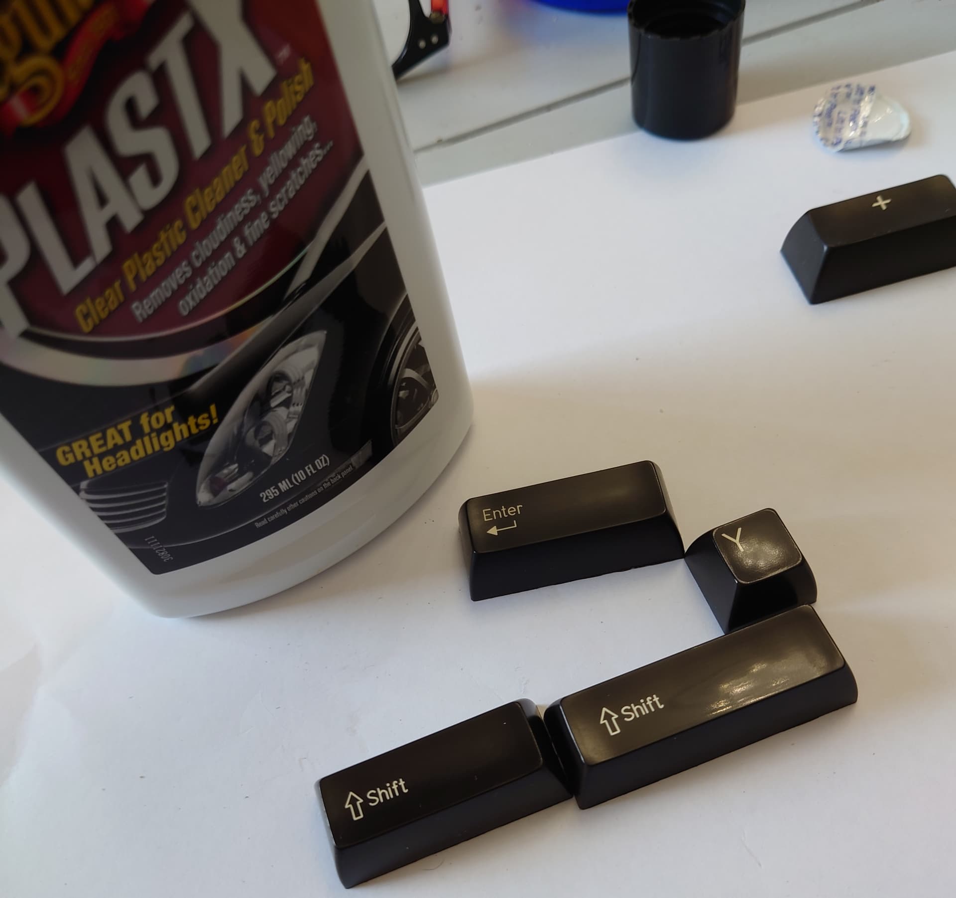
Definitely the filco & nuclear data have 1 key (right shift maybe? I’d have to get a set out and check) which is annoyingly semi-gloss. Every time I use these sets I find myself searching google for how to polish a keycap.
I totally forgot about that set being Signature Plastics, and I totally agree - it has that rich look to it that I was hoping 1965 and Chocolatier would have, and it was an in-stock item that cost like half as much! They do still have the hazy shift keys though.
So, in reading this thread we’re saying which sets would you “cancel”, mine would be the first group buy I joined: GMK Plum. Just not at all what the renders looked like. It left a bad taste in my mouth but I’m glad I stuck with the hobby cause I think all of the rest of the sets I joined matched expectations.
I own three sets of Hipro caps now. I have to say that this was the first sculpt that I tried where I actually felt like the sculpt got in the way of typing. I simply cannot type as fast or accurate on Hipro.
What I’m seeing in this thread is that it’s good we have so many options. There truly is no universal fit when it comes to keycaps.
Filco Double Shot keycaps.
They’re very dark brown, and semi-sculpted (223333).
If you can live without any extra keys then they’re a very cheap way of getting SP SA keycaps.
I can’t see anywhere still selling the ANSI set, but keyboardco has UK/DE/SE ISO, e.g.:-
 Also, there really are so few options for nice colorways in DSA