Why I dislike MT3 keycaps

Personally, I like typing on a cylindrical profile with tall, sculptured keycaps and nice legends. It is my assertion that engineers who designed the IBM Selectric I typewriter back in the early 60’s, did not went about it lightly when designing their keycaps.

So far, I have tried Signature Plastics SA, Domikey SA, Maxkey SA and AFSA. A recent review about AFSA, comparing this profile to MT3 spiked my interest in the latter.

For my most recent build, I (finally) managed to acquire a set of Drop MT3 White on Black, made from ABS. Having read and viewed multiple reviews about MT3, I was convinced I was really going to like this MT3 keycap profile. Unfortunately, this did not happen and I had to replace the MT3 keycaps quickly with ABS Domikey SA WoB, which I luckily had on hand.

Here are the points I disliked about MT3:

  • The surface area for the finger tips is smaller than with both SA and AFSA.
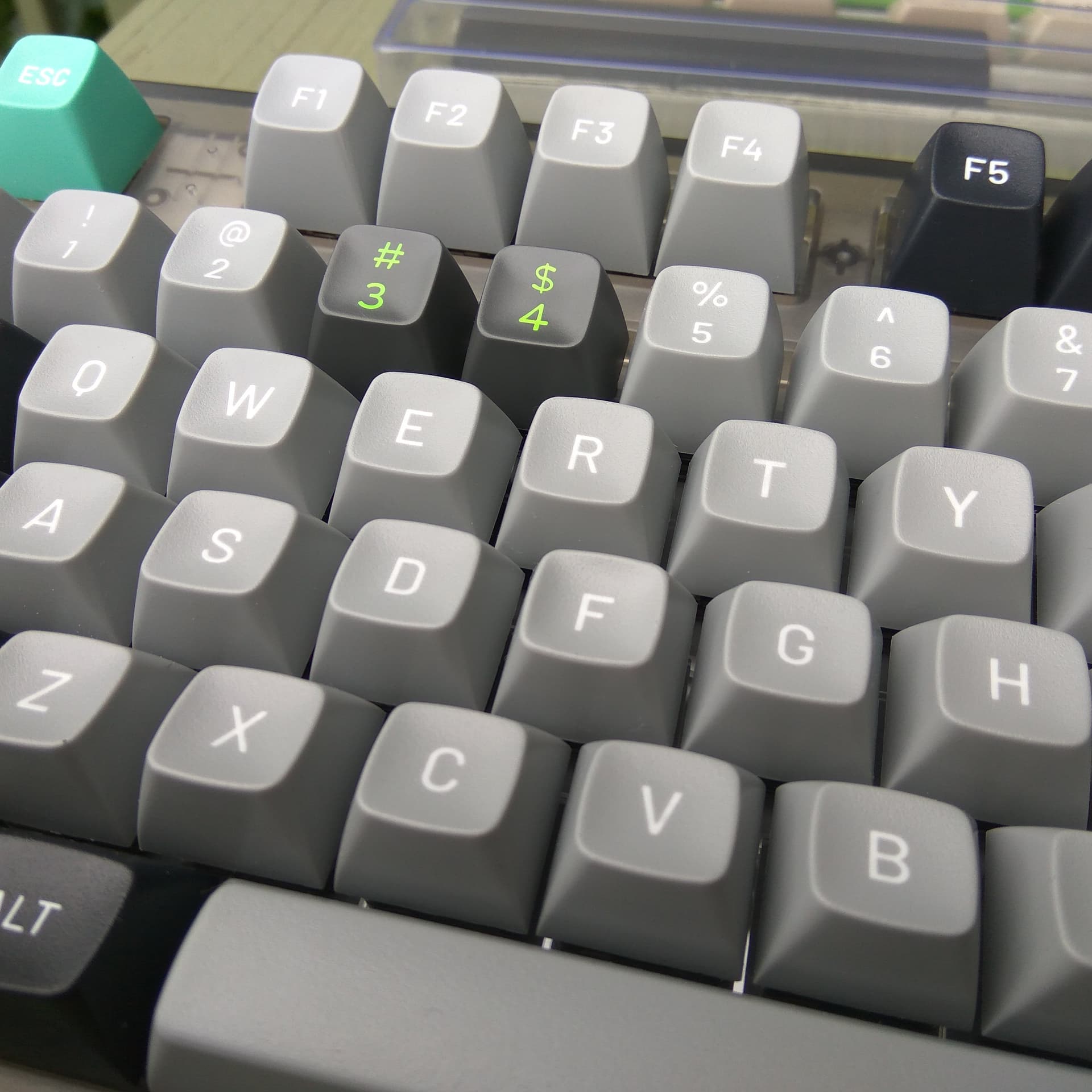
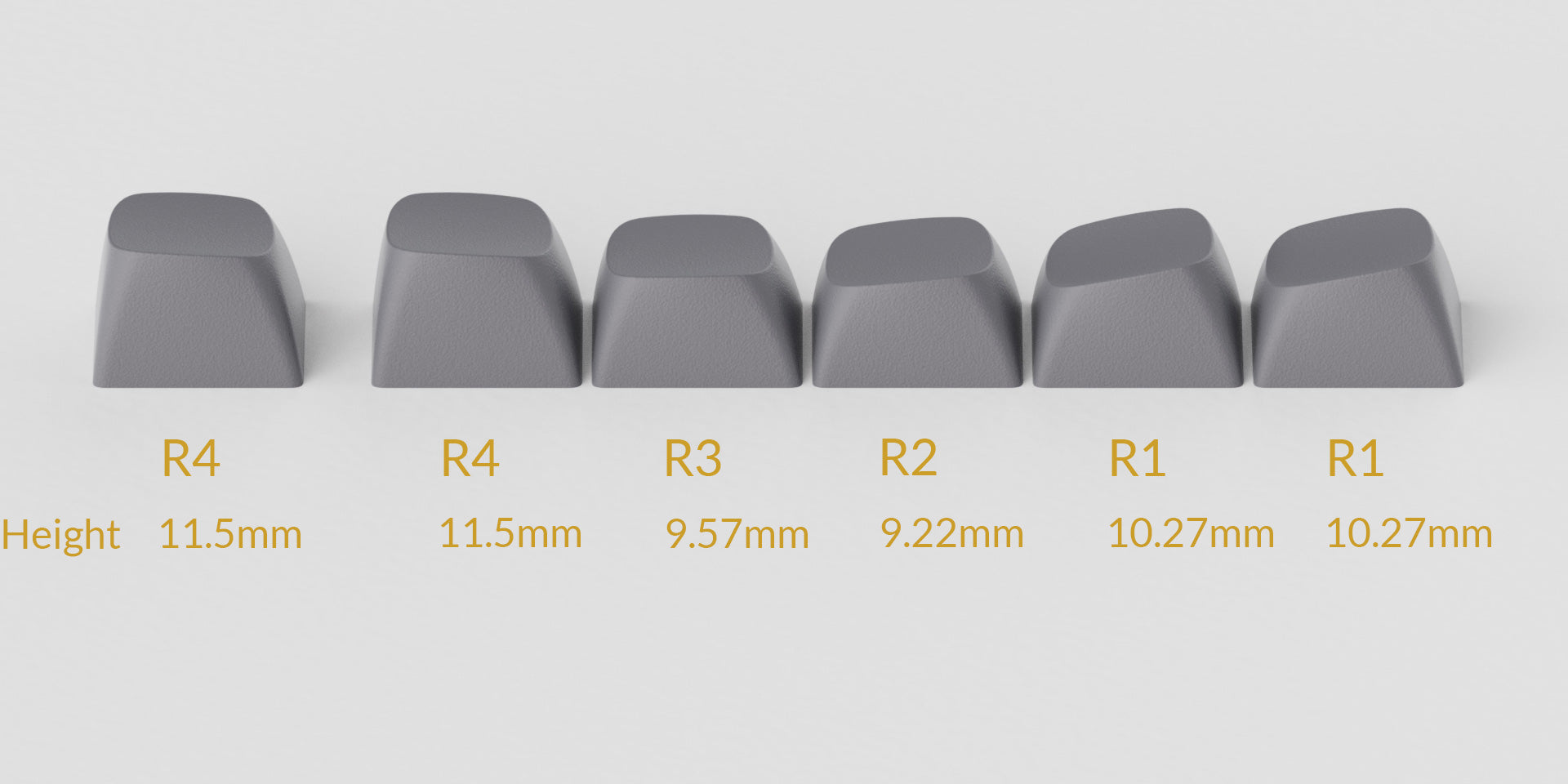
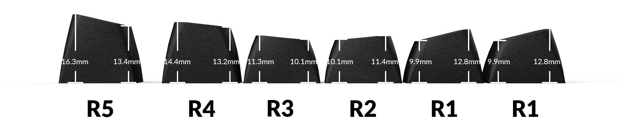
  • MT3 has a row R1 (the digits row) that is different from the function row. The problem is that the pitch or inclination of the top legend surface of this R1 digits row is too flat. This reduces the visibility of the digits legends. With SA, this inclination is 13°. AFSA also has a decent inclination; MT3 not. See picture below (not mine).
  • The alpha and digit legends are narrow (gothic, rectangular font instead of square) and small. See, for example: ^, *, +, ~, /, " PBT KAT keycaps are also produced with these inferior legends; what a pity.
  • Sourcing MT3 to the EU is expensive because of shipping costs, additional VAT and customs duties. Ordering from US Amazon.com turned out to be the cheapest channel for EU citizens.

What I liked about MT3:

  • The textured top surface, resulting in more grip and less shine than AFSA.
  • The larger legends of the modifier keys, compared to SA and AFSA.

Neutral:

  • The keycap height is comparable to AFSA, which is significantly lower than SA. This may be an advantage for use with thicker boards. However, this also results in a higher pitched sound profile, if that matters.

3 Likes

I appreciate MT3, but your criticisms are valid.

I think AF SA / MG have better sculpting than MT3. And yes, the legends are often more visible.

MT3 often sounds deeper, however, while the others are more hollow. PBT MT3, in particular, offers good sound. MT3 is less slippery in general, as well.

From a typing standpoint, Domikey SA and MG / AF SA offer the best value for the money. We are talking one half or even one third the price of an equivalent MT3 set. And for pure typing, they may be best.

With all the custom sets on offer, and special legends and such, MT3 can offer more variance than the Domikey / MG AF SA sets that go on sale on AliExpress. The latter are just different colourways produced on the same, albeit good molds.

In addition

I purchased this blue-white SA-keycaps TKL from AliExpress for a relative:

https://www.aliexpress.com/item/1005003208672826.html

and I was surprised at the quality of the keycaps. I don’t know if they are really ‘SA clones,’ or if this ‘FSA’ profile represents something different [fake SA?].

The quality of the plastic was okay, nothing special and nothing wrong. They weren’t SP-level polish. Smooth but grippy. But the sculpting was excellent. If those had been my introduction to high-profile [instead of SP R3 SA], I wouldn’t have been turned-off high-profile.

So I think there’s something to what you are saying. I think some of these clone manufacturers and new profiles are really looking at what makes for good typing. Not just recycling some profile from 1980 or 1975 that wasn’t even meant for Cherry MX, but actually looking at how keycaps fit on new boards.

There’s been a minor revolution in high-profile, and I don’t think it’s being recognized enough.

2 Likes

The PBT MT3 caps have different legends, since they’re not limited by mold availability. Sets like 9009 have pretty wide, SA-esque legends, for instance.

Supposedly Drop agreed to partner with international vendors as a condition for Zambumon rerunning MT3 Serika. But I’ve only seen ZFrontier as an alternative; no EU proxies have ever come to fruition.

2 Likes

The “F” in FSA most probably stands for “FL·Esports,” the brand name of the company. A while ago, I had been lurking at their “exploded” MF68-style keyboard. Nonetheless, I was not aware they are selling their keycaps separately. Nice find!

However, their row R4 seems to be even flatter according to below profile picture.

1 Like

Ah yes, the CMK68.

I had been tempted by that blue tricolour scheme, and because I like VA68-style keyboards.

So hard to find a good 70% these days in-stock! One with south-facing LEDs, and ideally a non tray-mount setup. Solder kits. The IKKI68 Aurora fits the bill, but you have to GB them.

1 Like

Yes, the double-shot dye-sublimated PBT MT3 9009 legends are better executed, but are still not on par with AFSA. It seems that MT3 designers are on a legends learning curve, taking into account the abysimal disaster of their very first PBT dye-sublimated set.

However, I have long been wondering why we are not seeing more tall keycaps in double-shot PBT? Is there a manufacturing challenge that I am not aware of?

I have also considered trying out Keychron’s double-shot PBT OSA profile which is really cheap, but my preferred colourway is (currently?) not available. Keychron’s legends could also be better, but I prefer PBT over ABS and the OSA profile looks acceptable.

1 Like

The set is not double-shot, PBT MT3 sets are all dye-sub. Personally I hate typing on SA and adore MT3. Different stroke for different folks :relieved:

3 Likes

Yep. That’s why we are lucky to have all these options!

Well, as I was checking (again) Keychron’s OSA availability, I stubled upon the forthcoming Double Shot PBT Keycaps With KSA Profile

The Full Set keycap sets (Dark Gray and Grayish Blue, Gray and Silver, Light Gray and White) are pre-order products, we plan to start shipping at the end of March 2023.

Specs

Material: Double-shot PBT
Thickness: 1.6 mm
Stem: MX style
Legend: Backlight does not shine through
Profile: KSA profile (Keychron redesigned SA profile)

KSA looks conspicuously like MT3, but than better & cheaper:

  • Made from double-shot PBT!
  • The legends are better executed than MT3, but still not on par with AFSA.
  • The inclination of the legends on R4 is higher than MT3, allowing for a better visibility.
  • Will be easy & cheap to source in the EU.

So, I definitely will have to try these out for a final verdict on these MT3-lookalikes. :smiley:

1 Like

Which set are you referencing? I thought dev/tty was pretty good.

I’ve been pretty impressed with the dye sub on some of the sets that came our in the past few years. e2048 looked great and I thought the LOTR sets were great. Operator isn’t mind blowing or anything but I think it’s a very nice look

1 Like

Yes, I was referring to the dye-sublimated PBT Dev/tty MT3 set.
More people share this opinion. See for example:

1 Like

I just wanted to make sure I don’t come off as aggressive or argumentative in this, so please note that this is all in the spirit of friendly debate! I found it interesting to read your post because so many of the reasons you didn’t like MT3 were the same reasons I love it. :slight_smile:

MT3 felt very strange to me at first, but I warmed up to it after about a week. When I first started typing with it, I kept hitting the edges of the caps, but found a rhythm and now each cap feels (as hundreds have said before) like a little hug for each of my fingers. It does seem a little polarizing as most people seem to either love it or hate it.

This feels more like personal preference rather than bad design. Unless you’re hunting and pecking across the board (not shaming if you are!), I don’t think the size of the legends is extremely important, so long as it appears proportional to the keycaps, which I think it does in the case of MT3. The uniqueness of the typeface is partly why I like the MT3 legends so much.

I don’t think it’s fair to say that all MT3 is bad based on some off-kilter legends for a first run of a 5-year old set. Unfortunately rough around the edges in the set shown in that video, but all of the MT3 sets I have bought in the past two years have properly aligned legends, or close enough that differences aren’t visible day-to-day.

Double-shot PBT is extremely expensive for tooling and incredibly difficult to do well due to some chemical properties of PBT that differ from ABS. I don’t know the chemistry well enough to discuss this point in detail, but from what I’ve read it has something to do with a narrow temperature window that gets the two parts of the double-shot PBT to melt together, but not so high as to distort the legends or warp the caps. Keyreative ran into massive delays due in large part to the difficulty of moving from dyesub to double-shot PBT for some sets.

Personally, the modifier legends would be a deal-breaker for me on that KSA set! They feel oddly bold and the kerning seems too tight for the thicker strokes.

I am glad you found an alternative keycap profile that meets your needs and personal preferences, which really is what this hobby is all about. :slight_smile:

3 Likes

Hi @ListlessLlama. No, as long as you are not spitting :smiley: you are not being aggressive at all. Myself, I might also be straight to the point —which I think is a regional cultural thing,— but it gets the debate rolling.

It is not that I am “against” MT3, there are also good things about these keycaps (e.g. the textured surface) from which other manufacturers can learn. However, there happens to be a fair amount of hype around these keycaps and they are certainly not cheap to source in Europe. This is why I wanted to contribute to this group with my critical review. It is an attempt to elucidate what one really gets for that amount of money. Despite my own thorough research before buying, I stumbled onto a number of shortcomings that were not apparent before hitting the buy button. If these shortcomings matter is of course personal.

Yes, I am well aware about this novelty effect. In fact, it also applies to key switch testing. A lot of key switches require a couple of weeks of continual use before they mechanically “break in”.

However, you are of course alluding to the psycho-motorial adaption of the human user to newly shaped keycaps. Well, I do not think it applies that much in this case, because one of my daily drivers is AFSA, which is also very cupped. So no, this was certainly not the deal breaker for me.

Let me tell you what it was. I am a kind of night owl. When I am up late, I keep the ambient lighting low in an attempt to not mess any further with my melatonin levels in my brain. It also helps with the energy bill. :weary:

I know to type blind on the alphas, but I find myself from time to time searching for the top row digits and especially their shifted symbols. So these legends need to be well visible for me in low light conditions. This is not the case with MT3. Not only are those symbol legends tiny, the inclination of the legends surface on row R1 is too flat, away from the view of the keyboard operator.

Oddly, it is hard to come by any profile sketches comparing MT3 with SA and AFSA or MG. However, if you carefully look at below picture, you will notice that the legend surface on R1 (left and second from left keys) of SA, MG and PGA are tilted towards the user. With MT3 (R1 is left) and OSA there is less tilt. The tilt looks identical to that of its R2 (second from left). This is what killed MT3 for me.

Luckily, I don’t own OSA, but it would have been the same. PGA is new to me. These are ABS and only available in a couple of colourways. Whereas PBT KSA is not out yet, but it looks more promising in this respect.

This may all look like nitpicking, but this is what this hobby is all about —isn’t it?—

1 Like

Well, I guess I will have to completely temper my initial enthusiasm about Keychron’s KSA. From what I gather from below video, I looks like they copied MT3 so well that their R4 digits row will also suffer from reduced legend visibility due to too little/flat inclination of the legends surface. The inclination is identical as for row R3, i.e. 1.2 mm over one keycap.

I guess, I will better stick with the SA profile then for my next build. :neutral_face:

1 Like

There are more people who independently noticed the digits row inclination issue with MT3.

I think I have more trouble with the angles than the shapes, especially the top row being angled against my fingers, making me want to use the top edge instead of the face of the cap.

Thread necro, but I’m returning from r/mk and participating a little in keyboards.

MT3 is probably one of the worse disappointments for me. I’m shocked to see that nobody mentioned the appalling decision to not offer a flat R5. Ortho users, mac users, pretty much anyone who uses their thumb for bottom row modifiers would have benefitted from a flat bottom row.

1 Like

See this thread - at least dev/tty and serika R2 have flat bottom row.

But even with flat bottom row, I can’t stand it.

1 Like