![]()
“Bobo” was my grandfather’s nickname; because as a young child my sister couldn’t pronounce his name and said that one instead. It stuck!
![]()
“Bobo” was my grandfather’s nickname; because as a young child my sister couldn’t pronounce his name and said that one instead. It stuck!
Ha. No numpad support. Bold move Drop!
Well Tai-Hao am I going to Bobo-up my fullsize?
I’ll see myself out
Strong choice calling your keycap profile “BOBO” 
The copy all talks about these having shine-through legends, but to me it looks like they just have standard opaque legends. This is real weird.
Something I’ve seen Tai-Hao doing lately is an approach in between traditional frosted-POM shine-thru legends and traditional opaque double-shot legends. The plastic is colored and doesn’t have the degree of translucence that regular shine-thrus do, but it does carry light, illuminating the legends.
This is how one of their new Cubic sets (called “Avatar” I think) works, and I’m betting that’s how these work, too. That first photo on the Dorp page shows grey-ish keys with orange legends; I’m thinking those orange legends are somewhat illuminated by the white light underneath. Same for the pink set; I think that’s slightly translucent white as opposed to the traditional frosty clear.
“Translucent” may be too strong a word but “allows for sub-surface scattering of light” doesn’t roll off the tongue as easy; you can’t see through it, but it can be illuminated throughout by light.
I took some photos of MCR profile caps this evening as part of a piece about the set and figured I might share a few un-retouched ones with you here;
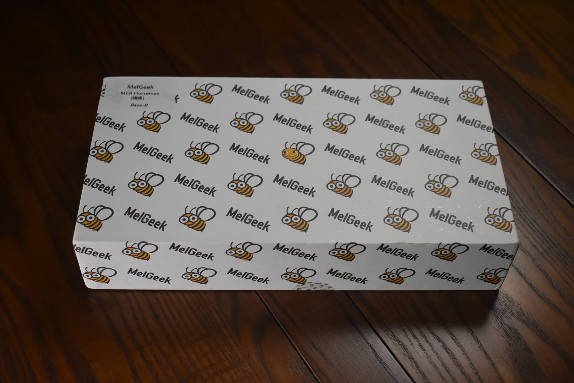
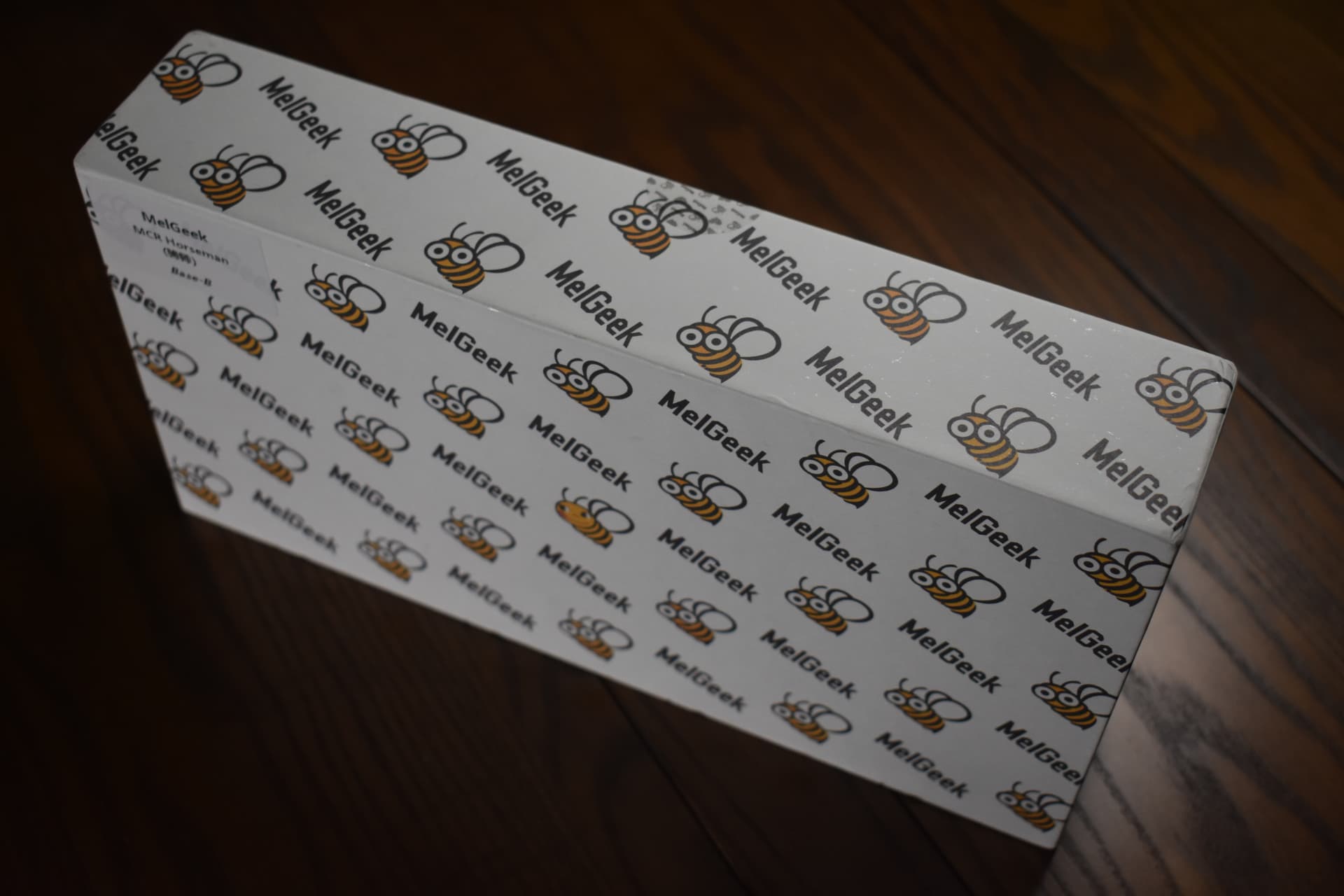
The box:
It’s kinda hard to slide open but hey it’s a sturdy little box with cute bees on it
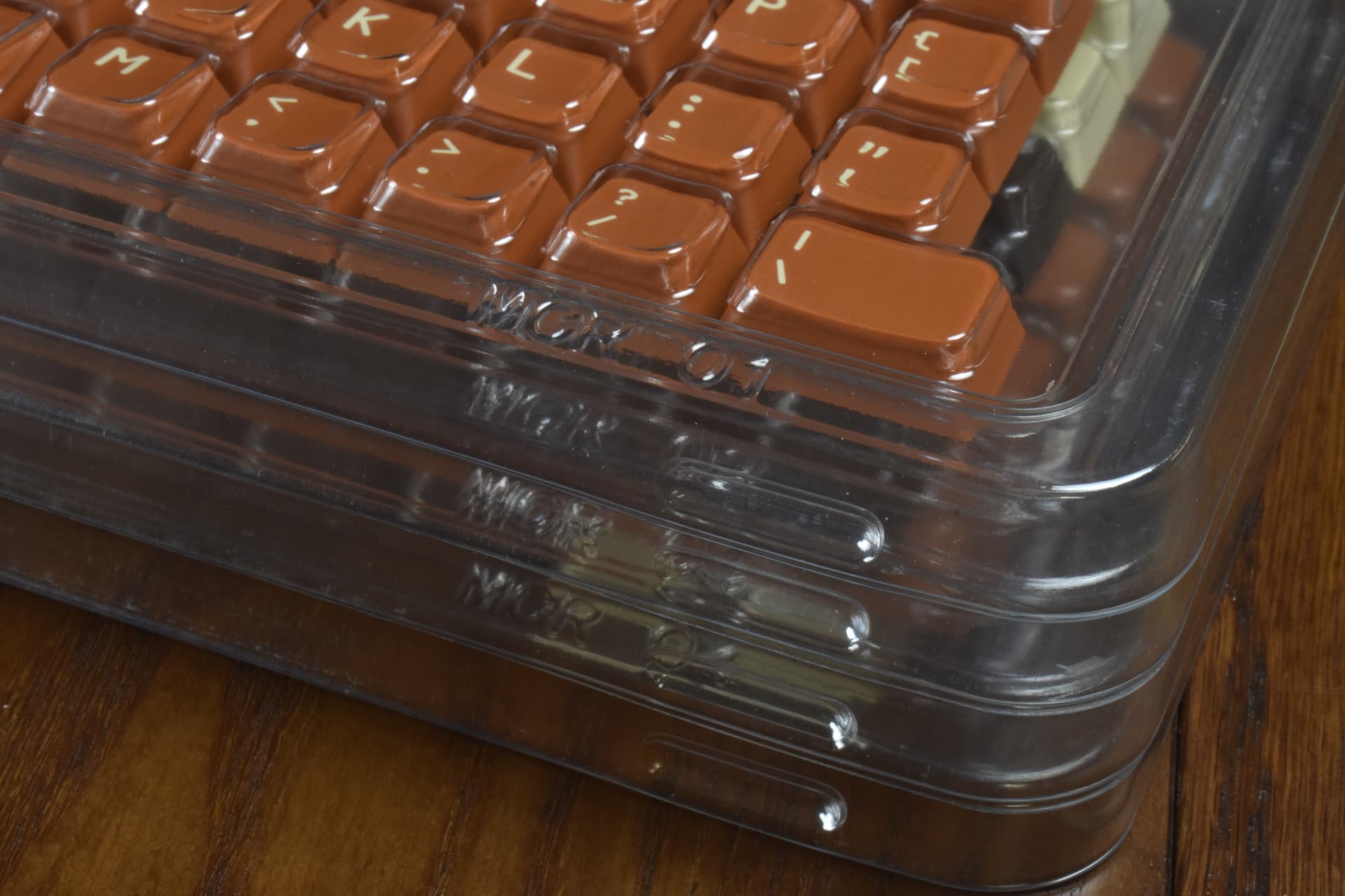
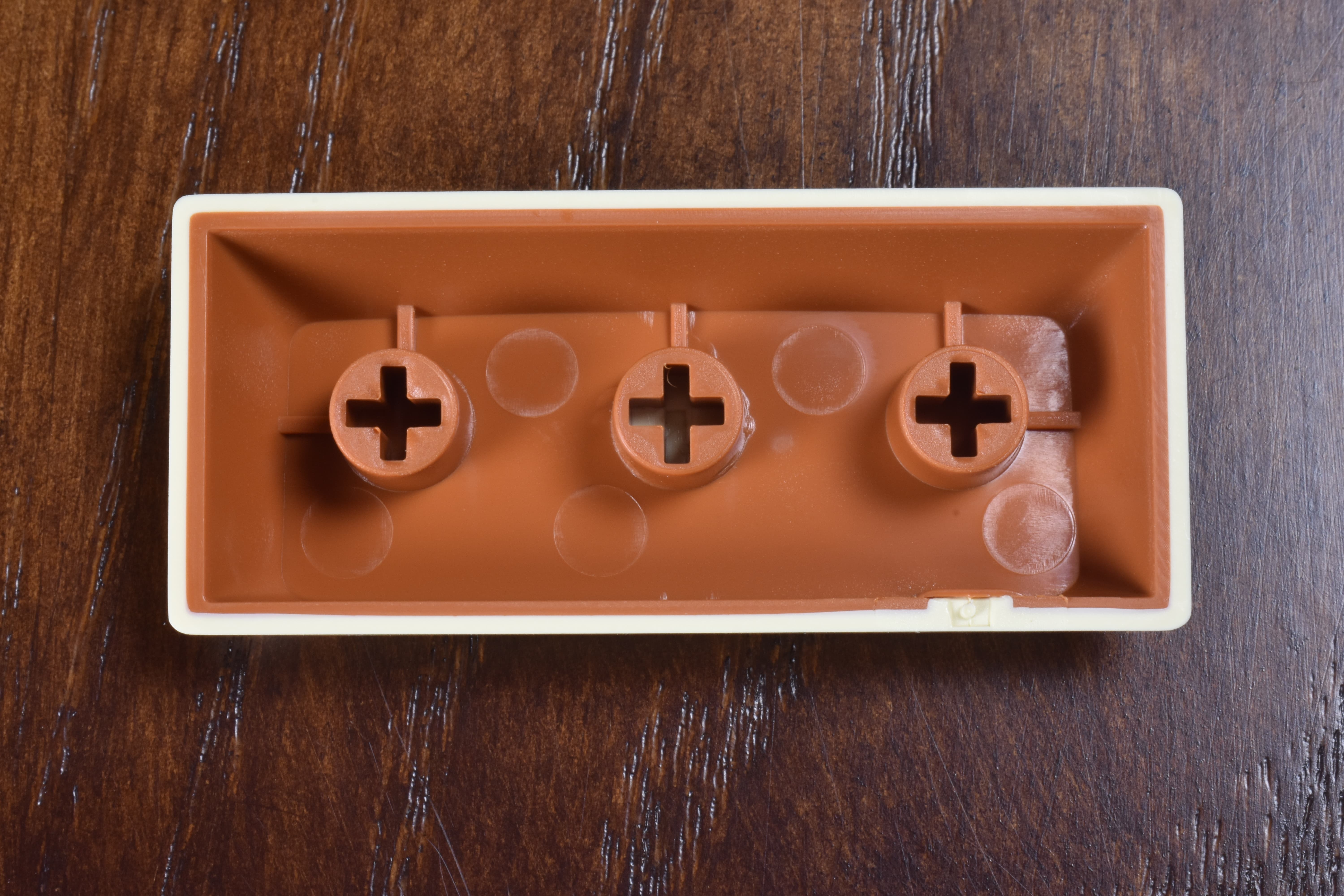
The trays:
The packaging is also the perfect thing to store the product in - love it. These were designed alongside the caps and are shaped to fit a base kit with nothing sliding around.
To accomplish this, all four trays got their own shape - so each one is labeled MCR 01 through 04. Both the trays and their lids have the label. Really love it.
No fishing keys out of troughs - I like that, too.
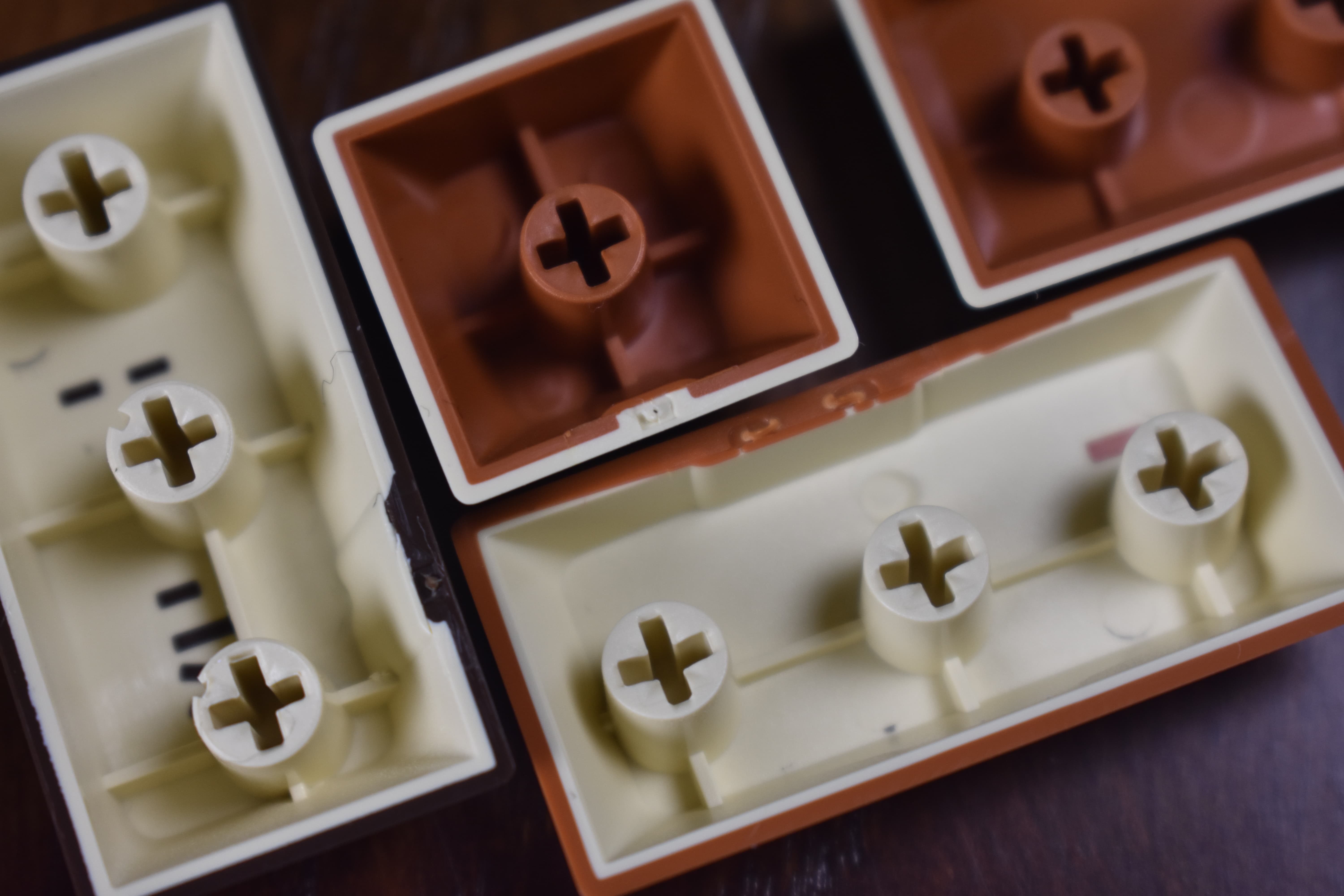
The mold shots:
Pretty good! And hey, check that out - the sprue mark is under the cap. High-five to MelGeek (and Dorp with DCX) for being mindful about that.
I hope to see this become a new standard.
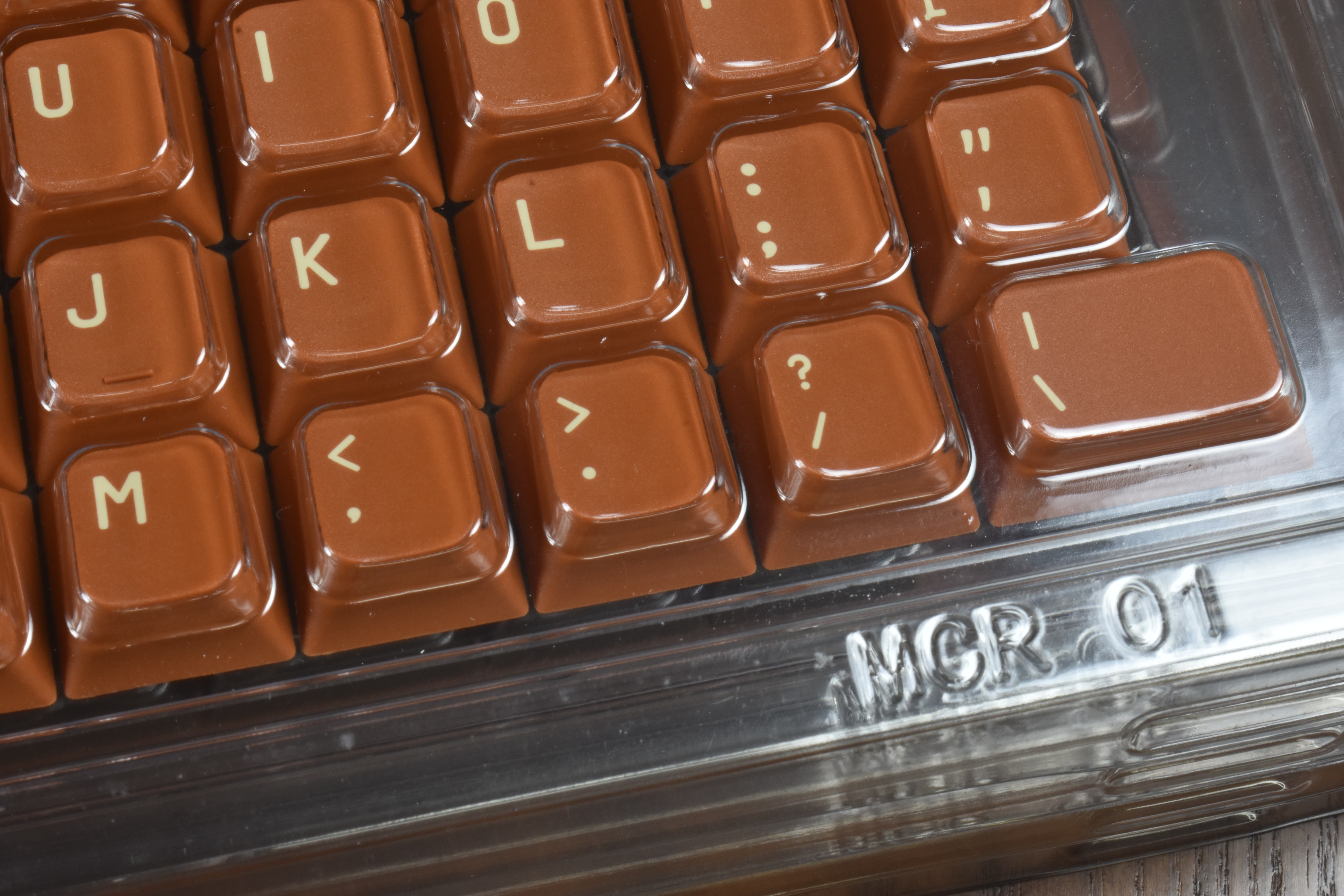
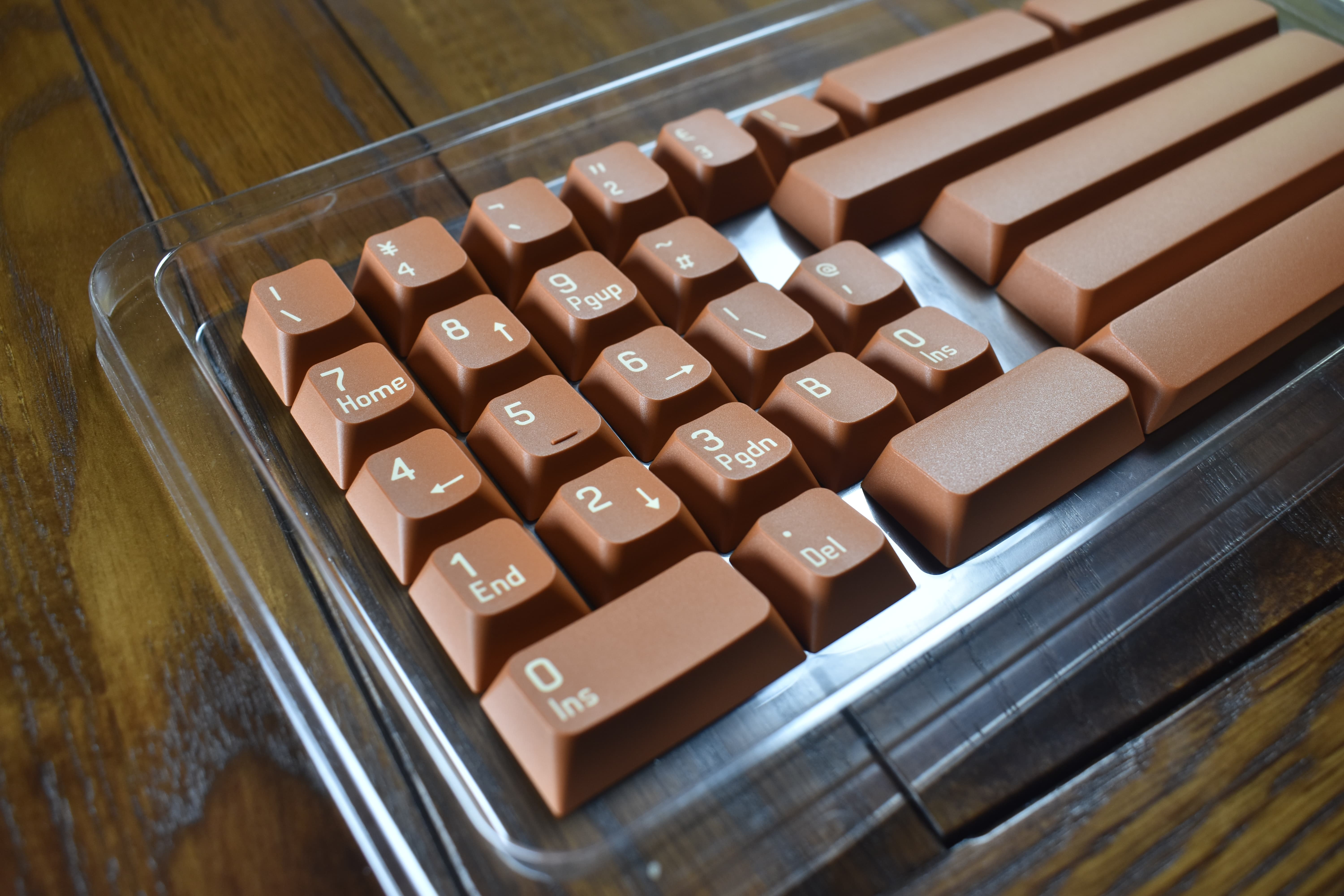
The caps! (The legends!)
Pretty good! That is one tasty dark-chocolate coffee-bean brown right there. I’m a sucker for this colorway.
Really nice fine texture. On the smooth side, which I think works well with the shape - they do start to shine pretty quick, though. Nature of the beast with ABS - if that’s a deal-breaker for you, hold tight - MelGeek is cooking-up a PBT version once they have a few of these under their belt.
This “Horseman” colorway comes in three versions; A, B, and C. This is the B variant, which has this pumpkin-pie-filling color for the alphas. (Yes, I know it’s supposed to be tanned leather, but I’m still in a food state of mind from the last shade of brown.) While this one might be my least favorite of the three, I’d still almost bought it a time or two for those brown mods - and I don’t dislike the cinnamon-yam alphas - I’d just rather have cream or coffee.
![]()
![]()
![]()
![]()
![]()
![]()
I’m a brown fan. Brown is underrated.
I think the legends look really nice. The condensed gothic typeface has a retro-modern look, which is right at home with these colors. I feel like a computing pioneer when I look at these. I can almost smell the cigarette smoke and percolated coffee.
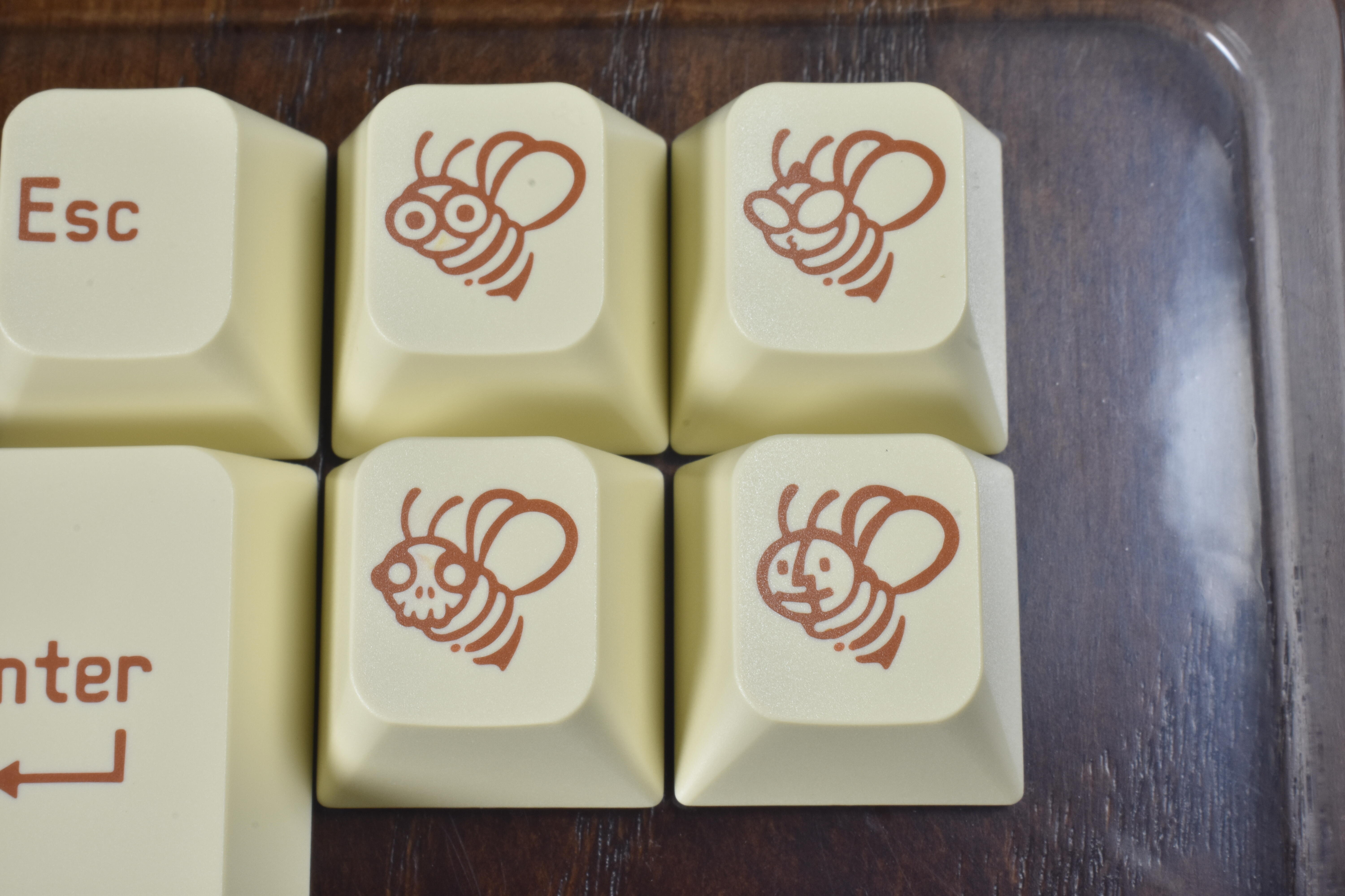
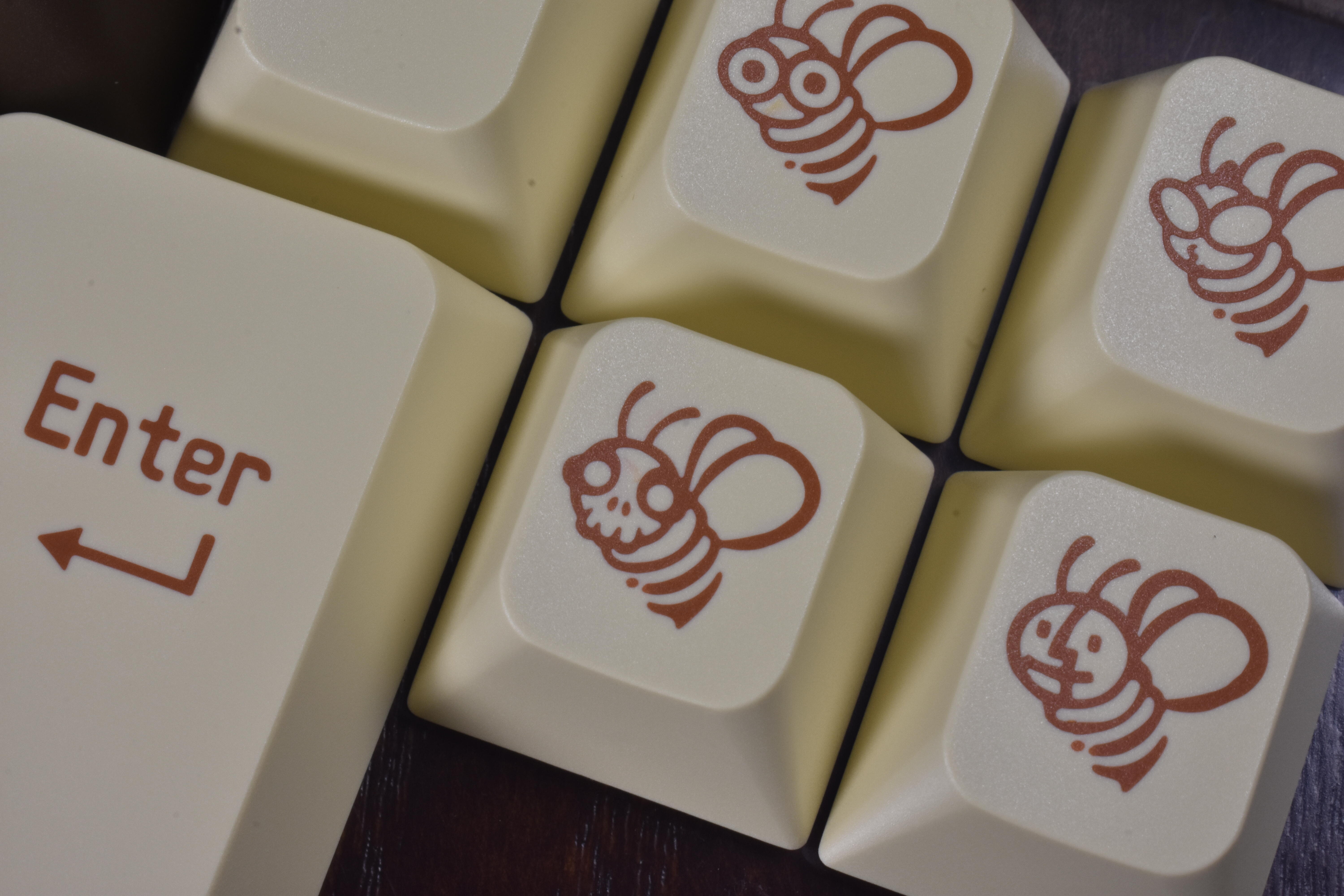
The MCR base kit novelties; MelGeek, GrannyGeek, DeadGeek, and MacGeek. Actual color is a bit warmer. If you look close, you might see some slight color bleeding on the novelties - I didn’t see it at all until I zoomed in on this photo, which was taken under pretty bright light. Overall I think the legend quality here is at least above-average if not excellent.
There is some dust on these, but the grey fuzzy dots are schmutz on my camera sensor. Susuwatari, if you will.
Really quite good. Zoom in and you can see how crisp these are - and also the color bleeding on the top and bottom left bee faces. I haven’t noticed it on any other keys yet.
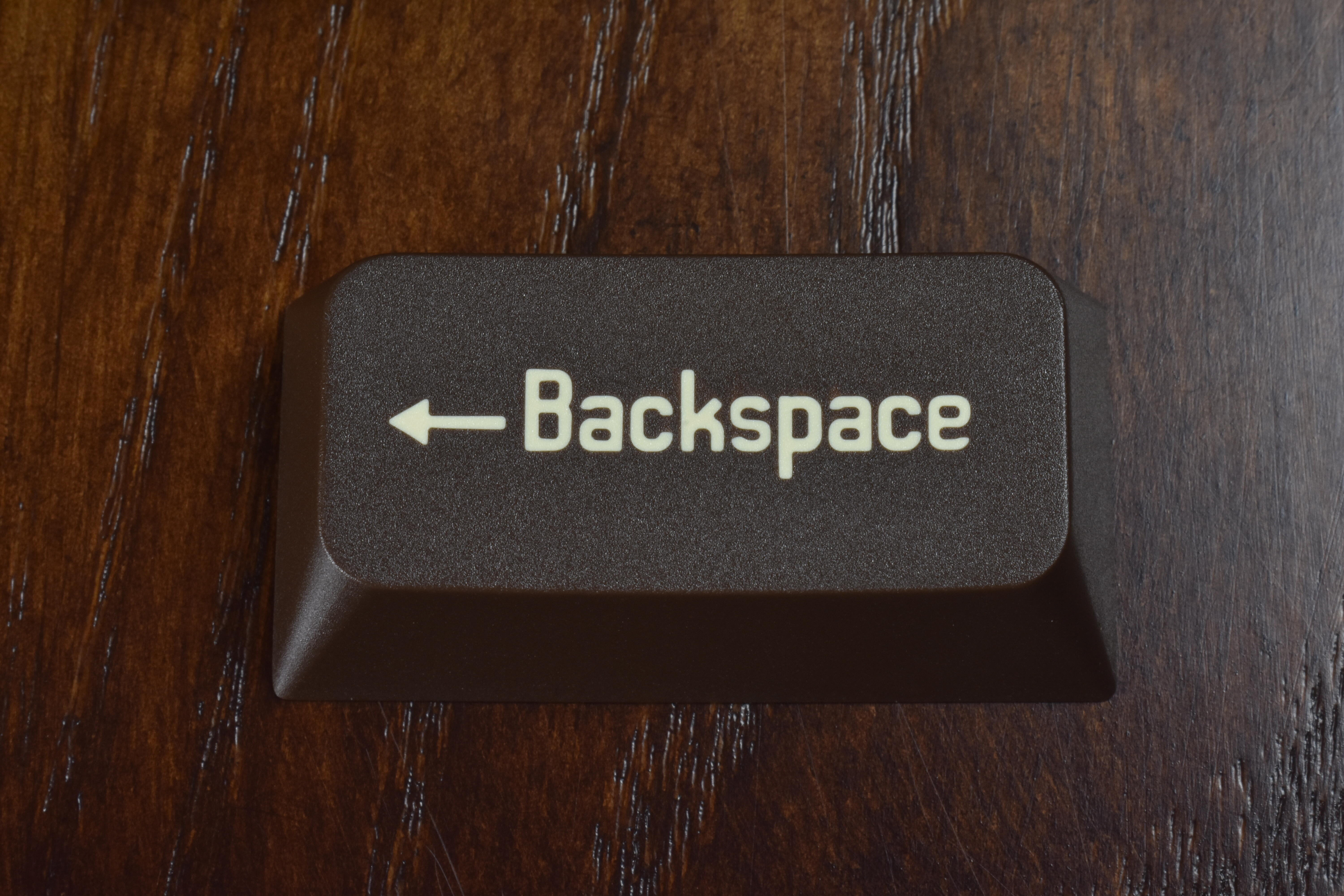
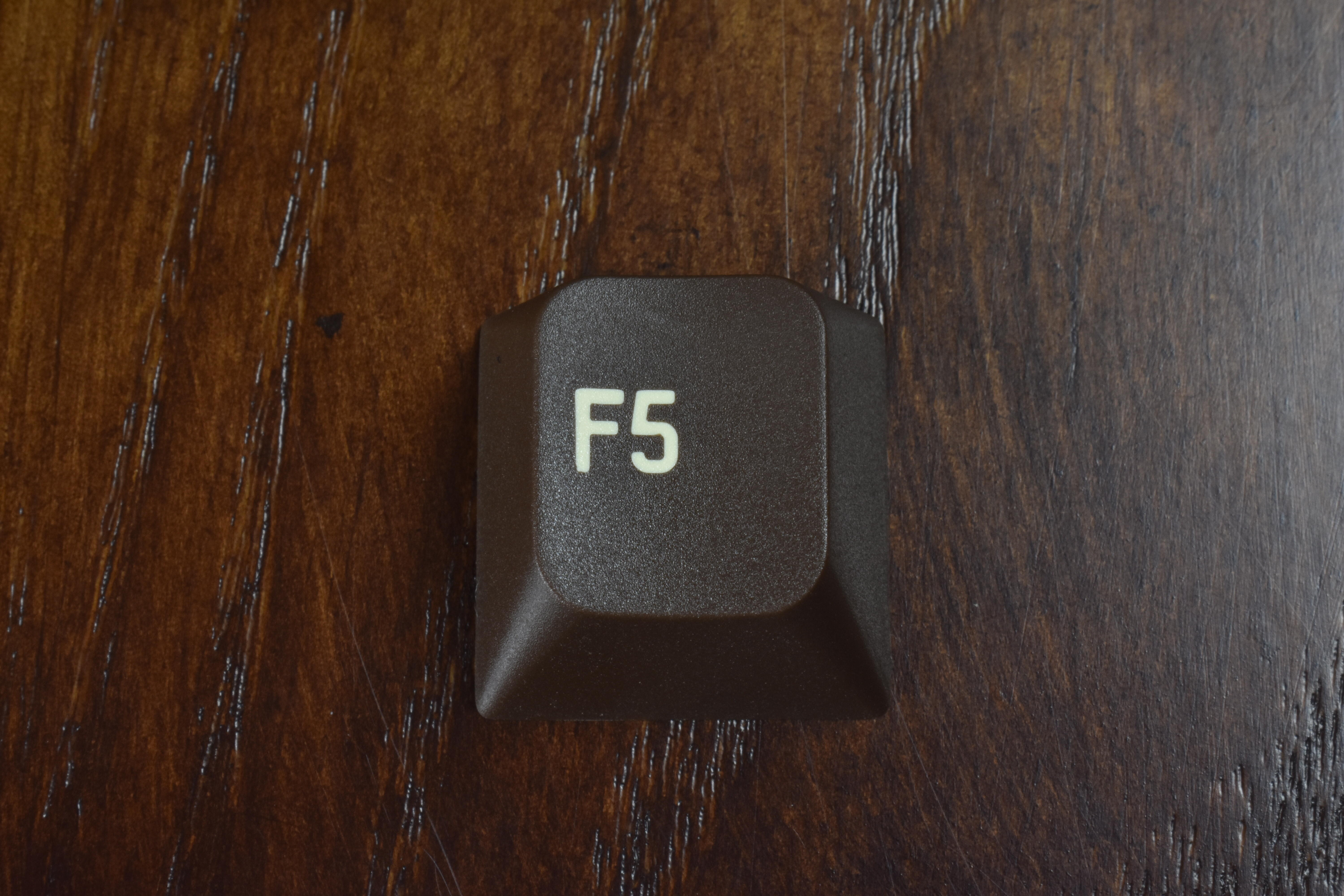
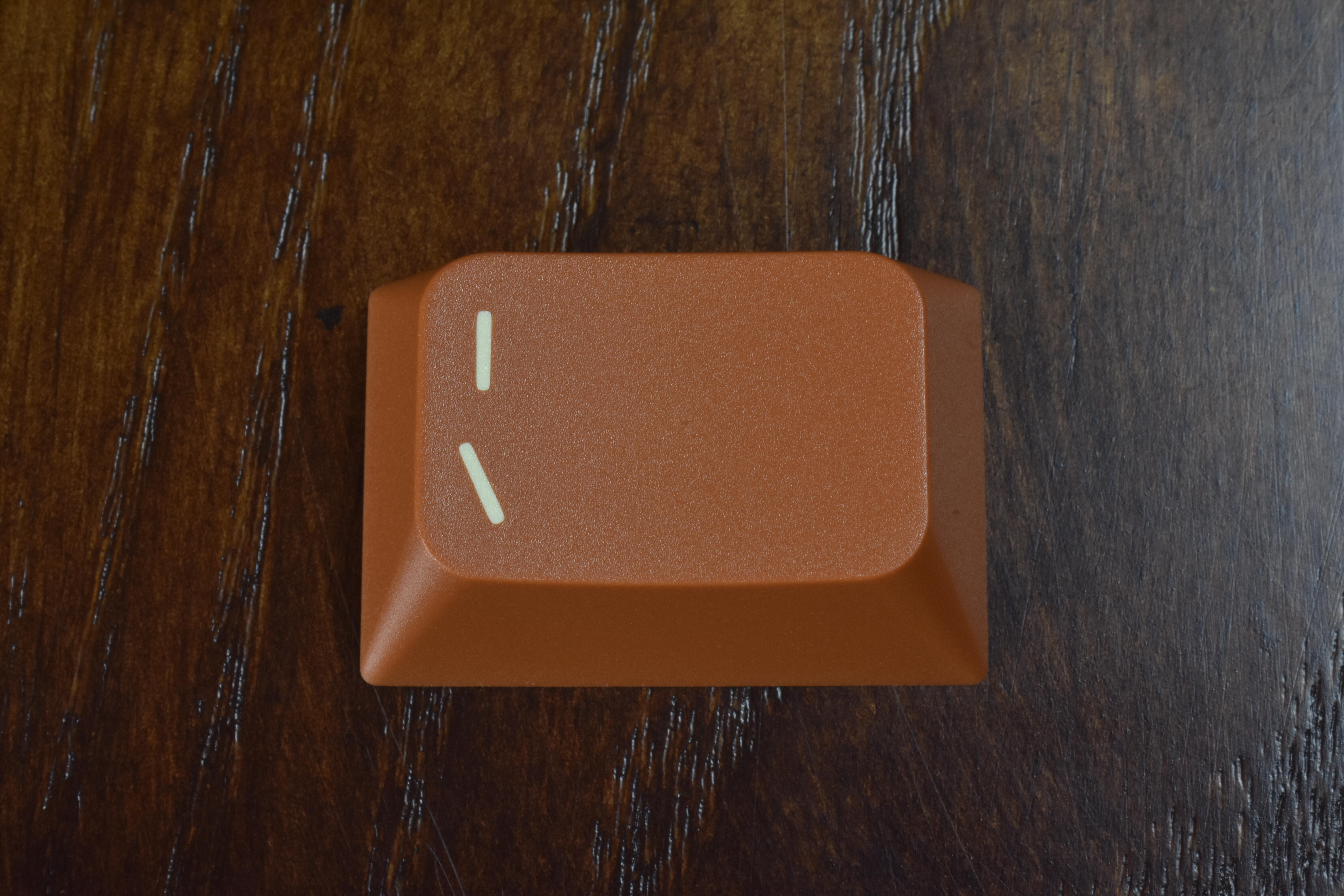
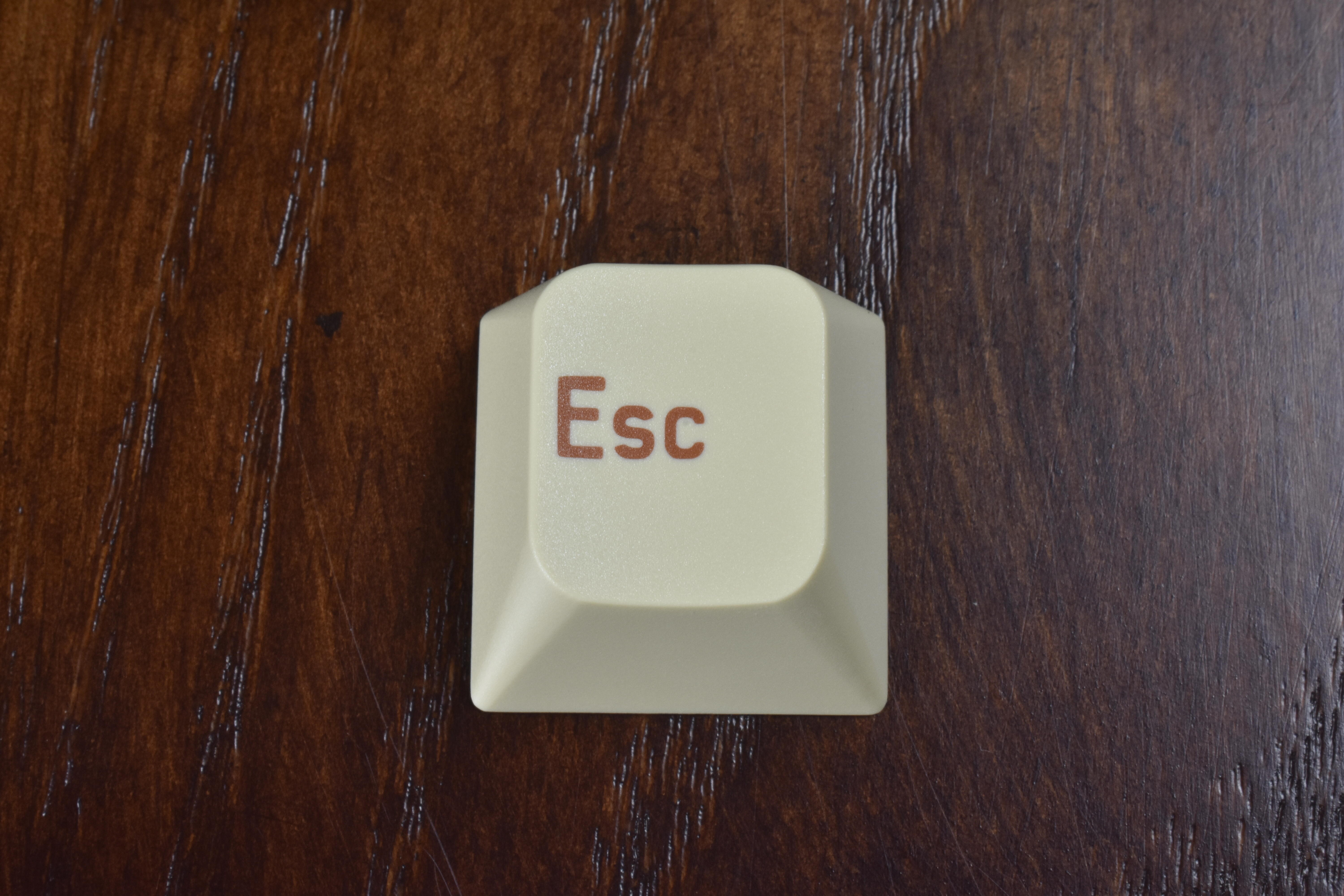
Some individual keys:
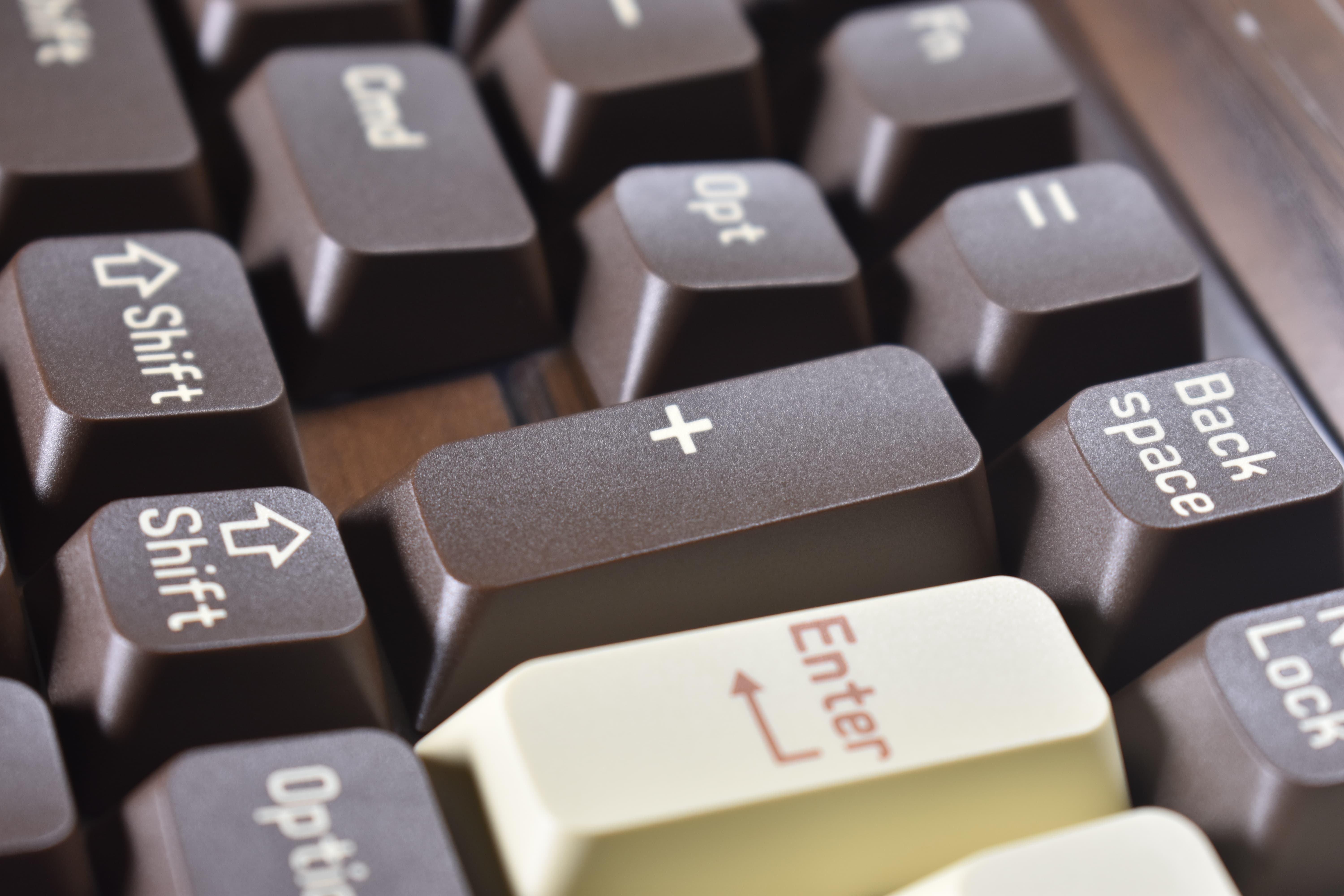
Quicksave / Refresh
Pipe / Backslash - this is making me think of the pie I have in the fridge right now
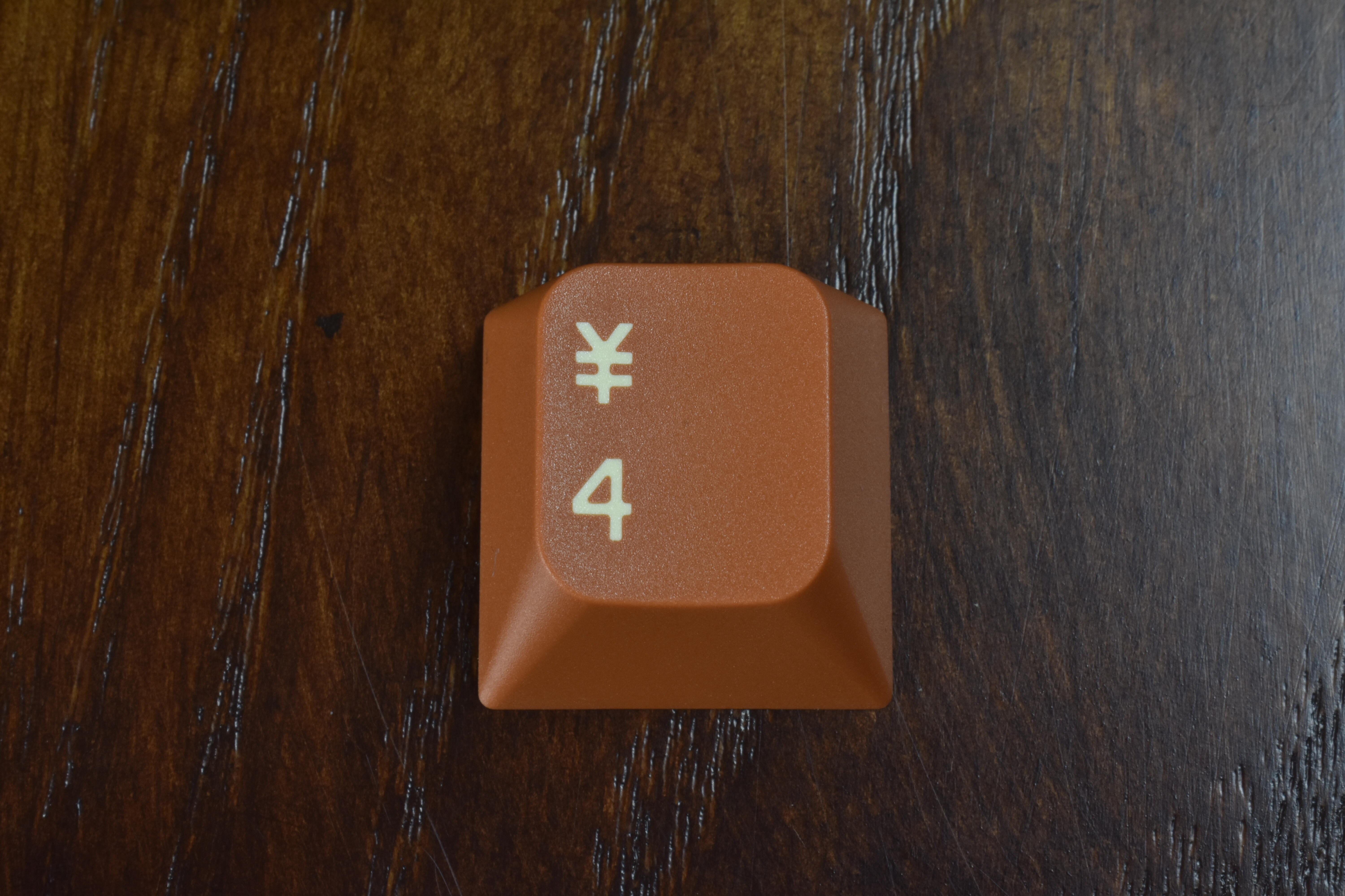
4 with ¥ (Japanese Yen) symbol
[ Next typing test ]
Full review video in the works - Charcoal first, though - it’s next in queue after the Clickiez, but I thought MCR as a profile was interesting enough to share these with you now. Cheers!
Lovely colors. Tempted to get the B and C kit to have an all Pumpkin and all Coffee set 
Quality looks very good. Colors superb. The font though, I have reservations about. 
Thank you for sharing so many images.
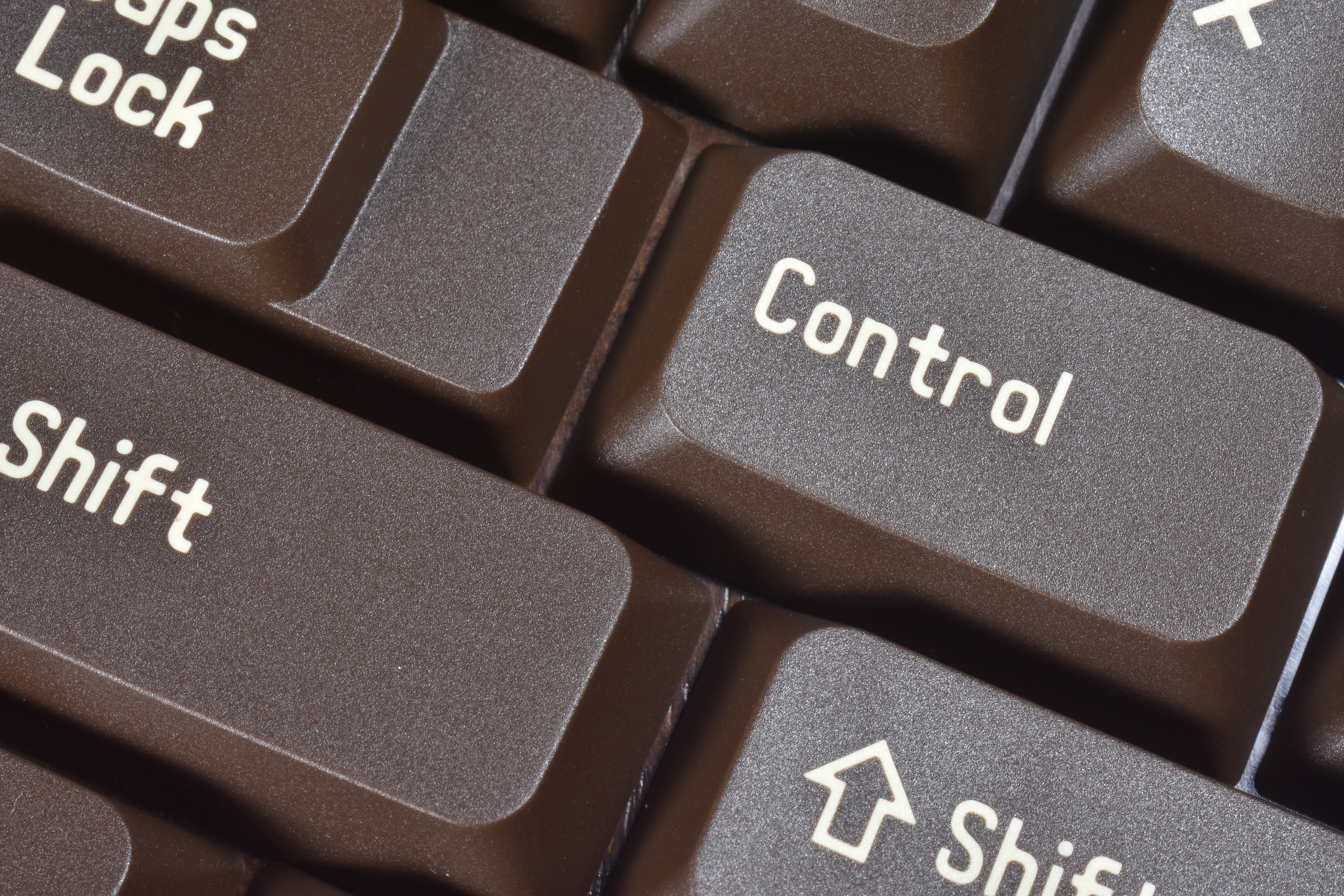
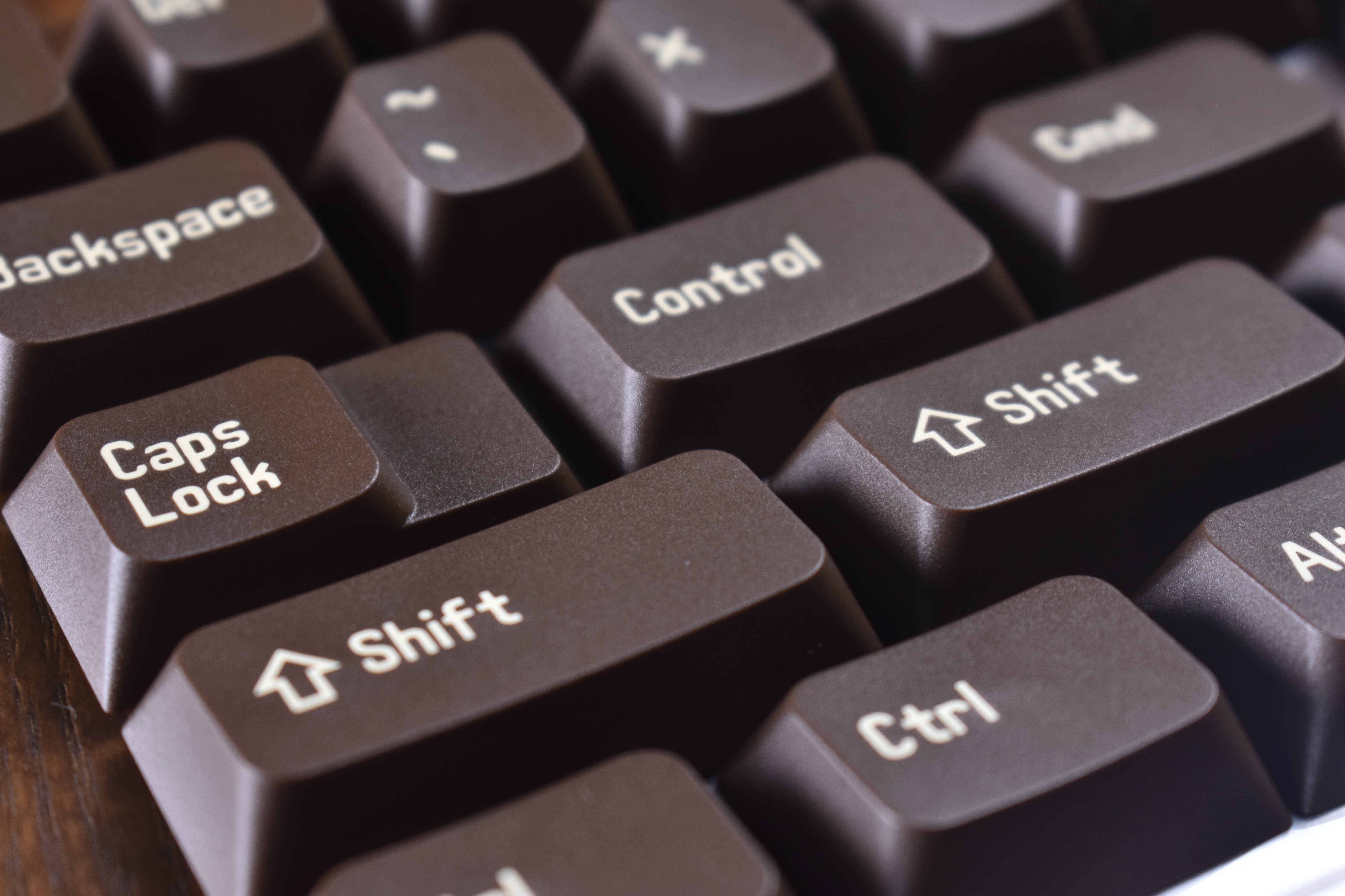
Thanks for the photos! Yeah, something is just slightly off with the font, like where the F and T are next to each other in “Shift,” and between the N and T in “Control.”
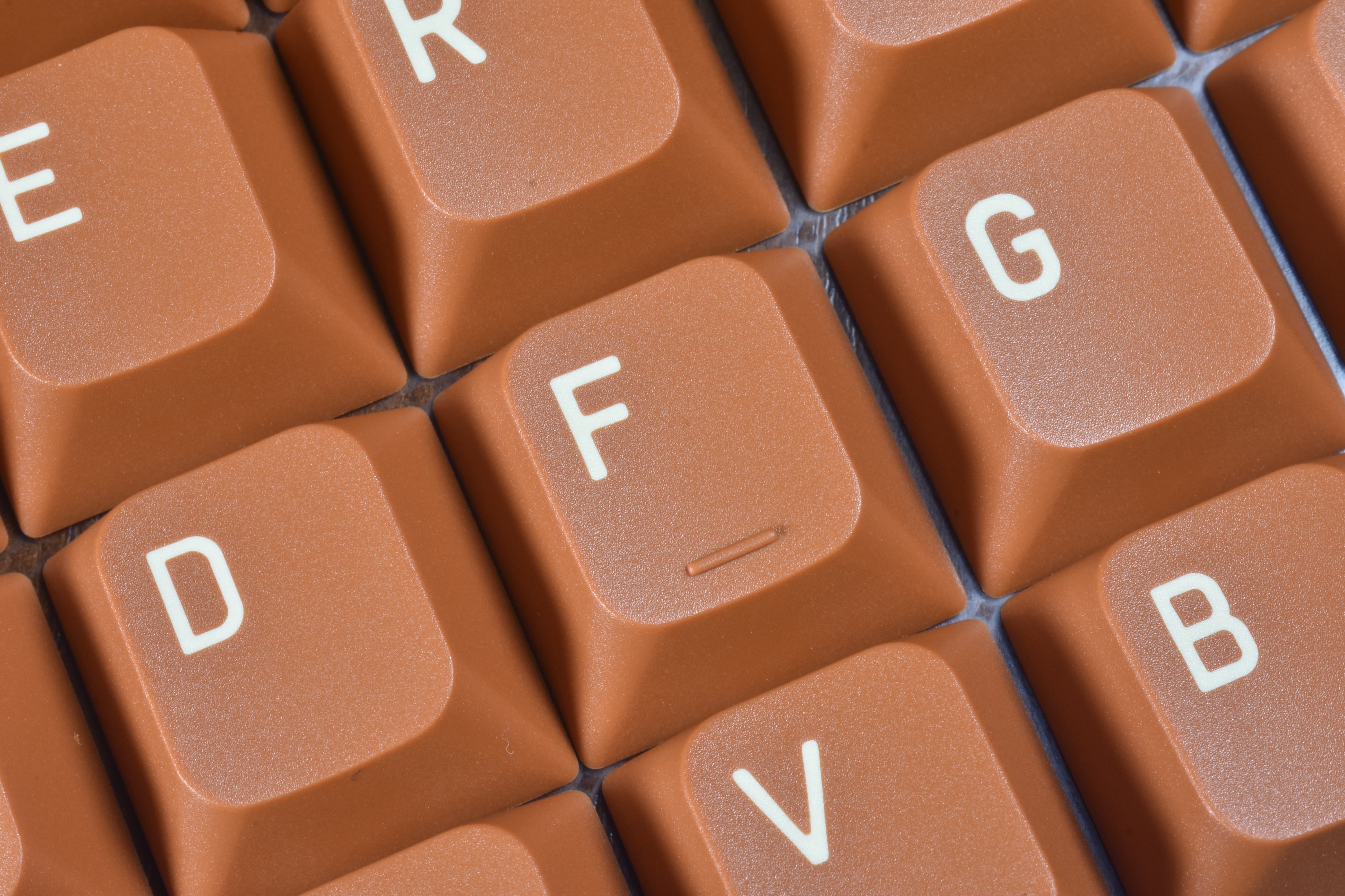
The individual alpha keys look good. But for whole words, the font doesn’t look quite as nice.
Yes.
I’m not really into keycaps but KeebMonkey offered me this set for a giveaway and I realized this is something different. Marketed as OEM but the two-part structure makes it actually cool:
Was poking around @SwitchCaptain’s website and happened to see these. Not really familiar with them at all but the price is nice and the photos look pretty good. From the description it sounds roughly similar to CXA, but who knows.
I have a very few number of boards with 6.25u space bars now, unfortunately. The deep green and cream looks nice though.
The stems are definitely different than CXA. Maybe closer to OSA or Akko’s ASA.
WDA: a new middle-height profile with mild spherical dishing, currently available at Z-frontier. Seen above between Cherry and SA.
This particular set uses “heat-treated pad-printing” - they say it’s durable, who knows.
Hm. Shape-wise it looks similar to MDA – which is one of my favorite profiles.
Speaking of MDA, is double-shot MDA a new thing? I receive a set with the Mojo 84 from MelGeek and realized instantly that the feel is different. It turned out I got a double-shot This Is Plastic set. It is more textured compared to my old big Bang MDA caps, the homing dashes are larger, just like the legends which are almost ridiculously HUGE.  But it fits the aesthetics perfectly.
Doesn’t look too great. There are already way too many profiles tbh.
Interesting! I’m also a big MDA fan, and I have a dye-sub version of the Plastic set - would you mind posting some photos of a cap or two close-up?