Hello to all,
I got into mechanical keyboards last year during my first months in a sustained period of working from home. Needless to say, the rabbit hole started to get deep rather quickly and soon I found myself going from an Apple full-size to a Keychron K2 to an Epomaker GK68XS to a Drop Planck. I had a short retro romance with a Durgod Fusion but found it lacking my retro needs. I just don’t like the looks of Cherry/OEM/cylindrical profiles.
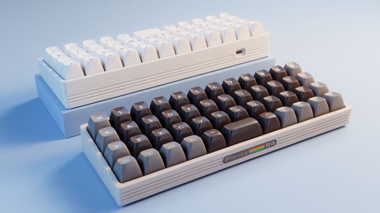
So I started to design around my Planck with my eternal love for my first computer — the Commodore 64.
So here it goes…
Initial design and render. Nevermind the strange row 1 texturing. These are not yet the scanned keycaps, but rather eyeballed.
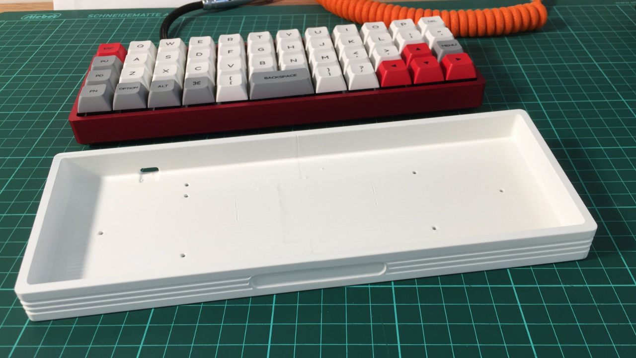
Overall I wanted to keep the case footprint small and in line with the overall design of the Plank, hence I decided not to have the iconic C64 forehead. Rather I chose to use some design elements and see how they fit. The alpha prototype of the case is PLA printed and the recess with the label is just a decal for now. I’m planning to have an actual insert with embossed letters.
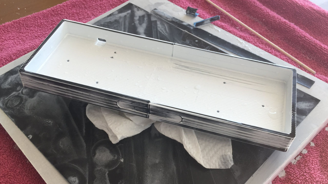
PLA printed case glued and first round of priming and sanding
Paint, sand, paint, sand, paint… you know the deal
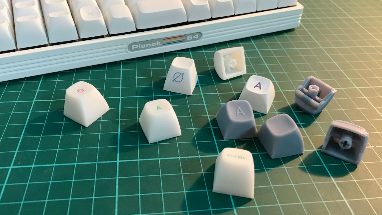
On the keycaps, I couldn’t settle for anything less than the original profile. So I scanned and reconstructed them — quite an involved process I might add. At first, I printed some keys with PLA, but quickly switched to photopolymer resin for accuracy and detail. For the first full set, I’ve decided to go with white caps and recessed legends. By doing so the legends are ever so slightly legible while avoiding a more complex solution for legend coloring.
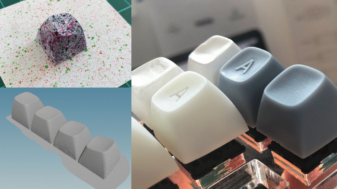
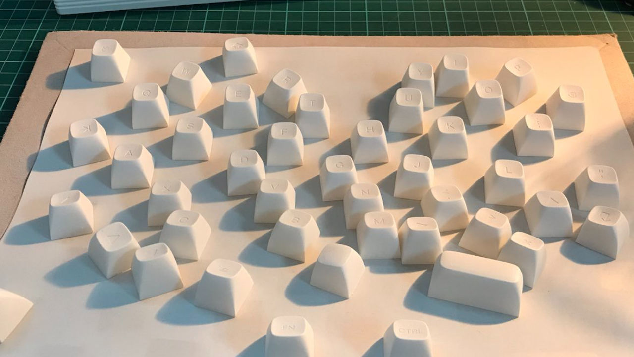
Keycaps scanned, reconstructed and first prints
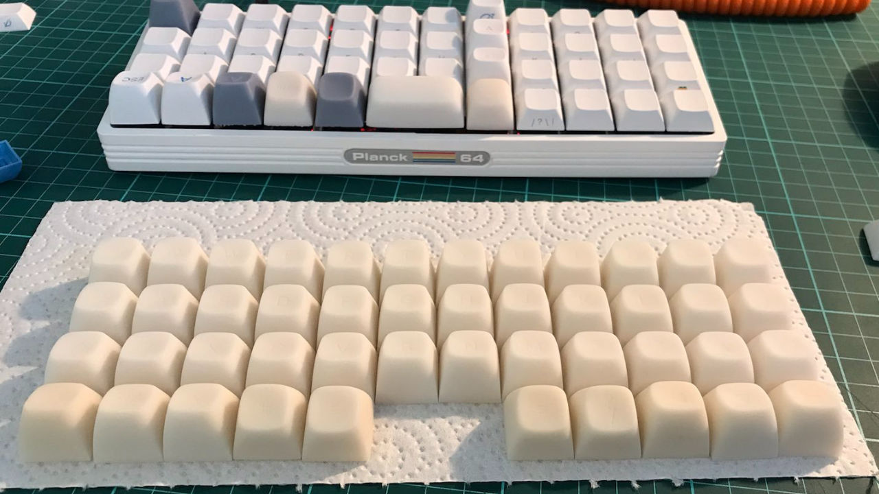
Full set printed and more test fitting. DSA meets C64 profile.
More painting…
What else can I say other than that they feel absolutely great? 
I’m currently making some adjustments to row 4. As seen in the images I’ve reversed some keys for ergonomics on the Planck. I’m thinking about adding an in-between angle for the left option key to smoothly transition between ctrl and command keys. I’m also undecided on whether to have convex or concave layer keys.
This version was kept white for a more modern look, something Commodore also went for with the C64C and C64G. My next version will sport the classic brownish colors. Stay tuned
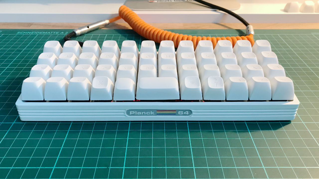
Bringing it all together
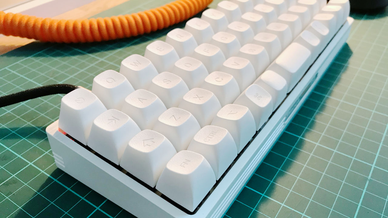
A closer look at the keycaps.
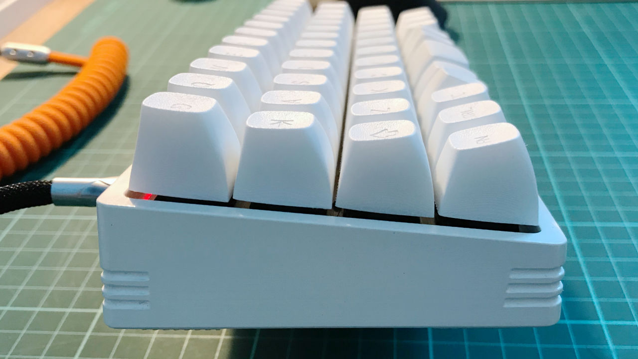
This is a blue steel pose, yes I’m that old. I didn’t account for dampening, so the o-rings lift the PCB higher than I’d wished for, therefore the keycaps stand out too far.
Many Bothans died…
Thank you for being a great community — being respectful, sharing knowledge, and helping each other. I’m happy to be here and taking part in it.
Have a great weekend.
Andreas

