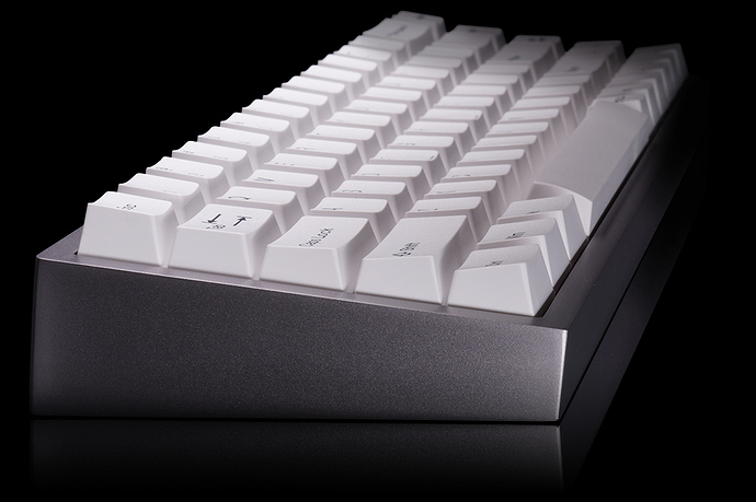
Me, yesterday:
Thx for the heads up. I had forgotten about this set. Ordered!
Idk, still got a bit of a bitter taste leftover from Jukebox Cubic. Still seems like a decent set for those wanting something cheap that haven’t been spoiled by better profiles/sets.
I mean, that’s fair. But I think it serves it’s purpose as a $40 ABS doubleshot set with good enough compatibility that it’ll fit most anyone’s first boards.
This keyset’s look and price is perfect as a gift.
I like how it took Tai-Hao so long to get a basic colorway like BoW done. Ever since cubic released I’ve been saying they should do BoW or WoB  . Thankfully Novelkeys comes in to talk some sense into them.
Cubic keycaps are almost 90% of GMK quality. They are thicker than standard Tai Has caps and the legends are impeccable (better than JTK).
The problem with Cubic in general is compatibility, but we have that problem across a lot of new double-shot profiles as well.
I love Cubic caps and am relieved to see a more sane color way! Already order this set as soon as I saw it.
I think that’s perhaps a bit of a bold statement. My impression is that the legends across key groups(alphas, numrow, mods, etc) are inconsistent in their styling, exemplified by numpad having centered legends vs the rest of the alphas with upper left alignment, tend to be quite thin on the mods, and frankly not that nice to look at. Additionally, I find the top edges of the caps significantly sharper than similar profiles, tends to remind me of cheaper caps. Caps may be thicker than some offerings, but in my experience they’re inconsistently so even across the same row. Not that big of a drawback in usage but moreso overall quality. I think perhaps the worst thing in my experience was paying $100 back for subpar quality with Jukebox. This set has that covered, so at least you’re now getting much more for your money, but I’d still say you’re getting what you pay for here. It’s a very solid $40 set, but I would be hesitant to compare the profile to pricier ones for its drawbacks.
The legends on Cubic Concrete are close to flawless. I prefer the Cubic’s finer font on the number row and modifier keys, but that is personal preference. If you look at any JTK set you will find errors on the actual legends, like the serifs on the Shift. Even the descending stroke of the last letter in a modifier will be cut short sometimes. Errors like that really irk me.
Perhaps only your early run of Jukebox had centered num pad keys?
I checked my Concrete and Midnight Dawn sets and they both have upper left aligned legends. I also looked at the latest round of Jukebox sold on Massdrop and they have upper left aligned legends.
Although I am generally defending the Cubic caps, I will agree that 90% of GMK was an overstatement.
I did notice that some keys were inexplicably thicker than others and none are as thick as GMK and I certainly wouldn’t pay $100 for them where as I don’t blink at paying $150 for GMK.
I also just noticed that Jukebox has different bottom row keys. The Win and Menu keys are odd looking.
Both of the sets I have have icons and don’t suffer from the awkward look of those two keys.
The included numpads for Cubic have been corner aligned with sublegends, it’s the extra ones that are always centered, which with Jukebox I got for compatibility because the base kit was poo for compat. Also if you look at this set on Novelkeys it’s showing centered numpad legends. And yeh, JTK for sure has their issues like H being the wrong font/typeface and their Windows icons. Jukebox just killed me though because I always wanted the colorway but every version of it has had fucked compatibility one way or another.
I hope that is an error with the render. And I just noticed it has the wonky Win and Menu keys. Blah.
Will confirm when my set arrives.
I’ve been wanting to try a cubic set, I think this might be the one for me
Jukebox deserves better. I don’t like the set, but it has always deserved better.
No, this is very intentional. It’s in multiple other Cubic sets, including ones on Tai-Hao’s website.
SO MUCH. How am I supposed to deal with possibly my favorite colorway having missing and actually incorrect layout support? Like I still don’t get why R2 1u numpad+ even existed when you just look at a g80-1800 and be like “oh, + on R3, - on R2, nav keys R1”, and it happened for two rounds :\
Can’t wait for MT3 Jukebox, where they print the legends upside down. /s
Hey I’d use a set with all upside down legends if they supported my layout.
I ordered my set last night, will report in when its arrived
Taihao has also some cubic profile stuff for sale on their website. I searched to get compatibility for my fc660c with a 6u spacebar one can be ordered from them.
Also interested to see more pics of the BoW set ![]()
