Omg. I didn’t even think about that. Totally could have attended ![]()
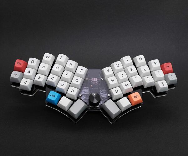
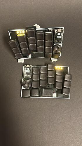
Great board. This actually spurs a question I was wondering about. For angled thumb rows/cluserts, is there any value to the thumb keys being convex, or do the normal scoops work well at an angle? I’m sure, like everything else, it’s hugely dependent on preferences, but what’s your take?
Great question, also my first time of using convex keycaps there. I do have to say, I find them more comfortable, otherwise I would mainly rest on the edge of the scoop. Really would appreciate some for the 1.5U also.
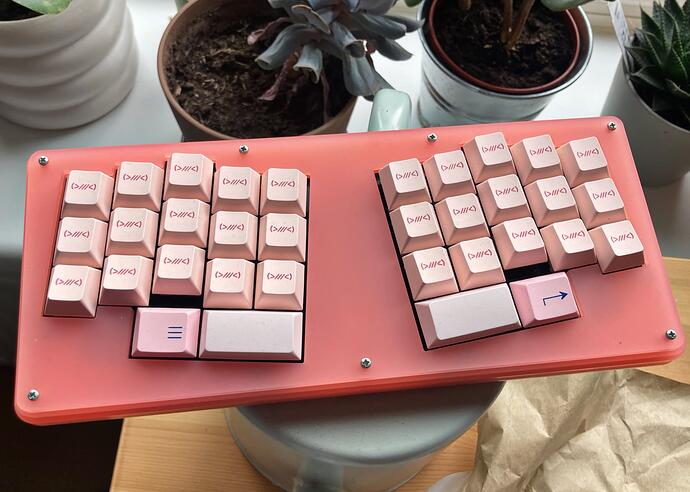
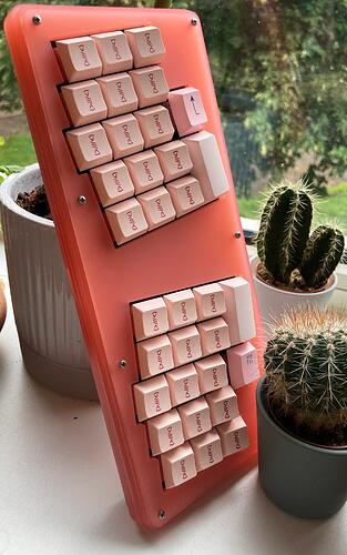
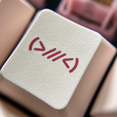
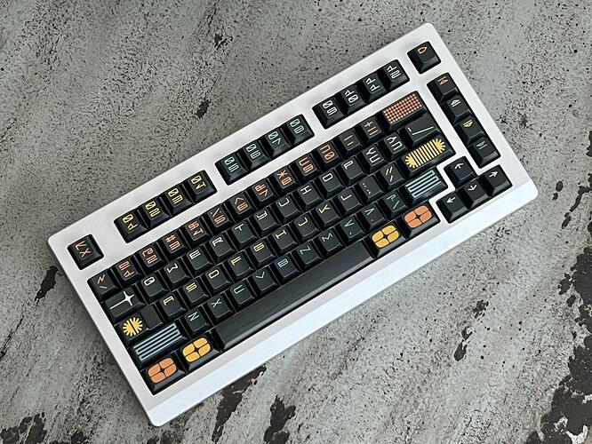
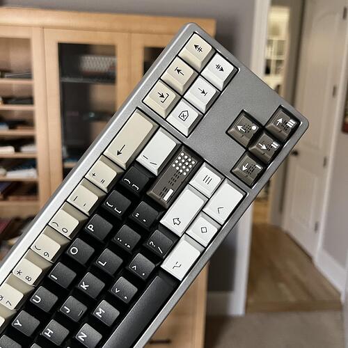
That’s a great picture. Is this an ASCII terminal? Something different than the VT-100?
Was there a functional reason why the ASCII codes needed to be on the keycaps for this terminal?
I’m old, but not old enough to know the answers to these questions.
Great question, but I have no good answers. I was rather surprised to see the ASCII caps as well.
Those Viktus Sinne sales were craaaazy. I may or may not have another unbuilt Sinne somewhere in my drawers.
You are loving that bottom row layout for sure lolol.
LOL, our 40%, ergo, and ortho brothers and sisters have much to teach us. They are wise and we may learn.
I do love it lol it’s trips me up using normal keyboards so badly as I hit the FN keys (both sides of the space) all the time.
I thank those special users for all the 40s and extensions child kits that are available for most sets haha without them I’d be dooooomed
Got everything needed for the Klotz today
- NRF Controller
- Choc Jades
- 602030 batteries
Battery is plasti-dipped. At first I did not like the texture that appeared after it getting dry, not I see that it’s kind of fitting to the MJF caps.
Mounted my MV Expo set for the first time today. Shown here on my silver GHS.RAR
More on my Instagram post
Do you guys have these keycaps? They’re interesting. I love the design. The swirls in the plastic are cool, too. But it is weird to feel the printing on them. Definitely raised to the touch. Give the fingies a bit of a massage when you rub them across.
Scandi on Sangeo65. Never thought of putting these caps here but they look lovely!
More photos on Instagram post
How has ePBTs quality been of as late? I stopped buying them a few years back after I got the GOK BoW set & updated Red Cyrillic set. They both had some badly warped longer keys & with so many other options I haven’t given ePBT a look again.
I think this is one of the last sets I purchased. No issues except the stepped caps was made wrong. They "fixed’ it and sent out replacements and it’s still wrong. LOL
I joined this group buy because I’m in love with the colors. But I haven’t purchased an ePBT set in quite some time.
My last experiences with ePBT sets are a mixed bag. Soju and Origami were defect free, and really perfect on that front. Kuro/Shiro R2 was another story. I’ve never seen such bad warping on all the mods, somehow including caps as small as 1.25u! They were all bananas, and the sides were also deflected inwards dramatically (aka, fish face caps). It was so bad that after sharing pics with Mekibo, they issued a full refund and a free shipping label.
Assuming that the caps are all straight, I still don’t think I’d pick up another set due to the texture. It’s just too smooth for me. I prefer the feel of XMI for instance. I really wanted Scandi for the colors and novelties though ![]() .
.
Thanks for the update! Sounds like they still should be avoided for unfortunately. Similar twisting on my GOK BoW set & not as bad but still a lot of affected keys in my Red Cyrillic set.
Mounted PBTfans Resonance R2. Some more pics on the Instagram post
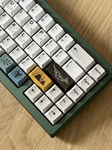
Love the versatility of this set. You could make it look so different depending on what accents you use. I’ve chosen to mostly use the brown semi transparent caps and the beige “alert” top row
Look great! Are the alphas basic WOB? I already have the PBTfans WOB icon kit and thinking about getting this kit and doing some mixing/matching…
