I will definitely have to do more research on the pointing device community, hearing that!
What a beautifull mouse!

Z Flip 3
10 Likes
It’s half the phone it used to be.
2 Likes
Mommy Milker
Interested…
2 Likes
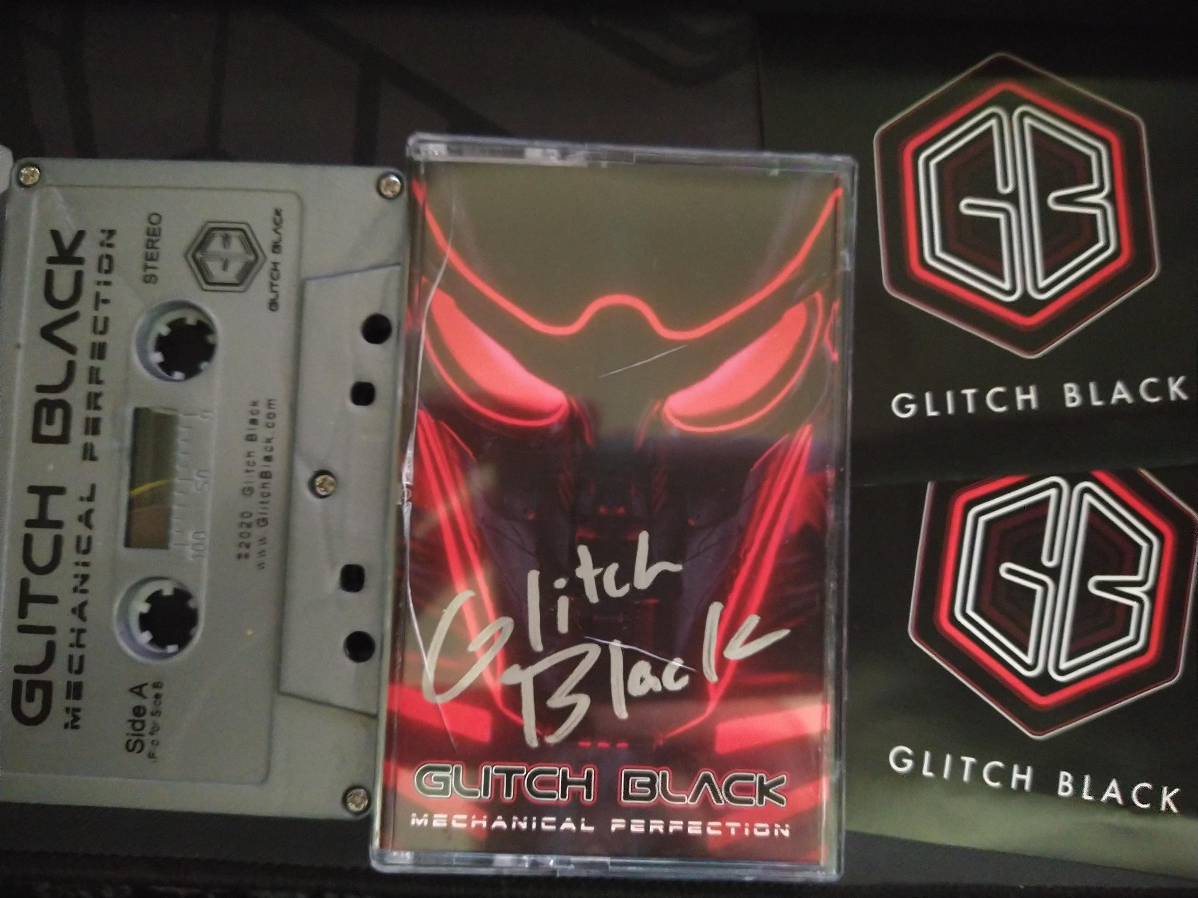
Had to get myself a set of akko neon after their anouncement that they will stop making “clone” keycap sets. also got some silicone so i can make dampeners. my levels of hype are quite high. 
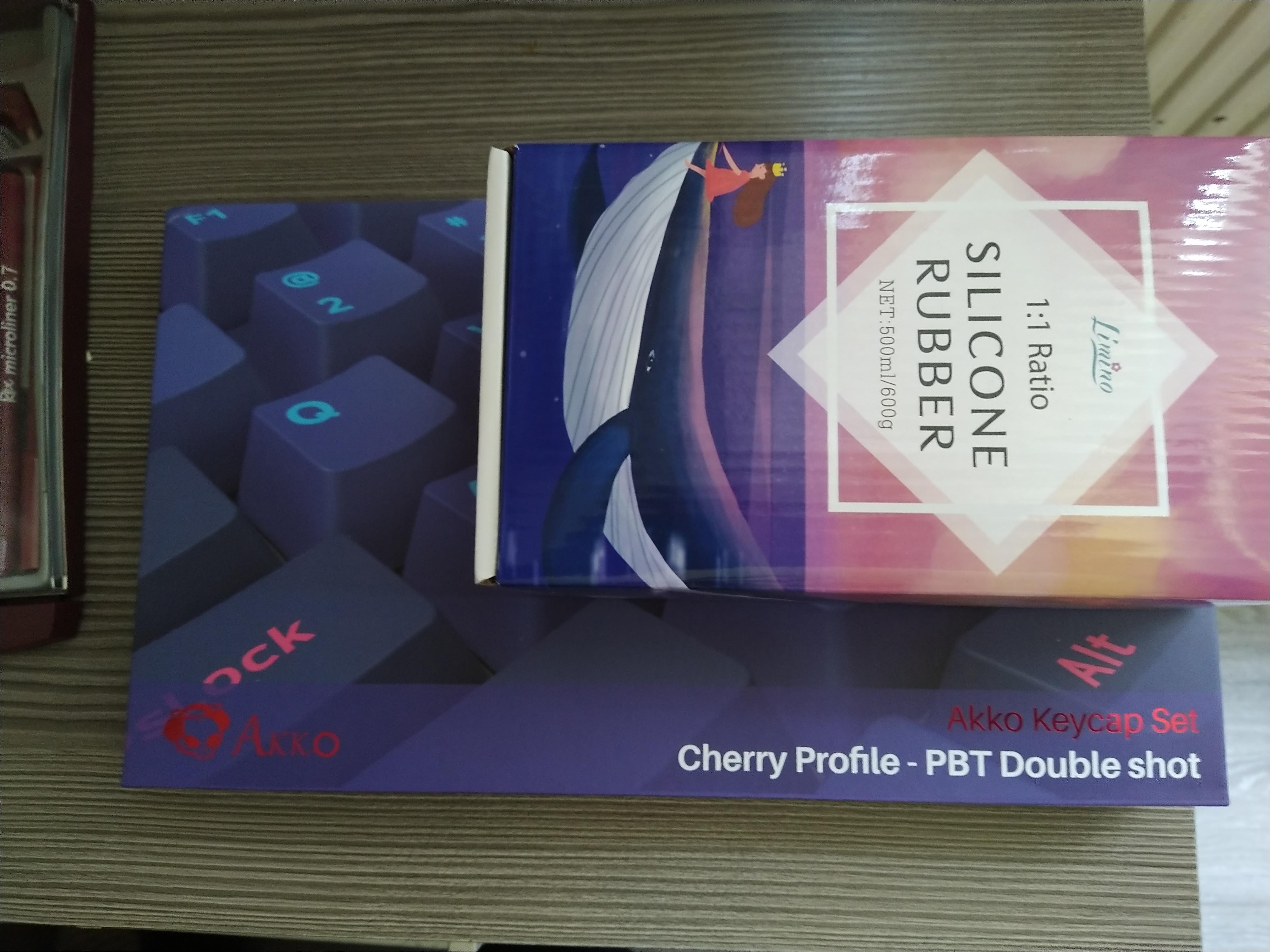
8 Likes
Wow, beautiful!
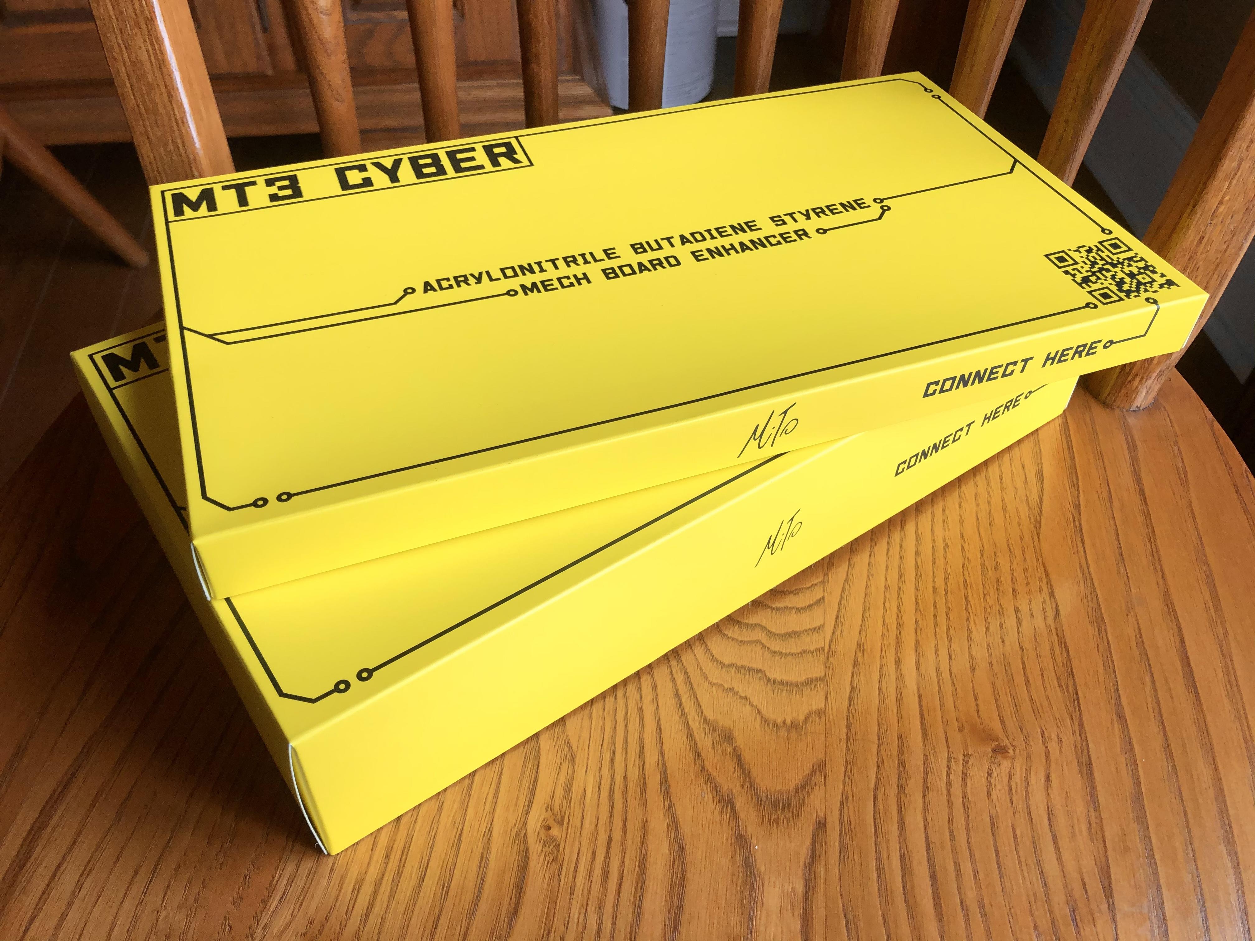
MT3 CYBER
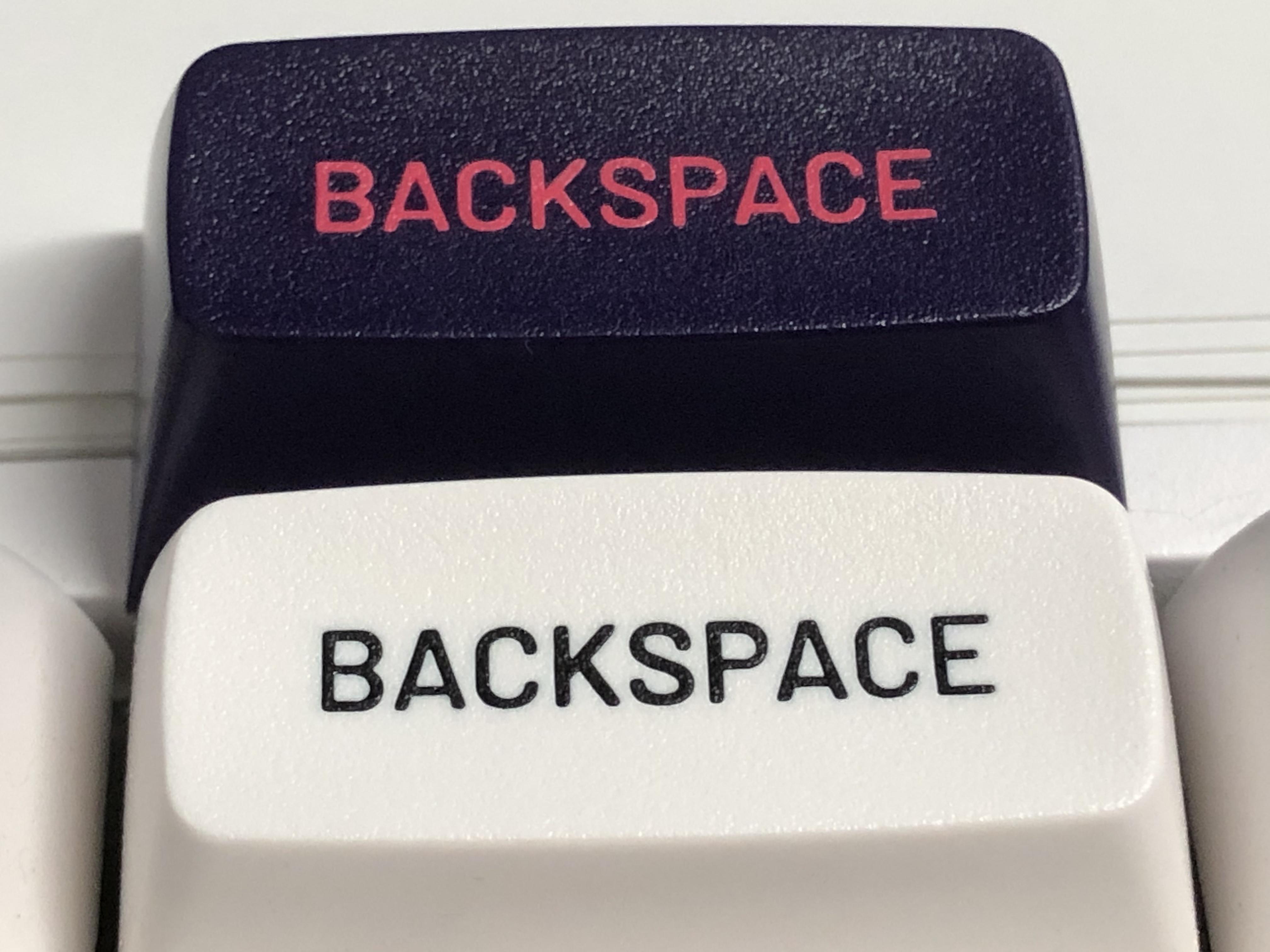
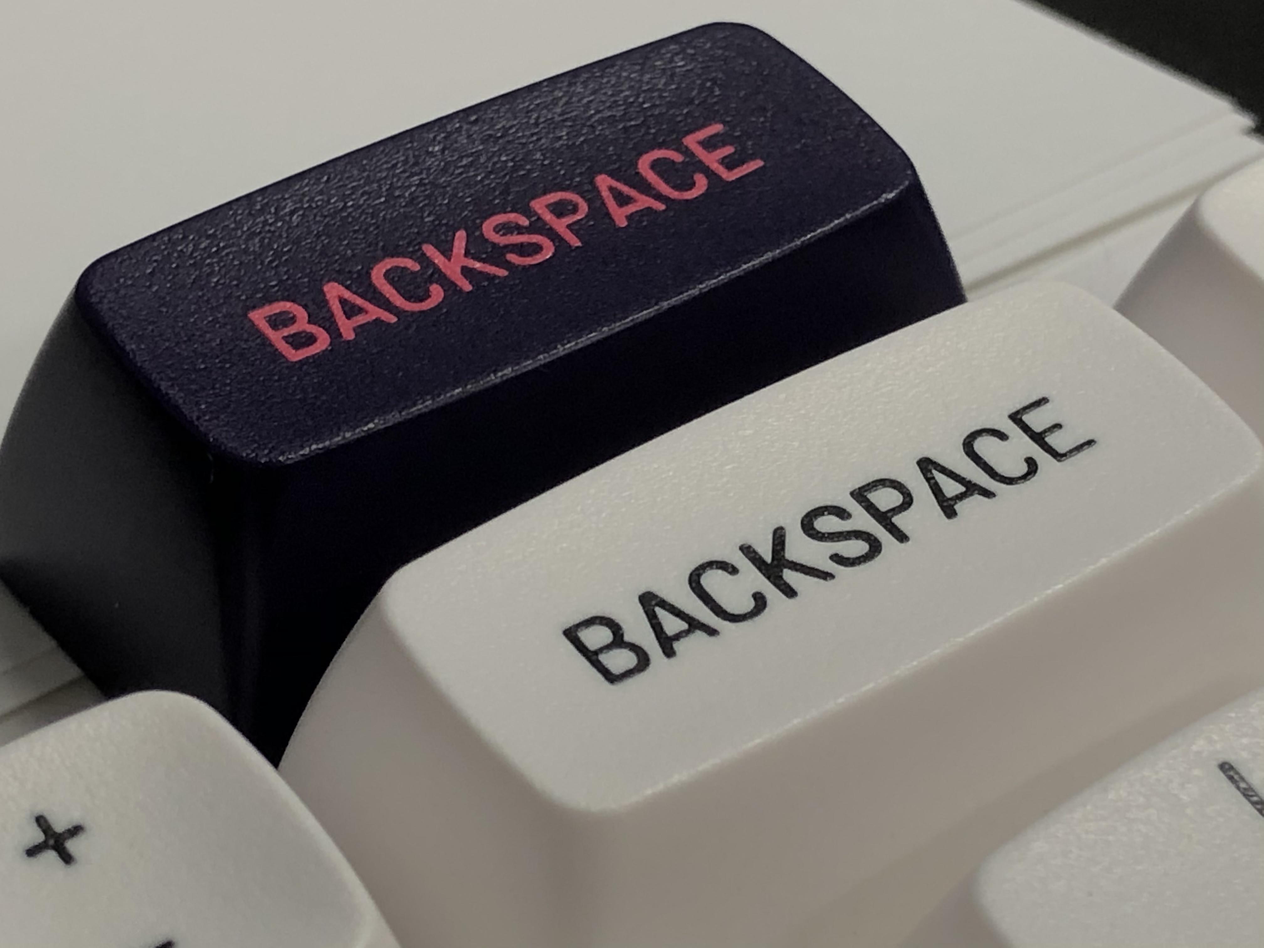
Initial impressions: these look excellent. This might be the difference between an MT3 set with Mito’s name on it and one without; at least on my example here, QC is basically perfect from what I can see so far.
The legends are consistent; not under or over-injected, no blotchy or weirdly fat legends. “BACKSPACE” has the same letter weight the whole way through. They look great - kinda like Susuwatari does.
I love my BOW and WOB as daily driver sets, but I haven’t seen a single example of those QC’d as well as the much smaller number of Mito’s set’s I’ve seen. ( 4 each of the black and white sets, 2 Susu, and now the 1 Cyber )
Dorp, if you’re reading this - not QCing your own sets as well is keeping MT3 from having the spotless reputation it deserves. Preference aside, these were designed to be top-shelf caps - and when made right, that’s exactly what they are; fantastic.
10 Likes
You are a tease. Show us the real stuff.
4 Likes
Ha, fair.
I’m saving some for a write-up (and I’m also at work) but here’a a quick phone snap comparing the backspace keys:
More photos when I get home tonight.
Edit; software is down at work so here’s another quick n’ dirty comparison:
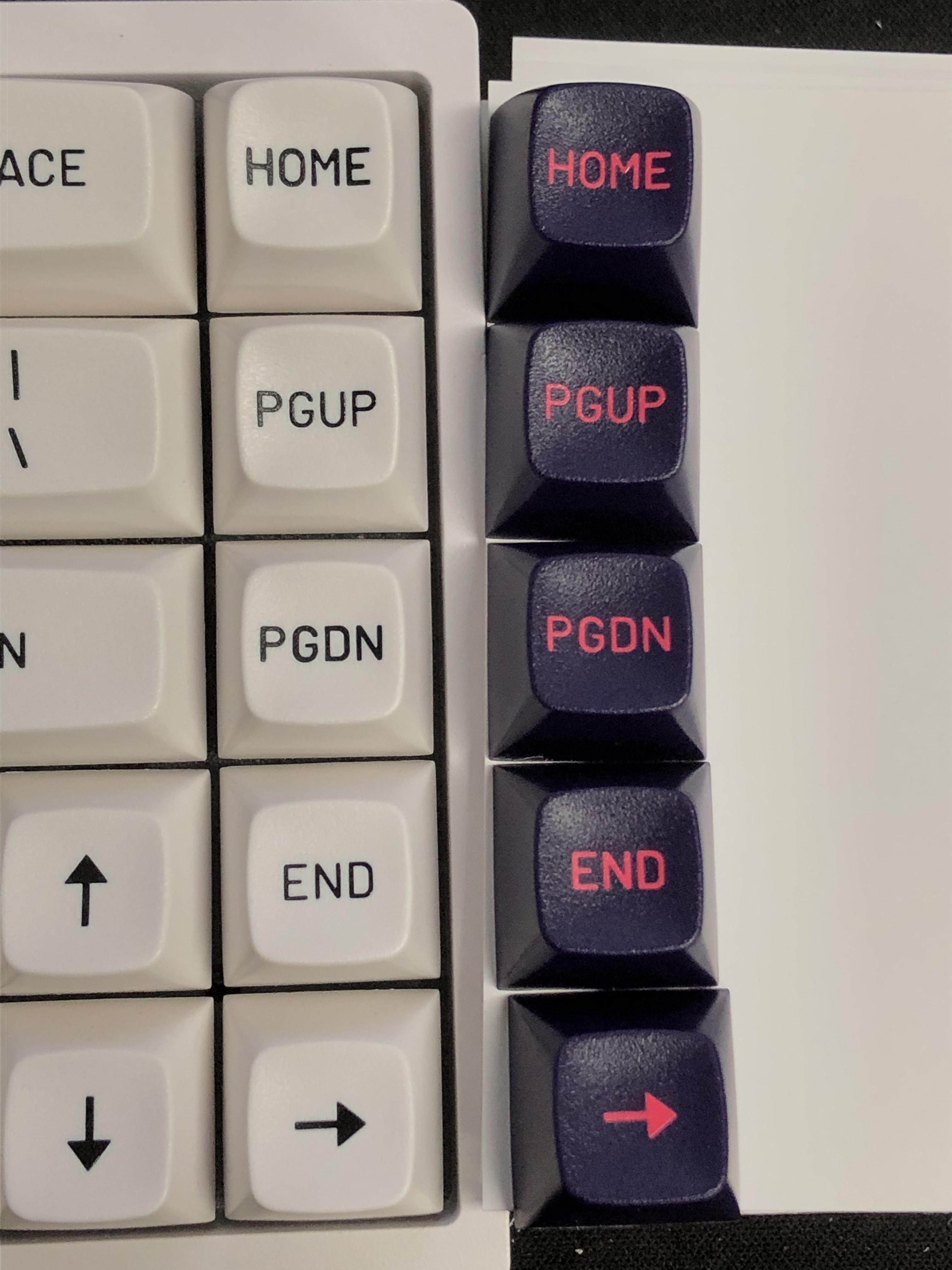
On the left, you might be able to see the BoW legend inconsistency in the nav column; it’s subtle, but the line-weight is all over the place even within single letters, and that colorway is probably the easiest to see it in when it’s there. The biggest difference might be between the “G” in PGDN and PGUP.
I can see a little variance with Cyber, say, between the PGDN and END keys, but the legends are consistent within the keys themselves, and quite a bit more consistent between keys than BoW here. I’m working on a write-up to compare these (and a few other things) in greater detail, and with proper photos.
7 Likes
A tube amp financial burden…lol
12 Likes
It’s pretty interesting but I’m also curious how it’s possible.
I wouldn’t bet on Drop re-investing to create new molds after the initial Susuwatari ones were made. Is it possible they used the same mold for both but something changed in the process to change the line thickness?
I am guessing at how molds work, fwiw. I just hear that they are expensive, etc
2 Likes
Almost certainly the same tooling - I’d say the inconsistencies are probably a result of rushed injection. Either trying to do it too fast, trying to do too many too quickly, or not allowing the plastics enough time to heat / cool before moving to the next step.
It will be easier to see once I get some macros; but on the inconsistent ones some letters look not quite fully formed; like there’s still surface tension shaping where not all the plastic hit the end of the mold, where some other letters will be extra wide, either because too much plastic was injected and it spread, or there was uneven heat causing the legend to melt a bit and spread into the other plastic.
2 Likes
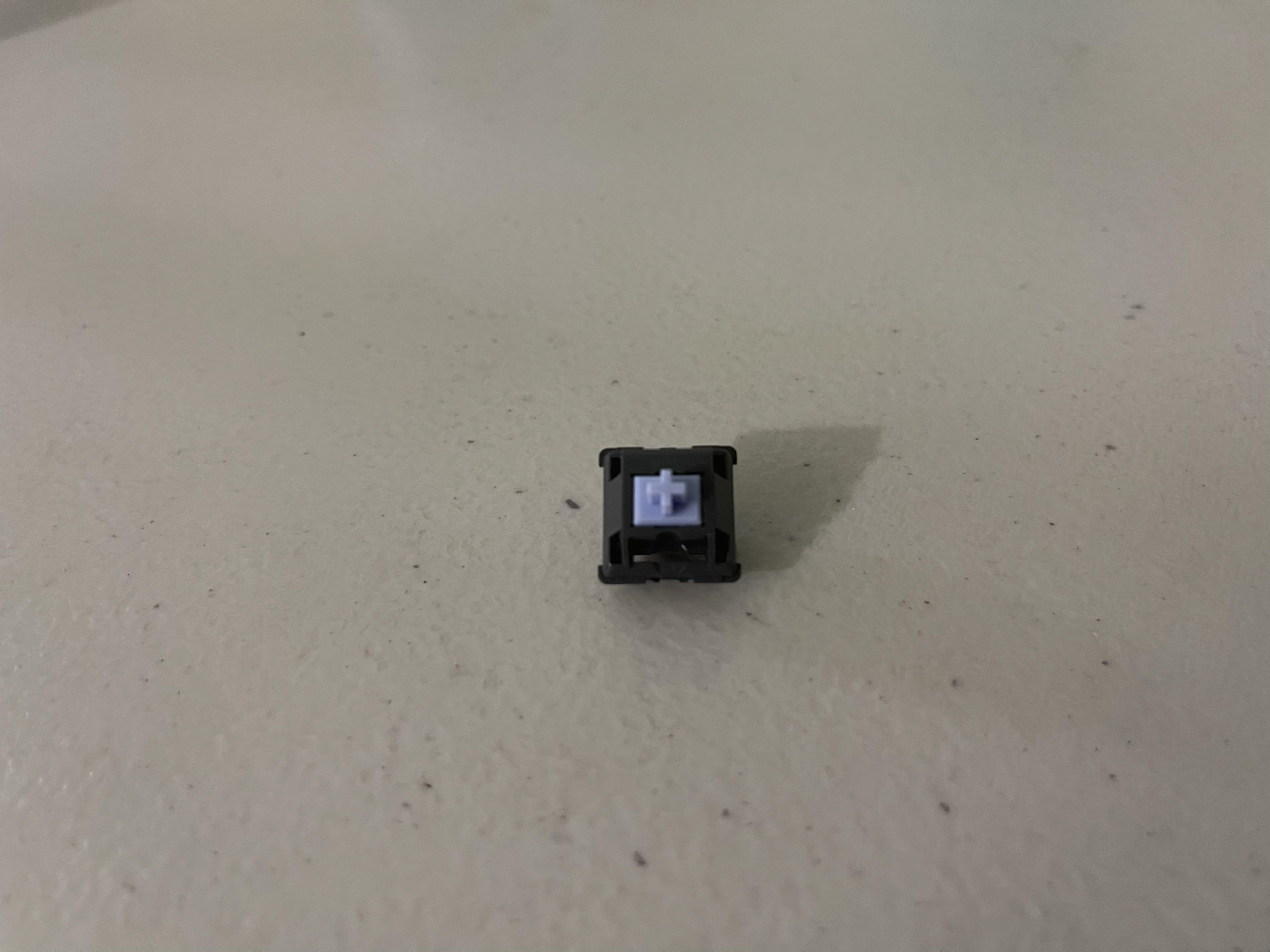
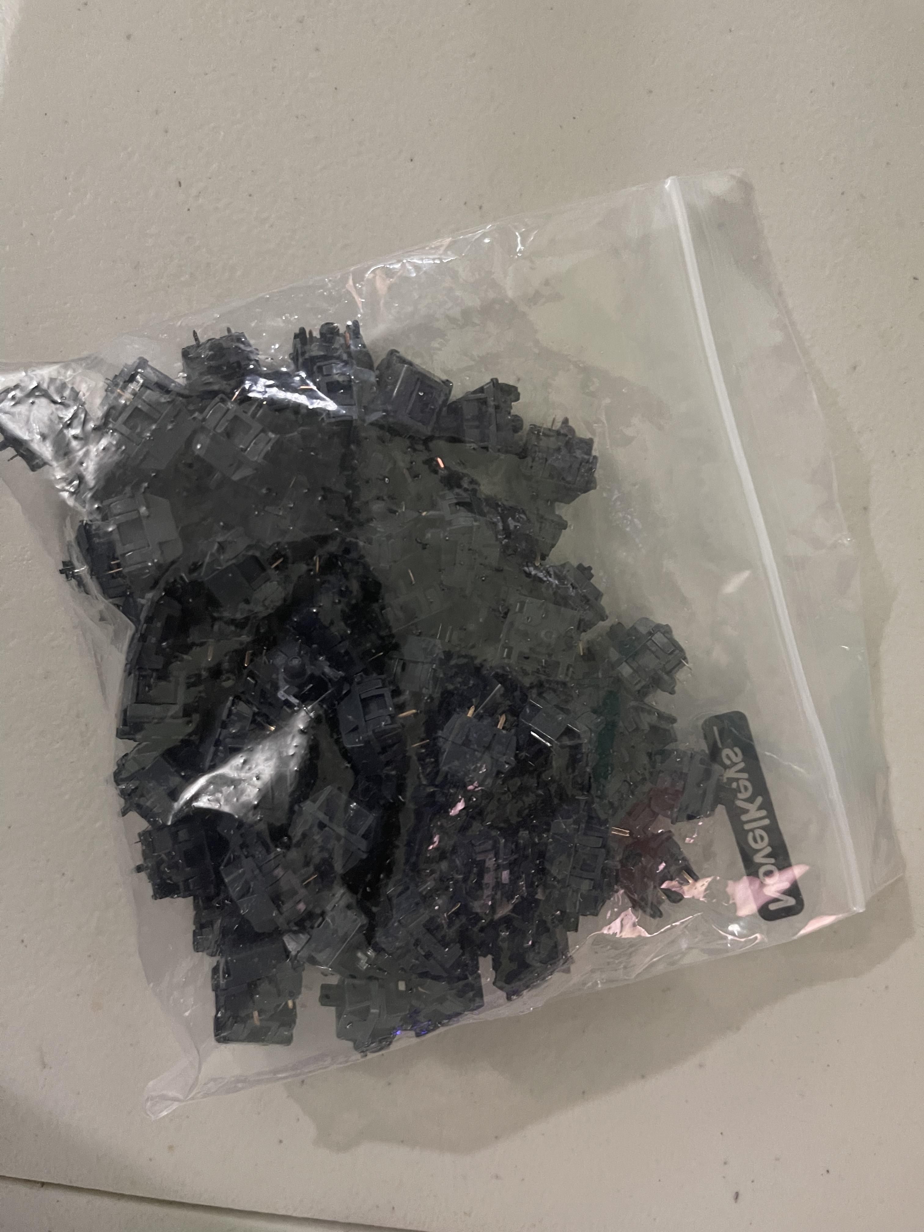
Trash pandas arrived from Novelkeys. Threw in a Polia stem and even stock this switch feels and sounds great. Can’t wait to lube, film and put them in my KBD67 lite R2.
11 Likes
That’s gonna sound awesome.
1 Like
I can’t wait!
I really like the way the purple goes with the BoW caps.
3 Likes